Lessons
Day 1
1Day 1 Pre-Show Banter
18:50 2Introduction
33:25 3What Makes a Dramatic Image?
19:34 4Before and After part 1
35:33 5Before and After part 2
17:23 6Adobe Camera RAW
44:25 7BONUS: Upcoming Alley Shoot
07:09BONUS: What can you do to a pixel?
05:06 9Working with Example Files
55:00 10Preparing for Alley Shoot
11:35 11Photo Shoot in Alley
1:17:00 12BONUS: Homework Assignment
01:22Day 2
13Day 2 Pre-Show Banter
06:33 14Reviewing Yesterday's Images
22:02 15Adjusting with Curves
28:55 16Adding Masks
39:25 17Student Photo: Orb
26:36 18Black and White
27:09 19Audience Q&A
15:37 20Student Photo: Toy Car
10:57 21Black and White Portraiture
17:57 22Tone and Colour Correction
22:02 23Student Image: Journal
14:39 24Audience Q&A
10:08 25Bonus: Internet Homework
19:05 26LAB Color
21:03 27Student Image: Girl on Phone
13:06 28BONUS: LIttle Girl in LAB
07:18 29Wrap Up & Q&A
12:10Day 3
30Day 3 Pre-Show Banter
05:50 31Introduction to HDR Photography
17:50 32How to Shoot HDR
51:55 33How to Process HDR
18:16 34Hands On: Shooting for HDR
52:13 35Processing HDR in Photomatix
1:08:40 36Student HDR Example
27:28 37Thanks + Credits
06:18 38Student Image: New York City
36:23 39Final Review
16:52Lesson Info
Before and After part 2
Let's just jump back in and get back to where we were on. We got up to get up to the bucket image on. We're now back to, um, guy here. So what do we agree on? We agree to seven in the studio on a range of anywhere between three. And 11 online. Okay, so if he's a seven now, what is he? There is about nine now, right? Okay. Yeah. Would we agree on that? But what's changed? Just jump between the two. What I done there's always going to black and white are toned black and white, but what is being accentuated? What? What makes him in nine Now, when he was a seven before you've shown a lot more detail in his skin on like some of his wrinkles around his eyes. And his hair looks really crisp now. Yeah, So it all looks a little bit dull. There it was, actually stood under a tree. So again, soft light quite diffuse the light. Now it's a lot more directional. There's one important change. The image, which was kind of incidental, and I only really noticed it later. Which is why I asked, you know, ...
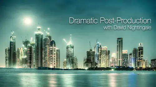
this the scale of not to attend something else changes that changes. Harry looks. And it's not just the wrinkles. Something seems to go wine. Oh, that's a photo, says the cheekbones. The cheekbones certainly become more pronounced now. It's kind of it's on that same theme. Kind of the shape changes in one important area. The image I was gonna come in under the chin. Yeah, yeah, yeah. So look at how look how his jaw line changes. What you've got here is kind of, you know, I'm not sure how old he is, but you can see the signs of age under his chin when it's post processed. You get is very angular shape. You're following his beard. You don't really look underneath his chin. It's not kind of got into darkness. It's not edited out. It's just the way the lighting, in the contrast has changed. It's changed the shape of his head. People David are also commenting about the glasses. His eyes were more mysterious because I can't really see as much, but also his mouth. Yeah, yeah, it's a kind of we started off with. 70 is probably a really nice guy, and he's probably looking for his grandchildren. You know, it is not a biker, and, you know, it's kind of all speculation, but it kind of has that on edge to it that I wanted to bring out on that kind of does it. It focuses your attention on the detail, accentuates the details charms treat bones on it kind of loses, loses chin, so change the shape of his head. So goes from 79. I'd be interested to hear what the person who gave 11 thought. If they want to come back, come out from behind the sofa, then we'll hear what that's Okay. This one, What does this need? It needs more contrast. Anywhere in particular. I was around where the the I guess it will be the kite needs without more contrast between the color separation between the different colors, as well as probably also in the shadow as well. What about a sky behind it? Yeah, right. If you have the skills to do it, what would this look like when it's finished? I think there's gonna be some green on the case. Some green that you see before. Yeah, it is kind of Yeah, this is This is one of my many PSD, so you can kind of download this one if you subscribe. I'm so again it's a flat image. The kind doesn't stand out too well because it's officer. You kind of draw. Your attention is drawn to the top. Right left corner is bright. That kind is a bit dull, the shadows not very pronounced. The claims don't stand what you said Green. Why? Why would not change the colors? It's not that I have a thing against Primary Colors, but if I'm trying to create something that's evocative of the 1st 1 of these one of the issues I called SG Blackpool Star Gate, it reminded me of, I don't know, something quite surreal. Um, so again, if I shift the colors, I'm gonna change the moves. What I did with this one was that so everything you said about the contrast is there on. But the main work is done on the kite itself. So kind of for me again with yellows and the reds and the oranges didn't work all that well. Um, I can't quite explain why I think the green works better, but this is really about lighting the kind So again, this is a shot you could like be quite difficult to do, I think. Yeah, I wanted Zach to be in the studio today so I could teach you about post production, but he could have been answered. My questions about lighting my knowledge of lighting is quite small, but does that Does that work better than that? Did you have any trouble identifying what the problems were with that? No. You know, you can write. We're getting a sense now that you can all do what you need to do before you get to the next step on the casing. Managed to feed that back into when you're shooting, so kind of you need a different shooting ethos that says Right. Okay, in post production, I can do this and that's kind. That's the not the difficult step. It's the one that most people don't do. You can look at it now and know what's wrong with that on May be. Just discard it on, delete it or not. Process it or whatever, but you can deliberately shoot the sort stuff if you think the whole process through and you have no trouble. Identifying issues was like Look, a couple more examples. Okay? This is on birth. Khalifa in Dubai on some famous is at the bottom. Yeah. Is it a striking image? No, not really. Is it? No, it's kind of this kind of thing. You shoot if you happen to be stood there at the time, Is he walking past? Which is exactly what I was doing. What does it need? What kind of mood could win to this? I think what we do. It's, like, different. I made a mistake when I sat my blawg of deciding that I give a title to every image that I posted, which was kind of fine for about the 1st 50 But now I've got up to nearly 2000 0 no. What can I call this one and I'll name it and then I'll try and upload the files off the server and realize that another is an image called already. So this one, Anyway, I called Gotham City. So if I call it Gotham City what is it gonna look like when it's finished? What? What does Gotham City look like? Dunk, maybe Sort metallic. Yet what else? What's the mood? Rodney says sinister, sinister Yeah. Leslie Lee Photo says Punk Stark. Retired Phil. Dark. Stormy skies. Dark, stormy skies. Okay, Alexander says. Gothic Gothic yet crunchy says Jay Ramp. Crunchy evil, Evil, foreboding, foreboding, right callus. If it Let's see if I managed. Does that get it, then? Kind of the families orbit twinkly. Kind of. Not really. You know, you don't expect little twinkly fancies in Gotham City, but does the building in the sky look better? What's wrong? Did you work? There's one thing I added to this photograph, which is actually extremely per names in terms of processing. What is it? Ran the edge. A vignette. Well, look at this. During postproduction, invariably, I had vignettes, two images. Why would I do that? Yeah, yeah, I always find it. Occasionally. Read forums about equipment on guy really like the ones that I called in the gearheads. And it's the people who tell you about the lines for millimeter at different temperatures on moan about. We've been getting you know, this this lens is awful. You need to stop upto 11 before you get rid of the vignette. When I'm thinking Well, nearly always, I add vignettes, pictures because I kind of want the viewer to look at what's in the middle, not what's at the edges. So in this case, I'm trying to bring this down dark and the edges to focus your attention on top of image there. So not quite Gotham City, because the families are a little in Congress, but certainly a lot closer than that one. And again, it's about changing. It's about changing the light, bringing out the details on sky. Um, bring in the building. Yes, go. How many frames did you shoot for this photo? What's this one shot I shot from probably about half on hour before then, about half now after. So it's kind of the one where you had the right balance of because we're shooting at dusk kind of waiting for the right balance of light. We were hoping that the lights more lights would come on in the building, but it kind of wasn't finished and they didn't light it up. So this was kind of the optimal image for post production. Okay, lets go through just a couple more. What does this shot made? What's wrong with this one? Is it dramatic to start with? It's kind of odd this one, but it's flat. Yeah, the light is very flat. Yeah. What's the most noticeably darknet that needs to be changed? Heather Shary says that it lacks depth and folks are starting to say the eyes. Yeah, here. Yeah. They always very dark. Invariably, if you're shooting kind of portrait sound doors people's eyes in the dark shaded light falls down under under the brains. And when you look at people, you don't particular notice. When you photographed, you do so typically with all my pointers, I do some extra work in the eyes. What about the colors? The colors of flat as well. What would we do that we would do anything with color? What would you What would we be doing with color? For me? This one is kind of an old image because I'm not sure what mood is here. She was playing. You're playing on the beach, been burying each other, which is Sandra in the neck. I'm But I I actually went colder colors, which kind of changes the mood slightly So the eyes, the main difference. You know, very little color and rise. There are big changes to the eyes, but I actually went for quite cold, Almost incongruent colors. So that this kind of something odd about this image, you know, I'm not sure what Mooch is in. I'm not sure what the image is trying to say, but it's kind of certainly a lot edgier than that one. That's kind of just a snap on. That's a bit more of an edge to it. Okay, so let's just do one or two more, and then we'll move on. Um, what about this one? Is it dramatic? Feel free to say no. Remember, you can say no for all of these ones before the post produce my I just get stuck on that blue line there. Green line, Green line. Yeah. And so kind of composition of this is okay. You know, the green line is it's not 1/3. It's kind of in roughly the right place. The piers on the top third, you got the pedals at the bottom, but it's kind of just a bit dull and flat. You may or may not like it. I do this for us again. I was in my kind of my pink phase at the time. I'm not even sure I like this one anymore. Still things on the front page of the website, but it's certainly more dramatic on the green is now disappeared, are sold. It is still there, but it doesn't draw attention in the same way. Now it's kind of like a component of the image, but again, it's all about contrast, particularly in the foreground. You look at the light changes in the foreground. It really brought the detail and in the pebbles, Um, and if I did a very song, Strong salt, Grady in the top, so kind of focuses on the pier. You got the line. You got stuff. Okay, what about this one? This is when we hung one of our daughters because she was misbehaving. It's not really dramatic, but it's a fun composition like you kind of wondering, like what's going on? Ski jumping on this thing has a price producing. Then what would you do? I I would sharpen it up. I don't know. Um, it's not really it's very flat, so there's nothing really like popping right, Okay, is flattened. It's not popping. Good has suggested bringing out the what? More green in the wood? Yep. Yeah, maybe direct some attention towards the feet. So, like, maybe dark and some things around in the rest of the photo. Um, and lighten up the feet a little bit. Okay, so we're talking about contrast between the elements. Kind of. Where you gonna sf Photo says no pink, please. No pink? No, no, no pink in this one. Trust me. No. Pink, right. If we're thinking about increasing the contrast between the foreground element in the background, there's two ways of doing that. One is in terms of the point you made about darkness to conduct and down in the background. What else coming due? Does this see? Look inviting Until and as you clue, what would make the city look nicer? Maybe it would look nicer if it was, like a bluer color instead of green. Yes, it is kind of just a gray flat. See, I imagine to see, um, Seattle looks a little bit like this. Certainly. This is typical of northwest coast of England. I got to see what I did with C. So I did everything you said. I brought out the detail in the wood. I've increased the contrast in the feet, so it kind of looks now as though the sun is shining on. There's no particular selective adjustments here. There's no very complicated masks or anything. This is an increase in contrast, which it increases the hardness of the light if you like. But I also told in the background, so kind of, she really stands out. You know, if you look at the density of the background, there's slightly more contrast, but not a huge amount. But I separated the foreground from the background by changing the color. So it is not difficult to do, but it's kind of you thought through what is wrong, but didn't come up with that suggestion. But it's kind of increasing the separation between elements and an image. There's two ways of doing that Is brightness on this color? So in this case, it was color and brightness, but to a much lesser extent, key thing there is the color. Okay, so this isn't easy, but what's it needs? Um, too dark in the background? Yeah, I can see what you're thinking that So what we do then is we'd lose kind of the distraction, the muddiness of the picture, and I would be one way to go, I would make the close early pop out. Yeah, this one yet, and that's the other way to go. So I didn't do well. That's what I did, which is kind of the opposite. So in this case, this was just kind of curves and color. Um, so there's nothing added to this image, but it's just made a whole lot brighter, so not know especially difficult. So I can see what you were saying. You end up then with kind of things fly now and much, much more clearly. Defined lines are gone. Kind of What interest did you look at the orangey bits and think I don't like the color of those? Is that what you were doing when you were looking at and saying Make it dark? And what were you trying to get rid off? I was looking at The background is kind of muddy, so I wanted the stuff to pop a little bit more right, so you're trying to hide the fact that it was muddy right? That's a color issue as much as anything else. Muddy salt, brown, sludgy grays and things like lamp. But he changed color. You know it's still quite did. It is still quite dull, but it looks a whole lot better. But you also have more light in the foreground doing that. So you pick up more detail. Yeah. Yeah. Okay, so that's kind of the end of those images. The key thing, though, is with all of those almost invariably all, if you could pick out problems, would you Would you agree with that? There was nothing complicated in there about the nature of the images. You could all identify the problems. You could all pick out what was wrong with it. I think kind of anything you missed, but you got there in the end was seahorse and the bucket thing. Generally for most of them, you already know how to do that. You already know to look at a picture and go, Yeah, it's a bit flat on the cards. A bit off was not enough contrast. So that's a really good starting point. If you can recognize that the rest is kind of plain sailing. Well, there's a few things here in that. Generally, if you if you can do that stage, then you've got to do the rest of this with no problem at all.
Class Materials
bonus material with purchase
Ratings and Reviews
a Creativelive Student
Ive been following davids work and tutorials for around a year now...well ever since i took up photography as a hobby. Im a lifetime member to chromasia.com and have been working through his tutorials when time allows. There is no fast track approach to this subject but i wanted the best advice i could get. Ive always found david very approachable over the internet and is always willing to offer advice on questions ive had regarding all manner of photography questions, being a noob. Whilst the tutorials are very comprehensive and well written sometimes its hard to digest this by yourself. So when i heard that he was presenting a three day course over the net. I jumped (well not quite more like sat down) at the chance to make sure i was able to watch the course (didnt manage that either). Sometimes its better to have a monkey see monkey do approach to walk you through different aspects of photoshop. And after the first day of the tutorial, so much information sunk in more so than it did sat reading through the tutorials. Although i didnt get to actively sit and watch the remainder of the last two days i did purchase the course so i can refer back to it time and time again. I can highly recommend this course, its concise, well planned and enjoyable course to watch. When you subcribe to the course you even get the files david walked through so you can practice yourself. I cant really praise the whole package enough...but its an invaluable reference course and couple this with chromasia membership you have a package that will dramatically improve your processed photos, the way you think about composition and importantly your camera settings! Great stuff
a Creativelive Student
David’s Dramatic Post Production Workshop is an excellent source of both education and inspiration. The Photoshop instruction is excellent and was my primary reason for watching the workshop. I was very surprised by how thought provoking the shooting sessions in the alley were and the lasting influence it will have on my own photography. Firstly the preparation for the session in the alley was interesting – having a goal and a purpose in mind. The fact that they are producing interesting work to illustrate the points and techniques in a rather dull alley helps emphasize the learning. On my next shoot after watching the workshop I definitely made adjustments in my approach. The discussion, examples and instruction on the goal of making an image more dramatic is very inspiring. It really makes me step back and review my own work to see how I can approach it from a different perspective
a Creativelive Student
The workshop was a great opportunity to learn to be more purposeful and intentional about the creative process at the post-production stage. I found the second day of the workshop – where David goes into his own approach in Photoshop – to be the most valuable for me. I look forward to putting this new found wisdom into practice into my own work. Thanks David!