Lessons
Day 1
1Day 1 Pre-Show Banter
18:50 2Introduction
33:25 3What Makes a Dramatic Image?
19:34 4Before and After part 1
35:33 5Before and After part 2
17:23 6Adobe Camera RAW
44:25 7BONUS: Upcoming Alley Shoot
07:09BONUS: What can you do to a pixel?
05:06 9Working with Example Files
55:00 10Preparing for Alley Shoot
11:35 11Photo Shoot in Alley
1:17:00 12BONUS: Homework Assignment
01:22Day 2
13Day 2 Pre-Show Banter
06:33 14Reviewing Yesterday's Images
22:02 15Adjusting with Curves
28:55 16Adding Masks
39:25 17Student Photo: Orb
26:36 18Black and White
27:09 19Audience Q&A
15:37 20Student Photo: Toy Car
10:57 21Black and White Portraiture
17:57 22Tone and Colour Correction
22:02 23Student Image: Journal
14:39 24Audience Q&A
10:08 25Bonus: Internet Homework
19:05 26LAB Color
21:03 27Student Image: Girl on Phone
13:06 28BONUS: LIttle Girl in LAB
07:18 29Wrap Up & Q&A
12:10Day 3
30Day 3 Pre-Show Banter
05:50 31Introduction to HDR Photography
17:50 32How to Shoot HDR
51:55 33How to Process HDR
18:16 34Hands On: Shooting for HDR
52:13 35Processing HDR in Photomatix
1:08:40 36Student HDR Example
27:28 37Thanks + Credits
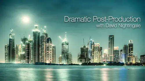
06:18 38Student Image: New York City
36:23 39Final Review
16:52Lesson Info
Processing HDR in Photomatix
Okay, So what we look at this afternoon is working through post producing your HDR images we'll start with Is the shot side shot out in the alley so we can kind of go through this first step again just to make sure we're all clear about the various options for creating the 32 bit HDR image. So I've got things Time will do. Its likely for why I've got photo minutes pro running on. What I'm gonna do is click the load bracketed photos button, and I'm gonna brown's to the folder there in, uh, if I can remember where is on its here somewhere. Okay? I can't find it. So I'm gonna cancel that. I was gonna drag him back home. Stand again. Okay. Basically, I'm doing here is just opening up files. So on emerging for actually out processing, I don't want to just open files clicking. OK, so here's the bracketed photos. Kind of got them all that. So this is the shot I was shooting with kind of some commune of the top of the building. And as you'll see, it's kind of it's not gonna make it on to the w...
ebsite. It's not It's not a great shot, but it's a good a good example. So again, let's go through these lowing the source images on cross the line images. The probably is integrated movement, but I wash it on manual sequence of touch the camera between each exposure. So I'm going to pick again by matching features on include Perspective, correction. There's only slight movement between frames. This will correct it. Hopefully on, I'm gonna leave remote removed. Ghosts are selected just so we can go through that again just to make sure you kind of know how to use it. I don't think that will be any kind of wasn't anything moving and it wasn't windy to the cables aren't swaying or anything like that. But we'll leave that selected again. I'm gonna reduce the noise on just younger exposed images. Kind of. I don't think there's a problem with noise shooting. I So 100 something that's probably gonna be okay, but I'll leave that checked on. I'm going to reduce the chromatic aberrations White balance and leaving shot color primaries based on Adobe RGB. It's on a click. Pre process is gonna take a couple of seconds, so you guys. Have you got any questions? At this stage? It's all making sense. Yeah. Did you find the shooting easier than you expected? We're expecting to be more complicated. It will be more stuff to worry about. You kind of got stuck with shooting before you send Exposes never smells. Yeah, you're right. No, it went really quickly. I think I picked up everything this morning. Really? Well, yeah, again, It's No, it's no hard Once. Once you get into your head about these two extreme exposures, right? I'm kind of darkest. New light isn't here to read the Instagrams. Everything else is just really simple. Yeah, you kind of nail those endpoints pick an equal interval to shoot your secrets through so relatively straightforward. I'm Kenya people online. There were lots of questions while we're shooting the kind of got stuck over lunch. Anything. Are they OK right now Suzanne has asked. Doesn't matter. What order you load the images in? Not at all. No. The software reads the exit data to put these together. It's kind of you load the matter, fold the kind of going in one order anyway. But it really doesn't matter. You could change the names, it wouldn't matter. This is purely using exit data to determine where the guy in the sequence. So we're just about done here. It's aligning the source images. Um, so we're nearly ready to take a look at this masterpiece off Ali Photography. There you go, right. This is the selective de ghosting stage. So if we had any movement to say we had this cable was moving about a bit. All I would do is click and hold down the mouse button on, draw around it to select the area, and I would right click marked. The selection is ghosted on. Then I would preview de ghosting That kind of there isn't any, so it's not making a difference. Nothing moved in the shots and confidently to worry about that. But I might do is let's just delete that first, cause we don't need to do it. Just do it and check the way many people wondering about the top of the hour. And now there's nobody up there, so there's no there's no problems with this shot, right? Okay, so it seemed like an again. So once you've removed any ghosting, assuming there wasn't it to start with on, you can click the OK button on that takes us on to the next stage where it says now it's merging into HDR. Andi, this will get there very shortly. There you go. It's reducing the chromatic aberration. That was that human before lunch was saying chromatic aberrations kind of most flexible, especially when shooting wide angle, especially the edges of the frame. And then we kind of get the image up. Now we might come back to this one. I don't work through this one now because none of you have got this file. I want us to all work through the same image. So I'm not gonna close this woman. Actually, I'll save it is an HDR first explain something while we do that. So this stage and I got to save hours. I've got a choice off three file formats and this is a 32 bit image was saving. Now the benefit of doing this is if I want to come back to it later, I don't have to go through the whole process of loading in on aligning it cropping and everything else. I can open up the HDR directly and work on it. I can also open the HDR in a different program. So I could every photo shop I could open Votomatics I could open in different actually out software. So we'll save it in case we come back to it. You've got three options in terms of format radiance RGB. So that's the dot hdr file open E x ass. That's a dotty Excel file or flute floating point tiff. So it's kind of a 32 bit tiff file now. Wouldn't recommend floating point because they are massively huge files that kind of leads radiant Sergey be on open e x r. Most programs will definitely accept a dot hdr file on. Some will accept a dot e x our file to There's not a huge amount of different treatment. Typically, I would use the radiance rgb e. Sometimes you get slightly better color rendition if you use in the X on our farm, but it's again. It's a marginal difference. So for you can do some more research in this you don't look into in more detail, but leaving on the default value of a dot hdr fires is perfectly OK. I'm so let's just put it somewhere sensible. So we'll put it in and you'll notice it's named it as well. So it's kind of easy to find these fires afterwards, so it tells you the range. So we've gone from on the scar. MGM has called for a 71 and seven more, So we kind of know where we were in sequence, and we know how much exposure have reused. Kindly save that one close That damn. What we look at now is the HDR demo image, which is the shop. The Bush allusion monument kind of the outside seats. You guys have all got that one there. I'm you may need to right click this to open it. I found on this machine that it kind of trying to open it with preview rather than for automatics pro. So if you right click on open with Votomatics Pro or you drag onto Votomatics Pro Icon or you launch for automatic pro navigate to it opening up that way so you'll see these quite large files. It's that say, I'm 65.7 megabytes files kind of bigger than the role file, but not not hugely. Bigger than not, they're not massive files right. So what we're looking at now what? What what What file is this? This is the the three of the 32 bit hdr file, so we kind of went through this before lunch. But let's just remind ourselves what we're looking at here. So I'm going to the view menu on bringing up the HDR viewer so we can never get around this image on. We could get a preview of the data that we captured. So again before lunch, we went through the cider. You can't display a bit file on a normal computer monitor because it doesn't have the dynamic range to show all the details. So the HDR viewer, it's kind of it's not all that useful if you if you've shot the frames properly in the first place. You don't need to do this kind of what you would be doing, though, if there's any damn is, you'd be checking. The very brightest areas would be checking the very darkest there's just to make sure you've got this data, so I kind of know I have here. I know the sequences you are shut out in the alley of fine because we went through and checked Instagram's to providing. You're doing that from the outset. You don't need to worry too much about this stage, so kind of there's the intermediate stage. This'll only pops up of you. Click that button to start show Intermediary 32 hdr file, but it is worth doing. You can kind of you can kind of check. It's OK, you can save. It's the actually. Are Francis Avery processing it? It's kind of pause at this point. Save the file and then carry on. So we're gonna do now. Is tone mapping. So what did we say? Tone mapping loss. What's the process of tone mapping do? What's it for? The details? It kind of does. That's an effective tone. Mapping What's the purpose of total If you imagine we've got this 32 bit way, need to bring this data back to something viewable. So if we imagine 32 bit date is kind of out here, 16 bits there, right, it's there. We need to compress it in some way. So we've got this massive tonal range. I'm from kind of the brightest highlight detail here, down to the darkest shadows, so tone mapping is the process whereby we compress this data. Right. Click the tone mapping button on its jumped straight into kind of the main fota Matics. Pro layouts hide everything else in the background from being confused. Right. So what have we got here? Have you all got all of these pallets on your screen name? Which ones you missing? All of all of them? Way don't have that. What did yours do when you click tag mapping, You're going have a kind of what's going really great out rock. I figure you haven't got any windows at all. I got the picture of the I've got the previous file that you had that one. Yeah, but I didn't have the panel that showed up. Said the adjustments panel. Right? I just have on the left work shirt. Okay. What? You may be using a slightly different if you got work like short cuts. You should be kicked open up in there. Okay, That should bring up this sequence of window. Ok, Okay. So what have we got here? We've got this power over here, which is kind of all the tools and sliders that we're gonna be working with. I Let's ignore that for a minute. We've got a preview of how the image will look. Now, one thing is worth mentioning this stage that this is a preview, and it's not always an accurate preview. What Fota Matics is doing is kind of approximating how it's going to end up looking. If you remember this, 32 bits of data is potentially What was it? 4.3 billion levels per pixel. Eso it kind of the computers not powerful enough to make it entirely accurate. It's an approximation. So we're kind of we're kind of going off. This is gonna look roughly like it is. But when we processed, it might look slightly different but will come back to that later. We've got a load off presets down the bottom here that we're gonna ignore for the time being, we're gonna look at the sliders first, and then we'll look at how the presets relate to the sliders. Presets don't really teach you anything at all. It's just kind of a quick way to get close. Do we want to go? We'll come back to those on. You may or may not have the history invisible, so if you haven't. What you wanna be doing is going to the View menu on bringing up eight. But history instagram is that thing that looks a bit like peaks. There is. It's a kind of again I want this on the screen because we've gone to all the trouble of shooting all this data, but I don't want to inadvertently do is kind of lose some of it on. So I want to control the process. I want to control the detail in shadows. Wanna control the detail in the highlights? I don't want to clip either. Raining, having gone to the trouble of nearly killing myself gets the top of this mountain making sure about the exposure sequence. Right. I'm gonna keep in on instagram just just to make sure we're ok. Okay. So who's got completely lost while playing around with the sliders in for automatics? Probe? Yeah, it's It's a confusing interface. Um, So what we'll do is we'll go through them one at a time. Now, at the moment, we're using the details in handsome method. I'm gonna jump out that for second. That's kind of the more interesting. More It's coming. The most powerful but it was Switch for a minute to tone compressor. That's kind of here is his method. So we're gonna select own compressor instead. Now, what do you immediately notice when you do that? What happens to the image on screen? Does it look anywhere near is HDR like? No. Right now, the process of tone mapping is taking all the tones and bringing them down. Now, the tone compressor, in essence, takes this 32 bits of data and it just goes eso kind of it looks a lot more natural. So first inspection of the highlights are all quite Brighton Sky on the ground is quite dark. So if you imagine what it looks like if you were there, this is kind of closer than this. In terms of human perception, you can imagine standing there with the details enhancer. It doesn't look like that, but the tone compressor is kind of It's a bit more like human. I would see it's just taking this massive, dynamic range kind of shrinking down to something we can see on the screen. Now the tone progress. We don't have a great number of controls. We're gonna brightness slider, which we don't really need to talk about it. Kind of makes sense brighter. It makes in the dark. What about total runs? Compression? Now I want to do with all of these slides, is go through and you tell me what they're doing Because kind of weaken, weaken sort And some of the confusion about these particular with the details enhancer. If we talk about what each of them is doing, So what this tonal range compression slide it about? So I go to the left kind of does that if I go to the rights, it kind of does that. So what? What's actually happening there? It should. Well, it is kind of getting brighter and its getting darker. Now 11 of the problems will find with virtually every slider and Votomatics pro is a side effect is it? Either goes lighter or darker, which doesn't help when you're trying to work out what it does. Let's keep it on the history, Graham Wolf we got with a history Damn here. When we take the tonal range compression down to minus we got a distribution all the way across. We've got no blown highlights, but what's happened to the shadows. We've clipped the shadow. Details were lost. You can see down here in the bottom, right to the image. There's a lot date, a lot of data missing as I pushed this up. Ignore the fact that the image is getting brighter. What's happened to the highlights? Look at the history I'm here. Is there any change with the highlights? Are we clicking the highlights? New? No. We're retaining the highlight detail kind of them. Or I turn up tonal range compression. So I turned it all the way up. Look at the history and ignore the fact that its a lot brighter. But do we have any clip? Shadows? Name? No, No. Right. Okay, so I turned down the brightness New. We start clicking the shadows there. This is the compressor isn't a great tool, but it's kind of introducing some of these topics, So tonal range compression is kind of what it says. It's the extent to which you compress the tonal range, so I turn this right down. We're kind of keep the highlight detail some of the midterm values, but we don't bring back in the shadow details. The more I turn up, turn arrange compression on the kind of them or of the shadow detail, with being brackets overturning up to pass attain. We've got a little bit off shadow clipping. Maybe they're not huge man, but we've compressed all these tones back into the image, So it kind of done what we set out to do, which was shoot this wide range and bring them all together. But it doesn't look too good at this stage. What about contrast? Adaptation? So let's leave brightness about minus one from turnaround compression about plus 10. What does contrast adaptation do? And if you get stuck even kind of read down the bottom. If you hover over it will it will tell you often there with Votomatics probe. The description are overly helpful, so it just the influence of the average brightness in relation to the intensity of the process. Pixel, even slide to the right tends to result in more pronounced colors, moving the slides, the left tense result in a more natural look. Does that make sense? I thought I find for automatics pop ups a little bit difficult. Um, it's a kind of if we want to retain the tones we need to turn it up to the right. Because if I go all the way to the left, I'm losing the determine sky. So if I go to the right, bring this back. But then the colors are going a little bit wacky. Um, so it's kind of an old slider, but a lot of the slide is, in fact, a Matics prayer. Quite strange. So all we get instantly like a this point are impressed with this image. So far, No, it's not looking good, is it? Right? Let's just go through the other couple of sliders. We got a White Point slider on Black Point slider way. Don't need to explain those. We know what they do. You know, if I turn it up, I'm gonna clip the highlights on some of the black point. If I turned that up, I'm gonna keep the shadows. What we also have is color temperature so I can make it colder. I can make it warmer. Neither look very good. It's gonna look a little bit better or to the saturation down, but not much, right. The tone compressor nearly always produces results that are especially interesting. We're kind of going through it because it's an option on. I kind of wanted to show this idea of you kind of have to visualize this massive, eternal range. And how you gonna bring it back into something viewable? It was kind of a potted tour off the tone compressor, but not especially useful. Let's go to the details and cancer before we start to see part way down this reset button. I'd like to click that so it resets everything back to the default values. So it kind of all starting from the same place. So David, um, on contract, back on tone, compression conscious adaptation, it seems a lot more like another variant of color saturation. It kind of is, but it's also keeping on the history. Graham, can you see now? Why drag it all the way to the left and we get kind of this ball, this trough and if I drag it the other way, it pulls, it turns back in again. So, yes, it does affect the colors, but it's kind of we need to watch history. Ramsey whatsdoing tonal range. Okay, so the details enhancer. Now, this is kind of the interesting warm again. We're going to ignore these presets for the time being. So look, there's actually this is clicking Hansa Grunge. You Look, we've done it HDR Now, five or six years ago, if you posted that on Flicker, everybody would have gone well on their way to download the program and they would have done exactly the same. I kind of think the days of producing stuff that looked quite like that kind of governing anyone interested in knowing how to do that? No, it wasn't. It's not difficult is Click that button that way. Don't want to be doing that. So click the default button on. We can't get back to the starting point now, we're kind of in terms of schedule. We're looking at creating factor realistic results and then doing cereal grungy later on and kind of they're gonna run into each other. So what I'm going to start with is just going through. We're not gonna worry too much about kind of the style of the image, because I want you to understand how these sliders work and have they would influence the start of the image so the presets are too useful. Let's go through them. All right, So I need to join in. No on. Tell me what the sliders do. What's the strength slider for? What does it do? Strength of what? The effect that you're fine. Kindof is kind of like a master volume switch for an audio analogy, it moderates everything else so it doesn't. You can't turn it all off. If I drag it up to 100 you kind of get a more pronounced effect on. If I drag it down to zero, you get less of an effect. Now you can kind of see that from history ramps. Let's keep an eye on the instagram again. What have we got? New When it's done it. Zero. What does this history tell us? We've got to clobbering of data. One for the what, and one for the what we've lost lost some of the shadows as well. Some of the highlights. Some highlights, but we haven't lost the new data because there's no clipping. If you look at the end, there's no loss data there, but it is kind of distributed. Finally, drew on my psychology training. That's a by motile. Distribution is too large clumps of data. So what's this large clump here. Darks, eso midterms air here. So it's kind of there's no deep blacks. This is kind of dark stuff. So it's all this round here on this smaller peak is what? Yes, This guy that you see through here. Now, if I turn the strength right up, watch what happens to Mr Graham Now, what did it do? Where did this by motile distribution go for these two clumps? What happened to them? Consolidated round together. Now it's kind of dark and now, but kind of nearly all the data now is in one clump. So kind of There's a clue here about HDR type effects on more natural results that more naturally if you stood there, kind of it is gonna be darker in here and it is gonna be like her out there. When you turn the strength right up, you're kind of heading more towards more of a surreal type interpretation where the illumination in all the different areas of the image is broadly comparable. So we still got a broad range of tones from shadows, right upto highlights in a lot mid turn stuff. But the majority of the tones air in the same place So it's kind of again when we're thinking about this. Started two bits of data in hand, we bring it down. We're not just squashing it now. We're kind of mixing it all up together and balancing out across the image. So it kind of the local contrast, which is global. Contrast is images. A whole local contrast is particular areas. So each part of the image, the more increases strength from or the local contrast is the same in each area. Okay, that makes sense. How we doing On line? That makes sense. So far, yes. So far, so good. A few questions. You're going? Yeah. Yeah. Um, Sam Cox wanted to ask. When you do go through tone mapping, can you briefly discuss double tone mapping? Yeah. We'll come back to that. The process of double tone mapping is if you really want to make something that's more than you can do in one pass. But yet Wilmette Wilmette, remind me to mention that. Remind me. Okay, so that's the strength slider. Sorry. You got questions? Um, there was a question from a germ. Dern Lanston, which was How does David feel about Votomatics? Image alignment capability in quality versus Photoshopped on all the programs are getting better aligning sometimes. If Fota Matics fails, then focus shop will work. But I've had it the other way around as well that folks shut your phone and vitamin six will work. Typically, it's not too much of an issue for me because I don't shoot handheld age. The hours it's really when you hand holding that you have the issue. Um, it's a kind of if you get these horizontal and vertical distortions, that's not too bad. It's just a question of slipping one emission from the other. But when you're shooting wide angle and you tipped, your kind of the perspective on objects is changing as well, and you kind of have to re map one image onto another. It's not just a question slotting them over. Generally, I think maybe photo shop has a slight edge sometimes, but I don't normally have problems in Fota Matics because I'm shooting on a tripod and I'm trying to make sure it stays still, okay, and we do have one request from our west. If you could just talk your brief description or summary of what strength is again, strength Okay, strength does a couple of things on. One way to think about is kind of a master control for everything else that follows. So all the other changes we're gonna make weaken, moderate, using the strength slider. So if you mention, um, are counting the comparative graphic equalizer, You know, you kind of get all the all the independent controls, but you could say how much you want. The graphic applies to effective, yes, a passage. He might be another another slightly better analogy, given that we're talking about Edison images rather than listening to music. So, yeah, that might work better. So, yeah, 100% capacity is the whole effect on 0% of capacity is no effect. Having said that, it isn't just that because of the way affects the instagram. So when we turn it right up, we compress the instagram on. When we turn it right down, we kind of split there screaming. So it's kind of an overall strength control, but it does affect the way the tones in different areas of the image of mapped in relation to tens elsewhere. Okay, right. So let's leave it at strength 70 for now, I'll just click the default, but for time being color saturation Fortunate. This is when we have to worry too much about it, does what it says. If you drag it all the way down, you end up in black and white. If you drag it all the way up, you end up with something horribly over saturated. So it's kind of just suspended. Saturation control, right? Luminosity. Here's another interesting one. Drank it about a bit and tell me what it does. It's kind of, um, looks like it's just suggesting that highlights in what? Why it's bringing him, like all the mid tones up actually looks like What's it doing in terms of Instagram? Um, there's actually two things going on. It's spreading the midterms out. Yeah, this kind of take this to effect a lot of the slides of that Magic Pro do do two things and kind of their key effect is the one that's least obvious a lot of the time. So most obviously, if you drag leaving Austin left, the image gets darker, and if you drag it to the right, it gets brighter. Kind of tempting to think it is like a brightness control and it's called luminous is so that would make sense. I turn the strength down a bit. Just want to exaggerate this effect. If I drag the slider, all the waste that left kind of look at these two peaks here. Yeah, so we kind of got this dark doctor again. We've got this light light of data over here for drug away to the right. What it does is it kind of pushes them a bit closer together. So luminosity is doing two things. It's making image brighter. But the more you turn it up, the more you can kind of compress this data in. So again, if we're trying to produce really kind of over the top HDR, we're looking at a high luminosity value because of this tonal range compression. You kind of shoving the data together. So I turn the strength right up. You never get this kind of this one peak and turn the luminosity down. It kind of Actually, it's not gonna work now because, Lieutenant, So all these sliders are interacting, But luminosity is another way of affect internal range compression. So don't worry if you get confused with this, but we'll go through it again on what kind of work it detail. Contrast. This used to be called micro contrast up until I'm not sure what its early version for or appoint version version for on yes. And speaking of which, which version are you using now? Bloom would like to know this one is version 4.1 point one. So kind of this is This is the latest version on With Photo Matics. It's nearly always worth upgrading because kind of refined the problems. Eso like the de ghosting, I think, was version four. Generally, the program kind of does a better job that used to do so. It's always one of those problems that is worth upgrading. On Version for was certainly a big improvement on version three. Okay, so this I detail contrast on for local races of the bottom it controls. The map contrast applied into detail in the image so used to be called micro contrast on. This is kind of like crunchy little detail that you bring out. So if we zoom in, we have discusses where you double click anywhere in the preview. You kind of get what's called the loop so it brings up a small subject section of the image you can look at on again. It's an approximation, he says at the bottom. Now the loop shows a level of detail enhancement only. Showing the correct brightness requires processing entire image. So for what we're looking at here, if I turn up the detail on we've got, we've got exactly the same problem again. What we're doing is enhancing the detail, but we're also affecting the brightness. So again we have a control, is doing two things. So, you know, you just quickly look at it. Oh, yeah, you can make it brighter and you could make it darker. That's not what it's doing. That's not the key function of the slider. The key function is to enhance kind of the micro contrast, a fine scale detail on the loops, not showing it very well, either. But trust me, that's what that's what it does. Is that my sense? Yeah. Again, I'll setting that back to the default value on right. You've got lighting adjustments. This is kind of yours. Does yours have those little boxes? Always have the slider on your screen, and you've got these kind of five boxes here or if you got a slider, translators, your sliders, boxes and boxes, right? I'm This just confuses things further on. This was kind of like I always imagine, and I don't know, but I always imagined Votomatics Pro is developed by a bunch of kind of nerdy scientists who just sit in a room playing with images all day on kind of. This one was like, Oh, you know that you know that lighting adjustments sliding we've got Let's have some buttons as well. That kind of look the same, but kind of aren't the same. And that'll really confuse people because it's confusing enough already. So it's like having an extra layer of complexity. So what does? Let's switch to the slider says, You got the buttons. Actually, no, let's go to the buttons. We'll start with the buttons so we've got these five buttons because they kind of give you a clue Mr What they do on. So the moment has one default settings. It says natural. So why am I correct? Click on surreal, Plus what you think that's gonna do? Does it sound like it's gonna be good? No, no. Okay, let's click it and find out on DNO. Surprise, surprise! It doesn't look quite two bit of talk, is it? What we've now got? Savory, flat image. But the major problem with the surreal plus. And if we were using the slider, this would be dragging the slider all the way to the right. Actually, the changed no dragon story dragged me all the way to the left. What's happened to the edge here? Let's go back to the button. That's kind of more pronounced what's happening at the edges of objects hailing. Yeah, so this is kind of one of the killer problems for HDR is you get hailing now, kind of. If you want it to be surreal, then kind of buttons give it away, even clicking a button that says surreal. But what you have is this issue of hailing between lightened objects. Kind of what it's trying to do is really compress the data. So if you look at history, I'm here. You know, we got kind of quite tight peak here. If I click natural, it spreads the date around and natural plus spreads even further. So again, in terms of history, it's a fallen data compression, But the side effect off using to hire setting here is you get hailing along the edge of objects. Sometimes if you want kind of a really crunchy over the top HDR I'm This is the thing you gotta watch out for because he will introduce Halo on, in my opinion, is it? It's one of the things that really gives away. Actually, our images the problem now. But I think because they've been around for so long is that if you produce an image that looks even vaguely like this, all the person will see who's got any familiarity with HDR HDR image for automatics probe on. They'll never get beyond that to appreciate what you're trying to do with the image. So we tie this back to what we were doing yesterday day before we're talking about How did you create images of plausible only create images that mention creative vision? I can't imagine anyone has accrued correct vision that says, Hey, wouldn't wouldn't look call if it glowed all around the edges of the windows because it doesn't. It looks like it's over processed so normally, kind of this stage is a bit of a compromise if you kind of want Marvin over top image. You can have to dial this back to a point where it starts looking reasonable, so it kind of go through them there. It's wrong. Surreal is wrong. It's kind of too bright, but not it's spread out a little bit more medium. You can still see it's brighter here than it is over here. But maybe it would have bean anyway. By the time we get to natural, Natural kind of looks fairly natural, a natural plus looks even better. The down side, you know, if you look at the ceiling here and you look at ground, you know there's surreal. Plus, that's over the top. Let's go for it. Go for medium kind of Look at the detail here now in medium, we've got lots of detail. We got lots of detail up here. We've got a problem with the sky natural. Plus, we just lose immediately. Lose kind of lows and data in the darker areas is kind of a couple of solutions. Here. You can Isar say All right, maybe that's not too bad. Way can live with that or you can drop in one of the original skies using lives and masks when you finished your shop or you can say right find. I really do want the natural. Look, this is kind of thing is how it looks when I'm there. This is what I want to portray to people. So kind of you can go for the natural, the natural. Plus this for me, this adjustment here is one of the key adjustments for getting the image looking reasonable. And certainly we're gonna talk about photo realistic results. You have to get this bit right. But you get this kind of weird hailing round objects trees the horizon in this case, been no frames, Andi, No matter feeling about with it unless you do something drastic, Info shop is always going to scream hdr image in. It's always gonna look wrong when you kind of agree with that cell phone. Yes. Yeah. Okay, so we have the buttons or alternatively, we have the slider, which does kind of much the same thing, but in a slightly different way. Now, I don't know what the algorithm is that tries both of them. If I kind of go that way, we have this natural look at the right handed. I'm sure this used to work the other way. Ran slider, but doesn't matter. So the left hand edge is kind of the more surreal, slightly haloed Look, you want even more halos, Switch back to the buttons and you get even more pronounced effect. It doesn't matter which of these use. They're doing much the same thing. I'm kind of I'd be looking something like probably something like that, the skies looking quite natural now, maybe a little bit bright there. But, you know, I can probably live with that. And I still got a reason. Amount of detail on bottom kind of makes sense. You follow it along, all right, Cool, right? And that's the first set of controls. So let's pause. They're just gonna questions online about any of those. Yes, Chris are would like to know. Are the pixels near the window actually brighter? Or is it a matter of visual perception due to the contrast difference? It's kind of sun is kind of. You can see where the sun is because you can see the shadow coming in from here. So the song is kind of over here behind there. So, to an extent, this area of sky is going to be brighter because we've got a little not quite flair, but there is a little bit flare in there. So there's the sun. So this air of this guy's gonna be naturally brighter than this bit over here. Um, probably with these settings, this is slightly unnatural. It is slightly over brightened compared to the original. But if I turn it down anymore, I start losing detailed on the bottom of the image. So it's kind of it's a judgment call when you're looking at the image doesn't look right on. If it looks like let's go back to the buttons for May. If it looks like that, then it's completely wrong. You know, there's no way you can look at that and think that that's a natural interpretation of the scene. It just looks. It just looks bad. I said that with HDR first came out, this was a sort thing you look at, you go well because it was so radically different because we've been looking at it over and over again. Kind of novelties worn off a bit on the strength of the technique is still there, you know we can't get this style of shot any other way. Um, but I think kind of this interpretation of hdr is kind of people lost interest in a bit. Let's go back to the slider. Yes, a couple more questions I had questioned from Rahm Dome. Would it make sense to use the surreal button if you were using it with a neon night shots? Um, kind of if you got a scene that's a bit more wacky from the outset that you get away with a bit more wackiness during production. But again, you would still have hailing. So why you've got lights, you will, You will have lights that lighting up other aspects of the scene and you kind of get it kind of flattens the whole thing. You lose a sense of depth and you get this kind of halo warping of light around the edges of objects. Eso I suspect you've got more leeway with that type of shop, but not infinitely way. I think it would still look unnatural if you did that. Did pinks um, Bobby Fox asked, When processing in HDR I often run into a sexual situation where the sky looks great with the sky looks great, but the foreground looks wacky when I make adjustments to fix the foreground and in the sky looks wacky, is saving two HD ours and then blending them and Photoshopped my best or only option on. If you can't what will go through the slider? So maybe that's something we do would help prevent the wackiness in one air of the image. When we may be able to solve the problem by going through things I suspect not because it's a problem. I run into a lot as well. Typically, skies skies will look unnatural a lot quicker than other other areas of an image. So even with moderate processing, a sky construct look unnatural, whereas you could push the foreground quite a lot harder to bring out the detail, and it was still look good. So, yes, one solution is to produce two separate HD ours and emergency food shop using masks. As I was saying earlier, I don't have the files. This shot, the foreground is HDR. On the background is one of the original exposure sequences to kind of one of the dark exposures, and that was merged in using the same process kind of using a mask to put in a natural sky with an HDR foreground. So sometimes you get away with it. You know, with this image, I kind of almost got away with it, but ended up dropping in aspects of one of the original skies. But you can kind of see that from the fire later. But generally, no, that's kind of one of the problems. If you're aiming for photo realism, sometimes you have to kind of give up and say there are no one set of settings that gonna work for every area of this image kind of question from Susie Q. Who is using an older version of photo Maddox, Version 3 to 2 and her boxes and the lighting section say, Men Low Mid High max and they're no further choices. Yeah, you. Can you talk about this kind of the sign, although you might want to ask taking something I can't remember now which way round it works, so it's either Max is like surreal plus or it's like natural plus, but it's kind of the same degree of control. It's either kind of smoothing out the light on and opening up the history am again or is kind of compressing everything and running the risk of introducing halos. Same buttons. They just changed. The name kind of thing is kind of marketing thing that, if you call it surreal plus people, the war that sounds surreal. I like I like that when, really, it's kind of like just an extreme that people have gone off. Let's really let's re Badgett call. It's real plus and then that will be OK. But no, the buttons of the same effectively, much the same results on exactly the same set of problems. So we don't like Hey, living were killed. Just ask you. One other question from Duke is is their control for the diameter of the halo. How far out it diffuses? No, no eyes kind of various image on image as well. Eso if we have time, we look at the alley picture and it kind of very the reason. My reason for mentioning is it varies in terms of the content. So what you get with wires through sky is a much tighter halo. So it kind of looks like a sheet of plastic kind of looks like something's poking up through it and it distorts at the edges, so it depends. So, no, there's no hard and fast answer when you can't kind of reduce it other than toning down the whole effect. Okay. Great. And just for information, K k C reports that if you do have version three, you can upgrade to version four for free. Absolutely. Win. In which case, then I would definitely recommend people do that. Four is just for the de ghosting is way better, but kind of you gonna slightly better controlling for us. Well, okay, So that's the first set of controls appear we'll come back to those is gonna need to fiddle around with him again in light of what we do next. Um, So what we got now is show more options on show advanced options again, a car in what they used to be called. But I kind of think that we'll start with shut with more options, Right? Sort of got name. We've got smooth highlights. White point, black point, gamma temperature. Now let's look at what will skip smooth highlights from It'll come back to that one. White point is kind of self evident. Is like a white point slider now it's normally set somewhere around here. Sometimes you'll find if you have highlight clipping when you first open your HDR image, Nagy, the white point slide a damn defaults to a particular setting. It doesn't mean you shot it wrong. It just music. Votomatics and its infinite wisdom is clipping the highlights for you. So if that's happening and you don't want the highlights clipped turned down the white point black points kind of side you can turn it up on. You know, Jim left hand edge of the instagram across. Now he's saying, We want to avoid highlighting Shadow clipping on on most of time, I kind of dig. So I'm going to the trouble of shooting HDR. I don't really want to sacrifice in detail that I took a lot of effort to capture in the first place. Creatively, though, if you wanted to, you could have some very dense shadows so you could blow some of the wines. But general, with you kind of trying to retain this detail of this stage so it might be nudging. The white point down would probably leaving a black point alone Gamma game is fairly obvious. It's kind of It's a brightness control, taking all to the brightness. So what's happening to the ends of the history? And when I moved gamma, I actually did jump off button. Generally, it is not affecting so much the ends, but its effect in the middle. So it is kind of Bryant's controlled, but you can introduce some clipping if you drag it too far on temperature is self evident as well. I could make it colder. If I go to the left on, I can make it warmer. If I go to the right notice immediately. The colors have gone quite strange. Name showing that, yeah, you kind of this purple skies that are blue sky on again. This is kind of one of the problems with HDR images that you wouldn't expect if you if you warm the color temperature, that blue would go purple. So you kind of need to be a little bit careful. That slider it's it's It's not just adjusting the color temperatures, it says. There is almost like it's alternate tints liner as well, so I'd be careful with a temperature slider. Um, you can not get a little bit, but generally it's not gonna have particularly hugely good results rights. And now that leaves in the seven options. Smooth highlights what the smooth highlights. In fact, in this image is doing very little, which is interesting. So dragging that about is gonna make no difference at all. What smooth highlights does, right? Let me just okay. It takes the original highlight areas of the image, and it smooths the now on the basis off, kind of almost making them more like one of the original exposures. So if I turn up some of these effects, you be able to see a little bit better. Turn up strength on luminosity on, then bring the gamma down a bit. If I turn up smooth highlights, Can you kind of It's noticeable at this edge here, and it's kind of noticeable in the middle. Now, some images This has quite profound effect on it will blow the highlights. Watch this area here. You see this? These two lines of plans in there and drag it across. They become a lot brighter, almost clipping the detail. You look over the side here on drug it back down to kind of get a dark edge on the image. There if I drag it up, that kind of goes down, it's useful on. Maybe we'll open up another image later to illustrate it a little bit better. But it's useful when the skies are looking a bit unbalanced in terms of tonal range to kind of. If you smooth the highlights, you end up with a more natural looking sky is kind of a good control for dealing with the sky. Yeah, thank you guys all make sense. Question. Do a question from I d seven. Who said, Dave, I was with you when you shot this. This is one of a favor. HDR images. Hi, Craig. Glad you watching. It's quite it's not too late. Craig's in the UK It's a good question. Ones. Is this one of your favorite? This is you know, I think, Yeah, this one on this one, which doesn't shop too good in the print. But those would be actually, interestingly enough of feeling Craig was written when I shot that one as well. So perhaps, is my HDR muse packs weaken, given pressure. Give him that title today. I'm I think this is certainly one of my favorite actually are images because it's such a magnificent place as well. And we need to kill themselves getting that. So that leads me to my next question. Do you normally go? By Dave David Norman. Dive Call you David This time psychotics my family. Call me David and other people probably days. So, Dave. David find crazier. Whatever. Your friend D n Stephan off is asking where the bureau's the beard on beer on Facebook. Where is the beer? Yeah, he's asking. Where's the beer? What beer? The beer that were drinking. No 100 been. Now we're gonna be here. We could drink beer. Now. Now we're definite drinking beer lighter. Okay, We'll get to the beer. We're getting there. Yeah, just 2.5 hours will be hitting the beer, right. So before we lose track because we need to go through all of these sliders at once because the kind of all interact with each other. Um, that's the top set. Done. That's the middle set Done. Although smooth highlights wasn't having a very pronounced effect in other images, it will have a more pronounced effect. But kind of the basic message here is the more you turn it up, the more natural skies going to look on. That leaves us with show advanced options, right? So what we got here? What is my Chris moving? Do read? It smooths out the enhancement of small details, which has the effect of reducing noise in the sky. For instance, On tends to give a clean look to the results. Now kind of. This is one of these old controls, because what we had up here, if you remember, is detailed contrast, so we can turn up the amount of fine scale detail Ondo accidentally make the image dark as well, cause that's not what really the control of doing. And then we come back down here to smooth out that increase that we've made to the detail with yet another slider. It's a kind of the kind of almost doing the same thing. Ones increasing the detail, the other one smooth aims. But the point about the sky is the good one, because micro smoothing will reduce kind of noise in areas on like the sky. So sometimes you can turn up on East because micro contrast, it's now called detail contrast. You can turn up quite high to bring out detail in the foreground kind of these rocks at the bottom here and then turn up micros, moving to kind of negate the effect in the sky. In the meanwhile, you're juggling about with the gamma slider because both of those having an impact upon the brightness of image all I want to get in your head is two things. One the primary effectively slider. Not necessarily apparent effect, um, on the fact that the other factors that kind of work together, and sometimes when you change one, you have to change something else because there's a secondary effect of the slider. So for detail contrast, it has a major impact on brightness. But that's not its primary effect. So if you turn up the detail, you can turn this up. And then if you want to be a bit brighter, you would change the gamma kind of juggling these things. But you just what you need to remember is the primary effectively slider. My sense. I think this is why people get confused with Votomatics probe, and it took me ages of kind of actually emailing them on reading the manual. Andi kind of endlessly playing around with stuff to work out what these did. Probably the only reason I did that because I wrote the book on HDR photography. The book a book on HD after the Balkan nation state with. But I had to work it out. And it's so difficult to dio if you read the manual and you play around with them to work out well, exactly what is this doing? Because yes, during detail, but doing brightness and kind of just go round and round in circles. So get any head kind of the primary function and then, if, as a secondary effect, mitigate that using the primary function of a different slider kind of makes sense. Okay, so micro smoothing kind of negates the effect off the keep on calling Micro contrast detail contrast, but it's useful to kind of smooth out the detail in the sky again. Unfortunately, we can look at the sky and we can see there's no there's no noise on, but this only shows the level of detail enhancement. So we may find when we actually finally process it, that it's a bit noisier than we expected. So in May end up going back, doing it again, right? So advanced options micros movement done. The next two were actually quite useful. Saturation highlights. Well, they're all quite useful. But these ones are especially useful saturation highlights. What's that doing? Just a just a just the saturation levels of your highlights. Yes. Yeah. Now one of the problems with HDR images is kind of this wackiness in terms of color. Now, one of the things you'll see and it's not really evident in this image is occasionally you get very blue shadows. Have you noticed that? Yes. And when you take the shot, the shadows like a naturally vivid blue when they should be neutral. Part of the reason for that is kind of the white balance issue that you've got this discrepancy between the lightest and the darker so the light is cooler in the shadows is in sunlight. So saturation shadows is particularly useful in a Lanny to kind of mitigate that on saturation highlights lets you control the highlight detail. All you have to bear in mind is that these acts on the areas off the scene that were bright on the scene that would dark. So if you are turning up to kind of stupid effects with grunge. You kind of not quite sure why One bits going dark on the other. If you've got a more natural look from the upset, you can kind of see that. Yeah, that's the brightest areas. So if you're going for a very strong effect, just bear in mind that it's the brightest areas of the original affected in the darkest areas of the original shadow smoothness on the next one. It's kind of a bit like, kind of says here. It reduces the contrast enhancement in the shadows. So sometimes this will introduce clipping. It doesn't do with this image, but it kind of says, All right, I don't want quite is pronounced effect in the darker areas of the image. So you got a bet. Noise turning itself will lessen the noise because they're getting naturally darker. If you want to just make the image look more photo realistic. Sometimes turning this up will help because this scene, if you're there, is naturally dark inside its natural break on shadows. Clipping is kind of what it says that he turned us right up. You can clip the shadows, so they're turning it right out with clipped it here now, regrettably, that's almost the same as the black point slider. So it's kind of another confusing control that does much the same as the other control. So kind off on. That's the set. Have you been working through these name? Have you been following along? Are you being pursuing settings of your own? Yeah. Okay, Right. So let's pause there for a minute. What times 1/4 to were not deal. Break yet. Let's just take a couple of minutes to make sure we've gone through all of those sliders. Yeah, okay. Did I will make sense to you guys, but wait for these guys to ask some questions, But you're clear about that kind of. The key thing is, just make sure you understand the main effect of the slider. Even if it's it looks like it's not the main effect that that's what you need to have in your head. That makes sense. And then, for automatics, probably a lot easier. Can I have a couple questions? Um, waiting lens correction in Light room or Photoshopped deal with chromatic aberration. Better before pushing, too. If it's a major problem, yes, because the engine in light Rumford Shop is kind of a better correction engine than Fota Matics, Votomatics. I can't do everything all the time. So if chromatic aberration is a problem, you're better off running the files through first to remove it. Just make sure if you lose using lens correction that you apply it to all of the images in the frame because it will distort the content as well, so providing you apply to all of them and correct the chromatic aberration. All of them. That's fine. Just don't do it. Some of them, and Suzanne asks, Is this all a matter of taste or their some rights and wrongs? It really is a matter of taste to think. You know, I don't think people like typically you won't find too many people. It actually doesn't look. It doesn't look moment stress on that screen, but it kind of doesn't this one. Um, it's kind of a look that's gonna have fashion. We talked yesterday about spot coloring weddings with just a single red rose, and it's kind of popular. More so in the eighties. It's less popular. New. I think this type of HDR images isn't especially popular anymore. You can't imagine many people want deliberately setting out to create this type of image now, so it's a quick it is a question of taste. But I think if you if we tie this back to kind of the purpose of this workshop, which is dramatic postproduction and creating compelling images that match your creative vision will get you work that will hang in galleries that won't generate comments on websites. This is not the direction you want to be going in. What you want to be doing is mastering this tool so you understand it so you can use it to create images that are maybe equally compelling but a lot more subtle. Just too many artifacts and processing errors in this kind of algorithm for people to look at it now and go well, you know, it's kind of nobody. Just that is kind of that's a bit overdone. Is that my sense question From Leslie Lee Photo Is it easier or harder to do HDR in black and white? Um, neither one nor the other kind of you can go to black, black and white fixes some problems, and it kind of fixes the wacky color problem. So if the colors have gone wrong. The going into black and white is one way of fixing it. Um, hey, living in black and white doesn't look any better than it does in color. Sold some problems, but no others. It certainly doesn't make anything any worse. Um, and it's no coincidence that this is a tone black and white image. My second favorite, HDR. It just didn't work in color, ended up with a very grey sky, quite bright red rails because it is that it's a disused rail track. So trying to tone down the color in the rails without losing color elsewhere in the image, it kind of just gave up. In the end, it could have been done, but I Indiana thought noticed It's about the structure of the shots of badness detail doing black mine. Yes, so know your post processes in photo shop afterwards. Wouldn't you aim for exactly here? I think one of my problem is I don't quite know what is a sufficient file to, you know? Okay, get me decent results on, and that's why I get better results out of Nick Hdr FX Pro because I get a better sense of my final output through that program than Photo Matic. So can you help us understand what A for is it okay to have, like a not so compelling flat image, like many of our rye images out of camera may not be all that exciting. Yes, right. Remember what we said yesterday with something asked me. You know, what kind of lighting do I like shooting under? And I like shooting on the flat lighting. So why did I say that? What's the benefit of shooting a flat lighting? Well, you don't get harsh shadows, and you can recreate defict that Yeah, it was kind of the point about contrast that you can add contrast quite easily, but you can't kind of remove it. So here's his my post process version. So if we take a look at what came out Votomatics Pro that so that's not dissimilar to the default settings. It's kind of tweets a little bit, but it's not radically different, so it is kind of a flat image on kind of. The work, then is done with curves and masks. So, for example, lacked curve there kerf the window overall curve. Different curves will go back through that later? Because I kinda wanna look a post production. So what made you think this was the right file to get out of photo Matics out of all the possibilities? Larger experience? I didn't want something too bizarre on, but what I wanted was no, obviously no clipping. I kind of want want to bring out the detail. I didn't want it to end up looking over the top. So, you know, I kind of wanted a fairly natural in results. So I wanted some good details, Not not too dark in the shadow areas. And I know that with curves I could bring that up. But I also did with this will know, in the end was dropping one of the original exposures. So this exposure is that one. So I kind of messed this one in because I got fed up of trying to deal. I'm kind of with this discrepancy in line, So I was saying, you know, maybe I'd get away with this. In the end, I decided that I hadn't, so I kind of dropped him one of the original sequence. Now the kind of problem with doing that is you end up with masks like that. Now, over here, that's fine. You can see it is great. So it's kind of just a partial effect. But along this edge, it's a very precise Max. If I zoom in on that, I kind of see this is this is down to kind of the pixel level almost to drop that in just kind of fiddling about. But it depends a lot of time. It depends how far you want to go. So it's kind of not coincidence. This is my favorite image. One of the reasons I invested hours now is now is to get it absolutely right. If I hadn't dropped the sky and it would have been OK, it wasn't hideously unnatural, but it doesn't look quite as good as it does dropping in the sky Don't make sense, okay? Making sense. Okay, right. So on. We've kind of gone through settings there. I think what we need to do now is go through it again. Andi, there's one of you want to volunteer to come and do some of your own images up here. We'll need to copy the months. The computer over there. But would someone like to come and work through either something. The shop previously awesome from the shot in the alley. Earlier, while while we're chatting and going through kind of tighten this up, can we arrange for the fast coupled off on? We'll we'll have a look at that, but my sense cold. Do you want to question if you have? No, no, no. If you've got more questions, I kind of want this. That's kind of the first run through. I want to do it again, like I want to make sure we've understood what we're doing before we go to break in half on hour because kind of will continue after we talk about food shop after the break. But I want to make sure there's actually stuck in everybody's heads at this stage because you kind of go away and slide. It looks like it's doing one thing, and it's actually doing something else. I don't want people ended up confused at this stage. So at the end of three days, you see Japan images and also the ship chatted outside of Nicholas, which would you prefer? I haven't seen the shops were Nicholas. Let's try the ones with Nicholas because I think that with shots from Japan are kind of a little bit subtle to production of these effects. Let's try on. Have a look it Nicholas. Inaction scaling, scaling the wall, escaping. So for grab those ones on have a good demonstration of the de ghosting again to go through that kind of work through those. Meanwhile, gym in Kenya. Let's take a couple minutes to set out. But in the meanwhile, I've got more questions. Yeah, Blue Light would like to know if you could go over the primary and secondary effect of the of the sliders once more on guys there, some of them on right on. No, All of them have a primary second effect, although they kind of looked like they do on. So the strength slider, for example, is kind of how pronounced there. You're gonna make all these effects eso if it's turned up. Everything else you've done below is exaggerated. If it's turned down, its mitigated. But invariably the image will end up darker. If you turn up the strength and if you turn it down, that's kind of a side effects. That's not the primary sex. Yeah, okay. Color saturation kind of stands on these open on, so we don't need to worry about that one. That is color saturation. Luminosity. The primary, effective noon lost is to compress the tonal range, but the kind of the side effect is ends up very dark if you drag it towards the left. But that's because you've expanded the total range, so it's kind of the primary effect is tonal range compression detail. Contrast. The primary effect is bringing out small scale detail. The secondary effect, again, is a big change in brightness, so more detail. It goes darker, less detail. It goes brighter, but it's the detail is important. Spears high prices for fixing the sky. So there's no secondary effect. White point in black point. Okay, gallons. Okay, the gamma slider we haven't explains. But when you when you're changing all these other sliders on, they do have this effect on brightness. The gamma is kind of useful one for nudging it back to roughly where you want to go. Temperature. We looked at what kind of color temperature micros moving again. It has a bit a bit of an effect on brightness, but not a great deal on. This is kind of a softening off the detail and is particularly useful for keeping noise out of sky saturation heights is kind of a highlight situation. Saturation shadows, shadows on shadow. Smoothness was kind of mitigating. Only has one of the image gets darker, but it gets dark. And because the primary effect is to tone down the local contrast in the shadows on shadows, clipping is pretty much like Black Point. It brings back very deep shadow detail. It's a kind of, hopefully, that's another a potted summary comeback. Teoh. That's a great summary and addition of a dent into that question. Do you have a particular workflow where you might do certain sliders in a certain order? Or do you just kind of started the top of working way down? It probably varies. I kind of tend to start with the default settings because the kind of the kind of reasonably moderate place to start, I'm trying to bring out more detail. I'll be nudging things up. Kind of you. Always sincere far what, how much you can get away with before you start introducing problems. So how anguished detail can you read in before you start adding halos? How much can you compress the tonal range before kind of the balance between the light and dark is looking all natural, So the advanced controls are probably believing. No, still the end. But I would be looking at some of these smoothing things here kind of. It's balancing luminosity, the light in just mints and the detail contrast it. So you're kind of setting a base point with the top set of controls and maybe tweaking with one slowed down. But there's no there's no real set orders to do. Okay, so question that following up on the black and when we're talking about black and white from inch NL is. What about HDR in black and white? Do you first turn into black and white, then Votomatics or first Votomatics and then convert into black and white photo shop again? It's kind of pause, making it about black and white that if you convert a black and white photo shop, you've got control. You've got more control over the tonal balance based on the color, So to go to black and white, this stage is just like using hue saturation talk. You know, I can kind of do it, but if I waited too long Focus shop. I could bring out more contrast in the sky because I could dark in the blues and I could like the inside of the building because I could like in the Reds. So for me, they would never. I'll occasionally look at it in black and white because he kind of if the colors are going wrong, you can kind of look and think, Well, is it going to look good in black and white? But I would actually leave the color conversion until Photo shop that works a little better.
Class Materials
bonus material with purchase
Ratings and Reviews
a Creativelive Student
Ive been following davids work and tutorials for around a year now...well ever since i took up photography as a hobby. Im a lifetime member to chromasia.com and have been working through his tutorials when time allows. There is no fast track approach to this subject but i wanted the best advice i could get. Ive always found david very approachable over the internet and is always willing to offer advice on questions ive had regarding all manner of photography questions, being a noob. Whilst the tutorials are very comprehensive and well written sometimes its hard to digest this by yourself. So when i heard that he was presenting a three day course over the net. I jumped (well not quite more like sat down) at the chance to make sure i was able to watch the course (didnt manage that either). Sometimes its better to have a monkey see monkey do approach to walk you through different aspects of photoshop. And after the first day of the tutorial, so much information sunk in more so than it did sat reading through the tutorials. Although i didnt get to actively sit and watch the remainder of the last two days i did purchase the course so i can refer back to it time and time again. I can highly recommend this course, its concise, well planned and enjoyable course to watch. When you subcribe to the course you even get the files david walked through so you can practice yourself. I cant really praise the whole package enough...but its an invaluable reference course and couple this with chromasia membership you have a package that will dramatically improve your processed photos, the way you think about composition and importantly your camera settings! Great stuff
a Creativelive Student
David’s Dramatic Post Production Workshop is an excellent source of both education and inspiration. The Photoshop instruction is excellent and was my primary reason for watching the workshop. I was very surprised by how thought provoking the shooting sessions in the alley were and the lasting influence it will have on my own photography. Firstly the preparation for the session in the alley was interesting – having a goal and a purpose in mind. The fact that they are producing interesting work to illustrate the points and techniques in a rather dull alley helps emphasize the learning. On my next shoot after watching the workshop I definitely made adjustments in my approach. The discussion, examples and instruction on the goal of making an image more dramatic is very inspiring. It really makes me step back and review my own work to see how I can approach it from a different perspective
a Creativelive Student
The workshop was a great opportunity to learn to be more purposeful and intentional about the creative process at the post-production stage. I found the second day of the workshop – where David goes into his own approach in Photoshop – to be the most valuable for me. I look forward to putting this new found wisdom into practice into my own work. Thanks David!