Lessons
Lesson Info
Getting Set
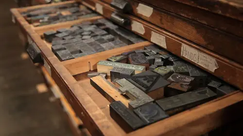
So now we're getting ready Toe print on a table top Platen press. One of the things that we need to do is do some type setting the stick in my hand here is called a composing stick. And this is the tool that's used to put all of our type, um, in place before we put it on the press, setting up the type to put on the printing, press things a lot of different tools. Eso as we're going through the process, I'm just going to kind of call out the names of the things that I'm using again. This is the composing. Sic this metal piece right here is actually called a slug. You don't need to take notes on all this cause the resource list that I referred to Ariel earlier that will be available to you to download and print. Um, will have a list of all these different piece these different tools on it. So this is a slug. Um, what we're gonna do is I'm gonna set up some type so we can print the words creative life. And I'm putting some metal spacers in here. These air, um, the type of blocks that the ...
type is made out of. But they don't have any letters on them. They're plain blank slugs. Um, the thing about typesetting and that you'll notice I just put a c down is I'm typesetting upside down and backwards in that I'm typesetting from right to left, as opposed to left to right, because all the pieces of type are actually a mirror image of what the printed word is going to look like once we actually print it. So I've got my sea here, and if you're looking at it close up, you'll see that I'm going to put an r next to it for creative life but that the r is upside out. Um, and then I'm looking for an e. I've got it. Eh? She Here's my I, uh the oops Don't want to put that upside down. Um cool. E creative Got that So far Creative and I need life l I be e hope I didn't forget in a letter C r e a t I v e l I v e t. And it takes some getting used to looking at the letters upside down and typesetting from right to left instead of left to right, but after a while, you'll get used to it. Um, Now I'm adding some or spacers at the end and at the beginning so that I can wedge all the pieces of type together really tightly so they won't move around. Um, when I get it on the press, um, two things bad would happen is if they were moving around, one of them is it would all fall apart and fall off the press, and I wouldn't be able to print, and the other is if it were loose, then we wouldn't get a consistent print, um, across all of the pieces of type. So now that I've got creative live here, I'm gonna cap it off with another slug toe, Hold it all in place, and then from here, I'm gonna take this word and put it in. This is this metal frame right here is called a chase. Gonna put it in the chase, and we're gonna wedge it together with even mawr spacers with different names. So here's the process. I'm taking the type from the composing stick. I'm sliding it onto this. Just called a composing stone, often times a composing Stone is made out of a piece of really smooth marble, but it could be made out of any number of other elements as well. As long as it's perfectly flat, that's the main thing. So now I put my chase around the type that I slid onto the table, and now I'm going to put a lot of different pieces of furniture, um, and furniture being these wood blocks all the way around the type that I just said with the purpose of we're trying to wedge it in tightly so that if I lift the chase off the table, the type won't fall out, and there's a little bit of a trick to making sure that doesn't happen. Um, so if you are a fan of Tetris that comes in handy, um, in doing typesetting, because you need to be a good puzzle master to get everything to fit into the frame in such a way that nothing is going to fall out or become loose when you lifted up. So let's see, where do I need here to make this work? No peace here. Maybe I need looks like I need to get some more friendship in the cabinet. So I'm gonna reach over to this cabinet and see if I can find a piece. It'll fit what I need. Here's one that's great. And here each of these different types of spacers do have different names. The big would ones air called furniture. The smaller ones air called regulates the these metal slats or cold slugs. And there's any number of different names for all the different shapes and sizes of pieces. But to save you from having Teoh try and memorize those, I'm going to skip naming them all here, and I'm just going to proceed the scene if I can lock it up now. These things right here are little vices, so I can oops there coins. And there's a little key that actually spreads the two sides and open so that it actually puts pressure on the two pieces of furniture on either side to help lock things into place. Now I think I might just about have this one to the point where I can pick it up without all the pieces falling out. But just to be sure, when a tap down middle type so that it's all flush with the surface of the composing stone. Use the coin to work on the vices. And let's see if I did this right. If I did this right, then when I push on all the type, it's not gonna fall through and it'll hold it in place now so that I can go and put it on the press. So now that we've got our metal type set up to take over to the job press now, we'll set up some wood type to put on the cylinder press. Uh, I don't see. I mentioned earlier that the metal types really heavy, and this is an entire your of it. So they were, um Now, let me put it, would type out we're gonna be using this Would type Teoh also print creative life. Um, and I've creep pulled some of the type out of this cabinet, and they'll bring those pieces over. Right now, the process of setting would type is a little different than setting metal type, because in the case of metal type, we have this cool little composing stick toe hold and set this type when we're using wood type. Since what types? So much bigger? I'm just going to set the type right here on the composing stone. Um, also upside down and backwards from right to left. Essentially. But I'm not going to use the composing stick because it'll be too big. So C r e a t I the e I be you And you don't have to worry too much about maybe the fact that you might set something right side up by accident instead of upside down or transposed things. It takes a little getting used to setting type upside down and backwards. Um, one quick way you can check to make sure that you did it right was to hold a mirror behind it and look in the mirror to see if everything looks correct at least felt. And all the letters air, right, set up in the mirror. Then you know you did a good job. So we've got creative life set up here, and instead of using little metal pieces like the slugs that we did earlier I'm using would toe hold all the type together here on both sides, and we're wedging everything, and I'm trying to get it relatively square. I'm not using a chase because on the cylinder press that we're going to be using to print this. The bed of the press, um itself is going to serve the purpose of this chase that we used for the metal type. So as you can see the set up for a wood taught using wood type as much quicker in some cases, in this case, it it definitely waas. And now I'm set up, ready to take this version of Creative Live in wood type over to the cylinder press to print. So you probably heard the phrase Mind your P's and Q's, and that phrase actually originated with letter press. Let me show you what I'm talking about right here. I've got some samples of letters. I've got the letters P Q. B in D, and they look really similar. You probably looking barely tell them apart. A couple things to keep in mind is this little notch that's on the side of the type is the site of the type that faces the letter, the downside of the letter, and also keep in mind that the letters on the type are the reverse image of what they're going to print. Like so what? That means is that even though this looks like the letter Q, it's actually the letter P. And although this letter looks like the letter p the reverse image, it's going to print like the letter Q. Thus the words. Mind your P's and Q's. That would be something that a boss would tell the people who were doing the typesetting to make sure that they remembered to mind their P's and Q's. Make sure they didn't put a P were que needed to be, and vice versa. Another set of letters that have the same or similar problems are B's and D's. Here's an example. This letter looks like the letter D, but in fact it's going to print as the letter B, and this one looks like a B, but it's going to print the reverse image. It's going to print a letter D when you've got them all jumbled up on a countertop. It's really hard to tell the difference. And sometimes that's where the proof process helps, because you'll be ableto print a proof of it, read it and then go back and fix your mistakes and then print it again. So you're not stuck with anything you can always make adjustments. Now let's take all of this over to the printing process and print and see what we've got.
Ratings and Reviews
Erica Engdahl
This is a super inspiring course that really made me want to try letterpress printing! Itamura is a great instructor who speaks clearly and shows and explains every piece of equipment and that's really good if you, like me, don't know very much about letterpress printing before hitting play on this course. Well worth the money!
Henry Aquino
Great Intro class, a little pricey for how short it was, but still worth it. I don't see anywhere to download the resource list mentioned in the movie "A World of Resources".
Chris Guppy
It's a great intro, but like Henry, I don't see the resource list for download that she mentions.