Lessons
Day 1
1Calibrating Your System for Accurate Results
40:07 2Shoot Prep: Workflow & Lighting Setup
17:07 3Shoot: High Key Beauty Portrait
19:13 4Shoot: Hollywood Glamour
17:54 5Student Shoot: Colleen
13:48 6Student Shoot: Andrea
12:27 7Image Review and Q&A
15:46Skin Tone and Black & White Points
27:01 9Image Selection
25:20 10Global Color Correction
21:02 11Retouching Basics
46:12 12Advanced Skin Smoothing Technique
46:36Day 2
13Luminosity vs. Color
14:44 14Shoot: Low Key Dramatic
28:43 15Student Shoot: Ian
11:54 16Student Shoot: Michael
11:20 17Student Shoot: Colleen
03:41 18Shoot: Beauty Light
12:57 19Luminosity Blending in Photoshop
16:07 20Applying Luminosity
12:19 21Color Correction in Lightroom
23:57 22Detailed Retouching
23:55 23Color Space Discussion
19:16 24Darkening and Lightening Skin
21:10 25Spot Treatment
12:20 26Sharpening
29:57 27Compositing
54:51Day 3
28Introduction to Shooting Movement
11:41 29Shoot: Dancer Leaping
10:52 30Students Shooting
44:15 31Shoot: Dancing
14:59 32Student Shoot: Ian and Colleen
08:57 33Shoot: Dancer Portrait
15:49 34Dancer Session Q&A
11:30 35Figure Retouching
10:52 36Liquify Filter
10:16 37Masking and Edges
13:22 38Importing a Background
16:47 39Color Change and Motion Blur
24:45 40Enhancing Color
17:59 41Removing Tattoos and Adding Effects
21:30 42Lee's Photoshop History
21:56 43Final Portrait Edit
19:03Lesson Info
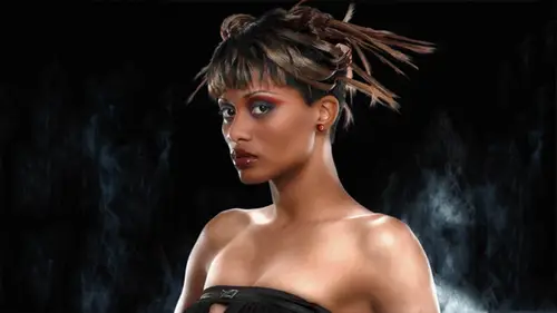
Luminosity vs. Color
Welcome to creative live day too so yesterday way we're talking about the color of skin and I went through the numbers and reading the info panel and and just how to really analyze the color and how to get the right color um but actually I like to let people know that photography is actually a lot more about the lights and darks in an image than it is about the color and color is kind of, you know, it's kind of a crazy thing and digital uh the camera chip has a mosaic pattern of red, green and blue pixels so this a little diagram here sort of illustrates the most common pattern on the chip which is a bear pattern and that gives us twice is many green pixels is either red or blue because green pixels on our on every single line but the chip itself actually only captures brightness values and uh it's just it knows by its location on the on the surface of the chip whether it's a red, green or blue pixel and then the software d mosaic in what you do in your rob processor blends these three...
values together to arrive at it at a new color. We call this sort of additive color because we're blending brightness values so they all those rgb numbers just represent brightness values in the individual three color channels so things to remember about this is that actually, cameras on ly record brightness the only record brightness and the color is interpreted from the brightness levels at those pixel sites on the ccd and you have to you have to process these files either in the camera to arrive at a j peg or later in the raw processing software to actually arrive it at color. So even though colors not actually captured, it sort of created after the fact um, the people we talked yesterday about how people don't really want accurate color but you have to start some place so you get some sort of sense of color accuracy. You have to calibrate your capture to a known target, which is what we did. Oh, I showed you yesterday with the colored checkered uh, target, but in the end finally, what we consider to be good color is highly subjective luminosity. That, however, is less objective because our human visual system really responds more acutely to brightness. And because of that luminosity, the quality of the lights and darks in your image will trump color every time. So let me let me show what I mean by that. So here's a scene uh, it's a very information rich scene this was taken a lark camp it's, a music camp that happens every year I'm in the process of making a documentary movie about it, but this is a scene where you can see a number of people you know exactly what they're doing uh and there's a lot of detail. Okay, now if I drain out all the lights and darks in this image and depending on how your monitors calibrated you may perceive some of the, uh warmer colors is being lighter but in fact digitally this is all one luminous level and it's it's much more abstract. If you study this you can probably still work out you know that they're people in there and they might be playing musical instruments but it's really hard to really get a sense of what the scene it's now if I do the opposite by drain out all the color but leave the luminosity, the lights and darks we have a black and white picture right and it's but it's still very clear what's going on could see all kinds of details. In fact you get more information about what this scene is from the lights and darks we can see textural detail and we can see shadows and highlights and and that information is more important than the color content. Certainly we had back to color you get some more information and it's it's it's not like it's not important but whether the color is like this or more saturated or maybe cooler there's a lot of aa lot of leeway uh, how? We, uh how? What kind of color we will accept and people have personal preferences. So some people like cooler images. Um, however, if you can nail the like the black point and the white point and your range of tones from black to white is good and you have good local contrast, that is the thing that really makes it a photograph. So today we're really going to be, uh, concentrating on lights and darks, and we have kind of a different problem coming up with a darker skin model, and I'm going to show you a lighting diagram that's in my skin book, we're actually going toe use a variation of this. Uh, and this was the diagram that that was for the, uh, dark skin beauty shot. And you can kind of see that the the the attempt here is to really light a dark subject. Uh, in the example in the book, the it's sort of a head shot it's, a woman and she's looking directly at the camera, and all the planes of her face are lit by that beauty dish with a big umbrella behind it. The key was a really large light source, so that the planes of the face can reflect the large light source, and you're not using a small light short source to throw shadows like we were using a smaller source for a fair skin model so we could get some shading on the face with a dark skinned model. We're more concerned about getting some light on the face, and so we want a larger light source and, uh, here we see these umbrellas for rim lights on either side. We're going to use one room light on on the shadow side of the face. We're going to do more of a rembrandt portrait today, so at this point, um, I'm actually gonna we're goingto we're going to strike all this and actually set up the lights, and but I'll take some questions for, so yeah, considering I just want to back up a little bit, considering what you're talking about with luminosity in color, what is your preference? Or can you speak to the approach of converting a color image to black and white? I know that just d saturating is dangerous. I will, I will get into that when we get into our post thing and I'm ok into photo shop very good, and yes, I will be covering that it is very important, uh, any other questions about the conceptual stuff that I just went over there are questions coming in let's see focus of grace says what do you do if the sam why came values are correct but the image toe looks really off and what if you can't get the image to the right see m y que values especially getting sion value correct thank you uh ok well like I said before it's like uh it's like the pirates the caribbean these these aren't exactly hard rules right more like guidelines so, um if you're if you're just struggling with it here close but you're just not quite there I really do think it's more important to consider the lights and darks and get good contrast um if you're really worried about it looking color like the color looking off you contrite d saturating the image so that uh it's not so much in your face I think the big problem that people have is they they they have too much saturation they go for too much color saturation really, you know, restrain yourself from that saturation is lighter and you're probably going to have more luck with, you know, without seeing a specific image that's about as detailed a second kid with a specific images get hard and any of the questions before we likes, you know, men like you on all right let's do it all right? So what we're what we're going to try to do here is we're gonna create a sort of rembrandt lighting effects. So our subjects here in this chair the way have a really big, uh, umbrella with the diffuser panel over. This is going to sort of be like our window light. Um, very large. Uh, what is it? Sixty inches. Yeah. So this is ahh zbig a big umbrella with the diffusion panel. So the light is very evenly distributed to this very large light source and that that gives us more surface to reflect into the darker skin. So and this is going to be our hair alight here we have a soft box again to kind of wrap that highlight, and we're kind of hopefully, like the top of his head. We're going for a sort of a dark, moody look on against the dark background, so I want him to separate. So I want to make sure that the edges that air going against black get lit somehow. Uh, and we're gonna have this v flat here, uh, to act as a rear rim light on dh. Okay, let's. See, I'm just kind of trying to test to see where our model is going to be. What do you think? I look good. All right, let's. See, let me turn my right on what we got here. Okay, good. Sixteen, five. And so I'm trying to measure the light. This lot says twenty two two, did we? Are we closer? Maybe. Ok, yeah. So let's, try and get this tune down. I don't want my rim lives to be hotter than my main light because I'd like them to be more subtle. Maybe. Well, maybe we could get them. Okay, right. Do it again. Okay. That's. Better on. Duh. Let's. See? Okay, let's, do that again. Okay, so I'm eleven here and I'm jealous. Okay? Let's, let's. Bring the people out in a little bit closer. I'm trying to get these lights balanced out before we bring our model out. This is the diffuser head on the flash meter and I'm rotating it back in to measure the lights and separately when the when the dome is out like that, it sees light coming from every direction and it's harder to get a sense of the individual light outputs that I'm trying to balance. So I rotate this back in there like that. And and then sometimes I'll even shade it with my hand to make sure that no, that I'm only reading the light coming from one light source. All right, so let's, let's. See, now I'm going to try and see what we're where we're at with this one. Ok, ok. Eleven seven on dh let's, let's try mar sixteen one okay, on our our main light is sixteen. Seven. Okay, that's, that seems good. I think we do this one more time. Let's. See? Let me let me that. What was what is this again? Let's, I'm just double checking here. Can we bring this down just a little bit? Yeah, a little dimmer. Okay. Okay. And all right, final final step here. Let's measure. Ok. Better. Okay. All right. Almost there. Um, I've got to have my flag. So this this flag is protecting the camera from the hair light and I'm going to go next. Place it now go from camera on dh let's. See? Raise it, raise it up a little higher. But there that's good should be pretty covered from here. And let me just I may move in a little bit so let me just check and make sure it's still covered, okay, that's, good
Class Materials
Bonus Materials with Purchase
Ratings and Reviews
Luis
Skin tones correction and portraits editing are new to me. This course provides a set of tools for me to improve my portraiture work. Lee doesn't just show you how things are done, but also the reasons for the corrections. The delivery is a bit dry because the topic is quite technical. You can have a break between lessons, if it becomes too overbearing for you. I highly recommend to take this course, if you are planning to do portraits, head shots, or even senior pictures.