Live Photo Critique
Lesson 14 from: The Art of Seeing: Macro Techniques for Flowers and PlantsFrans Lanting
Live Photo Critique
Lesson 14 from: The Art of Seeing: Macro Techniques for Flowers and PlantsFrans Lanting
Lessons
Class introduction
03:17 2Macro Photography Overview
16:27 3Playing With Plants
49:33 4The Importance of Light
36:29 5Using Filters, Reflectors, & Diffusers
07:56 6Working With Afternoon Light
10:18 7The Lighting Toolkit Wrap Up
16:15 8Why Macro Photography?
04:08Lesson Info
Live Photo Critique
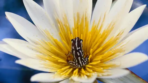
We're still in Adobe Lightroom. We're going to share a number of images that have been submitted by viewers from all over the world. Yep. And Jim is moving them into the develop module. And then I will make some comments about them. And Jim is going to exercise the controls, some of the main opportunities we have to adjust contrast, and color, and so on. And we're not going to be very definitive about this otherwise we'd be here 'til midnight. 'Cause, yeah, adjusting images in Photoshop or Lightroom is a time sink. So we just want to see what we can do. So, here's a first image. I recognize this flower, Jim. (Jim chuckling) I photographed this for my (coughing) photo essay on orchids. So I'm quite familiar with the pattern, and I think the photographer tried to get into the other pattern that is the heart of that flower. And, of course, this has a very strong biological function, 'cause all these stripes, and blotches, and colors are a lure to let the insects go into the heart of i...
t where it pollinates the flower and so on. That's the biological story. But, when I look at it as a photographer, my observation would be that we're seeing a little bit too much. 'Cause what is the picture about? Is it about what's happening here? Or is what is happening there? I would argue that we can make the image better if we crop off the outside of the flower. So Jim we could bring it back to a square, or maybe we could even turn it into a vertical. Okay, so almost bring it in to something Yeah, let's try a vertical. Yeah, I think a vertical would be really cool looking. Yeah. Really isolating those those features. And it's easy in Lightroom to maintain your 35 millimeter aspect ratio if you lock that one function, and then but look at it. Now I think it is a more complete image, without any distractions. So what else could we do here? Could we adjust the color a little bit? Not so sure, it's beautifully expressed. The lighting is even, so I would say in a matter of 30 seconds we've cleaned this up. Yeah, made it much better. So we go on to the next. Fantastic. Now this looks like a flower I recognize from Western Europe. And I would say that this image is a candidate for some applied lighting. Remember what we did during the section on working with light? We, we could add a diffuser here. This flower is illuminated by direct sunlight. It looks like it was morning dew, or maybe the photographer added some water droplets to it, but it's quite busy. And it's also a little bit harsh here. So I think we can clean it up a little bit by cropping it in. The predominant lines are vertical. So let's crop out the left and let's crop out the right. 'Cause either side does not contribute much to the appreciation for the flower. But it's still a little busy here. These areas behind the main flower subject are not contributing much. That should really be cropped out. But even when we do that or, we are not able to do much with the actual quality of light here. And I would suggest to the, to the maker of that image that if he or she has a chance to go back, at least try to apply a diffuser. Because I think the lighting is going to become a lot nicer on that same flower. But we've cleaned it up quite nicely. This looks like it is a detail of a leaf with some spines coming out of it that may be part of the defensive strategy of the plant to protect itself against animals that try to eat it. But it's hard to make a definitive statement about it because we're not seeing much context. And the photographer tried to create a pattern. A universe within one leaf, but the pattern is not complete, so I would suggest that we shave off this portion on the upper right, for starters. And there's also something in me that feels like trying this as a horizontal. Could you flip this 90 degrees to the left, Jim? Sure can. Got a, we got a photo and then rotate left. This is subjective but how do you all react to this? This looks more interesting. It feels a little bit more appropriate to the situation. You know we're seeing light come from the left actually, from the top left, And now it's stroking that leaf here from the side. What could we do here, Jim? We could tone down the highlights maybe a little bit, or do we need those highlights? You know let's look at the histogram. Let's see if we can pull the histogram a little bit to the right. OK. A little bit to the right, instead of to the left. OK, I'm sorry. Um. That helps, yeah. See now we're brightening up the shadowy parts um, it's all about texture so, shall we try whether we can emphasize the texture by giving it a little bit more contrast? You got it. Frans, do you ever use clarity? Yes. Maybe a bump of that. Yep. See it looks like this image was made using available light and no additional lighting devices were applied like a diffuser or a reflector, so I think we can dress it up a little bit. You know, give it a little bit more personality. Um, now these little spikes are you know the bright points now. But you know the histogram is not showing that we're clipping the highlights, so I think we're still in safe territory. So our next decision could be to crop out the upper left, but something in me wants to see that. It's almost now as if the light is tumbling onto the leaf. So maybe we leave it this way. I think the main thing we did here that improved it was to rotate it. To add a little bit of clarity and add a little bit of contrast. What else would you suggest here, Jim? Um you know I just feel like I wanna bring out the shadows just a little bit. It's we get a little just a hair more detail. I'm just gonna pull those just a hair. About like that. Yeah and now I feel this is bleaching out a little bit so maybe we tone down the whites just a little bit. You got it. OK. Yeah that was a good call. Yeah. But we're still seeing that nice pop. Yep. So I think this is as far as we can take it now. But ah it's a nice clean up. Do you know if there's a way to like hover over something to show a before and after, or original? Ahhhhh..... Down here? Slash? Oops. That was the wrong slash. Well I'm just gonna come on out. Go to the next. Alright. Well this photographer was definitely looking at a background and background's really beautiful, you have beautiful color, beautifully diffused. And what we're seeing is dew drops that reflect the flower. Let, yeah, my eye's drawn to this particular droplet and then there's a couple of other that support it, so it's a repeating pattern. But you know this leaf is not contributing that much. So what could we do? Could we crop it a little bit? If we crop it in a traditional fashion, then ah we would end up slicing through this. So Jim what if we rotate the image a little bit? Sounds good. If we go to the crop mode, if we go to the crop mode and then we rotate it to the right. You got it. To the right, but in the frame a little bit, before we um do the, do the size adjustment. And do you wanna remove that black frame there Frans? Pardon? Do you wanna remove that black frame? Yeah, yeah let's do that. Great, I'm just gonna come in a bit. Yep. Give us some room for rotation. Yep. And clockwise or counter? Ahhhhhhhhh, clockwise. And um, yeah, I'm a traditionalist. I like to maintain the DSLR aspect ratio, which is 2/3. And if you keep this lock locked, then no matter how you crop the frame, it'll maintain that aspect ratio. In this case it might be a little bit difficult, but see, now we, we're a little bit tighter on the essential parts here. I, we could rotate it a little bit more, if you wanna go back one more time. You got it. I think we have a little bit more room to see that. Yep. Just gonna bring it in from the side here. Yeah. Now bring it in, yeah. OK. So now the relationship between the reflection of these flowers and the background is much better established, and that's before we've done any other technical adjustments. I would suggest that we maybe tone down the highlights a little bit. Because you know the goal is to make people appreciate this more so we don't wanna compete by showing the highlights as being very prominent. OK, took down the highlights Tone down the highlights, tone down the whites a little bit. Yep. And maybe we can warm it up a little bit. In other words adjust the color temperature a little bit 'cause the yellow looks a little bit cool. You got it. OK. That was a good call. So this looks a lot better now, than it did when we first saw it come up on the screen. What else can we do here, Jim? I'm thinking that just a hair a bit of contrast. What do you think? Less contrast or more? Just a bit less. Yeah, 'cause this is still looking a little bit harsh here. Yeah, exactly. OK, and then because of that little bit of less contrast, I'm just gonna bring up the blacks a little bit. Just to get a little more of a bite. To about there. Yeah. All of those are good adjustments in my opinion. And then I got the, I learned the preview. There's our before. Uh huh. And here's with our color adjustments here. So you see there's subtle adjustments, but especially the cropping exercise really made it from an image that, that had potential to something that makes it much easier to appreciate what the image is about, and that is the reflection in these water droplets. Ready to move on? Yep. Great. This looks like an abstract detail from a palm tree trunk. It could be another tree, but that is what it's strikes me as. So the photographer's already cropped the image, 'cause this is not a 2 to 3 aspect ratio, or it could be of course generated in another camera. Um, there's an interesting pattern in it. Um, the color is secondary to the pattern. So you know we could (coughs) excuse me. Shall we try whether this one's better as a black and white? Yeah, let's take a look. I'm just gonna do some initial adjustments. Bring up the blacks a bit. Bring up the whites a bit, then I'll let you go to town. Yeah, I would give this a bit more contrast. You got it. Um, let's see how much further you want to go with it. Yeah I think with this we could push it pretty far. Yeah. It's a great pattern. Yep. So we deepened the blacks and we pull up the highlights. Lemme give it a little bump of clarity. Yep. It's lookin' nice. So you see how quickly you can go from something that looks fairly average, to something that becomes a much more interesting composition. Here's our before and our after. Yeah, yeah. Now we're really looking at the patterning, yet we are such creatures of color, you know? We are among that group of mammals that is exceptionally gifted when it comes to perceiving colors and all their nuances. A lot of mammals do not have that ability like we do. So as soon as you show an image with color in it we start thinking of interpreting it in terms of the color. As opposed to appreciating the underlying pattern. So if the color isn't that strong in your image, this is what I would recommend you consider doing. Turn it into a black and white. Oh, that's nice. A perfect tulip specimen. Um, with a very different kind of color in the background. So this is an interesting example of selective focus. The depth of field is very limited. Um, the composition however is a little bit on the static side. Unlike the exercises that we practiced with this morning, there's no foreground here. And you see what a different impression it gives. Backgrounds are important, but foregrounds and backgrounds together, they can really transform your composition. So as it is, I suggest that maybe we can crop the image in a little bit, 'cause that straight line here, draws my attention to the upper left. Let's see if we can make it a little bit more, yep yep come in just a little bit more from the top left, yeah. From here? Yeah yeah. See how far we can go with it, OK? Now let's stop right here. Let's lock this in. I love how Lightroom just while I'm on this gives us the, the thirds. This is really handy. Yeah. So what we've done now is we've eliminated a slight distraction in the background, but we've also moved the tulip to the left, and that makes it easier for the viewer to disappear into the distance and appreciate all that lovely color in the background. Um, the color is rendered quite well. I'm not sure that I would do a lot more in terms of changing the color temperature, which is quite, quite good. I wouldn't saturate it any more. I wouldn't add any more contrast, nor would I lessen the contrast. What do you think, Jim? Frans, do you mind if we just take a look at raising the exposure just a hair? You mean making a little brighter? A little brighter. OK. Just to about there. Yeah, just a touch, yep. So here's our before. Yep. Good call. And there's our after. Yep. Just a little bit of a punch. And maybe we can bring up the shadows a little bit more here. Or maybe that is what is needed to give it a bit more definition there. Yeah. Let's try it. Yeah, that's good. See shadows give shape. They give definition. So ah, by bringing up the shadows we may improve the color, but we may lose a little bit of the shapeness, shapeliness of that tulip. Overall I think brightening is a good idea. OK. I think this is, this is as far as I'd like to go. Yep. Oooh. Now we're getting into details here. This is a pretty technical image. Um, it looks like everything, this looks like a sunflower of sorts. And everything looks razor sharp. Beautifully composed. It looks like it is already cropped, and it looks like a background of sorts has been applied. Um, it's hard to think of ah, of an organic entity in nature where you get that kind of turquoise, unless the photographer did this in the Bahamas, which is possible of course. Um but I think it's a striking combination of colors. Um, it's an artistic statement as opposed to being a documentary picture. I'm not sure I would do anything to this. I will accept the photograph, the photographic execution as it exists. What do you think? You know what, I agree. I'm just gonna at least from my screen, pull down very slightly on the saturation. The those reds and yellows at the top just seem a little hot to me. But other than that, I think it looks great. These guys have done a really great job. Alright, we got some daisies. Very different view. Um, this looks like it's not very far from here. This looks like the coast of California. I recognize those flowers. So this is a wide angle view. Photographer did a decent job, kind of using a wide angle lens, to create a sense of place. But I would like to get a little bit closer in, 'cause you see what's here in the foreground. Does that really, yeah, yep, express that? No, I would say start right in with those flowers. And we can do two kinds of crops here. We can either maintain the 35 millimeter aspect ratio, or we can turn it into more of a panoramic scene. And I might suggest the latter here, because that sky's not doing much for us here. So yes, something like that. Frans, lose the sky entirely? No no no, I would keep the sky. Just like about here. Yep. 'Cause what is our eye drawn to? It's drawn to the flowers and then there's other plants here, ice plants and then we have that, the bench lands, and the more I look at this image, the more I'm trying to imagine where this is. It's not very far from where I live I think. So but I think this is more interesting. Now we're much closer to the flowers and it gives you a much better sense of that, yeah, that coastal, that coastal scenery. Now what can we do in terms of color? (coughing) Maybe ah let's look at the histogram. You got it. So we're right at the edge. So should we back off on the, on the highlights a little bit? Should we maybe increase the saturation a tiny bit? Definitely. Should we give it a touch more contrast? I also bumped the vibrance. Mmm hmmm. And bumpin' that contrast. Oops. Much nicer. There's before, there's after. Oh yeah that makes some nice, you wanna bump the blacks even a little bit? I'm not sure that we need more black in it OK. 'cause it's a scene with flowers and as soon as we start bumping the blacks then those begin to influence our appreciation for the, for the flowers I think. And I think I was maybe thinking just a little bit more contrast, is I think where I was going. Yeah. OK. Alright, well done. Great. That's interesting. This is really minimalist. Two tendrils from a plant that is looking for an attachment. You know nice twirling pattern here. Aperture wide open. I like the relationship between this tendril that is in focus and then that suggestion of a shape. Lovely wash of color here, the blue and the green. Um, what could we do here? You know I could leave this as it is, 'cause it is a nice kind of spacious way to frame the composition. But let's try to see what happens if we crop it in from the bottom a little bit. Not too much, just like that. 'Cause we don't wanna lose that sense of space. Um, maybe we can make this a little denser. It looks a, not, it's not washed out, but could we give it a touch more saturation? Got it. Nah, that already looks too yellow. Um, 'cause yet, yeah, that is not the inherent color. And you see that yellow begins to affect our appreciation for the cool hues of blues and greens here. So just by doing that we see, (both laughing) don't go there. Don't try to make it into something that wasn't there originally. Um, I would not want to see this get any darker. In fact we may wanna lighten that up a little bit, 'cause we really want the viewer to keep going up and down the tendrils. OK, I just opened up our shadows. Yeah. I would leave this be. Yeah, it's a great photograph. Yeah. Alright. Well done. Now for something else. What's this one doing in a workshop about plants and flowers, Jim? Um, hard to tell Frans. It is a macro. Yeah. But yeah. And it eats (laughs) Let's just say he also loves plants and flowers, right? He's definitely a vegetarian. This looks like it's a cricket who has either landed on a piece of fabric or was put on a piece of fabric, so it's a nice application of the principle of creating backgrounds for the purpose of making a more artistic statement. Um, the cricket's been put dead center, you know and my initial thought is we either wanna go in much closer 'cause he's got personality, or we want to get him out of the center. So let's see what the first approach leads to. That didn't work. Like that. So that's one solution. But something in me wants to see him dead center. 'Cause there's a symmetry to the organism, and he's looking straight at us, so. Fix our aspect ratio here. Yep. I don't think we're losing anything, compared with the original composition, and we're gaining character. Yeah, eye contact. So what else can we do here? The histogram is pushed to the right, but it's not so close that we're clipping highlights. Um, we could, maybe increase the contrast a little bit? You got it. And increase the saturation a touch. Got it. That's as far as I would go with it. I wouldn't make it any darker. I wouldn't make it any lighter either, so. We brought him to the forefront. He looks good. Do we have a name for him? (laughing) Well one of my friends would certainly know the names of it. (Jim laughs) Alright, um. This is a very technical photograph. Yeah, there are legions of photographers who specialize in doing studio set ups using high speed photographic techniques to show what water does you know, when droplets end up in a little, in a little tray with water. Um, so this has obviously been done with a very fast shutter speed. Um, I don't know exactly what technique was applied to the background, but this is a studio shot, and if you're interested in that kind of work, all you have to do is Google water droplet photography high speed on line, and you'll find lots of excellent images. So that (coughs) um, I feel that the eye candy is right in here. I wanna see more detail in here. In fact, yeah, we can see a softbox here. This is the light source that's been applied. So (coughs), with all due respect for the maker or the photographer, who's got his name in here, I would say let's get closer. So we can yep, turn it into a panoramic image, but you know what Jim, I wanna see this as a vertical. You wanna see it as a vertical? Yep. Alright. You got it. Bring it in. Yeah. 'Cause the action is in the vertical realm. Yeah, I'm just gonna give us a little bit more Yep. More room there. And I think it's sharp enough to survive even a, a pretty significant crop. Look at this. So I would go in a little bit more. Pardon? And then straighten it? Yeah we can straighten the horizon as well, OK. Get that right, if I can go the right direction. Yep, let's tighten it up a little bit more on the left and the right. You got it. OK. (coughs) Come in a little bit, get him centered. OK. And now come down a little bit. And now the maintain the aspect ratio, just bring the crop down a little bit, yeah? OK. Now we're really appreciating what's going on there. Yeah, so I'm not sure the image needs, yeah, color adjustment, contrast adjustment. Yeah, no I think it's there. We just wanna get closer in and appreciate the pattern and the physics behind it. Alright lemme come to this side. This looks like Cardwell beach. (Frans laughs) This looks like tide pools. With um, yeah, with barnacles and little crevices in a tidal zone. This could be the coast of California or you know it could be someplace else. This is a wonderful pattern. It's also a really interesting biological photo, 'cause every one of these creatures, every one of these little crevices has its own story. What I look for when I create patterns or when I judge patterns that somebody else has produced (coughs) is I go around the edges of the frame. And I wanna make sure nothing you know, distracts me from appreciating the pattern. And what do I see here? I see a couple of distractions. I see one here, I see one here, and I'm not sure that this is necessary or that even that is necessary, so let's maintain the aspect ratio and then crop it in from all four sides a little bit. OK, just like that. Mmm hmm. 'Cause the interesting things you know are these little tide pools, and that one there. Now if we bring down the highlights a little bit. And add a little bit more contrast. And a bit more saturation. Mmmm hmmm. Now it's beginning to sparkle. Here's our before Mmmm hmmm. And our after, much better. Yep. Cool image. Nicely seen and executed. Alright. Yeah. Boy this is a pure abstraction. I'm not sure what we're looking at Jim, but does it really matter? Um, it's an abstraction, right? Tree like. Yeah. It's organic, it has some sharpness to it but it also looks a little bit soft, and I don't know if that was a deliberate softness that has been created by the photographer, but let's assume that it was. Since it's so hard to perceive what the origin of it was, yeah, I'm struggling a little bit with coming up with any yeah, critical suggestions for what else we could do. It looks like the image has been processed already a little bit, I'm seeing some digital noise or some artifact here in the darker areas. So I would not want to pull those out any more, because then I think the artifacts become distracting. But if we would darken this area, then we would lose the overall softness, so we're kinda boxed in a little bit by what the photographer already did. Um, could we yeah. Now I'm beginning to see a little bit more of the artifacts here. Could we crop it in from the upper right a little bit, to lose this a bit? Did that improve the image? Yeah, it's getting a little better. Little more balanced. Yeah. A bit more balanced. But um, whoever made the image, if you're watching I would say be a little bit careful with your image processing in these darker areas. Frans, I also brought down the saturation a little bit, Mmmm hmmm. It was feeling almost fake to me. Mmm hmmm. So here's our before. Mmmm hmmm. Felt a little hot. Mmmm hmmm. Yeah. What about black and white? Yes, ah, let's try that. Mmmmmm. Yeah. Yeah now the color processing doesn't look so, um, ah look so problematic any more. Now we're getting to the edge of washing out the highlights here, but that can be adjusted, but it's mostly the ah, the processing here in the shadow areas that I find a little bothersome, but a ah, an evocative image. Photographer did see something, it's just the technical aftereffects that ah, that need to be watched. Could this be flower petals? Flower petals? You know that's possible, but it looks a little bit more woody to me. I'm still I'm not sure what we're looking at, but that doesn't matter. It's an abstraction. Well done. OK. A bee in a flower. A bee with pollen on it it looks like. Um, let me try to gauge what the lighting situation is here. This looks pretty bright. Um, see how bright the bee is? So is that because a strobe has been applied? I would almost say so, 'cause this doesn't look like straight sunlight to me. But it looks a little bit hot. Now I certainly like high key images, but um, look at this histogram. You know it's pushed all the way to the right. Let's see if we, what happens if we bring it a little bit to the left without losing that lovely light color here in the background. So let's just push it back a little bit, and. Could we crop it in maybe a little bit here, on the right? Mmmm hmmm. 'Cause yeah, those petals, we don't need to see them end that way. It's really a universe. This is the world of a bee. I think that improves it. Um, you know we may be able to push the histogram to the left even a bit more. And now we can do two things. We can either give it more contrast, or we can give it less contrast, and I'm not sure what the right solution is. Yeah. Here's more. Clarity. See, it becomes a different image. It defines the background more. Or it becomes super smooth. That's a very subjective decision. Why don't you bring the highlights down? Pardon? Wonder if you could bring the highlights down? Yeah. Yes, that's another. That's definitely a good idea. Yeah. Mmmm hmmm. OK. Bringing the highlights down. Yeah. Here's our before. Nicer. Here's our after. Yeah. Yeah. Well done. I like the group effort. Yep (audience laughs) Oy. Um. Perfectly executed centralized image of a flower with (clears throat) the patterning perfect, nice dewdrops in it, beautiful smooth background. I would say it's picture perfect, if that's what you want. And I would not want to go against what the photographer has you know beautifully executed. The only thing we could do if we accept the photographer's vision, is see if it becomes more symmetrical by cropping a bit more tight around it. Maintaining the aspect ratio. What do you thinking about, like coming in and just getting tighter? Yeah. 'Cause in this case I feel, ah you know there's all these compositional rules. The rule of thirds, you know, don't put your image in the center of the frame, but for every one of these rules, I can give you the exceptions to the rules that have led to fantastic imagery. And in this case, you know the photographer framed it in a way that is totally symmetrical. So when you have symmetry, I would argue that that calls for putting the image in the center of things as opposed to moving it one way or the other. So um, let's look at the histogram. And so there's the bump on the right, that comes from the whites and the yellows. And then the bump on the left side that comes from the background. I wouldn't warm this up, because the white really wants to be white. Could we bring it down just a touch? Bringing down the whites that is. OK. That becomes subjective. And we could render it more graphically of course, but then we lose the ability to see into the background, so I wouldn't do much more here. We wanna stay true to the vision of the photographer. Great, here's our after. Yeah. Here's our before. It definitely, nice, that warmness really helped. You see that? Great. Oy, nice. This looks very simple, but it's actually technically speaking this is not an easy shot to accomplish. Um, a dragonfly perched on a leaf and and this is the kind of situation where a telephoto lens with extension tubes is the right tool. And you try to creep up to a dragonfly but these enormous eyes. When you use a macro lens (snaps fingers). Unless it's a very very friendly dragonfly, it'll be gone long before you can finalize your image. So with a 300 millimeter and an extension tube, you can photograph it from a longer distance and you can also throw the background out of focus. So I'm not sure what kind of lens the photographer's used here, but maybe we can see the tech specs. Yeah, let's do that. OK, we haven't done that yet. So 100 millimeter. So that's actually yeah, quite an accomplishment, to yeah, get that close to a dragonfly with a 100 millimeter lens. So aperture is relatively wide open. 6.3, perfect settings I would say. It's a little bit on the bright side, Jim. Mmmm hmmm. Maybe we can bring it down just a touch. There we go. I would say this is picture perfect. Yeah. Well done. Very nicely done. Oy, hmmmm. I would say this is selective focus for sure, you know? Let's look at the tech specs here as well. (coughs) F/5.6, 89 millimeter lens. And ISO is 1250, relatively high. Um, and the shutter speed is 125. So this is an image that you could execute hand held, 'cause your shutter speed is high enough to match with the lens. I like this a lot. I don't know what kind of flower this is, but that doesn't matter. This is a really gorgeous classic close up, looking into the heart of a flower. I love the combination of light pastel blues and the pinks in here. And because we have white in between that really expresses all the other colors very nicely. We could start saturating the color, but then we might affect the lovely pastels a little bit. So I'm not sure I would do much to this at all. OK. Lovely shot. This is much more literal. In the previous image we had color. In this case you know we have more of a botanical image of lilies growing out of the ground, and nicely cropped. There's nothing distracting on the ground. Um, you know the lilies are nicely rendered. Let's take a look at the histogram. And the settings. So F/8, 800th of a second. The background looks like it's almost in focus but not quite, and I think that is actually (coughs) quite nicely done. And it makes us appreciate how the flower is grounded without revealing too much detail. We may wanna back off from the highlights just a little bit. I would not saturate this because of the color is really lovely and soft. Sorry. Momentarily disappeared from view. Sorry that's me. Yeah. I was checking my clipping on my highlights. Yeah, look a lovely distribution of the histogram. So I would leave this as is, Jim. Right. Very nice. Alright. This looks like yeah. Blossoms of some kind, I can't quite figure out the species. Apple tree? Apple tree? OK. Thank you. Image has been made under yeah soft light, even illumination. If you do this under direct sunlight you lose that lovely soft color. But I wish that there was a just a touch more quality to the light here. And this is where I wonder if a reflector could've helped a little bit? 'Cause under these kind of open light, yeah, it's not open light, it's an open shade, yeah you can dress out the light a little bit, but let's see what we can do after the fact here. Let's look at the histogram first. OK, we see that it's very delicate, 'cause those blossoms are white you know, and there's almost no real color in it. So we definitely don't want to go towards more contrast because then that ethereal quality vanishes. So not quite sure what we could do here. Sometimes yeah the image as it's presented is the image that we accept. I wouldn't crop this any further. I love the center space. The background is nice and clean. So it is what it is Jim. Alright. Oy. Now we're looking at leaves encased in an icicle. And the, eye candy, the intriguing part is right in here. I know this adds context but I wonder if the image is sharp enough for us to you know, crop out this part of it and see if we can get into you know the core of it? Could you switch it to a black and white? We can try that as well, but I think we ah, see this this bothers me a little bit. It's out of focus and that triangle, there's no relationship to what is going on here. It's really that frozen nature of the leaves inside the ice. That's what the picture's about. So Jim could you crop it in from the, from the top? You got it. OK. Yeah, come in yeah, let's look at it now. Just gonna get that aspect ratio correct. Yeah, OK. Now it gets a bit more character, huh? Pardon? Rotate it? How would you rotate it? To the right or to the left? To the right? To your left? The suggestion was made whether we could rotate this to the left. Let's try it. Tell me if I went the right way. That doesn't quite feel right, eh. So (coughs) and I think the um, the ice has definitely come down from the top. I think um, the vertical is the right orientation. Now a suggestion was made whether this would look better as a black and white. Should we try that, Jim? You got it. That could work. But I can accept it either way. Bring down the highlights a little bit. I also opened up the blacks so we could see Yeah, yeah. What's goin' on underneath. 'Cause there, the highlight there's a little bit of an imbalance here. It's definitely we wanna see the leaves, 'cause you know that's the subject. And when the highlights are that bright and the leaves themselves are so dark, it kinda distorts the relationship a little bit. OK. I like this better. So Frans, we're getting some great comments, um from you know from our chat rooms. Really enjoying this a lot. The field work was especially interesting to me. The critique has been my favorite part. Do a shoutout to Lindy, whose friendly dragonfly that was, so thanks to her. Alright, a ha. And ah just wanna let you know, we're probably have time for one or two more. OK. Oh, this is lovely. Um, I don't know where this image was made or how it was made, but, that's yours? Well tell us about it. It was from a large arrangement at the de Young Museum Bouquets to Art and I was shooting kind of looking up at it. Alright. This is lovely. Um, I would say this is where the eye candy is. You know I would like to see what happens if we can get rid of the black in the lower left and the lower right. And yeah, let's try that, see? 'Cause now we're deeper into the flowers. And then Jim I would suggest that we try to bring up the shadows a little bit because yeah we really want the eyes to feast on the pinks and the greens. Yep. And becomes almost a Georgia O'Keefe like composition. Think the histogram might be too far to the, to the left? Yeah, let's we can try pulling it a little bit to the right. Oops. Good point Larry. Yeah, yeah. We can make this more of a high key rendition. Yeah, this is lovely. Beautiful image. Alright I'm gonna show us the before and after. Might clean this up. Here's our before and our after. Very nice. Mmm hmmm. Oh we hadn't done this one. (Frans laughing) Well what can I say about this? (laughing) I know, right? (both laughing) Now let's appreciate it. It's gorgeous. It's very very nice. You know this is one of the most common things you can imagine. You know this is a seed pod of a very common flower. And it's been photographed so many times and yet for the photographer in question this probably was a revelation. A revelation of beauty and yeah, the, one of the wonders of nature. You have the symmetry, you have the evolutionary story behind it. And it's absolutely beautifully rendered. Some symmetry, yeah the cropping is very nice. Yeah we could tweak it a little bit, but I would say bravo. Bravo. Yeah. Alright, and round of applause to all our students who submitted. (applauding)
Class Materials
Bonus Materials with Purchase
Ratings and Reviews
JIll C.
I had the pleasure of participating in this class as part of the live studio audience in the Creative Live San Francisco studios. I really enjoyed the format in which two students had been pre-selected to visit the UC Santa Cruz Arboretum for a photo shoot with Frans Lanting about a week in advance of the class; then the videos were edited and played out during the class. Frans stopped the video frequently to clarify and supplement the information provided, so we weren't just sitting in a room watching pre-recorded material. Nor were we just listening to him lecture for hours. It was actually a surprisingly dynamic format. I also enjoyed the final session in which student-submitted images were critiqued by Frans and edited by Jim Cetechi (Creative Live host) real-time. It was interesting to learn how our images could be improved with just a few simple techniques, e.g. cropping, contrast, highlights etc. - all done in Lightroom. Frans helped us to see the potential for perfection in each image. I was thrilled when he didn't find anything to "fix" in my images :) Frans seems to truly enjoy "playing with plants", and helped us think about how we can use our photography to portray the beauty and significance of the natural world. I like the fact that he helped us to think about the potential of photography as more than just a hobby. He is an enthusiastic and personable trainer, well-versed in all aspects of photography, not just macro photos. I can't wait to add some of his techniques to my photography arsenal.
North San Francisco Bay
This workshop will give you everything you need to start macro photography, appreciate macro photography, and/or take your personal skill set to the next level. Frans really is a fantastic instructor whose love of teaching is obvious and infectious. He provides you the technical tools, inspiration, and has a unique ability to help you refine your own vision while simultaneously broadening the possibilities of that same vision. His respect for individual artistry coupled with his fined tuned eye of decades of experience puts him in a very elite class of photography instructors. You can expect to have a list of gear (much of out inexpensive and very effective) to put on your wish list as well as the urge to immediately go out and try what you have learned. If you have gone so far as to read this whole recommendation then go ahead and purchase the class. You won't regret it. Have fun!
a Creativelive Student
Frans is an inspiration. Not only is he an incredible photographer, but also he is an equally wonderful teacher. His ability to explain both the simple and complex in easy terms -- as well is the ease with which he shows as he speaks -- makes learning from him a treat. You can also see him come alive with excitement as he 'plays with plants' which makes you all the more excited. So glad I was able to take this course with him! Thanks, CL!