Lessons
Pre-Show
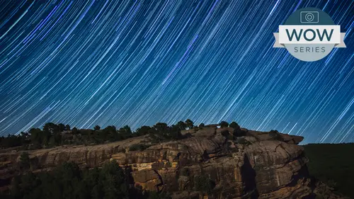
09:45 2Night and Star Overview Part 1
35:26 3Night and Star Overview Part 2
24:26 4Night Photography Gear
42:33 5Settings Chart for Night Photography
44:45 6How They Took That Image Part 1
19:48 7How They Took That Image Part 2
27:59 8Night iPhone Photography
17:29Lesson Info
Digital Darkroom: Enhancing
This is your original file from this sequence. What I did on this one, the person was also talking about Grady INTs and in this one what? I'm just playing around with it in there's different ways to interpret this. You'll notice we go to the the Grady Int tool here. Oh, and this is the tiff. This isn't the layered file, so we won't actually use that one. That is a flattened version. So you could see the preview. I did. Basically, we'll just use this one. Here is, um, in addition to the overall total control and things like clarity may be taking your highlights down to maintain that, um, story from me in this particular image is obviously the light streaks the cities themselves. It's not like I've got a landmark in the buildings that that are attracting me. It's the movement. It's the It's the drama of the lights and especially with razor sharp, you know, arrows. This is this is the story. So coming into something like your graduated filter, remember your, um, adobe camera, raw and ligh...
t room, or exactly the same in terms of the develop module of light room and the basic operations of Adobe Camera Raw, and you start off doing your global adjustments here in what's known as the Basic Panel game, which is the same thing in light room, A doe became a raw does left to right and, like room does top to bottom. These basic adjustments down here are going to be your basic tonal adjustments, basic edge and color adjustments and eso Aiken do that edge enhancement, that clarity that we love so much. But the targeted adjustments basically, this basic panel is inside of these three tools up here. The adjustment brush, the graduated filter and the radio filter, which came in a couple versions ago. All of them are amazing the sense that they have a dozen plus capabilities to manipulate the image in one fell swoop, something that you can't do in photo shop when the main benefits. And in this case I'm going to go to this Grady int way of manipulating it, and I'm going to start off by taking down that exposure in adobe camera raw by click on the plus or minus. It resets all the other sliders and just give me what I'm working on. There is a little effects label in light room. If you double click on that, it resets all your slider. So you know, you're starting with something that is zero. So, um, talking again about that radiant question, I can come over here and click, and you can see that I have this ability to add this radiant, which in this case, is a perfect exposure. It's not just darkening at or adding black paint, it's actually doing an exposure. And Aiken, you know, exaggerate that so you can see it. The nice thing about this is one. It's nondestructive, as everything in light room in Adobe camera is, you can change it after their fact once you're done. But you can also, just simply as you move away from the one that's already active. I can click and drag over here, and I'm adding that down here I can click on the top and dragged down. I can go. OK, I like that. But maybe I want to do this little kind of tilt shift. That's really popular now where I'm gonna blur portions of the file not based upon a depth of field based upon my aperture in my camera. But I want to actually come up here and doom or than one thing rather than just exposure. I can take this little setting over here called Sharpness, and you'll notice all these settings start off in the middle. So I'm not able to just add any one of these attributes. I can also remove them, and that goes for sharpening as well. So if I take sharpness down, you're going to notice over here that I'm actually blurring the file, okay. And through a soft edge mask. So, as you can see here, we'll just exaggerate it. I'm actually able to add blurring to the file. And if you do it judiciously in with understanding of how riel shortening of the depth of field works, you can actually do some basic, you know, im blurring optical blurring on the file. In this case, I like doing it. We're all do this scenario here, and let's just will add it to these other ones where we're just going to take the sharpness down. So I'm going back, tell you that it's completely non destructive, not saturation, but sharpness. So now I've got a little bit of softening, but if I want I kind of like the overall darkening of the file. I can say new and just add one. That's just this. Scharping and I can add multiple ones of this so I can add a adjustment on top of another adjustment. And every time that I do this, I'm adding another blur to it. Where I start, it's gonna be 100%. And where I let go, it will be zero. And so, by adding a fume or of these, you know, Grady INTs, especially in a you know kind of stacked fashion, I'm adding war blurring. So it's blur, blur mawr and and less. I'm not just limited to one. I can come up here and actually add multiple blurs to it. And what you end up with is this. Um here's R p before, after before, After we look at our file here, we get this. Yes, this is this happens to be interpretive. It is not what would happen with a true shortened up the field. By tapping the peaky, you can see how much I'm able to bring in in terms of my detail. Get rid of distractions along the edge, and in this case, the story of the wonderful light trail that brand captured, um, is able to be maintained. So taught me that the I goes to the bright areas of the image is naturally but also to the sharper areas of the images. If you're not looking to create a tilt shift effect, you can still control like a within. And yet you're bringing I to the center. You can also similarly d focus the outside to bring your into the story of what you want people to focus on first. Yeah, we talked about this in our blur class just three other day that sometimes I'll add a subtle softening to it just to exaggerate something that may not be razor sharp. You know, you need to have that. You know, one element, your subject tax sharp. And if it's not, but it is the money shot. It's beautiful than adding a little bit of softening will make the mind perceive that as razor sharp just because in comparison to everything else in the in the scene, it is sharp, so adding a little bit of blurring can be useful for all sorts of things. In terms of directing the I fooling the eye of getting rid of distractions. So absolutely. And then in terms of, um, well, one I'll. That's so we did both dodging and burning by having the exposure taken down and also the light taking down on that the lights, the highlights of the file. But we also added the blurring the other will file that I have here is more of a straightforward color and tone manipulation. But when we come back to this, if we have time once, you okay a quick show of more artistic playing in post processing rather than playing with the camera, I still haven't opened my room. I showed this image earlier with the bridge mirrored about. It looks like it's reflecting in the waters, whatever it is hanging in space. So the original image with this one. So a quick story on how to do this? I duplicate this layer by right clicking on the layer. You have to get on the name. I believe part of it. You name it that for now it is a good practice. The name your layers as to what you're doing, so that when you come back later, especially if you're trying to teach something like, What was I doing here on this copied layer? Edit transform? In this case, I'm gonna flip it vertically and then drag it down. And if I hold down shift, it will force it to go in one direction. But snap is helping me out. You know, Snap is helping me out because of those magenta lines there. Drag it down. I don't guess of where I want it. There, it's off the screen s I'm gonna say image menu, reveal all that expands my canvas. And now I need to zoom out. I'm hitting control 02 or view fit on screen to see the whole canvas and then simply adding a mask to that flipped layer and I'm gonna paint in with black toe hide this overlapped area. I find that it's calls attention to the mirror if you have a perfectly straight line. So I would never use a hard edge on that line. And I often will leave portions of one image like making a zigzag kind of thing. Bring in elements that is not perfectly mirrored, So I might not want these mountains are fiddling around with Maybe this bridge part won't be mirrored or something. Make it a little bit more uneven so that you aren't thinking, Oh, that the mirror your looking at the subject of the image rather than the process. That's another one way, and so you can take that into stars with, You know, if you have the Milky Way arching through, you could flip it horizontally to make a rainbow out of the Milky Way. Are are smearing elements in your foreground as well. Did you say where that picture was taken? Where that bridge it's in Iceland, on the south coast of I. Would you ever take that bottom image and then either darken it or motion blurred or something toe to differentiate it from the above one so as if it was reflecting in water or glass or I don't tend to do that, but that could be a fun thing. I know there's some IPhone app that'll make a reflection that looks like water. I was making this for my sister and the the Norse mythology sort of things. I wanted it to look like it was floating in the air and the auroras, but you could liquefy and wiggle. This may be our make it look more like water. If I'm tryingto make it look like a water bath, you can also take a cookie sheet of water out there and hold it there and shoot it with really water to get that reflection. If you want a real low angle. Yeah, actually, the we didn't use this. I don't did show one image, but they make my lar mirrors that have a slight texture to it. They're plastic, they're unbreakable. You can put him in your backpack and things like that. Nice thing is, you can use them underwater of actually worked with models doing underwater portraiture where they're having this large plastic mirror. And you're able to get all these different reflections because, of course, the the top of the surface of the water acts like a mirror when you're shooting from below. But also, the mirror is, you know, so you get the model dancing with herself or himself because you've got two versions of it. But I've seen other people do a smaller version of it, and basically you carry it around almost like a plastic pan of water, and you use it to shoot different elements while you're out in the field. So it is kind of fun, because that, you know, reflection, especially with some slight irregularities in it, is something that you just you can't get unless you want war in a lake or something else like that. Just what my bag needs is a now or by That's the nice thing with the camera. You know, you just actually you could do something that's 8.5 by 11 and put that close up to your your lens and you get that especially thrown out of focus. It's even nicer because it's reflected, but it's not distracting. You're not seeing the plastic. If your focus is still on your subject matter, you get the reflection. So but can that was part of the water class. Okay, um, another image that you graciously allowed me to use was this one from those that lithium mines. It sounds like something Star Wars. Yeah, I'm gonna send you to the lithium mines. Um, and just again, one of my most favorite shots of yours, This is as it came out of the camera. Um, and I started experimenting, and I'll show you what was done in terms of either the radiance and on some of these I used the brush, but usually just the ingredient. And but going back to the story, really, for me, was that the textures in it That just amazing texture. And of course, the fact. Speaking of reflection, we've We're seeing this. I take it this is a sunrise or sunset. Was Dr So a sunrise? The fact that you have this geometric, you know, reflection of the services. It's just amazing area again. It's one of those things I can't imagine being there. And I'm very fortunate that you took me there by Let me see this image. But eso here were experimenting with different ways to accentuate the story in this. In this particular scene, you obviously could have done some little light painting on here. You may have done some little flashlight to bounce around, but that's what I love about a CR and late room is that we can take advantage of these Grady INTs an experiment in this case with just a simple tone in the foreground, or in this case, I wanted to do my little bit mawr exaggerated color. Yeah, he's he's going Tom. Never again on Dhere. Bumping up. You can see over here we've got our saturation up in here as well as the clarity. One thing I've been mentioning about things like Vibrance. And this relates to night and star photography as well as other things that vibrance, as you may know, is a nonlinear form of saturation. It takes what's unsaturated and balances out those colors with what's already saturated versus saturation would take both what's already saturated, what's unsaturated and bring them both up and these that were already saturated now, or getting close to being that out of gamut and going screaming to their death of a Roberta area. It's been a long three days for May do. That's not even a word. Every report we produce ability. Okay, time for the margaritas. So, um, so usually, vibrance. The reason why Adobe invented it is because it it is less likely to cause problems in getting your colors out of gamete or out of the reproducible range of the device monitors or printers. All these things have gametes. So, um, but the thing to remember about Vibrance and why didn't use it here is that because vibrance is nonlinear. Adobe not only said I'm gonna work on unsaturated and bring it up, but I know that everybody you know doesn't like iridescent skin tones and all skin tones, no matter what ethnicity fall into the orange range. So I'm gonna be really gonna keep oranges down here no matter what, just because I'm a nice kind of computer. But I also know that people really love their blue skies. Ah, you love your blue skies. So you know what I'm gonna do is I'm gonna be a little bit aggressive with blues. I'm gonna take it up even mawr than what saturation would, because that's what people like. So any time that you have oranges or blues in the scene, think twice about using, um, vibrance, because one the oranges will not be manipulated. So something like a sunset the yellows and reds will be manipulated and the oranges left alone doesn't look natural to use vibrant on a sunset. If you have blues in the scene and you not a big fan of peacock blue, then also that same sort of thing that vibrance will actually ADM or rather than less of the blue than everything else so often times when I have things like and that's what we're having right here is both the yellow oranges and blues. If I come up here with the vibrance, it's going to add a lot mawr of that blue to the equation, and I get mawr of a linear. It's a consistent addition of more color to the scene. So oftentimes I will use saturation for things like sunsets, sunrises and Jack. That's true. And Photoshopped light room put a shop. Yes, the vibrance now is in photo shop. Up until recently, we didn't even have the option of vibrance and photo shop. It was only in a CR in light room, a CR and light room or the exact same engine. So any what's never won in another. You now have an adjustment layer that when you go for vibrance, it will give you both vibrance and set hue saturation in there, which is nice or a saturation. And of course, the entire adobe camera raw engine is now inside a photo shop as a filter itself. So again, yes, that it works the exact same way. And then the last one that, um, I did here which I think is my favorite. Because the nice thing with black and white is black and white allows you to get away with murder. You know, you do you think of what Ansel Adams did with his beautiful black white landscapes as he just went to town on putting red and amber gels in front of his black and white laden cameras. And that gave us a nice which dark skies there almost an infrared on some of hiss. Very high contrast in terms of that he did, you know, a lot of hand dodging and burning work on his imagery toe maximize that contrast. And some Sometimes they're more subtle. But oftentimes what we love about his work is thes beautiful, rich, you know, delicious prints that he created that had such such detail and such a beautiful tonal range in here. And so what On this particular one. And you know I can go. These are brands, raw files. So, as an example, if I were due to do this, I could start off with it being grayscale. So I see what I'm working with. I would start off with the basic panel to get my overall color and tone in this case, I know I've got detailed here, so I'm gonna jump before I do anything else. I'm just gonna jump and see what sort of shadow detail I can do in that file. Before I do something else, I could then go Well, I want a little bit more detail. Exposure is my mid tone value, so I can take that up to get a little bit more value in there. I may be lightening up that sky more than I would like if I turn on my a little out of gamut warning these little icons in the upper left in the upper right of the history. Graham, show me when I'm clipping. I'm still not clipping with that element there, but if I'm getting close, I have my highlight slider that can bring it back down into submission. So my exposure is my middle tone value, my highlights air going down and my shadows air going way way up Next. I want to pull out that detail cause I'm just that kind of guy. So I'm gonna do that. Clarity. Clarity is that EJ contrast will see that it's affecting all the contacts throughout, but especially where there's inherent areas that are already contrast like the horizon line in the water again. I just love the fact that it's bringing out this exaggerated inherent contrast in the file. So again, so far we've got our there's our before after it doesn't have the I want even war contrast. I am a greedy son of a gun askew all can already take. So this is where I may start doing some targeted adjustments in here. Maybe I could see it. You know, some contrast if I bring it in globally to everything in the file making sure you can see that I'm not anywhere near clipping my my image. Even though now I've got a lot of contrast to the file. I'm still not getting close to clipping it, so I like that. But I want more. I want Jet black, so I'm gonna use that graduated filter will take down the exposure a little bit. Let's get greedy. Come down. I'm gonna darken up that sky. So it goes to a pure black and I may do a trick. Let me let me dio one trick for you real quick. And it's mainly just just show you a concept in, um, inside of light room and how it works. And light room and adobe camera, raw thes air, both procedural processors. They're not pixel pushers. And because of that, that means that all these sliders are just pure mathematical calculations. Remembrances of the file. They don't change anything permanently. They're applied in such a way that you can do anything in any order does not change the output. It will always be exactly the same as opposed to photo shop, where you have to be very sequential in the right order or else you'll degrade the image and also because their mathematical. If you do one thing, let's say you take plus clarity 101 place minus clarity. Another. They cancel each other out. And it is if you had never done anything to it, not how Photoshopped works. If you took your contrast up on one adjustment layer and then you took contrast down, this one would have thrown away information, and this one here would have thrown away information. You'd have a very different result. It would not balance each other out you. That's why we use so much masking to not overdo things in photo shop, But in here, let's say that I want to come up here and I want a dark in that, um, horizon. So as it comes down, I want this to be jet black right on the horizon line. And then I want to keep this lighter foreground. So if I come over here, we'll do new. Then we'll do this. Exaggerated one. I'm gonna come back down here, click and drag. Well, I've done what I wanted. It starts here a green, and it is completely affecting everything that's here and above it. It starts here, but it doesn't start at, um, 100 nothing up here. It starts here, but that Presupposes that it started actually up here. This is all 100% of the effect. And then at green, it starts transitioning to zero of the effect. So I like my four grand. You can see the drama that it's doing in here, and Aiken, you know, continue to do more things to it. But what I want to say here is that this is what would be considered one stop under exposed when it gets to hear. If I say new and I go click, click and now Mitt plus 100. And I start here and I go up on this thing. So now I am adding Teoh this file and actually, what I'm gonna do is not start here and go up. I'm gonna start here and go down. It's going to completely remove the under exposure that I added a second ago. So I'm gonna come here, and it's actually going to negate what I got with the other adjustment. So technically it I was able to start at a very dark adjustment right here. And even though it went up into the sky, I can negate it by adding the opposite of what I had too much off. And if that makes you go, wow, it's such a very different way of working. But if you just keep in the back of your mind that these are just pure mathematical descriptions, I can even just take it. I take it all the way down that I'm completely negating it, You know it's there. Then this is a full stop from here. All the way up is a full stop. And it was a full stop. Was added in this adjustment right here. So simply by coming up here and doing this, I have negated that entire adjustment. It allows me to goto a hard edge with ease, Grady INTs and it's just a mental concept that I like. The other thing that I'll do here is for my foreground. I really want a little bit more of this edge here, so let's just switch over to that radio filter will use that exposure up. Maybe a little clarity. Make sure that it's on the inside. I've got a variable feather and now I'm just gonna come up here and kind of ad, you know, a little puddle of light in this foreground here, as if there had been a flashlight. And again, since I have the ability to change all of these parameters I'm going to do tapped the V key to hide that one. I can change my clarity, maybe with a lot of clarity I don't need. I'm just kind of exaggerating this area and again, I can move this through the scene and you can see it's as if I had this in a flashlight on the salt flats here and continue to manipulate that. So here is our before after before, after primarily taking advantage of the overall basic panel to pull out shadow and highlight detail in add clarity to going to the graduated filter and using that little trick of darkening my sky to add drama and in this case also adding some darkening right on the horizon line. But negating that by coming up here and doing the opposite in the sky area another way. Of course you could do this is you would use the adjustment brush do kind of a fine line here and then do bigger swatches to do Ah, handmade, radiant using the adjustment brush, which you certainly can. The main thing I wanted to share with you there is that concept. If you can get that concept of up, I added, Here, I can remove it here. It actually is very, very powerful. An example of that. If you were to do that anti sharpening to the entire file, you know, with with a Grady Int and then come back in with a plus, sharpening with a brush and tap, say the bride's face, you can get instantaneously a little shallow depth of field blur the entire document. Bayan sharpening it come back in with a brush at opposite, Tap it in, and it takes it back to the original sharpness. It's a very good concept.
Class Materials
bonus material with purchase
bonus material with enrollment
Ratings and Reviews
a Creativelive Student
I found this course interesting and motivating. I enjoyed hearing about using a range of cameras from compacts to larger DSLRs to capture great images. I appreciate the great experience and passion from both Jack and Bryn and look forward to using the information to improve my night photography. The post processing is a very useful part of the course which makes it an integrated approach. The varied ideas expressed by Jack and Brynn and a depth to the topic of night photography.
Cecily
Interesting and informative class. Jack as always is brilliant, and Bryn shared a lot of his night shooting experience, his chart is a great starting point, and as he states is "just a starting point", make your own settings decisions on the night! Even though I have been a photographer for quite some years I'm always learning new things. Thank you both for sharing!!