Lesson Info
22. Editing Indoor Shoot Part 2
Lessons
Day 1
1Class Introduction
09:49 2My Evolving Style
18:00 3Visual Examination
24:41 4Storytelling and Character
32:40 5Storytelling Q&A
07:59 6Critique Yourself Part 1
30:18 7Critique Yourself Part 2
13:06Identify the Problems
24:10 9Posing Overview and Q&A
15:17 10Ten Basic Poses
35:30 11Posing a Man
10:25 12Shoot: Posing Demo
11:53 13The Art of Self-Portraiture
17:49 14Posing Yourself
24:27 15Shoot: Self-Portraiture Demo
17:18Day 2
16Shoot: Indoor Scene Part 1
23:54 17Shoot: Indoor Scene Part 2
21:13 18Shoot: Butterfly Daydream
30:05 19Image Compositing
37:59 20Shoot: Using Props
18:26 21Editing Indoor Shoot Part 1
26:22 22Editing Indoor Shoot Part 2
20:47 23Editing Butterfly Shoot
18:33 24Editing Pool Shoot
24:48 25Shoot: Outside with Open Sky
23:49Day 3
26Shoot: Fairytale Scene Part 1
29:08 27Shoot: Fairytale Scene Part 2
22:20 28Shoot: Snow Scene
26:36 29Editing Outdoor Scene
31:28 30Editing Fairytale Scene
26:32 31Editing Snow Scene
15:59 32The Business of Fine Art
26:03 33Eight Business Practices for Fine Art
14:28 34Beginning Your Artist Statement
19:28 35Making Prints with Q&A
33:50 36Becoming You
32:35 37Taking Risks
29:40 38Bonus Video: Expand Your Space
01:17Lesson Info
Editing Indoor Shoot Part 2
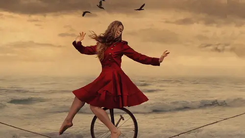
so I've got this big image I know that I want to keep the light on her face and absolutely addicted to this lighting right here so I love that wanna focus in on that I wanted dark and down the edges so the first thing that I think about when I'm editing and I have gotten to this point where I could make overall adjustments I want to go in and I want to say what needs to happen to the lighting the lighting specifically not the color I save that for later but the lighting I call this changing the lighting dynamics so with the lighting dynamics I am asking myself how do I read the light how should the light be moving through this image so I think that I would like to darken down this wall right here and this piece right over here I remember in some of the first shots that I took of this this area right here was very bright the light was hitting it very directly so we added in these leaves so if I had had more time or more patients I might have covered all of this in vines but I didn't hav...
e the time and patients so I'm just going to make it darker which is something that I talked about at the beginning of that segment saying that I'm going to show how to make this wall darker so let's go ahead and do that I want to work with my lasso tool a lot now so I don't need my polygonal lasso tool because I am using a walk him into us four right now so I'm going to go ahead with my regular lasso tool so I can just click drag and draw to make a selection now I know that this whole area over here is too bright for my liking so I'm going to go ahead and just run right along the shadow just get in here really generally I am not trying to make a selection that's perfect just that's kind of a big selection moving into the binds a little bit that way we do have all of the bright part selected right click feather or refine edge so I'll choose refine edge and I want to see what my selection is looking like now I'm going to take that feather slider up and keep going but it's so maybe somewhere in the hundred pixel range I think would be very appropriate here say ok I think that we're getting just slightly too much of that shadow so I might just move this down just a little bit you can always move your selection around and now I want to go in to curves so I'm going to work in curves again image adjustments curves and I want to make this area darker but what you notice about this whole area is that I really just want to change the highlights I want to change the brightest parts of this image if I click you can see that I have a little eyedropper tool that's in defaulting because of curves I can click and it is showing me exactly where that bright spot is on my curves graph and that is this little peek here that I have in curves so because I have this peak that means that I know exactly where my highlights are that I need to take down I don't need to go over here from the midpoint and pulled down because that bright spot is still there because I'm not affecting that area as much as I should be so I'm gonna click that little point drag it off of my curves to get rid of it and instead I want to move from the highlight portion of my graph and pulled that down so I'm clicking on the highlight portion pulling that down and you can see how it really starts to dull the wall there whereas pulling from the mid tones did not successfully do that so I'll take it maybe to there I think that looks really nice you can preview it to see what you've just done and that is a huge change in terms of how you read this image so I say okay right click d select and it's very natural because of how much we feathered that part of the image so I have that part darken and now I would like to darken this side of the image so I'm going to the same thing with just selecting very generally all through here right click refined edge take that feather slider up this side I could do a little bit more maybe one hundred fifty pixels and now same thing going back into curves and then from that highlight portion of the graph I am pulling it down just to there right click do you select so now if I click that you can see that what we've done we've darkened down the edges which means that we're focusing in on our subject even more than we were before at this point though I'm going to make some more overall changes I would like to do a vignette but I don't do vignettes how a lot of people do vignettes because I don't want to make all four corners equally is dark instead this corner right down here in the bottom left is already very dark I really don't need to change that very much because if you can see there are shadows in there that are going to be crushed so I don't need to make that any darker this corner I would like to make that darker let's see I'd like to go in here even more than I did before so instead of doing a normal vignette all four corners I just draw it in myself and I just say okay well start here I'd like to get in here again maybe appear maybe down there and just start to draw whatever I think a very natural vignette would be which ends up looking like a random squiggly line but it's not so random because I've drawn then wherever I think ah light pattern would look interesting right click and either feather or a fine edge so if I were going to feather this regular feather I'm gonna choose un amount of pixels that's very large because I want this to be an extremely soft edge so let's say three hundred pixels and say okay so I have feathered that quite a bit and now from they're going back into curbs so image adjustments curbs now I have already taken those highlights down in fact you can see the peak of the highlights has moved over on the graph because it's more of a mid tone now so I don't necessarily need to go from the highlights and pull that down but it can't hurt just to get rid of any lasting highlights that we might have to pull that down a little bit but I also want to pull down from the mid tones to make everything a little bit darker and say okay right click d select so now we have the lighting changing even more we have the light hitting the subject I'd like to add a little bit of light actually right here to this side of the frame so if I zoom in there I want to see the detail of the beautiful curls there so I'm just going to select wherever I want it right click feather will dio hundred pixels there at ah image adjustments curves and we're just going to pull that up a little bit because I am using such a big feather on all of these things the transition is extremely smooth so that makes a really big difference now I think I'm going to do one more giant sweep for a big vignette so I am going to now in this case I've actually selected a little bit too much I want to get rid of the wall here so if you ever want to add to a selection or take away from a selection you can always hit alter option which brings up a little minus sign and that will allow you to click drag and draw to take away from a selection or shift which will bring up a little plus sign and then you can add to your selection so I might want to add that I don't though so I'm going to take it away just like that now right click feather let's do two hundred pixels and then right click and select inverse so I've actually selected here what I want to preserve and if I write click and select in verse I now have the whole outside edge again selected so same thing going back into curves and now from the mid tones only going to make that a lot darker and say okay now you can see we've made drastic changes to the white from that to that how we're reading this light is very very different so I want to start minute plating now the part that I'm interested in which is her so I'm going to move in here and I actually want to start playing with some colors so I've changed the lighting dynamics and now I want to say okay what needs to happen now to the color in this picture to make it more dynamic everybody's gonna have a different opinion about that I get that a couple things that I want to dio first I might want to change the color of the green leaves actually hate photographing green I think that it could be really beautiful especially in this situation with the red interacting with it what if I wanted purple leaves what if I wanted to do something really magical so let's go into image adjustments replace color replace color is one of my best friends and photo shop because I do change colors a lot very drastically so in that picture that I showed during the last segment I was wearing a maroon sort of pinkish color dress I used replace color clicking the dress changing that to be a vibrant red and that's how I did it for that picture so the way that replaced color works is that it brings up thes eyedropper tool selections it defaults to the regular eyedropper tool you also have the plus sign and a minus sign I'm on my regular eyedropper which means that I can go into this image and click any color that I want to change so I'll click this green right in there really neutral green you can see this graph has changed whatever is white in this graph will be changed by our little sliders down here whatever's black will not be affected if you don't have enough selected based on that click you can change the fuzziness by pulling the fuzziness slider up and you can see that more will be changed because you have added it with your fuzziness lighter alternately you could always choose your little plus sign eyedropper tool to select more colors within your image and it will add to your graph you could do the same thing with minus by taking away color so you have added too much you can go in with your minus sign eyedropper click the color that you don't want selected anymore and it will take that away so let's see what this does what this graph does I'm going to go down to my hugh that's going to allow us to move the slider to make color changes so if I take the hue you can see what we're doing there were making some changes to these colors but you can see that we're not making changes toe all the colors because I don't have enough selected so that's where I would go in with that little plus sign eyedropper tool choose this vibrant green color and now all of that is added to our selection so what do you guys think should I change the color should I keep the color we can play with the slider as much as we want maybe I'd make it may be in there something that's a little bit on the cusp of being warm or just we'll just go blue you know who knows anything could happen there's my purple love using purple um but should we do something totally magical or not okay I like you guys so much but I knew you would say yes this is great okay so we're going with purple now I can always change my fuzziness and just see how it looks to add a little bit more but you can see that the more that I add the more her face changes color she looks like the wicked witch now with a green face so we're going to take that right back and we don't want to add that much this also seems to de saturate a lot of our image which I am absolutely fine with because I'm going to add color back into this picture so I'm saying okay I really do like that purple hue that we've added everywhere it looks absolutely magical with her red hair makes me so happy that's why I dyed my hair red because because I want to do have red hair and make sure so this is exactly what I'm looking for in an image like this little did I know I could just get an awesome wig and it would all be the same but here we go so let's start to add color overall into this image so I'm going into curves again image adjustments curves now let's say that you don't know what color you want to add into this picture you don't know if it should be warm or cool or whatever the case may be you can always go into photo filter and if you go into photo filter that's going to give you a really good idea if I take this density up off what the image will look like when you add color to it so this is a warming filter you could try a cooling filter you could try underwater if he wanted to sew all these different options to see what the different colors look like so I typically do that if I'm feeling a little lost I see what what kind of color palette I want but then I cancel that and I teach myself from there so instead of just saying okay I'll do whatever photo shop says I'm going to say ok I do like those warm colors now how do I recreate that in curves to teach myself what that curve would look like so I'm going into image adjustments curves and I actually want to add color to the white in this image so I want to make it red I want to make it yellow I do want to add warmth into this picture because I think that'll look really nice with her skin tone and with the wall so I'm going into channel rgb blue because the opposite of blue is yellow I don't want to add blue to this image I want to take blew away from this image but I want to do so in the highlights so I'm going to add yellow to the highlights of this image by taking from the top portion of this curve clicking and pulling down I am now adding yellow into this image into the highlights mostly now it looks a little bit green we're looking at this we're like I don't know about that that's okay it's simply because there's too much science in this picture or too much green in this picture so I'll go into my red curve perhaps pull up now on the highlights their toe add some red and we're just gonna warm this image up now I think that the shadows they're still a little bit too cool so let's go into our green curve and we don't want green I personally don't I changed all the leaves from green so I'm going to take away green in the shadows I'm doing that because the shadows seem a little bit too cool to me so in the shadow portion pulling down tto add some magenta overall to this image and then say okay so now when I zoom out on this I can see that I have the purple exactly at the color that I want it I really like the hair I might even make it a little bit more vibrant perhaps and I want to add a little bit more light streaking in here just a little bit and I want to make that light redder and more yellow so I'm just going to draw in the white wherever I think it should go like this right click and feather we'll do another three hundred pixel feather and then back into curves and now I want to play with how the light is coming in the room just in this particular section if you want to add hazy light if you want to make it look like the window it's coming in there's a lot of dust in the room in that case you khun stay on channel rgb but then you can pull up from the shadow portion and it'll look a little bit like there's some hazy light coming in there and then you could go in and add some yellow to those highlights and some red and so that's going to allow you to make it look like there's some hazy light filtering in I don't want to though I like it with a lot of contrast there on her so instead let's go in and play with this red hair now because we have added some red hues all around on the walls and what not I don't want to use replace color on the hair because I think that I'm going to pick up too many other colors that are happening within this image so instead I want to take my lasso tool and just very generally just select her hair just wherever I think it is it's not perfect but I just want to overall now change the color just slightly oh and we'll go in and make her I pop even more would be nice and creepy okay okay some selecting the hair oops missed a little spot so hold shift click and drag and draw now I have the hair selected right click and feather ah we'll do twenty pixels their two feather image adjustments curves now I could make it a little bit brighter or add some contrast you add contrast and curves by making an s curve so you can see there's kind of an s shaped happening here even though it's very slight what you're doing is pulling down in the shadow portion which is right down here with these black point meat and pulling up in the highlight portion so you're pulling up pulling down making that s curve and that's creating contrast by creating contrast were making the highlights in her hair stand out and you add saturation by doing that just by default if you hadn't done that you could always just go into your red curve adds him read to her hair pouf and that would work but we don't want her to look like ronald mcdonald so we're going to leave it just how it is you say ok right click d select now I want to go into her eyeball and I want to see what we can d'oh we're zoomed away in there I want to make her eyeball pop and I want to add color to it I know it myself okay so I want to add color I want to make her I blew again so I'm going to go ahead and just select right in here it's going to be ever so subtle but these are the kinds of details that matter when your printing an image for a show so I'm just selecting where her I would be blue right click and feather maybe two pixels very very slight and then I'm going to go back into curves I'm going into my red curve so I can add some science I'm going to go into my blue curve so I can add it's um blue and say ok and now when I d select that she's got some blew in her eye there and then I'm just going to select this little highlight making what mel it's like the whole eye just to make the whole thing a little bit brighter right click feather the four pixels this time image adjustments curves make the whole thing a little bit brighter maybe some contrast still but overall a little bit brighter say okay d select so she's got a much brighter I know you can still see that standing out really well so if this is a big print you're going to walk right up to the eye and you're going to say whoa I can see her eyes so well and it's going to be something that really stands out which is honestly what khun sell a print so I'm going to go ahead and add some make up to her face just a little bit this is something that I do a lot in photo shop especially because I hate wearing makeup I don't wanna have to do somebody else's makeup so I asked my models to come along with maybe some mascara maybe some foundation nothing more than that and then if I need to add something later on I can so let's get right in here on her lips I'm going to select her lips and I'm going to add some lipstick for her maybe it'll be red maybe it'll be blue who really knows what's gonna happen we'll see could be anything we're on an adventure together right click feather and let's do five pixels here for a feather now I'm going into curves command m or control em I could make them a little bit brighter could make them a little bit darker I like them darker actually so add some contrast at the same time making them a little bit darker and now perhaps we want to add some red so I'll make them just a little bit more vibrant when I add a red lips I also really liketo add some yellow so does add a little bit of yellow in there say okay d select and now just in the face so I click this on and off we've made a big difference and so maybe I would go in and maybe I would take out a blemish or lighten the shadow or something like that but I'm not really one to do much of that so I'm going to leave her face just out of it is because I think she looks absolutely stunning there and we're going to pull back and take a look at this image now I feel good about this I don't think that I really need to do anything else to this I would I'm sure add a little bit more color in but for right now let's move on to another edit if you guys were good with that
Class Materials
bonus material with purchase
Ratings and Reviews
Kirsteen
Brooke says she wants to be inspirational - she has achieved this and so much more during this course. I am so inspired to follow my dream of becoming a fine art photographer and step out of a life as an academic and stop finding excuses. Watching other photographers shoot and edit is always a great way to learn, everyone does things slightly differently and I enjoy Brooke's no fuss techniques. Seeing so many of Brooke's beautiful images through the course has been great and seeing shots from the shoot through to editing really makes them come alive. If you are looking for inspiration or you want to learn techniques or new skills then this course provides all of these things with a big dose of positive thinking thrown in.
user-a81eeb
Brooke is amazing! I love this course. Brooke is easy to listen to. She has a beautiful insight into creative fine art . Love it! I have learned so much. I especially love that she is so candid about everything.
renee Akana
I love Brooke and the wonderful way that she teaches. She is a gift to us all. Jane, her model, was lovely - a beautiful girl, a wonderful attitude and a real professional.. I could not do what Jane did to help Brooke convey her story.