Lesson Info
12. Color and Effects
Lessons
Introduction
01:59 2Lightroom vs Lightroom Classic
05:07 3Lightroom Overview
27:08 4Lightroom Mobile Overview
15:16 5Lightroom Web Overview
06:14 6Importing
07:22 7Organizing Images
18:49 8Searching for Images
15:00Lesson Info
Color and Effects
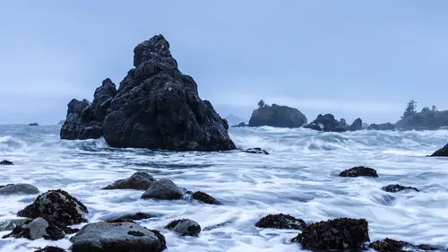
now that we've worked on the basic exposure of the image, let's go down to the color panel and by the way, you'll notice that when I click on the chevron on the color panel, the light panel closes up and the reason that does that is if you go to the triple dot button over on the right hand side and click on it, you can see that I have the ability to be in single panel mode. If I turn that off, I can open up multiple panels at the same time, but I actually prefer having it on because when I have it on then I don't have to move as far to find those. So in the color area, that's where I get to choose the color temperature of the photograph. And I also get to choose whether it has a lot of vibrance and saturation and I get to work with color grading and color mixing. So these are a lot of really interesting effects. So first off I can choose a white balance based on how it was shot or I can just say, well it's a cloudy day, so let's just choose cloudy and it changes the color balance of th...
e image itself. Or I can just simply slide this back and forth until I get the right color balance. So I'm going to do it right about there and then magenta or green and magenta and green are fairly ugly colors when they're wrong. So if it's too magenta or if it's too green it gets kind of ugly and so we can tell when we're wrong on those usually. So I'm just going to slide back and forth to magenta, to green, to magenta, to green until I get right in the middle, and then I'm gonna go back to my temperature and just play with it one more time and make sure I have it exactly the way I want it. I think that's about right. And then I get to play with vibrance and saturation. Now, I'm not a big fan of saturation because things get to um they just get blocked up and so I'm going to double click that anytime you can double click a slider, it goes back to the center, I'm gonna go to the vibrance and I'm gonna just bring up the vibrance because I think vibrance does a much better job at making things look more saturated but not um in a fake way. So I prefer vibrance to go positive. If I'm going to do some kind of a negative saturation, I'll use the saturation tool because it's actually across the board, the saturating things equally. Now in the color mixer, I have the ability to work on very specific colors. This is not a photograph where that's very useful because um there's not a lot of reds or greens or blue. Well there are blues in it, but there's not a lot of variation on colors in here. So we're not going to use the color mixer in this photograph, the color grading on the other hand is a really clever tool tool that allows you to change the shadows, the mid tones and the highlights separately from each other. And by the way, uh anytime you want information about these tools, if you just hover over them, they will pop up a little tool tips, which I really hate, I hate the fact that they're there and it drives me nuts, but anyway, they hover and you'll see them pop up all the time simply because it wants to teach me again and again and again how to use these tools. I wish there was just a way to say don't teach me anything, but you know, there we are, so I can control the shadows, highlights and mid tones independently. And so when I do that, I can simply grab a shadow and I can drag it out to the outside and I can kind of twist around the edges, looking for the proper blue that I want in the shadow or if I want it to be kind of a red in the shadow, that's kind of interesting. So maybe I'm actually more interested in it being kind of a reddish shadow. Now, once I've got that shadow, then it's a matter of how much saturation do I want on it. So then I just hold the shift key down and the shift key allows that to become a locked color, so now it's locked in, it's not going to shift up and down, it's just going to come in and out. So now we're at zero and I can just start to bring this in just a little bit, you can see how subtle that is. I like it, I like how subtle that is. So I'm just bringing in in just a little bit so it's a little warm in those shadows and now I can go to the mid tones, do the same thing and just kinda go around until I like the mid tones being the blue. So there, I like that blue, I'm gonna hold the shift key down, take it to zero and then I'm gonna start bringing in some blue into the mid tones there. I like that, that's pretty subtle and then I'm going to go to the highlights and do the same thing. I'm going to run around until I find the proper that's interesting. A little bit of yellow in there, Maybe, maybe more yellow, maybe a bit of. What is that purple coming on? I don't like that. That works. I think we're going to keep it fairly blue and now I'm going to take it to zero and I'm just going to bring it in just a little bit so that it stays nice and blue. Actually no, I'm leaving it at zero, I don't like it. So I'm just keeping it now, I also have the ability to brighten up or darken down each individual shadow highlight or um mid tone. So I can take this shadow and I can brighten it up or I can darken it down so I'm gonna brighten it up just just a hair and then I'm going to go into the mid tones. I'm gonna darken them down just a little bit and then I can take the highlights and brighten them up just a little bit. So I can add very specific contrast to specific areas. And then I have the ability to do some blending and balancing. So um if you, if you think about it balances, which way do I go? Do I do I hedge more towards the highlight color or do I hedge more towards the shadow color. And so if I if I hedge towards the shadow color, see how everything gets a little bit more that warm tone and if I hedge towards the highlight color, everything gets to be that little, well it's that neutral tone and so and then if I'm in the middle, everything's a little bit more blue. So I can just go back and forth until I find the proper balance and that's actually kind of cool. Um That's not, I don't want that because it's too blue and there, that's pretty interesting right there. I like that effect and then I can blend blending is how how quickly do things change? Like how much spillover is there between this tone and that tone or this color and that color. So it's just a question of how they bleed together and so I'm going to take the blending and I'm going to go down and up down and up and just look until I find the proper amount of and I'm just feeling my way into it. So I'm just looking for the way it feels and that looks pretty good. That's that's a that's a very interesting. So you see I've got all this kind of black and white going on and then that's got that weird coloration to it. Okay so now I've got a color grading and now I'm going to head into the effects panel. So in the effects panel there's texture clarity, D haze vignette and grain. And I want you to notice something that there's these little extra toggles right here on vignette and grain and that's because there's more information there, see that they've got more controls, texture doesn't but vignette has the ability to choose the midpoint and all that kind of stuff. So if I were to add a vignette to this and darken it, see that I created that. Then I can change the midpoint to it then I can change the roundness to it and then I can change the feather so that it's just so like that's ridiculous. But that's that's what that control is for and you have plenty of opportunities for control and see how the highlights bleed through the vignette. So I never used the vignette tool. It's a little bit hokey for me and it's not super useful. So I'm going to double click that and just get rid of it. So that's always going to stay collapsed because I just don't use it. But I do use grain and I do use the rest of these. So let's talk about texture. Look at that rock. It's got lots of texture in it. And watch what happens when I grab the texture and increase Man alive. That texture just is awesome. So I've got lots of texture now because I used texture. So I added 41 in texture and I've got a lot more texture here. Got a lot more texture in the in the rocks and in the seaweed. So that texture did me a lot of good. The other thing that I can use is and and texture is great in the negative as well. Not on landscapes but on people. That texture is perfect for like smoothing skin and we'll we'll show you a example of working on a person. Um So texture is a great way to get a lot of uh you know, rocks and and foliage and things like that to look really, really intense. Um And then clarity. Now clarity is contrast in the mid tones. And so as I zoom back out of this photograph and I add clarity to it. You can see how it gets just a little It pops a little bit more the highlights in these in these frothy waves starts coming up and the shadows start going down this rock gets a little bit more shadow here and the highlights start to grow. So if you can see that it's adding chunkier texture um to the rock. So it's it's actually a very valuable tool. So be aware that your clarity is a very functional tool but don't use it just to get texture because it's really more about shadows and highlights in the mid tones as opposed to texture which is about actually going in and drawing out the texture of Iraq or of leaves and things like that. So and then of course D haze d haze is adding contrast where almost contrast almost doesn't exist. And so as I add d haze I actually start to remove some of the misty nous of the photograph which is not what we want to do. So I can add haze and that actually helps to make it look a little bit more misty. So if I wanted to I could I could add some haze to a photo and then it would look like it was a little foggier or something like that but that's not what I want to do either. And then the last thing that we can add inside of the effects panel is grain. So if I zoom in again and I add grain, watch what happens to the sky. Do you see that? So we get that grain in there and we it starts to have a lot of really good um depth to the photograph. I love grain. I think grain helps to unify a photograph. It makes it look a little bit deeper. I I just like grain it prints really well. Um And lightroom does a great job at randomizing its grain. So as I look in the sky it's just it's such a random beautiful grain and then I can change the size, make it smaller, make it larger. But when you make it larger it softens things up. See how things get soft the edges. Because because your brain is going across the edge which then interrupts the ability for the eye to follow that edge. So then it becomes soft it becomes uh it doesn't it's not a crisp edge. So if I turn that off you can see how crisp that edge is. But then as soon as I have a lot of rough grain or I mean a lot of big grain it softens the edges. So I don't prefer to have the size up. I like the size to be fairly normal. But then the roughness of it is quite nice to increase. I could go up high on the roughness and I still have good edges but the grain is a little bit more prominent and so somewhere in between um 70 and 50 is a pretty good amount of rough. And so I like a little bit rougher grain and then sometimes I'll get up as about as high as 40 or 50 on the grain, but usually I'm somewhere right around here in the 25 range or 30 range, something like that until it looks good. And and remember every grain is going to be a little bit different depending on how big the photograph is. So if you have a megapixel file, you're going to use a different sized grain than if you use a 20 megapixel file because the size of the photograph is different. And so the size of your grain needs to be different. So just pay attention to that. So I like the way that looks, I like the grain um quite possibly I've got the wrong color balance on this but we'll get back to that at the very end. Now detail is where we get our sharpness from and keep changing photos, so detail is where we get our sharpness from and the sharpness of an image. Now keep in mind these have these drop down so you can drop down, drop down and drop down. So we've got sharpness, we've got noise reduction and color noise reduction. And so this photograph was actually shot at a really fairly low I s oh so it's not in need of a lot of noise reduction. So if I go into the effects panel and I double click migraine to get rid of it, see how clean that is. That's because it's shot at the lower I. S. So um so if I needed to remove a bunch of noise then I would do that by going to the detailed area and I would change the noise and I would increase or decrease noise, but we'll probably run into an image later where we need to reduce noise. So for now we'll come back to this later. Now sharpening is a place where we can play. So this has a need for sharpening but quite frankly I think that most of the time lightroom actually gives you too high a sharpening number, especially when you're dealing with people Now, landscape 40 is actually a pretty appropriate number for a landscape photograph. So I'm going to leave it at 40 but keep in mind that sharpness is just how much it sharpens. So what's the what's the drastic nature of the sharpening does it get? Because sharpness is just brightening up the highlight and deepening the shadow at a at a given line. And so sharpening the amount is just how much do I sharpen? How much do I create an edge at that line? Whereas the radius is how far out do I look for those lines. And so I'm going to take the radius up and it'll give me better cracks and fissures here. And so radius is like on a person will help to get the eyebrows and the eyelashes to pop out, Whereas sharpening will tend to look at individual uh pixels and sharpen them so that all the whole photograph gets rough. If I were to take the sharpening up, watch what happens? Do you see how in the sky that was nice and clean it now has this weird texture simply because I sharpened the actual pixels And they're starting to show, so we don't want to sharpen um more than we need to. So 40 is generally more than enough for anything unless you're just trying to heroically sharpen something that was completely out of focus. And then of course you have your noise reduction and your color noise reduction. And in most cases if you turn off color noise reduction, you're probably going to see some noise in a photograph. Now, this was shot at a very low I. S. Oh, so you're going to see very little noise. But Generally speaking, every photograph needs to be at 25 noise reduction period and then if you're at a really high I. S. So maybe you want to go up to 30 or 40 but that's about as high as you need to go anymore. If it's an old camera, then maybe you need more noise reduction and then we have the optics area which has several controls in it and we'll deal with those a little bit later when we actually have a reason to deal with them. And then geometry also has the ability to change the way the photograph looks. But we will deal with geometry when we actually have a reason to go there as well. So those are all of our controls when it comes to adjusting an image inside of Lightroom desktop. So everything that I've done on the desktop is already on my ipad. If I click on that image, I can see the image full, I can go to the editing area, click on the edit button, I have all of the same controls here, but I don't actually like the color I was getting out of that, so I'm going to go to the color area, click on the color grading and I'm just not a fan of what I did. So I'm gonna go in and I'm gonna reset all of these um so that I have no more color grading on this and I'm gonna exit out of there. Um and then once I'm done, I'm going to exit out of that photo because in order for me to send all of those changes to the cloud, I actually have to get off of the photograph in order to send the changes to the cloud. Um so now you can see that it's a very blue image and you notice that this little cloud is now uploading the changes that I made on that image up to the cloud and once it's done uploading those changes. Now, if we go back to lightroom desktop, you'll see that those changes are also made here inside of lightroom desktop and that's how the Lightroom ecosystem works together. No matter where I am, I can make adjustments on one and it will happen on the other. And then if I change my mind on one, I can change it and it will change it on all the others. So it's a fantastic system allows me to continually work on images without being tied to one place. I can be working on them on my couch, I can be working on them outside. I can be working on them on the road while I'm taking the photos, putting them into my ipad. And by the time I get home I have sketches of what I want those photos to look like from my ipad and then I can finish them here on my computer. So now you've seen the process of working on an image in general and you understand where all of your controls are inside of Lightroom
Class Materials
Bonus Materials with Purchase
Ratings and Reviews
Jean McMillan
Thoroughly enjoyed your class, have learned so much about how take my Ipad to another level, now can't wait to put it all into practise!
Red Tulip
Sometimes it's hard to know what the instructor is pointing to so it's easy to get confused. Better job is needed in explaining what you are pointing to.