Lessons
Day 1
1Class Introduction
10:02 2Color Models 101
26:46 3Color Schemes 101
45:39 4Debunking Color Fears
44:02 5Debunking Color Fears Pt. 2
25:23 6Evolution of Tobi's Color Style
42:37 7Evolution of Tobi's Color Style Pt. 2
44:12To Trend or Not to Trend
12:47 9Color & Design Trends
31:36 10Color & Design Trends Pt. 2
25:37 11Tobi's Color Inspirations
22:09 12Tobi's Color Inspirations pt. 2
23:29 13Using Inspiration Boards & Q&A
19:43 14Psychology of Color
36:34 15Color Meanings
17:04 16Psychology of Color Q&A
12:55 17What to Consider Before Choosing a Color
26:20 18The Right Color: The Entry & Living Room
19:27 19The Right Color: Family/Dining Room & Kitchen
21:19 20The Right Color: From Bathrooms to Outdoor Spaces
20:05 21Pairing Textile Elements for Success
28:49 22Pairing Wall Color, Pattern & Texture
24:42 23Floorings, Furnishings, Art & Lighting
19:04 24Intro & Top Color Palettes: NYC Showhouse
24:41 25Top Color Palettes: Hampton's & Richmond Showhouses
21:31 26More Top Color Palettes
33:46 27Layering Color Palettes in Your Home
38:16 28Transitioning Color Palettes in Your Home
28:08 29Historical Overview of Color in Design
16:47 30History of Color in Design Examples
43:59 31History of Color in Design Examples Pt. 2
16:32 32Color Mistakes to Avoid: 1-6
31:20 33Color Mistakes to Avoid: 7-10 & Final Q&A
40:06Day 2
Day 3
Lesson Info
Psychology of Color Q&A
We have so many keller question teo let's start with our studio audience if they're any questions, comments, thoughts, questions, I actually have a comment because I thought it was really interesting when we were talking about colors and psychological, like affect that impact, the colors and and part of my travels one the colors I really got inspired by was red, and, um, when I was looking at different textiles, particularly like in east africa and kenya, I was working with the masai tribe and learning how they do their textile tradition, and the color they use most is bread, and my question was, why? And because the question answer to that was because lions are afraid of fire, and they just yeah, and that's what I was saying earlier, and it was a little hard to understand, explain and that's a great example of why you said, I said, even generations of people have made associations are have had colors not be part of their culture, and maybe they don't know why, and you go all the way b...
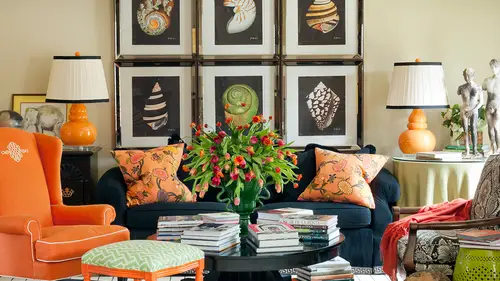
ack to its origin and say, well, it was a survival mechanism, and for these people, it's still a survivor survival mechanism now in their culture and their communities in their villages and that's amazing, isn't it? I love that yeah, that's kind of ah question. I'm gonna have to ask my grandmother, too, because, um, the bedouins in saudi arabia, their tents are black on the outside and then red pattern to some colorful. I've always wondered why that was especially it's, like the desert it's black, but it was always cool inside the tent side. I never understood how that worked because I would imagine, like a white, so another perfect example, because you think how in the world could something be so important that generation after generation after generation used it and did it, and why would you not if it's that important? Why would everybody not know and you both just gave me examples, and yours is a personal example in your own life that you experience this for years, and probably if you were going to go replicate that, like in space for yourself, you would pick those same colors, but you might not know why. So isn't it more fun and interesting to know the why there there's a joke I think that my mom used to tell me about. How that this family every thanksgiving locked both the ends off of the meat, the beef or turkey or whatever they were putting it in the oven. And finally, someone said, why don't we cut the ends off? And you assumed it was like that part wasn't any good or whatever, and they said the grandmother, why do we always cut the ends off the hand? And she said, oh, honey, I just said that for years because my pain wasn't big enough to fit the whole time the whole the whole ham on the plane are on in the oven, so it's kind of like that, like, we do a lot of stuff, even with color in societies and cultures, and we might not even have a clue of why we're doing it. But there was originally a reason, and usually it has a very practical purpose or it's a survival mechanism or some other deeply important reason why that came to be definitely no way we're gonna want teo like bringing in tomorrow until cal is curious about fear. We've been emotion related to color there any colors that a vote for me more than others? Well, it's like again, cultural, like black, maybe because some people are afraid of certain things that are associated with it, like death. On dh, sometimes like a red could mean emergency said that has an agitation or a fear piece about it, because you think it's like the adrenaline rush that happens when you're like in an emergency situation, or even yellow because of the agitation and that whole caution kind of connotations. So all three of those could be colors that we're associated for a number of different reasons from death to emergency, too, that caution kind of peace that could be associated with fear. We have a couple questions about applying the psychology of color that teo to your business, so pure design interiors who says reiterates its color is personal. How do you work with clients who, when colors a vote, different emotions for the people living in the same space. So one of the things we haven't exactly talked about, but we've actually talked about another parts of our core so far, and we'll talk about more as we move forward is that we haven't talked about in relation to specific colors is how much of the color you use in a room or how you combine it with other colors. So if you say you want to achieve a goal of serenity and you're going to pick blue, but maybe the person in this instance doesn't like blue, so you pair it with another color that they love, say, yellow but then you have to take into this is the meanings and associations of yellow and then you might also go back to your color will and kind of say what else might work with blue and yellow and use one of those compliments or split compliments or triads or something to start helping you build a complex color scheme that at the root of it maybe all the walls are a pale blue because they're tranquil but you bring in something else that's more energetic and more visible and it's more like the focal point that the other people really love that they relate to and also that kind of compromise of working with everybody in the home to feel like they have a part in the peace usually is the perfect compromise it's kind of like a mediation mediator helping everybody get a part of their themselves in the space so that partly answer steve perry's questions see, perry asked, can you pierre quest colors together that balance out the effects of one another like a soothing color develops out one that evokes aggression or agitation which so we saw yesterday the ring that was red and blue the wall was red and the chairs were blue a lot a lot more energy because a lot of strong lacquer red on the wall but think about reversing those and if the walls were all blue and just a chair or a pillow was written would have almost the opposite. You would have a serene room with just a pop of energy, as opposed to a really energetic red room that has some place for the id arrest on those blue chairs. That kind of brings it down a little bit. So that's where percentage has become really important, and then if you're picking up colors that all have a ton of energy that's when you get in a situation when we're talking about with the fast food restaurant, bright yellow, bright red, maybe even bright orange, those air, all sort of energy and agitators and high energy agitators, so they're going to be doubling or tripling the effect of energy in that space instead of just using one by itself, you know what I mean? So it's going to compound that sort of energetic fast get out of here in a hurry sort of mood. I have one here that I think is really interesting because I think it's going to be a lot about the texture and the materials. It's bob bob, sixty two, actually asked this yesterday and he's being very patient. Thank you, bob. I'm waiting for the moment when we could ask this question but bobby is trying to achieve a sense of luxury classic with authority but proactive and bold and a little bit industrial so pretty on she's pretty on target and a lot of goals for this fall that loved the gold kitchen that you showed us yesterday so I'm thinking about gold in the attempt to achieve that sort of thing bob also wants to do it himself d I y sorry he said I was impressed with gold in the kitchen that you showed do you have any recommendations which materials or metals will be pliable, effective and affordable to do a d I y middle gold effect could you combine silver and gold in the space? And I guess also what really is the key? Will a d I y application ofthe golden silver materials achieve his feeling of luxury? Well there's so much in that question he's asking glitter in my eye certainly into the color piece and I can certainly an answer from an aesthetic place but I'm not an expert and we're you know, craftsmanship and metal working and understanding all of those pieces so I'm not going to be the absolute best person to ask about the d I y and if it's pliable and cost effective and all of those things as much as maybe a local home store or there's a lot of craftsman and metal workers that aaron small shops artisans that I use all the time in my area that are going to answer those kind of questions for me but from a standpoint of color I think he said what mixing silver and gold so we saw those keller trans yesterday that we're like the golden gray and I was saying that even worked beautifully when you're mixing metals like chrome and brass or nickel and brass on that you can see how it does in that shiny surface is gonna have a lot of luxury you know, all of those medals are really associate id from a color standpoint and even a cultural standpoint with things that are expensive jewelry, gold and platinum and diamonds and all the things that we associate with jewels a lot of times have those metallic characteristics so it's certainly going to achieve some of that luxury I forgot what all he said he had a long list of things getting in the industrial piece I think he said, you know that's when you get more of like a raw kind of medal that's maybe not so polished and shiny so if you wanted to do some cool like juxtaposition of something that's like really rugged and like a found object that's more like maybe a bronze are dark meddle with something shiny that's sort of a cool combination right toe look luxurious and sort of hip and cool um, so yeah, they they're all and just thinking about medals likely said yesterday somebody said that was their big takeaway yesterday, either in the class are online. I can't remember which that they love the idea of thinking of medals as a color, so bronze you can think of is brown, and, you know, brass, you can think of his gold or even yellow on the associations with a lot of that, of course, the richer they are, like a paul, I mean, um, antique brass it's going to get a lot closer to a brown color, right, and look more luxurious than something that's like a taxicab yellow s o you have to really get specific about what tone you're talking about in that kitchen he loved in the image we showed on pinterest yesterday, and I remember having a gray marble top, grey and white marble like a career, a marble on a gold base, so that's kind of a perfect example of mixing the silver and the gold or the grey and the gold right there in that very inspiration room that he loved that's true, it also had the model across the on the backs of gold on that did you pierre design interiors? Do you have any good references for colors and cultures, so I know we've you've given us references for like the color wheel which I love but how about associating their amazing books even on like amos on and that local bookstores and barnes noble and all those web sources that I I own some of them and can't won't have all of them like my name right here but there were some really fun ones talking specifically and we're going to get into it a little bit more tomorrow we talk about the history of color and interior design and even the history of color that goes all the way back to ancient times of many many cultures from the byzantine empire, the greeks and romans and the renaissance and in italy and you know there's some great books that you khun google our favorite place or go on the web and got whatever your favorite search engine is and google I mean and search for this, you know, history of color or cultural meanings for color and interiors and honestly there's a there's a wealth of knowledge out there some of which I learned in school but much haven't I brushed up on again to make sure I was bringing you sort of the latest in those ideas so they should be able to find it that's awesome also sneak peek for tomorrow tune better join us history is really fun I love that it was my favorite class in school in history of interiors well now the chat room is absolutely buzzing with the possibilities of color isn't it it's crazy and we have so many color questions but I think we can sink way them in and out some of the things that people are talking about with the reaction to color matthew you says my high school colors were red and white the holes were read lots of tension in high school and now I know why I haven't tried advertising through the stargate on and come on I'm attain it tastes is to you toby this is excellent I love hearing your thoughts and ideas on the wonders of color and I think that would be a cub pretty much everybody there's a lot of positivity cal says rounding he finds grounding like the earth so if you're curious about the application of color and now you want to take that psychology and take it to the next level toby what are we going to learn when we get back from our forty five minute right today I'll help you I'm sorry alright right ram's worship on that now yeah does the right color for the right week is perfecto follow this course right because we needed to know what color means for us and then what a room means for us so in the break everybody needs to be thinking about what rooms there they're working on and what their goals are for those spaces emotionally physically functional um, storage, all of that stuff. We're going to see how we can use color to enhance the functionality of all those faces for them.
Class Materials
bonus material with enrollment
Ratings and Reviews
1st Carpet Cleaning Ltd.
Very convenient and creative! Continue In that way!
a Creativelive Student
Fantastic Course!!
Student Work
Related Classes
Interior Design