Top Color Palettes: Hampton's & Richmond Showhouses
Lesson 25 from: Using Color in Home DesignTobi Fairley
Top Color Palettes: Hampton's & Richmond Showhouses
Lesson 25 from: Using Color in Home DesignTobi Fairley
Lesson Info
25. Top Color Palettes: Hampton's & Richmond Showhouses
Lessons
Day 1
1Class Introduction
10:02 2Color Models 101
26:46 3Color Schemes 101
45:39 4Debunking Color Fears
44:02 5Debunking Color Fears Pt. 2
25:23 6Evolution of Tobi's Color Style
42:37 7Evolution of Tobi's Color Style Pt. 2
44:12To Trend or Not to Trend
12:47 9Color & Design Trends
31:36 10Color & Design Trends Pt. 2
25:37 11Tobi's Color Inspirations
22:09 12Tobi's Color Inspirations pt. 2
23:29 13Using Inspiration Boards & Q&A
19:43 14Psychology of Color
36:34 15Color Meanings
17:04 16Psychology of Color Q&A
12:55 17What to Consider Before Choosing a Color
26:20 18The Right Color: The Entry & Living Room
19:27 19The Right Color: Family/Dining Room & Kitchen
21:19 20The Right Color: From Bathrooms to Outdoor Spaces
20:05 21Pairing Textile Elements for Success
28:49 22Pairing Wall Color, Pattern & Texture
24:42 23Floorings, Furnishings, Art & Lighting
19:04 24Intro & Top Color Palettes: NYC Showhouse
24:41 25Top Color Palettes: Hampton's & Richmond Showhouses
21:31 26More Top Color Palettes
33:46 27Layering Color Palettes in Your Home
38:16 28Transitioning Color Palettes in Your Home
28:08 29Historical Overview of Color in Design
16:47 30History of Color in Design Examples
43:59 31History of Color in Design Examples Pt. 2
16:32 32Color Mistakes to Avoid: 1-6
31:20 33Color Mistakes to Avoid: 7-10 & Final Q&A
40:06Day 2
Day 3
Lesson Info
Top Color Palettes: Hampton's & Richmond Showhouses
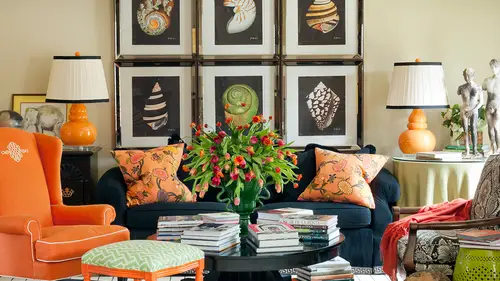
Okay so this is fun keep in mind this color palette and then look how close this one is but how far different it is isn't that kind of amazing? I had no idea again until I put thes side by side that this pink in this green are really not that far from this pink in this green but could these rooms be farther from one another another both feminine but this one's a lot warmer uh and the the other one was black and white what she would think there's nothing more dramatic than that that to me this one's really more dramatic in many ways the the stripes on the ceiling are much stronger to me then that subtle pattern and the other in the other room and the strong green on the dry paree and the bed and the lamps look at how much more percentage of green there is in this space already so it's supposed to two little lamps it starts making a huge difference right off the bat right? So our inspiration or my inspiration for this which is again another show house we're going to see lots of client pr...
ojects again later but show houses are again remember where I sort of create that runway look a little more daring so this when I was thinking was in the hamptons but it was a summer home a summer it was in the summertime when this show him um opened and I was thinking more like palm beach flavor citrusy tones. I love the chinese inspiration with the shin watari pattern on the fabric. And so we brought that in in this little cabinet and at a different sort of chippendale fretwork chair there, and then paired that green with a coral for this really warm result, it's almost like it's on fire and it's glowing the room where the where the other one I think, feels really cool like that. Black and white makes it almost a little icy, even though we know we have warm creams in there. It's not cold, but much cooler, this one to mejust glows, and then, um, the little pop of shar truce to break it up, so that starts adding that more interesting sort of thinking on the color will a little more interesting combination of the j, the coral and the sharp trees we do people live in these spaces, or do you install the rooms? And at the end of the show, you take the room away? It depends this one. I think I can't remember if we painted over, I think we left the the peach grass cloth and this one bitten off the ceiling, which is a little strong for some people, but I did paint the same stripes in the coordinating bathroom, and I think they remained so you know, it's it's pretty strong to have these stripes on your ceiling, but there are people who would love this. We do this sometimes in children, spaces or nurseries because it's really fun for babies and infants to see color on the ceiling, because that's what they're looking at all the time, and they love that graphic their eyes can perceive the contrast really well. So that's kind of a fun, clever place to use the stripes on the ceiling. I also noticed the saturation of the color makes him more dramatics. Yes, when I was trying to choose my colors, I was I didn't know if I should do to saturated colors or tone down the other one. I didn't know how dramatic it would be, and I feel like I can see it now. If you get too saturated ones, you can get one that's like a whole peace. That's very dramatic. Yes, and so that's. Why I left showing these two next to one another because they're almost the same color powers, but one is much stronger than the other on then we also see just, you know, as opposed again. This is a great lesson in being careful with paint on the wall, because look how strong coral can become, even in this paint, on the wall vs yes, this is a lighter shade, but also it has texture and it has the grass cloth texture to it so really turn tones it down it's not solid, it has movement and reflection and all sorts of things so even down to this blanket, which is really almost the exact shade as the ceiling but because it's got texture to it, it's not overwhelming and it's not a strong even as the paint is so and then I love let's see if we could see those lamps better in another shape. I love these lamps we may see him again in a minute, but they're made of bits of recycled glass can you'll see him in this picture there amazing, so similar but completely different to the venetian glass lamps because they're all of these layers of of reclaimed recycled glass made into a fixture which I think is really interesting it almost looks like a crystal like a natural crystal but really, really fun. So again, green lamps, but far different from the green lance in the other space right on dh then we talked about this a little bit yesterday, but I love what happens when you use a different material like these pieces of art a hand I was reflecting that whole shin watari, that asian kind of influence which I love from the from the twal from the drapery into the artwork, but I had him custom tinted, almost that exact color of the wall, so they're really just a extension of then it adds depth and interest. Do you all see that? How how had they been green? It would have been a completely different look. It would have been really strong, and it would have been competing for attention with a lot of other things in the room and way know that there's a lot of things already getting attention in this space like that crazy stealing, so really didn't need that toe happen on this side of the room. So it's all about making those decisions, I have had a balance the color through a space on then that short truce pop, which I love you can't even see in this image, but it so it's, really just almost like a tiny little piece, like maybe that five percent or one or two percent, this is the stripe I made from one of my own fabric patterns, and I custom colors that actually took each one of those three killers and combined them together in the strike, because I love that little bit of a matchy kind of approach to bring everything together in one place there's that great picture of those lamps, the recycled uh lamp and then this is an antique and we talked about that a little bit yesterday because it's so much more fun and interesting tohave a collected like nothing's not everything's no you didn't didn't just go out to the store and buy the whole showroom floor but there's a story behind this get speaks to that bamboo trend we were talking about because it's a bamboo mirror but really the color is one of the reasons I chose it because it's really almost the same a line is that coral town in the space so not a departure at all there and then look what it reflects that reflects the chair and the other side of the room so again noticing when you're using mirrors what they're reflecting cause they could even help enhance your color palette there on dh and one more shot across the bed there's the bathroom you can see what how different the stripes are on the wall versus on the ceiling which was fun and then a little short truce here it just so happened that one of my favorite artists I didn't even commission that painting I had again to sign the room it was a happy accident that she had created the same color palette so you know yesterday where I was saying that create looking to other creatives for inspiration on color palettes what are the chances that she has a jade coral and chartreuse painting we were kind of on the same bad there accidentally but it just looks fabulous in the space and then the decision to keep a lot of the other things really simple like the rug it's white but with texture this chest is white and really kind of we'll talk about this afternoon one of my favorite historic designers dorothy draper, who was a designer in the twenties used to do things like this little kind of green there's a little pop of color and dramatic sort of pieces of furniture and we'll see some of the things she did so that was a little nod to her but having a tiny little kelly green pop which was really sort of one of the things that she liked to do was add detail in an unusual way because you'll see some of her color palette this afternoon were really bold yes, it seemed like you had a little bit of green around the bottom of the bed as well I think it was the well ting on the let's see is it on the so so I did a contrast well, so yeah that's a great you have a good eye for detail you can see why she's in fashion so as opposed to bringing the pattern down to the side of the bed I was making a decision to work kind of keep a lot of the sort of other elements neutral, but I did take this fabric and had him turn it on the bias and use it as the well to pipe a white fabric all the way around and again you're starting to see the teeny tiny little details that designers used tto add all of that depth and they wants it's I mean it's it's kind of mind boggling when you break it all down is this accidental er this on purpose like for under the mirror the table is kind of the same bamboo but it's white exactly it is well and then this guy found later so that was sort of an accident but when I saw this it was reflecting the idea of bamboo and then you can't really see here. But another trick I did was I found some malachite wall covering while paper and ordered one roll and covered the top of the desk and then put a piece of plexiglass on top of it. So when you sit down at the desk, you're looking into this little kind of neat again like a jewel box effect a little surprise again these are the kinds of little things that designers love to dio that ad that interest so underneath that you can kind of see that it's dark it's got a pattern and malachite really is a natural material it's like a a stone or a gym and it kind of looks like this lamp there is a question by amanda that because we're a few other people of us and that is when you have these highlights, like the malachite lap and other labs and things that you've had do you spend a lot of your time trolling antique stores or do you have people sending you things because they know who you are? How do you get those but my lights and you know that old saying that it takes a village it's really kind of truth? You have to spend a lot of time out there looking but that's also the beauty of the internet force now, because there's amazing sights that I love like first dibs and one king's lane and all these cool places, first dibs is basically like an online antique mall and has everything from really, really traditional english and french antiques to mid century, so they kind of do the work for you. I love one king's line and other flash sales. You know, a lot of people know like guilt and and other flash sales johnson main and some of that one king's lane, I think, does a beautiful job of really curating, and they have tastemaker tag sales and I do have done three or four with them. I have another one in december so, like you can go on and buy things that toby has curated foryou and collected which is really fun because then your going out and they have them all the time with the top designers all the people that you're loving that air featured in house beautiful are having these tastemakers sales and things that maybe we're in a show house that they did or that they just find somewhere and they pick up and haven't used it in a project yet so but yes constantly going and looking for those and you know what we were talking yesterday about finding inspiration when if you can start planning trips where you have an extra day even if it's a business trip so that you can go look in antique stores and little you know even little junk places and you find the most amazing things on one of my friends is a designer just found some great door knockers and she had them applied to either end of the day bid made by hickory chair which was unbelievable and they had this patina to him and they were so cool and it just added that you know one step beyond a day bed in a space you know it was like wow, our conversation piece so interesting s oh definitely yes it takes a lot of time to find them for sure I want just one more image to a decision here to keep a surface completely invisible but using it in lucite ah, and then here's, another place where I decided to bring this bold chair on dh combined the color palette on one piece, but having the legs of the chair painted in a bright like or finnish and I do that a lot particularly this is a new chair, but particularly when I'm finding old pieces are we using a piece that was, say, someone's grandmothers that they think is really boring like a wing chair? And we'll pop like a purple lacquer on the leg of it and then put some fabulous fabric on it and suddenly it becomes their favorite thing in the whole space and it has meaning because it speaks back to their heritage or just something that someone they really love collected on their own. So so really a fun way to bring that together so yeah, fun, right? So let's go departure, but not so look at what happens when you bring black and white like we looked at yesterday with basically americana red, white and blue on dh what that means so again noticing how I have black and white in the spice and really, when you look at the balance here it's not unlike what was happening in that new york show house, right, but then again very different cause it's a lot more traditional this was a show house in richmond virginia, on the james river even have another bust, which is funny, I find notice things that I do in a signature way so it's kind of we all have that design personality that maybe we don't even notice that we do because we had the big bust on the center table in the new york show house, but this is more taking traditional elements like this really traditional sofa and making it fresher about the tent or tone of the fabric that's my greek key fabric design in and you'll see in a minute I created this fabric, thinking ahead of how I like to bring color and pattern around the space. I made the stripes. Ah, with that, I could cut them and use that as a border either down the drapery leading edge are sewn around the bottom of the skirt of a sofa or a chair, because it's really hard to find tapes and embellishments that air that big, and if you do, they're really, really expensive, so you could buy this in a few yards and cut it and use that as an embellishment, which is really fun. And yes, I initially notices like the railings, and then I see how that's all pull together by like this. So far by like the stripes in the carpet by you and if I look at the different like tables there and how all those lines kind of all fit together they're different but they all mix together so I have you I love this because I have you seeing beyond and met you may do that already because of the profession you're in, but a lot of people don't and this was the whole idea behind this exercise and what we've been working on for a few days is having you really start tio zone into and go deeper into understanding the balance in the space and you're right so I could have made this really traditional sofa in like a white finish but it wouldn't have had any point of reference to this and this may have seemed really heavy then right? But because we decided to use a stained finish on the sofa it really had a point of reference to the banister and they both become a color in the space and you know that that brown tone it really almost leans more toward speaking to the blacks it's really about contrast more than color here, right? And then I had the rug made and repeated this exact shape and pattern here point of reference here and then do something really crazy like when I told this company I wanted them to lacquer these police most shares in powder blue they called me at least three times now you're sure you want this color? Yes, I want this color. You're sure you know how blue this is. Yes, I know how blue this is, but it was part of the whole scheme and it made sense, and I knew it would speak back to the silk pillows and the other things that were happening in the space. So it was a very specific and planned decision for me, not something that was accidental, you know, and then even just the tiny little red welt. So, again, I think I mentioned this yesterday, but the inspiration for this space was that it is a historic home is on the james river there's, just richmond, steeped in tradition and history on dh. So it was all about bringing a lot of those traditional forms and shapes, many of which go all the way back to greek influence like the cleese most chair and the greek key pattern. But so did I. Ah, lot of the historical architecture in this town have those same sort of beginnings. Eso again a great point of reference here's another look on another of my favorite artists who again, it was on trend with me, so I didn't leap for this whole room because of this artwork, but my friend kat scott carroll he's a brilliant artists made this painting and he was working in that same kind of trend so again you're going to a lot of time see a lot of creatives that have synergies between things they're working on and color palettes and other things because they're seeing the same things when they're out in the world looking for inspiration andi here you see the drapery with that stripe of fabric used as a detail on the leading edge there so and then these are all all of these fabrics are mind this one this one and this one so I really customize those so you could go out and do this in your own home if he went to like spoon flower dot com or another web site that allows you to do this you could pick two or three patterns from their website and create your own color palette and have so much fun yeah I really love this room and what my eye turns to is actually how you started bringing like circular things in from that chair on the left you like looking at the table and underneath it and that curves in there and then the table on the right yeah and just how you're able to bring and comes into a lot of things that were very like linear yes and they soften it and even like the chinese lantern that I created for that you'll see the big one in the second and it again that's how you can bring in some things that would otherwise be really bold just like we were talking about the phillip jeffries knew what they were doing when they made that fabric are that wall covering with the square in the circle it softens it eases things in because this is very dramatic so if every angle and every shape was harsh it would be a little bit too strong on you repeat those curves and here's a circle again and that's not accidental that that happens it's all very planned and then this for me is definitely signature in my work now there are other designers who don't do this at all and their approach is very haphazard and collected and it's it works and it's beautiful this just start showing you really what my design personality is a about and how I like to really coordinate and doesn't that speak back to my my background my personality I have an accounting degree and a design degree and isn't that kind of literal and structure that toby likes to go there's a circle here's a circle there's a square here's a square like I account for it in a space so again it makes sense right you can really see beyond its uh why someone like me would do that and yesterday you know how we were saying it's the eye plus the mental plus you know the brain plus the body it's all those parts that allow us to get into some color psychology it's really all of those parts of you that if you'll embrace them and follow your intuition that we'll start showing up in your own design aesthetic that was a really long hallway which was really fun to because a lot of people you know, yesterday I showed you the entry hall that was right next to a dining space for eighteen and we had seating in it and that's another thing that will get into if lighter and some of my other courses about form and function but I think it's worth mentioning here this was a huge center hall and it could have been used is just a space for people to walk through but I chose to use it as a face that people could actually use so there's several seating arrangements and this sort of again a library you can see my love of books with the library table and the secretary and it would be great for entertaining for this to become a secondary space for people to really use so I'm very much inspired by function. Yes, um I have a question about the color palette uh just the placement of the colors is there a reason why you put like the squares on the side? Yeah, yeah like white and then power just to kind of show you the progression from the light lighter tunes like it was a little bit of blacks in the middle, of course, not necessarily. But I think that it's, the kind of shows the progression of the drama in the space, a little bit on dh. That red was the smallest piece. So make mostly white, then believe them, black on dh, then some small bits of the darker blues, and maybe so, really more about the percentages for you to kind of see on. Don't know that we were that consistent in every slide, but that's what's the case there. But I love to pull these out. Isn't it fun to pull out as just solid colors, what's happening in the space so you can see them and really understand their placement in the room.
Class Materials
bonus material with enrollment
Ratings and Reviews
1st Carpet Cleaning Ltd.
Very convenient and creative! Continue In that way!
a Creativelive Student
Fantastic Course!!
Student Work
Related Classes
Interior Design