The Right Color: Family/Dining Room & Kitchen
Lesson 19 from: Using Color in Home DesignTobi Fairley
The Right Color: Family/Dining Room & Kitchen
Lesson 19 from: Using Color in Home DesignTobi Fairley
Lesson Info
19. The Right Color: Family/Dining Room & Kitchen
Lessons
Day 1
1Class Introduction
10:02 2Color Models 101
26:46 3Color Schemes 101
45:39 4Debunking Color Fears
44:02 5Debunking Color Fears Pt. 2
25:23 6Evolution of Tobi's Color Style
42:37 7Evolution of Tobi's Color Style Pt. 2
44:12To Trend or Not to Trend
12:47 9Color & Design Trends
31:36 10Color & Design Trends Pt. 2
25:37 11Tobi's Color Inspirations
22:09 12Tobi's Color Inspirations pt. 2
23:29 13Using Inspiration Boards & Q&A
19:43 14Psychology of Color
36:34 15Color Meanings
17:04 16Psychology of Color Q&A
12:55 17What to Consider Before Choosing a Color
26:20 18The Right Color: The Entry & Living Room
19:27 19The Right Color: Family/Dining Room & Kitchen
21:19 20The Right Color: From Bathrooms to Outdoor Spaces
20:05 21Pairing Textile Elements for Success
28:49 22Pairing Wall Color, Pattern & Texture
24:42 23Floorings, Furnishings, Art & Lighting
19:04 24Intro & Top Color Palettes: NYC Showhouse
24:41 25Top Color Palettes: Hampton's & Richmond Showhouses
21:31 26More Top Color Palettes
33:46 27Layering Color Palettes in Your Home
38:16 28Transitioning Color Palettes in Your Home
28:08 29Historical Overview of Color in Design
16:47 30History of Color in Design Examples
43:59 31History of Color in Design Examples Pt. 2
16:32 32Color Mistakes to Avoid: 1-6
31:20 33Color Mistakes to Avoid: 7-10 & Final Q&A
40:06Day 2
Day 3
Lesson Info
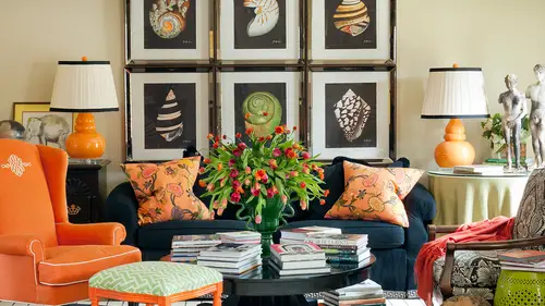
The Right Color: Family/Dining Room & Kitchen
So on and then a family room which is sort of like a living room but for most of us a place where people hang out more and you know, like just t watch tv and it's more casual and that sort of thing so this is a family space not their main family room is sort of a secondary room and the whole roll of this room was for everybody to pile in there and watch tv and play video games and it's near the kid's room so the kids could feel really at home s so what do you know what it kind of vibe how do y'all feel about this space? I love the spice I you know I really love the that the kids are in portrait up someday the silhouettes did you did they have the silhouette? So did you commit? This has come from jonathan adler who already knows so quirky and my favorite part is that the baby has their passing and continue l see it reminds me of like maggie simpson on the seven seas with cassie that she's sucking all the time but it was either that or a moustache and I was thinking I'm pretty sure the b...
aby doesn't have a although the stash is a really hot right now through this year remind of put moustaches on everyone for fun um but yeah, so it's it's a little quirky right a little bit funky and a little bit irreverent innocence and pure design interior interior says vibrant personalities as well is that fun, playful and they really do in particularly the mom of this household as a very vibrant personality. So it was, uh we were kind of thinking, relaxing plus energetic, and those are the opposite of each other. So how do you relax would say energetic at the same time, it's that, uh exact gets the position of each other, but it really feels both don't you think so? That's what we were saying earlier, like, if you were gonna have several activities in the space and the percentage of each one you put on the wall had we done pale blue on the wall, it would have gone a lot more relaxing and a lot less energetic, but we achieved that relaxing component of it by adding quite a bit of blue in the space, but we kept the energy in the room by really wrapping it in this warmer color, so more energetic than relaxing, but it's a space that you could relax and you're not going to feel agitated or like you couldn't take a nap in there if you wanted to, um, I think that's a perfect example of a blend, okay, so here's, another sort of family room um really, two teenage boys in a mom and this is sort of a space that the boys hang in most the time. So what do you think about this and it's? Pretty interesting to see so much glass in a room for teenage boys, isn't it? Like I'm looking at the glass chests over the other side on the blast of a glass chess it uh oh, yeah. So yes, so they were on and they were a little older, so, you know, like teenage towards college, and they actually are very intellectual, both the sons are now actors and growth, but they loved to play chess, and so we created them and she it's a mid century house, too, so we didn't want a chess as in the way that you wouldn't think of chests in the library, which could be a little stodgy and a little old. Um, we wanted it to be cool, and they're starting to come in. We have intellectual classic casual from any vincent keller was does say, looks very grown up. Yeah, so a lot of spaces we do for teenagers kind of maybe tweens if you call him that that we want to grow with them so it's not so serious that it couldn't be great now. It is a lighter color uh sofa but but then you go well what's it made out of what's the content while sun umbrella so you can clean it and but you can get this clean, crisp look and they also um the older son was the actor who was already living in california coming home periodically and really, really loving the whole california modern kind of feel so they loved big, overstuffed white furniture and that whole kind of vibe that they get when they're when they're in california at the beach the the first word that came to mind was supportive of what they wanted to do that what whatever activity that decided do it because it's not too cluttered with all the color and stuff but it had the red energy and then we put the little spicy animal from cheetah print on the floor, right it's not like on a chair or anything but it's just a little bit little pop of fun and again a reverence or um you know energy there too, but ultimately a very what we would call a neutral envelope, right? Um okay and then here's that second home family with space that we saw yesterday so it's it's kind of related to the last one but the wall color is quite a bit different this one was a lot lighter and this one's warmer right? This is the house that's at the lake so lots of nature inspired like woods hee and green tones and cozy and then also by the entire sofa being brown here versus this this's two boys usually just one very reserved I like to read and play chess this is a whole family of girls and all their friends and their nail polish and probably red red drinks on the sofa and people piling up there every weekend so the sofas brown here s o that's something else that we accomplished with function and, um then interest um interest with color and chocolate and depths in the whole nature thing but we put it strategically on the surface so it's hard working and then here was my family room before um so how how do we think this feels? It's a super friendly, room friendly that's what everybody says about my house like they feel like they could all come in and just sit down yeah, thank you. You think it's fucking going about that the one before you had that really interesting big square coffee table that was upholstered so you could sit on it but it's a coffee table with stripes that I had wooden legs and it looked a bit beeton when this came on I was just thinking how interesting it is that if you picture you remove your books on your table and your stuff, and then you put your that's, sort of all the luck king almost killing me, thinking that, oh, yeah, and how that sort of change is the space against yours gets a little less edgy and a little bit more formal, I guess, or a conservative, or relate back or something happens. Grandfather made that table so it's important to us, and we love it. In fact, my husband says, that's the one thing my wife actually let me keep from the marriage because she likes everything l said, not quite, but all those s o I love that you said friendly, because that's, what people say a lot about our home, that it looks friendly and inviting on maybe that's, the orange that also helps achieve that. Okay, so we're getting some great ideas on the right colors for the right room. What about the dining room? So it could be a formal dining room? Maybe that makes an impression on guess. We were saying the one client was goingto see eighteen or maybe you have more casual dining in your house. Some people don't even have a a an actual formal dining room, a friend that I had dinner with last night, that's a a designer said he's buying a new place and it doesn't even have a formal dining room you can't imagine what that's going to mean for for how this house functions and what it says about them. So so how do you keep people feeling engaged? But you have them enjoying food and all sorts of things well and then bring in people's personality so this is back to the wife that was really daring and fun and the husband was super conservative on dh then read we heard earlier is it is good for appetites and it makes you, you know, hungry it makes you eat so that's appropriate for this space and it feels warm color wises it's fun to my dining rooms feel like a dramatic get away or a restaurant in your high? I agree, I think that's really fun because you're a lot of times your formal dining room is not like your eat in kitchen that you're in every day, so it is a little more fun to make it like a restaurant in your own home here's another option so this is really the opposite? This was a lot of contrast where this is almost no contrast and the thing that is contrast in here is the dark table where over here we had a really light table both work but for different reasons that this again to me fills this goes with the living room that we said was her grandparent's retro vibe and this goes to still that sort of that color palette, right? But still glamorous I think it supports that that glamorous look shimmery fabrics change these this is a satin actually believe it or not s o and then that paired with distressed paint on the chair makes it not so glamorous not so edgy not so formal so we're playing with a lot of details this was my dining room before and one of the things I loved about the spaces the seats of my dining chairs are vinyl short truce final so I could just wife I mean almost like hose them down but that also becomes the pop of color in the space I'm taking something like a cruel that's really, really traditional and making it look more current and more new so and then very light on the walls here s o that light neutral to support and it's not unlike the color palette here but very different right? This is a lot more traditional even though it's because it fits my nineteen seventy six traditional brick home and then this is almost the same color palette but we've introduced the blue and it's suddenly really gland really, really sophisticated and layered and in your own home I noticed you painted the walls, the moldings everything the same color yes, because the there was nothing special account tiny that molding is at the ceiling so either I would have added something to really make it architecturally interesting or I just want it to go away and let something else become the star of the show so it was really even than the wayne scott coming and everything we just I love the dimension of it, but I didn't want to highlight it out didn't want contrast and it's not a very big room and the red square and the round table almost fills the whole thing up so really wanted the walls to just support it and not to be a star of the show not draw attention eso this one yes glamour and strategically placed color which works really well for there in transition we'll talk about later and then what about this one way to look at it gets a bit let's talk about it from the standpoint of its chart truce and purple on how we get to that what do you all think about this? We actually had a bunch of questions yesterday on ceilings and how you would work with ceilings we had bethany was a bethany who was going to paint her bedroom doc teal and wanted to know if it was a good plan to do a goldberg katie wallpaper or a straight up gold on the ceiling of the bedroom or whether those were too powerful planes there that would be very powerful that it could work if she supported it with the other things in the house but I think if that isn't really dramatic to go bold teal on the wall and then a gold damn iscor brocade on the ceiling because you'd be lying there looking at it we have on the ceiling in the bedroom maybe is is a damn we saw one yesterday that I had put the gold on the ceiling with cem some turquoise but I didn't go strong on the wall it was the reflected gold ceiling was an extension of kind of a gold ish color paint on the wall so just be very mindful that she's going selecting a really strong contrast there on all very dramatic but this what about popping what do you think we achieved by taking something that could become really, really stuffy and putting something unexpected like the purple on the sailing? Well that's what changed me says it would never have thought to do that but the lilac works for me makes it feel formal but younger yeah younger and you were saying yesterday your favorite colors are green and purple so short truce and lavender a version of that beautiful together and it just kind of takes the edge off it's just kind of that little bit of whimsy and fun on people walk in there and honestly almost everybody that walks in like that it's like three is that purpose that laughing on depending on the time of day? It's really hard to see but they love it it becomes people's most favorite detail in this entire house mystery cashew design says that ceiling was very past a formal on modern and pure design interior says regal yet like freshly regal is there such a thing will and kate aren't they freshly regal would do something but is pop purple on there? You know, very appealing and mcqueen would probably so what about kitchens? So let's talk about kitchens well, this was existing wallpaper that's kind of aqua and an existing countertop and a lot of us deal with that particularly maybe an existing granite countertop or something that you don't especially love. So how do you start creating a space and picking colors that support that on dh? So we were transitioning the house from this aqua color palette and this is the room we've been looking at several pieces of this in we'll see later kind of a tour through the house, but it transitions from other spaces, but what do you think about it? It's really subtle, right? But what if there's a ton of people in the kitchen? What if there's they do have they don't have twenty people teo entertain at a time, but maybe ten and this is not a very big kitchen, so if this is full of conversation and noise and hustle and bustle isn't sort of nice toe have a calming atmosphere underneath that because a lot of us have really energetic, strong colors in the kitchen, and then all the people get in there, too, and it feels hot and overwhelming, and I know when I'm the cook, I'm like you all need to go in the other room. Ah, and sit down while I have make the meal, but that's not what they ever want to do, right? They want to be right there in the hustle, in vessel with you. So I loved the idea of using a cool palette that really tones the noise down a little bit on the visual clutter. What any anything, any comments on that eye agree? I think I like galley kitchens more and more because they're narrow and not too many people can get in a when you're having a party there kind of forced to get away from it because not only the color, but all the surfaces, air hard infractions, and that just elevates it because everything and yes, and you lose the peace, and I find more and more that that in the kitchen people want like this one that you all love and have mentioned and it's everybody's, favorite. They really want that serene idea in the kitchen, which is interesting to me because you used to think about it is like the most energetic place in the house, and you think yellow, which I also love the yellow kitchen, but more and more people are saying, I want serenity, I want color free, I need to calm down the noise in my life, and I'm always in the kitchen. So how do we bring that beach? You sort of feel and that you know, that relaxing concept to the space here's there's, the way it looks on the other side, which we've seen, but to not get so relaxing, where everybody's falling asleep in their plate at dinner, what we've done is bring in the warm wood turns on the refrigerator, the warm tans on the chairs, and again, I've used by and also from a practical standpoint, with children, if you were doing homework or crafts or eating in, really wipe it off. So it's a great function, uh, peace, but also warm, but it's in a lot of natural sunlight coming in, but I find it more and more people are asking for the sea. We'll feel like you would want that in your own lives, t that feel good, or does it feel a little too relaxing for making you want to go in the kitchen and cook? Yeah, um for me is to relax because like I said, going in the kitchen for me is a chore. It's not something I actually enjoy doing right? So you need you need high energy, and they're so what would you what color do you think you would select for a kitchen if you're working on a kitchen? Your dream kitchen? Um, I probably would do a blue, but I do a different shade of blue, so something brighter, even a classic one of my best friends. Who's, a designer in north carolina, has a classic blue and white kitchen, which I just love and it's, but it's not stodgy, like you can imagine, a lot of the traditional blue and white it does have collections of antique dishes, but it looks really fresh, and she always uses pops of yellow and her flowers and so it's, really cheery. And, you know, one of the things I love in a kitchen, too, is having the sink a window over the sink. So when I'm at the sink and look outside and see the sunshine and see nature and the idea of bringing that that sunlight and nature in a kitchen looks great, too, wei have a great suggestion on line for the the ship that doesn't want to shiff but first I wanted to give you some feedback on the a lot of people are saying this feels like the vacation home by the ocean it's just a client specifically asked for they're not stark wives have a lot of warmth that looks like you're looking forward to a vacation I was going to suggest you just slide a disco ball in the middle of the kitchen but pure design interiors has a way better idea, she said I've just designed a monochromatic kitchen with a ferrari red oven so maybe you just have love texture that's the k to your cooking that there are a lot of appliance companies now that make your oven in any color orange, turquoise, red, green and I think that's a fantastic idea and again a fun strategic way to use something that's exciting? Yes did you have, um I was going to mention and I was trying to study function way and failed miserably like, um if they always mentioned how like the kitchen inherently is warm because of the oven right there. So I said this is a great way to cool it down yeah, right they can then you can also like your appliances not the flies itself, but like maybe um uh the cattle on top of the oven could be read or something like that, so even the tiniest details. So yesterday, when kenneth was noticing just the flowers being yellow in that blue and orange space, like jeff it's, a red tea kettle on the stove could literally make you feel like a space had a pop of energy, I'm here's the retro fund version of the the client inspired, inspired by their grandfather, parents, brady bunch palette, and it does, doesn't not a little bit with the stained cabinets and the really modern forms to that sort of seventies mid century. Um, so totally different than all of the white cabinets that everybody's loving these days, but I still I still like this, um, was the lamp there just for styling? Or is it really the the lancer there? So the island is huge, really big, and I knew you couldn't reach the center, and it wasn't gonna get in the way, and I thought, what would be fun and clever to not drop pendant lights that could cut off the view from the living room across to the kitchen? And so I put holes in the in the granite and ran outlets underneath in the land literally sit and then there's, a pair of them that sit in the middle and thereby jonathan adler, so they bring in that mid century vie va's well, so they helped with the sort of styling peace also but they actually live there on work as opposed dependence that was kind of fun, isn't it on dh then here this is the one I was talking about earlier so totally similar color palette but totally different feel completely different this is the one I was talking about sally where we did green on the beadboard ceiling and then we had for the reclaimed uh, beams and it's much more sort of france your country feeling much more traditional on this is off of the house with the purple uh, dining room ceiling, so the short truce from the dining chairs in the next room is coming into this space but it's really it's traditional because the house is very traditional but just a little bit more young and forward. Isn't it interesting how grainy and something like how home maybe or rustic it suddenly looks because so those bay mes because that kid in the kitchen we were talking about was the one with the wide out coffin ceiling so even they could see the definitely different planes but that's amazing the difference that makes and then we talked about this yesterday said no need to really belabor but we were already kind of noting how just bringing in accessories could start changing a space I love to keep a kitchen very light. And so even in my new house, I will probably go back to wrapping my kitchen. Just for me personally, I like my own color goals in the kitchen is sport to feel fresh and bright and clean, uh, and tidy. I like to have everything put away. I don't know, I love this for party and entertaining, but then I want everything to go in a cupboard, because I don't want a lot of clutter on the countertop I wanted to fill, you know, very visually quiet, so, so that's what I would do again. But my goal here was warm it up with a certain shade of creamy white and layering tones, and the the backsplash is dimensional, but not contrast ing and just a little bit warmer. And so it's, this simple it's, a subtle layering of color and texture again.
Class Materials
bonus material with enrollment
Ratings and Reviews
1st Carpet Cleaning Ltd.
Very convenient and creative! Continue In that way!
a Creativelive Student
Fantastic Course!!
Student Work
Related Classes
Interior Design