Lessons
Pre-Show
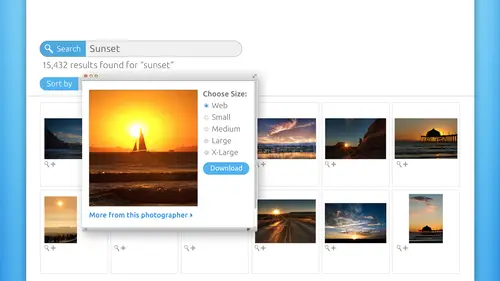
05:48 2Introduction to Microstock
19:26 3Learn What Sells
1:04:55 4iStockphoto Trends
17:07 5Model and Property Releases
09:15 6Cropping and Composition
31:14 7Shoots That Work
14:23 8JPEG vs. Raw
10:08Lesson Info
Cropping and Composition
So the third secret I want to share with you for getting your images noticed. And this is especially important in the small, small smallness of those thumbnails that we were talking about, which is the potential customers. First impression of your photo and also the image inspectors. First impression of your photo. If you crop in unconventional ways, you can sometimes make incredibly striking very different beautiful images. So I've got some extreme examples to share with you on that. This is an incredibly popular image on Istock Photo, and never in a 1,000,000 years would I have ever crop this photo like that. Never. I would have never thought to do this. But it works. It's absolutely beautiful. We don't need to see the entirety of these faces to get the gist of it. You know, grandparent's grandchild, family happiness, fun learning from our elders, which is very important. They're supposed to be wiser. They've had more experiences than we have. So while you would still need a model re...
lease for you to be need to unless the kid was a, uh unless that the older gentleman was the legal guardian for the child, and you still have to have two releases, but maybe he could sign both of them. But this is a very unconventional crop, so be bold. Be daring because you want your photos to be noticed. You know designers are going to be downloading those. They need striking images to capture people's attention, especially in advertising. So cropping like this can really pop up the level of quality of your images and your sales. Here's another couple of interesting crops I would have never thought to coffee image on the left like that. I would have probably left all of her eyes, you know, in the room of her glasses. But that works incredibly well. There's not quiet enough room for text on the left, so if I was shooting that, I would have recomposed so that the designer had more space on the left. But it's still a new, interesting, rather unconventional crop. You know, the top of her head is gone and the side of her face, you know one face side of her face is gone, so that's very interesting crop. The image on their rights kind of the same thing. It's also an interesting angle, and there's been an interesting color treatment applied to that. We're going to talk more about what is OK, the do's and don't of Photoshopped processing. And this is one of the rare instances where a creative color treatment as a lot to this image, because it's an extreme close up. We've got kind of a duo tune going on for the for her skin and then just the iris of her eyes lifting color. But we've got a lot of space for text over there on the left hand side, but it's still an interesting crop in an interesting angle. Very, very, very compelling image. This is also an interesting crop, but if I was shooting this, I probably would have gotten a little bit more of his body in the frame. But it's very powerful because the photographers close to the subject, so any time you get that close at the photo tends to have more impact. But we've got the whole left side, you know his arm is gone, but it still works, and the designer has tons of room for text on the right hand side. And as you can see, black and white images work quite well as a photographer you have no idea who's downloading your images. You cannot assume any level of Photoshopped prowess by anybody. He's downloading your images. The designer for the Bowling Alleys newsletter may have no clue how to create a black in my image from a color so you can absolutely submit to images for this when I guarantee you the photographer if he was smart, he uploaded. He submitted the full color version, and he submitted this black and white, which looks like there's a touch of blue in it, so you can absolutely do that. And the design will appreciate it because they might not know how to do that. They may be designing in Thor forbid Microsoft Word for all you know, right so black and white works really well. But more speaking to this particular photo, it's the way that it's cropped and framed. That's interesting and gives it a lot more impact. And and the lack of color also gives an impact. Here is an excellent way to salvage a photo that he might not have a model release for, and I alluded to this photo earlier in the day. We don't need to see her face arguably her face would be detraction from the message because you might get caught up in that. But what's important is the rest of her body, and you don't need a model release. It's a fabulous shot, but the angle of it is unique. The crop is rather unconventional, but it works. Designer has a lot of room for text on the left and that the designer chose to they could crop that photo to the left of her body in there still room for text over on the right hand side. So depending upon what part of the image they needed to set the text on top of it would work for them. So this is a great, great idea for shooting. This is another unconventional crop. Never in a 1,000, years what I've thought to chop his head off, but nevertheless, it works. We don't mean a model release for this one, either. And because that hand is coming straight out to the viewer, you almost want You can just feel yourself agreeing, you know? Oh, my gosh. I'm already hiring this person is attorney or Oh, my gosh. I'm already letting H and r Block do my taxes because this hand is just coming out of me and it's so friendly. And he's dressed so nice and noticed the complementary colors of the the blue and the orange tie. So this photographer put a lot of thought. Notice the nice but not too fancy watch on the arm. Notice the nice belt, but they're not too distracting. You know he doesn't have a big old Coors belt buckle on their truck. Stop belt buckle on, so a lot of thought went into that. But the cropping is rather unconventional. But boy, howdy does it work. A designer would drool over that image because they could do anything with it. They can knock him out or not the background out. Put him on something else very easily. They've got a lot of nice room for texts, very compelling. The color palette is visually pleasing. Get the tie isn't my favorite ties for guys or Jerry Garcia ties? I love Jerry Garcia designs on ties, but that would not work for this image because then you get caught up in the design of the Thai, so it's just perfect in a lot of ways. But a very interesting crop secret number four. We've been talking about a little bit already, and that is to leave space for copy. This is probably aside from getting really good exposures on your images and just shooting, just having a beautiful image in both lighting and color tone. I think this is the biggest tip that you can take away today is to leave space for copy because designers are the one who wants her downloading your photos. Now that said in a lot of my classes and you've heard me say that in probably all of my 20 or so workshops that I've been here, it creativelive. Photographers can also download stock imagery to use in conjunction with their own to create unique pieces art. So, for example, we've done a lot of collages in my classes. You know, the oh so romantic soft edge of and yet you may have a shot of the nice happy couple, but you may not as a photographer, have a shot of the bed of roses or the pink rose petals or the what have you. So that's a great resource for you. Also is to download those images to use in conjunction that you would not be able to upload the result of that paring to a stock side, but you could sure sell it in your business. You know so. But for the most part, it really is designers who were downloading your images. So you have to leave space for copy. This is another great example of that. This could be for a massage therapy company. It could be for councillors. It could be for attorneys. It could be for mediators. It could be for, uh, drug alcohol addiction. I mean, there's just no end to the messages, but the nice big space for copy now what makes me like this one is that there's just a hint of a background that gives this piece a little bit more depth, so the designer would be setting the text right on top of that. It's doubtful that she would be clipped out of her background and put on to something else. But this is a great illustration of leaving plenty of room for text. So if you just follow the rule of thirds for composing your shot at the super easy to do this and it is more visually pleasing, here's a few more examples and a variety of categories. We've got the image on the left. What a great shot for, Ah, bar or pub or karaoke A night right? Makes people want to get up and get in front of that Microsoft microphone. Or that could be for singing lessons, all kinds of things. But all of these images have one thing in common, and that is they have a lot of room for text on one side or the other. And don't worry too much about what side you leave it on because the designer can't flip flop the image. But what you do you want to do is, for example, the image at the top there. That that Red Star means that image has been downloaded over over 50,000 times. I believe you. You want to leave this space if you've got a person, if you have a face in your image than the space needs to be in front of them or to the side of them. Okay, we wouldn't have left the space on the left side of the little girl because then it would look like she's smashing into the edge of the photo. So you want to give your subject room to breathe. Think about it that way. If you've got a mouth and in those, give it the space in the direction of the mouth and the nose. If you're shooting something that has wheels like a car or a motorcycle, then you want to have the space in front of the wheels. It gives it a sense of movement, even though it's not really moving. So you can kind of let that guide you look at what you're shooting is not a big deal with inanimate objects. But if you've got something that breathes or something that rolls, make sure the space the copy space that you leave gives them room to do so. And interestingly enough, I I believe I stopped photos. The Onley, one of any of these micro socks sites that when you go into search for images, they have a copy space. They've trademarks that terminology a copy space section in the search where you can designate that in your search and you'll only get results that have space. They have a little tick tack toe grid interface. And so, as the potential downloader you can say, I'm looking for images that have space at the top. So you you touch the top row of the tick tack toe grit, and it would give you back images that have copy space at the top. Or, you know, I'm looking for images. Have space on the right or space on the bottom. Those are the most common top right and bottom. But that's kind of neat that I thought, Scott, that built into their search engine. Here's another opportunity. This goes a little bit back to the everyday objects that we were talking about. Designers love this kind of stuff. It's so useful, so very useful to shoot stuff like this because they can talk about space for copy. Now the photographers given me a place to put it, and it looks realistic. With photo shop, I could make the text look like it was really written on that. Post it note, even with the slight curve, very easy to do in photo shop using the text work tool. So photos like that are incredibly useful. The photographer put a lot of thought into the color of that pushpin. I guarantee you I would have probably tried to go for a blue pushpin, a little bit more complimentary, but it's kind of a monogrammed, monochromatic color scheme going on reds and yellows. The photo at the bottom is another really great one. No model release required for that with the photographer. Put a lot of thought into the clothing that that person is wearing. Looks like a woman's hands, and they don't have, you know, red flashy nails like mine. So they're nice and plain and not distracting nails, and the card is very clean. In photo shop, you could take your own business car or the company or the client and put right in that hand and it be amazing. And how much less expensive is that for you as, say, an advertising agency, offering that to one of your clients, where you don't have to pay for the photo shoot and then pass that cost on to your client? You can you lie stock imagery for something like this, and it just works perfectly, saves you money, and you could pass that saving onto your client, and it just works out as a win win. So shots like that are incredibly useful secrets. Number five is to get closer. Now you can think of this as cropping with your feet and somebody somewhere said that. And it's not my phrase, but it's really, really great. So I stole it. Crop with your feet When you think you're close enough to your subject, take three more steps towards them. It's the weirdest thing, but will improve your photos. 10 fold. It will make them more impactful, more striking, and I've got some examples. This is another one of mine that's in my stock library. Not the image of the top lift, but the one at the right. The bottom right, the one on the top left would never make it into a stock agency. Not any of them, but the one on the right did. And there's a lot of room for copy on the left hand side. I love shooting macro shots like this, So I first shot the flower, you know, as the top lift composition, and I thought it was pretty. But as I continued to get closer and closer and closer and closer and closer, and I got as close to the Stahlman and the center, that flower as I could and then shot so I got as close as my limbs would allow me to get. And at the end of the day, when I processed, I had a nice shot that I could submit for stock. So get closer to your subjects physically and this always Sorry. Jim always works with beer. Always. Look, how did that look? Can't you practically you can practically feel the Effervescence of the bubbles. I mean, in your mouth starts the water just a little bit, and you can see the chilled glass and the beautiful amber tones in the image. I mean, all of us. Now we're gonna want to run out and get a beer in that photographers brilliant because he planned it that way, or she planned it that way. Imagine what little impact this photo would have if the photographer was farther away from it. But because they got so close to it and filled the frame with this very frothy chilled goodness, then it just becomes a much more impactful shot. Can also funny. Here's another couple of examples of getting closer to your subject. So here we've got a pile of money which apparently is totally okay to shoot because there it is, um, do take advantage of the company's customer service people. They're there to answer your questions as contributors because without contributors, they would have no business. So very job depends on you. So feel free to to interact or go on the websites and post on the forums. If you have questions about, is it okay to shape money? No, go into the forms and and poke around and ask those questions. But here we have a money shot Now that the for tire for? Because they got so that's kind of funny money didn't mean it that way. Since you giggled that I'm gonna giggle. But so they got close to this stack of money. So they got kind of down on the money's level and much closer to it makes for a way more interesting shot. Here's another kind of close shot on the end of a camera, so, but because there's no logos, they've photoshopped them out. Then that's a perfectly fine shot. I don't look quite a few images of cameras for use in my classes or promotional materials. When I'm making promotional graphics toe, publicize the class, then I will often times reach for stock photography for that kind of thing. But everything lacks in logo so that I don't have to worry about pissing off a Nikon folks, if I've got a cannon or vice versa. Here's another example of a close up as well as an interesting crop. I would have not thought to crop this image that way, and maybe when the photographer shot it, they were further away and had a wide lens or something. And then in post, they just cropped it that way. But it's a fabulous shot. It communicates. You don't need a model release you. The people in the background are blurred enough where you can't recognize their faces. Probably don't need a property release, either, because you really couldn't tell where that was unless the restaurant had logo's on the umbrella. And it looks like they they did. They're gone now, but that's a fabulous shot that can convey so many different messages. I mean, you could practically see that one on, you know, a vineyards, promotional materials trying to get you to come in and do a wine tasting, and you don't even have to worry about what's on the wine bottle because it's blurry. You can't make it out. So close up. Get closer to the thing that you're shooting in. The unconventional crop works really well for that along the same lines, to help you create visually interesting striking shots that stand out that also looked really, really great as thumbnails. You can shoot from different or odd or unexpected perspectives, and we've seen a little bit of that. But I want to really drive this point home. Aerial shots very popular Right now. They're unexpected there, little bit different. So any time you can get underneath something or above something that can oftentimes give you a very interesting shot, the shot on the left, we don't even we don't need a single model release for. But we don't need to see those faces to communicate that message of winning of team spores, of competitiveness, of celebrations, of the joyfulness, of doing something well in winning. We don't need faces at all if that faces would be distracting from that. But do you notice? It looks like we have a little bit of ethnic variety in the arm, the tones of the skin, which is good, and we've just got red red wrist bands and red shirt. So it's hard to tell how much work the photographer put into this. This could be just a serendipitous shot at a at your kid's soccer game, or what have you. So a shot like that is it was really, really nice. And because there's a little bit of cloud in the background and a little bit of trees in the background, it gives the image a little bit of depth. But you just don't need those faces to communicate, and he's higher than they are. She's higher than they are, so that's a unique perspective. Carry a stepladder around in your trunk or your truck. If you can fit it. Don't need a big, long extension ladder, just a little stepladder. Here's another great illustration of an interesting perspective. Not that we're advocating tossing Children in the air. But this is a unique shot, so the photographer is clearly on ground level in shooting up and that that is very visually interesting just because it's not common and that'll these kinds of shots will catch an eye over a ordinary flat shot. Here's another example. When you're shooting kids when we're shooting kids It's so easy to do the aerial shot because we're taller than they are. So try getting down on kid level and you'll get a little bit of a different, a different composition there. I like this one a whole lot. Surreal, popular image You're looking straight at, you happy kids. I might want to send my kids if I had them to that particular preschool or take them to that eye doctor because none of them have glasses on etcetera, etcetera. And here's a few more examples. Like I said, aerial shots were really popular, so that's a bit of a unique perspective at the top left there. We've got another upshot down at the bottom with those shaking hands. That's a very popular image, uh, corporate world, corporate team building, strategic partnerships, any kind of message that could be advertised. Think about that and devise a scene that would communicate that along the lines of perspective. Here we've got another upshot. So the photographers clearly on the ground shooting up and it just makes for more interesting perspective. So do you play around with perspectives like that? One time, not at bank can't. But when I when I lived in Westport, Connecticut. I got the opportunity to shoot with Olympus. I got to shoot the U. S. Open at Flushing Meadows, and Jim Sugar was the photographer, and he might be listening right now you're there. Hi, Jim. That was really fun. But what I will never forget is being on the roof of the stadium with Jim. And I've got my big Olympus camera with this big honkin lands. And I've got elbows in because I wasn't shooting with a tripod. Right? So I'm shooting, shooting, shooting, and all I can hear is Jim screaming from the other side of the roof, Al vertical go vertical cover to cool go cricket. So he really taught me that the camera works like this act like this, like this, like this, like that. So don't be afraid to shoot cricket shots. You do not have to have everything perfectly level in perfectly line. This kind of thing is striking. This one works really well being crooked like this because it puts the viewer on the pavement because the pavement is in the foreground. You can just feel yourself standing on. It is the viewer. And then you're the direction of the pavement in the white lines takes you all the way through the photo to the top left quadrant of it. So that's a fabulous composition and a more visually interesting shot simply because it's cricket. So experiment with going vertical experiment with cricket shots, because that might be the ticket for that designer who's trolling through all of those shots of streets. So to find a shot like this on Istock Photo or any site, you would type in Winding Road or Long Street. And this kind of image can convey multiple messages. Could be a journey. This could be, you know, Triple A could use this to advertise their trip text thing if you're gonna plan a family driving vacation or, you know, get out on the highway for Harleys or BMW bikes or what have you so it can send a lot of messages, But because it's crooked and there's so much of the pavement in the foreground, it really puts the viewer on that road, and I don't know. I'm sitting here. I want to jump on my motorcycle and just take those turns. Eso experiment with your with your cricket shots as well. Tip number seven is to avoid capturing text. Texas Really a bad thing to capture when you're shooting for stock photography? There are very few instances where it works, because if you think about the designers who is downloading it, they're gonna have to remove your text If you capture that and also there could be copyright infringements that would get involved as well. So you just don't want to capture anything with text. If you're shooting a movie marquee, you know you don't want to capture the whole movie title. Oh, our performance title or a band name, that kind of thing. So just try to avoid capturing text at all costs. Now, of course, there are always exceptions to the rule. These two bits of text that were captured in the shot worked quite well, but they are an exception to the rule rather than the rule itself. So the one on the left we've got used cars you can't trademarked the phrase used cars, so that's perfectly fine to capture, and that would be useful to the designer. That's obviously a vintage neon sign, so that would work quite well. The image on the right is okay because while they shot a movie marquee. The name of the actual theater is a blurred out. You can't tell what it is and what's playing. There isn't enough of the text for you to be in trouble for that. And then the other bit Attacks that's down below really just adds to the authenticity of Hey, this is a riel movie marquee. This is a real movie theater, so in very specific situations like this text can work. But as a rule, really think hard about capturing Texan your photos. It's best not to do it back to some of these photos we've seen a few of these before. This is a much better, much better thing to try to capture. Leave room for the designer to put their own thing Now the sign at the bottom right? Do you think the photographer really was driving by and saw? Oh my gosh, there's a blank sign. Of course not. That didn't happen. What they did was, they photoshopped it out, and if you're Photoshopped chops are that good? Hopefully you've purchased Photoshopped the Missing Manual or watch some of my classes on Creativelive. Then you might be able to do this as well, and this is a really great special find for designer saying, but all kinds of things on that sign and make it look real. Same thing with the blank Marquis in the Post It note in the business card that we've seen before. Now, back when I did This is fake. So nobody in the creative life studio havoc our of this. This is all fake. I made it. It's not a real newspaper. So when I did live in Westport, Connecticut, I was the assistant for The New York Times technology columnist David Pogue. My good friends. He's also a CBS News correspondent. He does specials for Nova, how things work in all kinds of things like that. He also started the missing manual, Siri's. So I was his personal assistant for about seven years, and the last year and 1/2 of that, I moved upto Westport, Connecticut, to help him. So I was in charge of creating all the artwork for all of his books and helping him do anything. But what I'd spent the most time doing was creating weird, funky graphics for his New York Times columns in his New York Times videos because he always does a video that goes along with his columns. When the IPhone came out, he said, I've got a great idea and usually calls me at 10 p.m. At night. Good idea. What if we made, like fake news papers and fake magazines and all these situations where the IPhone was the savior? So I was like, What? It sounds like fun. I'll get right on that when you need him in an hour. So because of I stopped photo and stock photography and general royalty free, I was able to make it happen. And this is just one example where the designer me can take the framework of something that looks really it's not really a real newspaper. That's something that a photographer shot, probably as a roll of paper, right with funky edges. And then they put the header on there, and that's perfect for me. I nearly squealed when I found that shot. I was like, Oh, that's perfect. And then these other shots of the Wailing Wall and things like that down there. Those air also stopped shots, so those air totally safe. So using 1234 stock images from Istock Photo. I was able to quickly whip out this fictitious newspaper that was just the ticket for his New York Times State of the Art technology column in the video. And it was one of his most popular videos, and I did several magazine covers to that. We can't show because I did use real magazine covers. But for stock, this works perfectly for me. So you just have no idea where your image is gonna be. And another example of the same kind of 10 p.m. Late night calls. Help was when the last edition of the Harry Potter books came out. David reviewed thes pen scanners. So you there's a scanner out there. It's kind of big wand looking thing where you could take it. And on a piece of paper you could scan in the text. And there was optical character recognition. OCR built into the software that came along with the pen and so you wouldn't have to type it. You could just scan it all in. So he came up with this idea that he would fake sneaking into Scholastic, which is the publisher you're publishing House of the Harry Potter books so he needed me to create a graphic that would be believable as the Scholastic Building. But he wasn't sure that his viewers would really get what we were doing. So he said, Can you like, hang a sign on the building that makes it really obvious that this is where Harry Potter is published. So I'm like, Oh, my gosh. So there are two stock images in this composite here. I've got the original building shot on the left. That's actually from I think Midlothian, Texas. Are no mineral wells is a really old hotel there, and there was just happen to be a stock shot. So what did I search for Old marble building in I stock and I found the shot on the left, so I brought it in in photo shop, using some layer styles. I've set the words Scholastic and made it look like it was actually chiseled into the building. Great! Then I went back to I stock and I searched for sign. Blank sign, I think, is what I typed in. And I found that little blue sign with the chain, and it was just on a white background. It was perfect. So broth and in the photo shot made it really, really small. Use a layer mass to kind of hide part of the chain. So it looked like it was hanging in that arch. And then I found a free font on the Internet that's based on Harry Potter and I downloaded that. And bam, we've got a sign. And then I added a little bit of texture to the sign itself, because I didn't want the sign and the text to look quite so brighten perfect. But I could have just as easily added 1/3 stock image to this composite, one of like a concrete floor Teoh put on top of my layers stack so I'd have it above the text and I'd have the sign on a layer in the text on the layer and then my texture on a layer, and it could have massed it out and change the blend mode of the texture so that it looked like the sign was kind of grungy and kind of old. A messed up. These are the things I dio
Class Materials
bonus material with purchase
Ratings and Reviews
Christopher Lawrence
As much as I love CreativeLive courses - I was somewhat disappointed with this one. What caught my eye today (11/15/17) was that the class was being broadcast for free. I made the (incorrect) assumption that it was actually being "taped" today. This material is quite old. I wish CreativeLive would put the original "broadcast" date in their materials - or, if they do, make it easy and clear to find. I also found that this instructor was not as professional as others. She frequently used words like "pissed off", etc. when talking about models and companies. She also came across as being "short" with the hosts when it came to answering student questions. I'm not a prude by any means, but when I am paying for a class, I always hope for, and expect professionalism. I am still giving this course a "thumbs up" because most of the information that I received was good, but I just wish it was a little more current. Chris
Nawalescape
For a starter, it is a good course, I am not sure if it's up to date, like what Cynthia said below, but it sure gave me a push to consider this project seriously, those saved images lying there in my hard desk should get out there with benefit.
user-038780
I really enjoyed Lesa's webinar. It gave me the encouragement and information I needed to apply to iStock. My photos were accepted on my first try, and I owe a lot of that to this class. Thanks Lesa!