Lessons
Day 1
1Importing and Organizing Part One
55:47 2Importing and Organizing Part Two
38:08 3Tonal Adjustments
16:01 4Exposure and the Histogram
46:02 5Color Adjustments
35:06 6Fine-Tuning Individual Colors
43:15 7Maps
25:50Exporting
38:09Day 2
9Intermediate Organization
44:41 10Morning Q&A
38:53 11Localized Adjustments
1:00:57 12Image Enhancement
1:23:57 13Slideshows and Printing
1:13:47Day 3
14Shooting Tethered
30:52 15DNG Conversion and Keywording
50:15 16Keywords Q&A and Publishing Services
29:24 17Publishing to the Web
18:16 18Quick Collections, Dual Displays
13:12 19More Publishing Services
12:44 20HDR in Lightroom
23:18 21Advanced Adjustments
44:03 22Lightroom Preferences
30:02 23Sharpening Photos in Lightroom
31:02 24Book Module
15:02Lesson Info
Tonal Adjustments
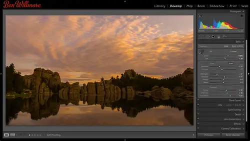
In light room we have various modules, those modules you can switch between them in the upper light upper right of your screen that's where we have the library module, the develop module maps, books and so on. So far, everything we've done has happened in the library module and that's where you gonna organize your pictures? Now we're going to head over to the develop module, and here are some of the images will work with to start with these air what I considered to be underexposed, and I want to see if we can get anything out of him to make him more usable, especially that first one if you look at it that thing first off, if this was a jpeg file, I would give up because anything that is solid black and a jpeg file there's no way to get detailed back from it. If it's a raw file, though one of the advantages of raw is you can get additional highlight and shadow detail on your pictures that you wouldn't get out of the j peg in so correcting an image that's this far gone, I wouldn't do wit...
h j p having said that, if this image was ajay pack, I don't see areas necessary that look like they're solid black would be fine if you're working with a j peg there it's when you get to the extremes something like this were to me most of that image looks like it's darn you're black so I should wrong ninety eight percent of the time because I want to be able to get additional highlight and shadow detail it's up to you a ce faras what you want to shoot, I'm not going to try toe force you and draw the main thing is if you need to do extreme adjustments if your pictures looked terrible on the back, your camera bra would be an advantage if your pictures look almost right on the back your camera and you just need to push him toe just right j pegs fine. All right, also, one thing I want to change is a setting in here because every time I view and image right now, there is an overlay of information on the upper left which I find to be distracting, and I'm just using the studies that were in light room here, which I'm assuming the defaults that has this information let me just show you how to change it. You can control what is shown on top of your images when your viewing them in what's known as loop view, which means fit in window kind ofyou or when you're in grid view by going to the view menu that's where you're gonna find a choice about three quarters of the way down your screen called view options when I choose view options in here, I can choose it for you see in the last upper left grid view or loop view grid views when you see thumbnails of your pictures loop view is when you see them filling your screen so I'm going to go to the loop view because that's when I saw that overlay of information that I don't want in here it says loop infor info one and it says file name and uh copy name if I move it over, you'll see the final aim right there I'm going to set it to none below that it says captured time and date I'll set it to none and then I could go over here and start the other one or there's just a check box to turn it all off so if you find it useful to be able to see things like maybe your shutter speed or something else in there that's where you can tell it tio overlay it on your pictures and if you go to the choice called grid view at the top there that's where you can control the overlay when you're viewing the thumbnail images, so if you need to be able to see your file names or other things, this is where you can toggle those things on and off like, do you remember when I talked about rotating the picture and I said on summit of your computers if you move your mouse near the image you'll see rotation icons you find your machine you didn't see him right here is where you could turn them on right there so anyway I just wanted to get rid of that overlay so that when I go to the develop module or I end up viewing my image fitting the screen I don't see that distracting text okay I have an image selected I've clicked on the develop module at the top of my screen remember if you can't see these modules there's little triangle at the top of your screen where he'd expand or collapse that and now we're going to start talking about adjustments we're going to start with underexposed images when we're done with that will goto overexposed images we're done with that we'll talk about contrast when we're done with that we'll talk about color and I'll try to work with some extreme example so they're not overly simplistic and these are under supposed so let's take a look we'll start with this guy we have a bunch of sliders available on the right side if when you look at an image the sliders that you see for adjustment on the right side when you're in the developed module looked different than mine then glances your picture for a moment in see if in the lower right corner you find an exclamation point mine doesn't have it but if you find that the adjustment sliders available on the right side of your screen looked different than the ones I have on ly in that case you should look at your image in near the lower right corner if there's an exclamation point click on it and what that means is that that image was adjusted with an old version of light room back when they had different adjustment sliders available and is trying to maintain the look of that picture by offering you the old sliders so if you see the exclamation point click on it it will update your picture and you'll see the same kind of sliders I have assuming you have the newer version of light room all right so we have a bunch of adjustment sliders in here there are only so many of them we need to use for particular purposes let's take a peek first we have exposure exposure is an overall brightness adjustment so if the entire picture is too bright or two dark that's where I would start so in this case the majority of the picture maybe minus the sky is too dark so I could start with exposure but when I bring up exposure you'll notice the sky very quickly gets too bright so I'm gonna move exposure until the images the whole starts looking just okay let's say that I wish I used a different exposure setting on my camera I'm gonna move this until you get close to what I wish I would have shot of that. But then, if the problem with the image ends up being isolated to the bright or dark areas now it's, not the image is a hole anymore it's the overly brighter, overly dark areas, then I'm going to get away from using exposure. Instead, I'm going to go to two other sliders. Those sliders air called highlights and shadows highlights works on bright ish stuff, so if my sky is too bright right now, which I think it is, then it's highlights that is going to help me to adjust it. If I move it to the right, it will brighten it over to the left. It will darken it if it's the dark ish stuff that is having the issue, then it's the shadow slider I'm going to use and I think that's the case in the right side of this photograph, so I'll bring shadows up if you move it to the left, it'll darken if you move it to the right, it'll brighten and that's true of any of these sliders, another slider I could use for something like this would be contrast contrast is how big of a difference is there between bright and dark? So if there's too great of a difference between bright and dark which is somewhat what we started with were the bright sky and a dark shadow uh contrast controls how big of a difference there is between bright and dark if I bring it up they'll be a greater difference between bright and dark I bring it down they'll be less of a difference they'll become more similar somewhere around there let's go to a different picture I'm going to go to the library module by clicking on the word library and I'll just go find another image click over undeveloped to adjust it on so let's work with the same sliders if I think the images the hole is too brighter to dark it's exposure that I go to might only move it a little bit though because then the problem starts becoming isolated to the brightest or darkest areas if it's the brightest british or darkish areas then it's highlights and shadows I'm going to go to so if I want more shadow detail I'm going to bring up shadows if I want uh the highlights to become darker I'm going to bring down highlights in previous versions of photo shot should have keep saying photoshopped some use of teaching photoshopped uh in previous versions of light room uh if you moved the hot the equipment the highlights and shadows to an extreme it was very easy to get artifacts and your picture where you would see an edge around the edge of your picture, like where something dark touches something bright and that's not common in the newer versions so you can move these slaughters to very extreme settings if they're still too big of a difference between bright and dark, I could go to contrast either increase that difference between the two or bring it down to decrease. I'm going to go backto library lets try another one. Well, this image is a whole minus, the sky looks way too dark, so I might start with exposure, bring it up, see what I can get out of that image once they get the images a hole to start looking, okay, the problem is mainly isolated to the highlights in that the bright part of the picture is missing detail, and so I'll go to the highlights slaughter bring it to the left, which is going to darken the highlights. All right now, there are a bunch of other things I could do with all of these images to make them even better, but right now I'm limiting us two features we've already talked about later on look, tomorrow, when we get into more advanced adjustments, I would be able to do something to the waterfall to really make it pop a lot more, because right now it looks a little bit dull. But just see her where I'm limiting the tools that I'm using to what we talked about already and trying to slowly ramp us into that stuff I will be getting into things where I could enhance this much more so uh in the future one thing that I find to be useful when I'm adjusting my images is to look at a history graham the history and can be found in the upper right when you're in the developed module. So as long as you're in the developed area on the right side I find a choice called history graham minus collapse down because the little triangle next to his collapsed if I click on the triangle I can expand it and what this does is it shows me what tonal range is in my picture in general what that means is just what brightness levels air present within my picture the one thing I really wish they would show here but they never d'oh is imagine that there was a grady in't at the bottom of this to show you what I mean let me get photo shop open and show you where you can see one that has a um that has what I wish they had in there okay this is a history ram here we have an overly simplistic file so it doesn't have much in the history ma'am but do you see this little bar down here where black is on the left in white is oma, right? Imagine you copied that he stole it from photo shop, keeping black and left white on the right, and you pasted it right here below this bar chart. I would beg adobe to add it there because it would be a thousand percent easier to understand if it was there, because all this history graham is is a bar chart that tells you what brightness levels air in your picture. If that bar was below it that had black and left white on the right, then you would look straight up from any one of those brightness levels that was in that bar to see if it's in your picture or not. If there would be a bar on the bar chart, then yep, that shades in your picture. If there's a gap instead than that shade is nowhere to be found in your image and that's what it is, and it would be so much easier if it was there just remember, black is always on the left, white is always on the right, so let's, look at this sister gram for a moment and see what it tells us I don't care about the overall shape, I don't care about the colors that are there, I'm only looking at the ends. The end's tell me if I have black arrive white in this picture the left side is where black is. If the bar chart extends all the way until it touches the end, then you have black if there is a gap at the end, you wouldn't have black right side is where white is. If the bar chart extends all the way to the end, then you have white in your picture. If there's a gap in the end like what I have, then there's no white in your image, instead the brightest shading your entire picture is a little bit darker than white, the bigger the gap is here, the darker that brightest party your picture is because just imagine you're in and you had this little bar there underneath your bar chart. All it means is if there's a gap on the end there's a gap right there you don't have these shades right here, the brightest shane your pictures wherever that part chart ends, if the bar chart ends over here than the brightest shading, your tire picture would be right there. So you see why I wish they had that bar in there so let's see how we can use that when we're in light room, if you find there is a gap on either side of the bar chart, then your image could have more contrast by having either brighter highlights or darker shadows you don't have any white or black and your picture if you had gaps on either side what controls the ends of the brightness range in your picture the most extreme of the bright most extreme of the dark would be two sliders in here and they're called whites and blacks whites and blacks I mainly adjust them after I've already adjusted the images a hole and I haven't looking good when I think I'm about done I'm about to move away to another image than a glance at the bar chart and I see if there's a gap in either end if there is it tells me adjusting whites or blacks might be helpful if there's a gap on the left side it would be the black slaughter I'd want to use and if I move it one direction I'm going to get less of a gap if I move in the opposite direction I'm going to get more of a gap so if you look at mine history graham right now when I move blacks and one direction you see against the history I'm is jammed over to the left and if I'm moving towards the right it gets a gap so what I want to do is when I'm done adjusting my picture and overall I think it's starting to look good I'm gonna glance the history ram and on the left side if there's a gap or there's. A really tall spike. Uh, I'm going to adjust the blacks to see if it helps my picture. If, on the other hand, there is a gap or a spike on the right side, then I'm going to adjust. The whites, deceive, it helps my picture. Ah, spike means that we have a large area of black or white, and if we're working with the raw file, adjusting those sliders can actually bring back detail where it's looking, black or white.
Class Materials
bonus material
Ratings and Reviews
Gordon
Since most photographers give classes on PS, it's just great having such a great teacher teaching LR. I don't have the time or money for PS and teachers like Aaron Nates work only with PS like most others. They all are great teachers and I watch even though I can't use what they teach, I don't consider it all a waste of time. Bill Willmore is one of those great teachers and goes into great detail. I would love to have the money to purchase this class as it's impossible to retain all the detail that he goes into.
a Creativelive Student
This presentation was awesome. After going through two versions of Light Room, I still learned more in three days than I learned in 3 years doing self study with hundreds of dollars worth of books. Ben Willmore works magic in Light Room and shares his expertise with all. This is a great course and a real bargain. Not only is the course valuable, but so is the PDF as a bonus with this course. Thanks, so much. See you tomorrow for Photoshop masking.
Rico
Ben Willmore is a fantastic teacher. The PDF download is superb and worth the price of admission. If there was a way for me to do the techniques that Ben is teaching, with him, while he is teaching the technique, then that would be a perfect learning experience.