Lessons
RAW vs. JPEG
08:17 2Introduction to Adobe Camera Raw 7
10:10 3Camera Calibration
17:08 4Intro to ACR Q&A
12:48 5Cropping & Straightening
17:35 6White Balance
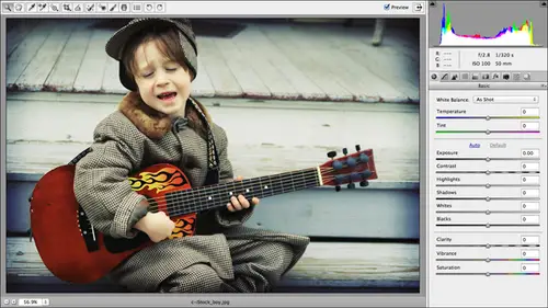
18:32 7Using the Basic Panel
1:05:33 8The Adjustments Brush
42:54Lesson Info
Split-Toning and Duotones
So the last thing we looked at was how to go gray scale in camera raw. And now I'd like to show you some creative color effects that you can build upon that gray scale image that are useful for, like I said, creative color effects and also useful to save a subpar image. So if you can't seem to get the color and lighting that the way you like it here in camera raw, which in with the new process version is a little tough to believe. But you can take the color out of equation and create an artistic effect instead. So let's take a look at how to do that. And again, if you purchase the course, you do get all of these exercise files. So we're going to be in folder number called Split Tones and Joe Tones. And just to give you a sneak peek of the kinds of things that you can create, remember the alien spaceship orchid that we looked at earlier? Here it is again. So this is that same image. It used to be purple. What I've done here is I've gone gray scale of pumped up, the contrast I've done s...
ome selective sharpening on the the actual aliens. See, it even has eyes. It's an orchid. So this is the kind of creative color fix groups that you can achieve here in camera raw. I'm gonna use the zoom in you the bottom left of the window to fit in view. So you get a nice big photo. I've also added a darkened edge vignette around the outer edge of this image. So we're gonna take a look at that after we cover split tones and dio tones. So going in, close this image and open it. Can you tell which ones were shot malley? See what I mean? The two of the most brilliant color. Okay, so here we have in image, and we're going to go ahead and turn it into a grayscale for sure. Gonna make all of your changes here in the basic panel. So if you need to make some changes, go ahead and do that here so that you're going into the gray scale with as much contrast as you possibly can. We're gonna go ahead and Lightner highlights a little bit. Dark inner shadow is a little bit, and I don't have any. I've got a little bit of clipping going on in the shadows so I can fix that and then come down here to clarity and pump it up so that my image looks more clear and give it a bit of a dose of vibrance. So now let's head into the age of cell grayscale panel again. It's the 4th 1 and that road buttons that we're gonna turn on convert to grayscale if you would like to go ahead and adjust the contrast here with the sliders. But for the purpose of this technique, I'm gonna go ahead and go into the split tone panel split stone Panelist to the right of the HSE l grayscale panel. We're gonna go ahead and give that a click, and everything in camera is just based on sliders. Could not be easier to use. Never split. Tony, I will tell you that there are some tips for producing a visually pleasing image. Yes, you could click and drag the huge slider all way around. Mess with the saturation to actually apply that you to your image. But basically what we're going to do here is we're going to remap the highlights to another color. That's going to be a color overlay. Okay, so we're gonna tell camera raw what color? We want our highlights to be using this rainbow bar, and then we're going to turn on the saturation, which is going to make that color change actually be visible. While saturation is zero, you're not going to see any changes you drag that huge slider around, then we're going to map the shadows in the image to another color overlay. In this exact same interface, you've got the rainbow slider. Then you got the saturation that controls how the the intensity rather of that particular color balance in the middle that determines whether the split tone that you're about to create favors, highlights or favor shadows. One of them will be a little bit more intense than the other one, and you can step that using the balance now, while experimentation is all well in fine there, there's a trick to creating visually pleasing split tones. Okay, the first trick that I want to share with you is to option drag or all to drag this huge slider. Okay, So as we option or all to drag it, we're applying that particular color. And by that particular color, I'm gonna release my mouse minutes. I can zoom in real quick. By the particular color, I mean, the color that's underneath that triangle. So in this position of the triangle we're talking about rid. Okay, So option on a Mac or alter on a PC, Click that Hugh Slider, and you want to drag it around until you find a color on that bar that you like. The way it looks doesn't matter what it iss Just pick one that you like for this particular image. I have done it quite a bit, and I happen to know that I like the way the shadows are the highlights. Rather look when they're mapped to yellow. So when you find a color that you like, you can release the modifier key and your mouse button. There is no change in the image because I'm at zero saturation. Now I can click and drag the saturation slider and gradually move it to visually pleasing place. So the option key or the Ault key on the PC gives you a preview of what that Hugh is gonna look like. Otherwise you'd have to be clicking and dragging the huge slider and then clicking and dragging the saturation, and it just makes it cumbersome, so the option are all key is a big help. The second tip I can give you for creating visually pleasing split tones is that you want to use colors that are opposite on the color wheel. Now, if you don't have a color, will have a fantastic book for you to go get. It's called Photo Shop CS six. The Missing Manual Because, believe it or not, in the chapter about painting, which is Chapter 12 it starts on page 842. No kidding, I don't really know. Never I wanted it sees you make you think of the page number, but it really isn't Chapter 12 the whole first section of the chapters color theory. I show you a color. Will I talk about complementary color schemes and analogous color schemes and so on and so forth. There's a lot of theory in that book, so anyway, a color will. We'll show you what colors are related, So basically all colors emanate from red, green and blue in the mixing of those colors to produce the other other colors that our eyes can see if he were to look at the color will in colors that are directly opposite each other or complementary. So if you look at a color will you would see that red is opposite green, meaning they're complementary to each other. Blue is opposite yellow and arrange depending upon which you know who made the color role that you're looking at. So those two colors your opposite of each other. I think blue's opposite orange and purple is more opposite yellow, so on and so forth. So for a nice split tone, you want to use complementary colors or colors that are opposite each other on the color wheel. So since I stopped in the yellow Range and I know I stopped in the yellow arranged to different ways. Here. I looked to see what might be underneath my triangle in my huge slider, but as soon as you pick a hue from the huge slider, then you're saturation. Slider changes to that particular colors. That's how I knew I stopped on purple, came looking at the saturation slider are stopped on yellow rather well, since I know that purple is opposite yellow on the color wheel. I want to set my shadows to something in the Purple Range and that will create a visually pleasing image so I can do the same option. Ault drag trick on the Hugh cider. So I'm gonna drag that over. Two Purple. Release it. The color goes away because we are at zero saturation an option. Ault Keyboard Shortcut Simply let us preview 100% saturation of that particular Hugh. So now we can click and drag the saturation slider slowly and slightly to the right until we find a place that looks visually pleasing. And that's a really neat looking image to me. Okay, here's our before. Here's our after so you can really create a nice artistic effect. And again, the toggle in the preview often on is not showing us our original unprocessed draw images, showing us what the image looked like before we started changing anything in this particular split tone panel. So the preview is showing us what we had in the gray scale panel a moment ago. That's pretty neat, huh? I love created color effects. Okay, so we'll go ahead and click it done on this now for these images, I am going to be using the done button instead of the cancel. That because we're going to go back in, were used. These same images will may apply our regiment getting in his girl legs. Oh, pretty. All right, So now let's open another image. And if you'll note the final names of these, I've tried to help you out as much as I can, with hints and tips and tricks in the actual file names, so that you could just look at this and I'm telling you, yellow and purple. So that's what I did in this file was I mapped the highlights, See yellow in the shadows to purple. So for this one, our highlights are gonna be put green and what is opposite green on the color wheel? Rid. So that's what we're gonna Mathare shadows, too. So let's go ahead and open that by pressing Commander Control are, and we can make some adjustments here if you want to. You. This one doesn't really need that much. I might pump up the contrast a little bit and come down here and adjust clarity so the image looks more clear, but the colors are amazing, in my opinion, just because of the So now it's going T o R H s l grayscale panel Turn on convert to grayscale Tweak the contrast of the individual colors if you like. And when you were pleased with the contrast, then you can come over here to the split tone panel here again, we're gonna press and hold the option key or Ault on the PC as we click and drive the hue slider, and that gives us a preview of that particular color overlay at 100% saturation. So for this one, we're going to come over to the green range. When you find the color that you like, release the modifier, can your mouse button and come down to the saturation slider and then started dragging it to the right until you like the way it looks. So we're going to stop it a fairly low saturation on this one, cause I'm not really fun of the way that looks a little too bright green for me. I mean, I love the lime green that's on the missing manual, but too much of a good thing. So now it's pressing holder Option key or Ault on the pc again and let's click the hue slider in the shadows section. And this time I'm gonna leave that set nearly pegged far left so that I get a nice red because red is opposite green on the color will. So those colors work well together. I'm gonna come down to the saturation slider and then drag that to the right until I produce an image that looks good to me. And let's say that that does. So we're press R p key to toggle are before and our after this is another great product to be able to offer your clients if you have a photography business, I mean, he can imagine these kind of creative color effects, toe wedding shoots and things like that. So we'll go ahead and click. Done. Now let's create a more of a dear oh, tune Okay, with a dual tone we're gonna add, we're going to map the shadows and the highlights to the same color. Okay, that's the difference between split tone instead of two different colors when the map them to the stain color. So we're gonna click to activate the image Impress Commander Control are to open and raw. This one, we're gonna do some pretty significant changes to here in the basic panel. Again, you could have a go with the auto button to set the sliders at a starting point. Or you could click the default hyperlink to send them all back to zero. And you could make changes manually. Okay, so we'll go ahead and, uh, dark and our exposure just a touch. We're gonna boost contrast. And then we're going to darken her. Highlights in Lightner shadows a little bit. I've got this a teeny bit of clipping warnings appearing toward the left side of the image so I can correct those with a combination of the highlights and the white slider for the highlights or the shadows in the black slider for the shadows. Here we go. So now let's add a little clarity to make the image look more clear. XT amazing. I love that clarity. Slider it maze will be called magic or enhance. You know, like the the magic wand in I photo is called enhance. It never does a job like this, though, So a bump up the vibrant, it's just a little bit here. So now we're ready to turn this into a grayscale image. And again that is grayscale just in what it looks like. It's not a pure grayscale image. We still have all of our color channels intact. So let's click. The grayscale pain will turn on convert to grayscale tweet your contrast with the ciders if you need Teoh. And now let's come over to the split town and panel and for do tones. Like I said, he want to use the same Hugh setting for both highlights and shadows. And then you're just gonna play with the saturation until it looks good. Okay, so we can use our option trick if we want to get a preview of the kind of color. And if I want to create more of a c p A. That I'm gonna stop somewhere around the orangey yellowish range. And if I stop on 39 for the huge for highlights and I'm gonna come down here on the shadows and I'm gonna type the exact same number in So now I'm gonna start playing with a saturation on the highlights. See, you wanna change that looks good to you. And you can also try using the same saturation on the shadows on the images that I would try that on that usually produces too bright oven image for my particular taste. So you'll need to tweak the saturation to your liking on the highlights in the shadows individually, just to produce an image that looks good to you again. There is no do tone police. To my knowledge, you're not gonna come knocking on your door. Can you imagine what would be awful like? We need that stress in our lives and you can use the balance slider Teoh Have the image favor the highlights versus the shadows. In which direction do you drag for which one? Look at the sliders, My dear grasshoppers. If you want the colorization to favor the shadows, you're gonna drive the balance lift. If you want to favor the highlights, you're going to drag it to the right because you can see on the slider itself. It's dark on one in in light on the other end. So here's our before and our after you've got that nice color early going on. So let's take this a step. Further case, I'm gonna go ahead and show you how to add edge of in getting, and then we'll come back and see if we have any questions on split toning dio tones or edge been eating cape. These work so well together and doesn't die in the Jodi. Okay, so now let's go over to the effects panel. Okay, so what we're gonna do is we're gonna add a nice, dark and soft faded edge around the photo is going to give it a more vintage looks a little bit of a romantic feel, and it's also going to help draw focus away from these edges. So if you've got a little bit of a distracting background going on a dark and edgy vignette is a great way to make it not quite as distracting or noticeable. It's also going to direct the viewer's eye right to the middle center portion of your photo. And your focal point is probably somewhere near there. Even if you're using and rule of thirds, like added the frame with the image, my focal point still falls within the center part of this image. If you can imagine an oval, there are no lips on this image, so let's go ahead and add are dark and edge been yet. You can do that by clicking the effects button up here, so give it a click. And what you want to do is you want to locate this section right here called post crop vignette ing. So basically, when you're using this control, you're saying, Hey, camera, I've already done my cropping. Please add this edge vignette around the areas that are within my image. In other words, don't add the vignette all the way around the original a ncaap version. You wanted to add the vignette around the crop version in photo shop. There is a way to do this using the lens correction filter. It has a vignette section. If you click the custom tab in CS five, he will fancy a six. You will find a vignette slider. But if you have used nondestructive cropping and see a six, it's not gonna work right, because it's gonna put that edge vignette around the whole photo where they're the edges of that photo dangling off the edges of your document or not. So it's not gonna work right. But here in camera raw, we have post cropping getting so it is gonna work like we want it to you here. So let's go ahead and leave the style. The highlight priority for this particular image. And it's a simple matter of clicking and dragging the amount slider to the left. I'm getting a little bit of clipping in this area, but think about why I'm getting that clipping morning because I'm adding shadows on top of shadows. So do I care that this is clipping my shadows? Absolutely not, because I'm adding that darkened judgment yet. So if you're doing this, you definitely want to turn off that clipping morning by pressing the U key for under exposed. Or you can just click the shadow clipping triangle at the top left of your history. Um, and look at this people. There's over four and there's air after that. Gorgeous. I just love using these creative color effects in conjunction with the dark indefinite. I think they're does gorgeous. Okay, so let's look at that on another image will go ahead and click done. And now we're going to come over here to our space alien orchid, and we're gonna revert this image to its original state. Okay, so we're going to go up to the edit menu in bridge and shoes, developed settings, clear settings. Or we could choose camera raw defaults from the basic panels fly out menu. If we had already opened that image in camera, Roberson's We're hearing bridge. We can go ahead and clear here so we'll go ahead and say Clear settings. You can also control or right click on the image thumbnail itself, and you'll get that same developed settings, many so we'll go ahead and choose clear settings. This is another great opportunity to use this copy settings, because if you get a creative effect like this just to right, then you might want to copy and apply it to a few more photos in your set or save the save those settings as a preset. We're gonna do that here in a minute, so we'll go ahead and say, clear setting. So we're back to our original image. Press Commander Control are to open it up in camera raw. We can have a go at fixing the exposure if we want. Here in the basic panel will boost contrast on this baby a little bit dark in the bar shadow some at some clarity and Now let's drag our white slider a little bit to the left to recover those details. We certainly don't need to add any saturation or vibrance to this one, but what we can do is come over here and use the adjustments fresh to add a little sharpening to a specific area. Let's say this one right here. Okay, little spaceship. So let's press K to grab the adjustments fresh. Use our bracket keys to go down and brush size just the feathering amount to make the retouch blend. So we're going to press shift control or shift right click, drag left to decrease feather drag right to increase. And I'm gonna decrease a little bit. Here we go and then increase my brush size Just a touch. And I want to make sure that my mask is on. It is so I'll see the why overlay as I paint and so that I know which area that I'm gonna apply this extra sharpening to and because I've got that auto mask turned on cameras trying to help me select all the pixels that match the ones I'm painting over. Okay, so let's call that good. Now, I'm gonna go ahead and press why? To turn my mask off temporarily, and we're gonna come over here and adjust our settings. So basically the only thing I want to do is sharpen that spot. So I'm gonna go ahead and type about 75% of the sharpening. I'm gonna shift tab to tab back up through those other fields to go backwards. And this press Ciro, There we go. So now the only thing I've got going on the sharpening, But again, you're not going to really see a sharpening preview unless you're viewing the image at 100%. And then you can see the extra Scharping, which looks like a whole lot of green when you're zoomed in this far. So we'll go back and shoes fit in view from our Zoon pop up menu. So now we're ready to come over here and create grayscale, so you'll notice that I don't have my basic panel right here. You gonna switch back to the hand tool or the zoom tool and you'll get all of your buttons back again there in camera raw. So now we can come over here and convert to grayscale, see what I mean about creative color effects. We've been taken the color out of the equation. If you end up with an image, arguably, this is a good example. It's gonna be really hard to make that that color really look good. There's just so much of it. But if we turn it to gray scale, it becomes an entirely different thing. It's much more artistic again. You could play with the sliders to tweet, contrast in certain colors. And now let's come over here to our split. Toning in What I want to create is I want to create a duo tone out of this. So the difference between split tone and deal tone split tone you want to use complementary colors and that the highlight stolen the shadows to another with the duo tone. You want a map, shadows and highlights to the same color, but you'll probably want to vary the saturation of those two. So we're gonna press and hold down the option key on a Mac or all. It's on a PC. We're gonna try to find a color that we really like. So this one we're gonna take into the blue room so we're going to stop about on 2 40 And now let's come down here to the shadows and type in 2 40 There. We want those numbers match, and now we can start changing the saturation. Looks more and more like an alien doesn't the eyes were right there? So now we can bring up the saturation of the shadows. So many images that I see framed these big fancy trade shows like Photoshopped Rule. For example, let's say that Epson is there, and they've got a big honking booth. And they've got a bunch of award winning photography that appears to be a black and white framed at large sizes all over the walls of their booth to show you the amazing prowess of their large format printers. 95% of the images that you see in situations like that, if not more so, if they appear to be black and white, they're not black and white. There dio tones there, black and white, plus other colors there black and white, plus a dash of blue, a little bit of blue or or more shades of gray. So very few of them are really just black and white because you wouldn't have the extra dips. By adding a color overlay to a black and white like this, you greatly increase the depth in the visual interest of the image. So we'll do before and after here. If you were just looking at that and you didn't know that I had added Blue, you might not perceive that blue was in it. And if you want it to be even more subtle, all you have to do is decrease the saturation. I've still got quite a bit of blue in there, but it doesn't really look like I do. So here's our before, and here's our after again. You can change the balance slider to tell it to favor the shadows or the highlights. So let's say that looks good. So now I can come over here into my effects panel, drag the amount slider under the post crop vignette ing section to the lift to create the dark and management. Yet, if you want to widen the vignette, then you can click and drag the midpoint. See how, as I drag it to the left, it's widening it. Now we are in serious alien territory. Anybody scared, kidding. So here's our before And here's our after all, non destructive, all done with sliders. And there ain't nothin easier to use the sliders. Any questions on split toning do tones and post crop vignette ing and camera? Did he even know you could do this stuff in camera? Raw? De Mariah did not know that. Oh, hell, Camera. You can see all this in light room to right. So fashion TV from Singapore, Um, split telling there are no options to control the blending modes for the color overlay are there? Excuse me? We rephrase that. Are there options to control the blending modes for the color overlay? Negative. The only controls you have are the ones you see right here. Okay. All right. But you can do a little bit of that by tweaking the balance slider, you know? Right. And I think we talked about this already, but photo travel chips and J. C had asked about saving these effects as presets. Can you do that? We're going to cover that last. But you know what? Since we're sitting here with our beautiful alien spacecraft all vignette in duo toned out, let's go ahead and say this is a precept. Say This isn't. This is an effect that you want to apply to the whole Siris of alien spacecraft. Shoot that you did or orchids. So the way you say it is a preset is you make all of the changes you're going to make to all the panels to all the sliders to produce the effect that you want. Now you're gonna come over here to the button that looks like a bunch of sliders itself, and you're going to give that a click. And you're going to see absolutely nothing here because I don't have any preset saying that if I did have any presets, they'd all be listed right here so I can do two different ways. I can click the little looks like a new layer icon. Click the little piece of paper icon at the very bottom of the panel with the dog eared corner to create a new preset. Or you can use the little fly out menu here and choose. Where is it? Actually, I guess you do need to use that button. You So Yes, do as I say. Not as I do. Click the little piece of paper. Iconic very bottom of the panel to create your new appreciate it. And you're going to get this dialog box that we saw earlier back in bridge, and it allows you to fine tune that preset. Okay, so if you scroll down through all these settings and you say, you know what I I don't necessarily want to apply grained every one of these things. So you could take off that one aspect or that one attributes without having Teoh click the cancel button. Go back to that particular pain. Our panel that the setting was in that you changed and undo and then come back to the presets panel. You could just talk all those off and on right here. Hey, and he's also got sepsis, so these are pretty much the panels. Okay, So if it's overwhelming for you to see all of them right here than you congestive, you a subset instead, given a meaningful name. So we're going to call this one Blue Joe Tone Dark edge, something that's fairly descriptive and meaningful. Tiu. And then you're gonna click, OK, and then it's going to show up here so we can click Done. And now if I come over here to this image controller. Right click. She's developed settings and clear out all the settings. I can't apply that preset straight from bridge. If I wanted see underdeveloped settings, Blue dio tone dark edges right there. You could select a slew of patriots or activate a slew of pictures, for example, right here in bridge. And you could apply that preset without even open opening the darn things in camera raw so we can do that from here and there we go. Now we've got the exact same effect applied to that image. But we'll go ahead and undo that, and I want to show you where that option is in camera. Ross will come back under the developed settings by right clicking or control clicking to bring up this contextual or shortcut menu. I'll say it clear settings now will come back into camera raw by pressing Commander Control are now. Where can we apply that preset? Well, they show up in a lot of places. They obviously show up in the preset panel. But let's say you're over here in the basic pan. One amounts all the way over there. The preset panel. You don't have to, but you do have to mass all the way over to the file menu and the presets. We're gonna show up under the cleverly named Apply preset sub menu and so we can choose it there and it applies. And from here, you might want to find Teen each one. And that's all there is to you, creating a preset and then applying it in both bridging camera. Wrong. That's great. Yeah, I like that process. It's very saves. A lot of time is sure has. And that's when we were talking earlier this morning about light room vs camera Raw. If you put bridge into the equation in, you use bridge plus camera raw. You could do a lot of the stuff that you can do in light room, and this is an example of that contest. So, Tess, um, asks the vignette. Is gray not color toned? Can we change it to match the tone in the image? I don't know. Let's go back over there in Sea Shell. Let's pop back into our effects panel. We've got some options here under the style menu, so perhaps if we chose color priority, it would be picking up some of the color and not just be a plain old gray that there's not a a whole lot of changes you can make your even if I choose paint overlay. I don't get anything that lets me choose the color of that dark edge of and yet. But then again, you don't really over in photo shop, either. Okay. Question from D. So if I edited an image in a photo shop, can I then bring it into camera raw to do the duo tone, you could want you edit an image and Photoshopped. You might have to save it as a J peg and then open the J pig. And that is not a clean, pretty situation for anybody, because Camera Raw is a tool for editing raw format files. But you can also open J pegs or tips. I don't know how you would open. I don't think you could open a layered Photoshopped document and hopefully, uh, that you would be using layers. If you're doing this in photo shop, I would do that. If you're in photo shop, I would do the duo tone and the dark edge been getting over there. I wouldn't do it back over here in camera. Wrong photo shop has a slew of deal tone presets. It's so amazing, in fact, that if I think we've got time, I'm going to show you that real quick. I'll go ahead and click done on this image, and then I'm gonna zap my presets or Zack. My developed settings by clearing it out show. I'm gonna go ahead and open this in camera robs, and I'm gonna send it straight. Teoh Photo shot by clicking open image. What I can do here is go up to the image menu, change the mode to gray scale, actually gonna create black my first. So we're gonna create a black and white and Photoshopped using the method of your choice. My favorite method is a grading math adjustment layer. So I'm gonna click the half black, half white, circle the bottom of the layers panel. Choose radiant map. Photo shop is gonna apply one color. Your foreground color is gonna be applied to your shadows in your background. Color is gonna be applied to your highlights. So there's remapping going on. Hence, the name of the adjustment layer. Grainy it map. So since my color chips were not black and white. When I created the adjustment layer, it used the colors that my color chips were, which was light blue and white. But that's no big deal, because all I have to do to switch to a black and white ingredient is click the downward pointing triangle next to the Great and Preview and the resulting properties panel or in the Adjustments panel of CS five. This is not see a six specific stuff by any means. The third preset in that talk row of great presets is always, always, always gonna be a black toe, like grading it. So go ahead and give it a click. And as you can see over here in the document preview, we've got a nice black and my name is going on. Now you're ready to really delete your color channels, which is what you have to do to get to the duo tone presets that are buried waist deep in the program. But they are worth hunting for, so really go up to the image menu. Choose mode. Choose grayscale Photo shop is going to say, Whoa, you've got adjustment layers, so we're going to say we don't care that we have just in layers. Don't flatten file and then it's going to say, But do you're asking me to throw away your color channels? Are you sure you want to do this? And they say yes for the shop. Appreciate the heads up. Discard. Now we're ready to change the mode of this image or this document rather to dio tone. Before we went into grayscale, Doten was an option. But it was great out we couldn't choose it. So now we're going to do a tone. We get this dialog box and just look at all the presets that air in here that were made by seriously highfalutin color scientists color engineers at Adobe paid boo coo bucks. These are all of your presets for dio terms and there are slew them. They are beautiful. I encourage serious experimentation with ease things so you don't have this kind of thing over in camera raw. So again, we're gonna call the specialist for what the specialist is good at. If you've gotten the image into Photoshopped already, photo shop is the best place to create a duo tone and you will create a true dio tone meeting that you don't have. If you sent this to a pre press shop, you would not be paying for off for color plates seem like it. You only be paying for black. Plus, however many you could think of him a spot colors that you're adding right here. But isn't that beautiful? I mean, that's black, plus a like a Pantone rest color. Would you even just imagine like the preview there's on and off? It's incredible in it. So Photoshopped has a bunch of dio tone presets that were, like I said, engineered by color scientists, and you can really create some beautiful artwork there. And then to create the edge vignette, you could come back and use the lens correction filter, so that was a long way to say no. I would do the duo tone and Photoshopped. Fantastic. Love it. Let's see. Ron Meo in San Diego asks, Will exactly. Complementary colors have Hugh numbers that differ by 1 80 half of 3 60 on the color wheel. Oh, gosh, that's the math question. I don't know. It seems logical, right, because all the colors, you know, you're dealing with 256 colors, which is 0 to 2 55 So it seems like they would have Yeah, I don't know. The excitement tried doing it that way. How much more of a visual person and I have a graphic design degree, so I've actually had extensive classes in color theory. So I know which colors your complimentary. But you know what? Their color wheels on the Internet. So just do a Google search for color Will, and you can bring up metals and gobs of color wheels and just take a peek.
Class Materials
bonus material with purchase
bonus material with enrollment