Lessons
Day 1
1Turning T-Shirts into Usable Fabric
28:15 2Organizing and Measuring Your Patterns
19:51 3Building Your Quilt Skeleton
25:03 4Stabilizing Your T-Shirts
22:28 5Creating Quilt Blocks
33:40 6Quilt Design Process
31:22 7Sizing and Layout of Your Quilt
32:42Sewing Machine Basics
19:22 9Sewing Odd-Shaped Blocks
10:35 10Sewing Your Columns Together
18:52 11Cutting Your Sashing Strips
24:49Day 2
12Planning Your Backing Piece
23:49 13Cutting and Sewing Your Backing Piece
26:09 14Making Your Quilt Sandwich, Part 1
28:07 15Making Your Quilt Sandwich, Part 2
19:16 16Tacking and Tying
34:48 17Seam Quilting
30:00 18Creating Your Binding Strips
26:11 19Attaching Your Binding Strips to Your Quilt
36:30 20Finishing Your Quilt
30:54 21Hand-sewing the Opening Closed
29:20Lesson Info
Quilt Design Process
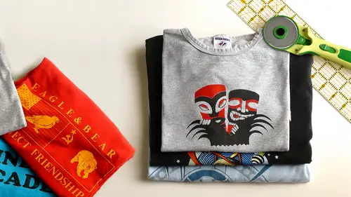
Once again I've sort of jumped us forward in our process a little bit so when we were here before the lunch break we were cutting quote blocks from our t shirts we had ironed that usable interfacing to the back and we had cut them into a lot of nice, precise rectangular shapes and so what I have for you now are two things I have a large quantity of prepared quote blocks and I have something new which is a design wall now a design wall is nifty to have, but a lot of you may not have this in your homes I don't even have one in my home I actually lay my quilts out on the floor because I work in a very tiny studio you might have a couple of large tables this size which you could pushed together side by side and use that as a quilt laying out surface or if you want to be fancy like this, this is just a very large piece of mdf the medium density fiberboard with some quilt batting stretched over it and what's cool about this is that you can actually lay a quote block on that and the surface t...
ension between the quote batting and the interfacing will just hold it there without any pens or anything so I can actually lay a whole quilt out up here, which was what we're going to do next and then I can peel the blocks down and move them around as I need tio so if you want to invest a lot of energy and quote making this is a nice thing to have but you don't have to have it I just figured none of you really wanted to watch me crawling around on the floor for the next hour now so here I am and I just want to sort of orient you these blocks come to me from anthony who's also a staffer here a creative live and these are all oriented around his life is a musician so some of the blocks come from his band which is called grants and some of them come from other bands that he enjoys and so it's a really colorful interesting assortment of blocks as you can see, I've got them divided into four staff x and I've kept my little labels that we used in the first segment to indicate the width of the columns that's just useful toe have for the moment so I'm gonna keep these blocks organized into their piles and I'm going to go ahead and set us up on the design wall so while I do that would be able to see the beginnings of this quilt starting to happen I'm just going to put them up here a random right now because we're going to move them around as we go into our four step design process so this will just take a second but you'll get to see some of these really crazy fun things that he has in his collection and as I showed you in the previous segment the slide that looks like four columns with uneven height that's really exactly what we're building here we're going to put these side by side and they're all going to be different heights and then we're just going to reconcile all that you know what might be great for us to dio while I'm setting this up is actually holly brought a couple of utterly beautiful t shirt quotes that she has made and if you'd like to show those off I read they're so beautiful I think people should see him while I get the rest of these appear on the board she holly bring them around the front here as well if you stand that would be great thank you, hon but this one is a story behind each one isn't it my first venture into yeah this way it's collar than it is this is really stomach. So this is that I said my husband's an animator so he's worked on everything from the california reason commercials two star wars and rang go and uh think after mr profits that brought us to london so you actually said you made this quite differently to the technique that diane's be showing us still turned out quite you did not use the back of any of my t shirt so you think you can see that it's not is crispy surf more feel to it yeah there's no fusing on the back and everything is a measurement of four so it's either for my four or four by twelve four by sixteen and then you multiply by the square wanted to get your way there was mass that was and on the back you've done some really beautiful stitching oh, that was the quilting part so after I got out I didn't want to do stitch in the ditch with all those different squares so I just did a line of little calling packing so can you tell us a funny story here about this this t shirt here on the front that your husband actually after you finished it yes I finished the quail and then he didn't like toe rubbing on great he didn't like the film that was under this original block and he liked the rang go one better so this is just applicator over the top of another e yeah so it's just you can always you can always flow around any the eventuality here like you said they're very forgiving him exactly you can kind of well thanks mr go signal says of really beautiful back yes so this one is a fellow animator and they've worked on similar films but you can tell they still come. It shows the personality so they definitely come out different in there. Which does this go? Well, this way, matrix ok, in their careers, but so here we have ted, the movie ted down there. Um, blades, spiderwick, she's from the giant peach. Oh, yes. Oh, yeah. Here, when you're asking the question, if you could put different steps so here this shirt it was so cute, but I didn't want it it was too small to make a a box like that the whole t shirt on there, he had a regular shirt shirt, so I included the buttons in the pocket so you can put different stuff on there. I think on that other quell it had a big fleecy skywalker ranch sweatshirt on that one. So you shows a really stunning backing for the past give you for that, get be picked his own backing. And this is what he always tony chose it's like mexican. Some kind of little make things right in lottery. The car? Yeah, they are that's a great backing, so don't again. It's really fine. So this was either way around? Yeah. This's the warm aside. Yeah, but let's, find something we really appreciate you sharing thank you so much for bringing those. I'm so excited too. See them and I love the pocket idea if you have a pocket t shirt just make a quote block out of it and you took a little note in there when you give it to the person anything you like thank you beautiful fuck right and that gives me a moment to lay out anthony's blocks here on the design wall so as you can see, we've just gotta siri's of uneven columns right now the four step design process that I like to use from this point forward sounds like this we're going to first identify any out layers in the design then we're going toe assess whether these blocks needs some breathing room or not then we're going to figure out whether we're going to add length or with two this quilt as we've discussed a little bit already and then we're just going to do a final balance check so on the subject of out liars if you've ever heard that old sesame street thing about one of these things is not like the others that totally applies when you're assessing your blocks from this stage generally speaking even in a very visually active group of quote blocks like we have here there's going to be one or two blocks that catch your eyes first right and generally speaking those blocks need to get special treatment from a design standpoint because they can really throw a quilt out of balance because they're so focused pulling so for you for here in the studio is you're looking at anthony's blocks. Are there any that seemed to you to grab your I'm more than others. Which one did bird with the red letters and yeah, ok. Any other, any other boats? The yellow one above that cotton. First, he had this one right here. Okay. And also the album, the bottom black way, how we're all different for me, it was the red one hears this. This one? Yeah. Ah, brings up a really good point here, which is go with your gut. I think, in all the classes there quilting related that ever taught there's always a lot of intimidation around. Like, what if I make the wrong choice as if there were a single universal set of rules for what is good design and bad design? And I assure you there is not so whatever you feel is right is right. If you're really having trouble identifying what your decision is, get a get a friend to come and help you. But yeah, so that's fine for each of you, you would you would actually end up with a different design with these blocks based on the ones that you found this out liars I agree that this big bird is pretty focused, pulling and off the quote true he's law that's another really important saying some blocks have a directional nature to them and that we can deal with that too and this is a pretty high contrast block there's a lot of color here there's a lot happening but this kind of bold high contrast thing I agreed really kind of arrests the eye so it would we would do well to give these a pretty central placement in the quilt so that there in a position of importance s and they don't pull focus to one of the corners or one of the edges of the quilt so here's how I would work that number one it's very easy to just bring this block up so now he's more centrally located and we'll just go ahead and set these under them for now these they're not going to be their final positions but we're doing a little bit of puzzle fitting at the moment and then I agree he actually needs to be living internally right so that's easy weaken just swap the positioning of these two columns and maybe we should set him up so he's a little bit more central to looks like we have one block in this particular column that's a little narrower so we could have that one be at the top and then we could bring this one under it and then we could let the yellow block go down below like so so already we're starting to get a little more comfortable visually right? Hopefully you agree with that? Let me just to please back up trying to be a little careful here because if you hit him too hard they can come tumbling off well, like so exhibit it. Okay. All right. So now we're starting to feel like maybe there's a nugget in the center that the's khun b more of the centerpiece and everything else can happen around them right? The other thing we want to look at in terms of outliers it's kind of a secondary layer of dominance and that's a fancy way of saying now that these air a little bit dealt with what other shirts air starting to catch her eye now have you have you experienced a change in what's grabbing your eye now that those air dealt what's your bottom right this is looking pretty prominent now that seems too big it seems too big it is a pretty because it's so bold in contrast it carries a lot of visual wait I agree there's also the concept of starting to partner some of these colors with each other so it's interesting in that of basic color family can really combine to balance a quilt so we have a green here we have a green here we have a green here we sort of have a green here we have a green here if we can spread those out a little more throughout the quilt weaken they can all balance each other even though they're not exactly the same corinne right there went one so given that I agree with I agree with the comments that this is looking a little bit lost there in the corner I think because it is a pretty focused pulling block a good option would be to bring it up here and now we're sort of creating a big band of really bold stuff right across the middle of the quill and then why don't I break my greens up a little bit so that they can spread out more along the quilt and balance each other a little better? So see that's already starting to help that and then we also have the ability like for this shirt right here which really is not that visually related to any other shirt in the collection because it's tied I if we want to balance something like this a great way to do that is to make use of these extra spaces which will start dealing within a few minutes. We could cut extra pieces out of this tie dye fabric and make solid blocks and insert those into other columns in the quilt to start ballot using that so every element in the quilt needs some kind of balancing element to me this guy is starting to get a little bit focus pulling just because he's the only one that's in fairly neutral colors he's got some little bits of orange and yellow, but they're pretty subtle and harder to see. So I would probably also cut a piece or two out of this blank shirt just to kind of give that color presence in a couple locations of the quilt. Is there anything else that's beginning to focus pull for you? I would I have looked on the to read so I might move the home base because that was another one that where the perp like, switch the purple and the home base kyra and me okay, yeah, I like that too. Then his splotches go with the eagle splotches say that again because it's got like those weird like red and then the eagle has read everything read I get what you're saying? Yes, that's fantastic and of course got yellow balancing yellow balancing yellow, which is good this army greens floating a little bit out there, but we can kind of consider that it balances the dark green are brown is sort of a cheese standing alone, but we can always cut a piece of brown solid and put it in there, but we've also got red, red and red balancing, so we've created some repetition so good that's, good annam I want to show you a little bit about how I've dealt with out liars in some of the quotes that I've made so I know looking at these is a little bit of a repeat, but hopefully we're in a different zone here so for example in the quote that I made for justin can't a lot of really bright, colorful shirts too, but the clear outlier in that quilt to me is the center block with the elephant on it because it's the most colorful out of them all and the graphic is the most complex so I gave that one a central location but then it has all this wonderful golden orange which has picked up in the tide I so have really spread the tide I pieces all over the quilt to balance that does that make sense? Okay, so then another example thank you would be in my partner's quilt here and that would be the monterey bay aquarium there lower center just because it's really the only kind of light blue and white and in a sea of really bold blacks and reds and things and then also this one was the highest contrast of all the shirts like gave that a central placement as well sometimes you'll get a group of shirts that air like all out liars if I could have the kids quilt, that would be great and when you get that I'll show you just visually a good technique for that kind of shirt and that kind of quilt and then will we'll deal, actually with it later. Yes. So this quote is one I made for antonio and sophia, who are a couple of really wonderful kids that my mom has figuratively adopted, one of the many children and adults my mom has figuratively adopted. One of those could be you. J k o is all I'm saying, it's, not a competition already. So as you can see, there is not a lot of commonality among this group of shirts. I had a real struggle trying to get these dying together. There's a few themes like sports and new york and stuff, but not a lot of color. Repeat, not a lot of design relation. So what I did in this case was I used to stashing, so every block is just surrounded by the dark purple e blue, and that little bit of framing went a long way board, helping these hang together. And then I also tucked in some vertical pieces just to repeat the colors that had no repetition at all. Ruelas faras certain color should be repeated three times, five times, you know, is there any kind of a rule like that now that displeasing to the eye now? No, just well, there may be, but I would say go with your gut I would say as long as it's repeated at least once you're covered from a balance standpoint if you really like the color though, why not repeated a lot? I loved justin's tio tie dye shirts so much I used every square inch of that thing I was slicing carefully out of the sleeves and everything because I wanted it all in there. So does that make sense about how out liars work in the design process? Okay, so the next thing we worry about is breathing room because every set of blocks is different now you know what the next I'm gonna ask you for the logan quilt in a second, thank you. Some blocks air very bold and simple and some blocks have a great deal of visual texture to them and that relates to how close they might want to be together in the quilt. And we've been working as we cut these blocks with a margin of two inches on all sides of the graphic. Usually if you wanted to create more breathing room in a quilt by cutting the blocks figure and all of your t shirts were large enough that you had the margin to do that you could totally do that though the two inches that I specified is a nice starting point, but it's not it's not a law it's going to come after you so when we assess a group of blocks the thing that we want to look at is how much space to those really require so that when I look at the quilt it doesn't feel terribly busy to me. So this quote that I made for my nephew is a great example of this because these were all little kids shirts and every single one of them has a lot of characters and a lot of motion and a lot of things happening right especially with all these super heroes heroes are like bam and power and so when I put all these blocs together like you see here on the design while it was major eyes bleed it was just so much going on and so this quilt really desperately needed pieces interspersed between every block so that you could look at each block individually right? I have a different quote that's an example of a different treatment of breathing room and that's this one which I haven't I showed the back of this but not the front that made this for my sister in law who has worked for this chain of pubs for many years called henry hudson and what was interesting about her collection of shirts is they all like had the exact same words on them they just were very different looking and because all of the graphics are really just text based for the most part, when I spread them out, they just stopped relating to one another. It just looked like a lot of words, and they didn't hang together is a design so this particular quilt the blocks didn't need breathing room. In fact, they needed to be right next to each other. And so, as you can see, I bunched them all together, and then I actually inserted solid fabric at the edges to fill in space instead of putting it between the blocks. So this is kind of a gut level thing that will be a decision you'll be making according to your own shirts, in your own preference, but it's a big part of the design process. So talked let's talk about these blocks of anthony's. Then what are your impressions of these? In terms of breathing room? I think they do need breathing room, but more of a neutral color in between. Okay, so you know what I want? Yeah, you would put in a neutral between everything or maybe strip we could, we could insert some vertical strips to just make columns of blocks. I'm actually I'm thinking seriously about the sash ing option for this one, just because there's these air, very complex, focus pulling graphics like every one of them, and it really could become very you know I don't know if you would could take a nap under that quote because you you couldn't sleep but yes so these so ever like I said every group of blocks will be different but I think the simpler your blocks are, the less they tend to need a breathing room sweet and the more complex they are, the more they'll tend to need it please stay there for some reason I feel like if that it's a tag tag it the green column it was switched that whole side with the little pastel e aside meaning this one here with a whole column put it on that side in the past really guys over in this one only because this is so it's exaggerated the length of the eagle against all the little tiny ones does that make sense? Oh yeah let's try it that's a great idea I've spent days and days like this is art it isthe fun it is fun I actually as a rule really prefer the laying out on the floor simply because it's very state obviously they can't fall off the floor the one thing that's interesting about it is you do d'oh a lot of crawling around and a lot of getting up and down and it becomes a slightly athletic activity and then the cat always wants to help oh my goodness right it's kind of like, thanks. You lay this out for my benefit that's so let's get it right. And then there's a slam dunk for the rubber band here. Let's, move these over so we have a little more space it's, really interesting as you move these around and as you play with them how the inner relations just sort of change as one bloc sits next to another, I am noticing just having gotten these two up, then I'm already not loving those two together. They just seem to fight visually because they have similar color ways, and they're both kind of complicated, so I will probably do a little switch switcheroo up there once I have tamed the bird again here, there's also something to be said for in every collection of blocks, even though the shirts are all equally important to the person who owns them in every collection of blocks, I would say that there are some that are very pretty and kind of they're going to drive the look of the quilt, and then there are some that are kind of more like this that in the context of everything else they're sitting with, might be a little more bland, a little less important, and I will tend to push those to the outer edges of the quilt every time. I'm thinking the yellow guy's gonna end up in the bottom left corner o ur this quarter that one no end up in the bottom this is good this is good thank you for yeah thank you I'm going to kill this burg all right and I'm guessing that there is no wrong way no that's good you've been e if yeah if two people are doing it it could be a completely different looking quote yes without a doubt and I'm so glad you said that because it really is about your own preferences you know we all come with this is really going to mess with you know well police air coming too a lot will be away they're coming the quote police they're never coming and it made a slide that said that I actually really loved that and I'm going to have t shirts printed if anybody wants to buy one after glass here let me just pan these and then they won't go anywhere on us all right so now that so how does that feel as a switch again I'm not crazy about this so I would agree with this one and I'm like that's right I kind of like a gun against it because that gives that one a chance to do it's crazy thing right but we could let me I'd like to just get those apart all the way we could do this and then the star bucky green and then that one how we liking that so far I like it better like the smaller ones to the right the balances it out more of an agreement I think that was a really good move needy the orange or yellow and the bottom left corner and the purple ly guy move him up underneath the eagle sure we can do that let's see, I would move that other yellow when over next to the baby blue okay that's good. So this brings up the whole next wrinkle that you might want to get into or you might not depending on your quilt that's moving blocks between columns we've done a lot of careful measuring to make sure that the blocks are within a certain you know with but that doesn't mean that it's illegal to move a block from one column to the next yeah, vanessa it has my partner's quilt back. I'll show you a little bit of that but sure let's let's try this move that's the one so like so and then we wanted the gold one to go here yeah, just to break those that agree that's true because then we're taking the blocks with the really bold coloration and we're giving them all a little space and then we wanted uh this happened here this happened this happened okay? Would you move a block out of this column at all? I'm almost feeling like this gives us two blocks in the column that air brightly colored, so we could even get away with sending the green to the other column. And I would personally do this just so that these two yellows are not living did not do it. Okay, good. I feel like you're all really getting a good sense of that's all we're doing, we're just playing with balance and how the pieces into relate with each other so let's talk about that. Because now that we've moved this narrow block to this wide column, we can't cut in any wider. We already cut it right. So what do we do? We let it fall. This happened with the quilted made for my partner. I think I mentioned this earlier that I had laid them all out on the floor, had them in perfect columns, and then he came out and wanted them to be in another order and first clutching my heart and turning pale. But what happened? Wass? Once I had put a lot of these blocks in columns of different with so I had this opportunity to so pieces of a different color to the sides of these blocks to make them the right with for the column, and that actually added this extra visual element to the layout that ended up being really cool. I actually really liked that so we could easily do that with anthony's blocks and what's great about that is. We then have an opportunity to use some of these cool, tied I fabrics that exist in the shirts. Repeat the beige that we don't have a repeat for. You know, we can start inserting the brown and the things that need to have a little balance. Those vertical pieces are a great way to do that. Now. Those are all pieces from the backs of t shirts that they're on the quilt already correct. Ok, so I just save the backs of all the shirts, and then I will be cutting those up to add extra dimension to the pieces.
Class Materials
bonus material with purchase
Ratings and Reviews
Arlene
This was a really fabulous class with an excellent instructor. It took us from a pile of t-shirts through every step to a finished quilt. There was a lot of time spent in design which was great, since t-shirts are highly variable in color and design. The second half of the class was all about basics, including information on backing, batting, and quilt top. Then making the "sandwich" with several options on basting. And then quilting (fancy, which was discussed but not included), hand tie and a couple of machine quilting options. Then binding. Each step was explained and demonstrated. Options were very often given, with easy, non-stressful techniques encouraged. This was a excellent class and the instructor was really awesome. Questions were anticipated and thoroughly answered. The instructor was always helpful and pleasant. This course expects some basic sewing machine knowledge, but you definitely do not have to be an quilting expert to enjoy this class and end up with a wonderful quilt.
user 08dcb9
Diane Gilleland is a fantastic teacher. One of the problems I always face with quilting classes is that the teacher seems to forget that everyone is at a different ability. I love the way Diane goes slowly enough for beginners while at the same time adding tidbits of information that even an experienced quilter could appreciate. Her "laid back" approach is appealing and non-threatening, which made for a very comfortable learning experience. It is such a wonderful idea, to be able to save the memories of your t-shirts, by making them into a comfy quilt.
user-33438f
Diane was fantastic! I am fairly new to sewing and have taken a tee-shirt quilt class before, but Diane's class was so much more informative, helpful, easy to understand and professional. I can't say enough good things about the class and how impressed I was. This was my first visit to creativelive, you can be sure it will not be my last. Thank you