Nino's Outdoor Image Workflow Overview
Lesson 52 from: Working with Capture One Pro 9Nino Batista, Dave Gallagher
Nino's Outdoor Image Workflow Overview
Lesson 52 from: Working with Capture One Pro 9Nino Batista, Dave Gallagher
Lesson Info
52. Nino's Outdoor Image Workflow Overview
Lessons
Class Introduction
14:41 2History of Capture One
11:50 3Dave's Capture One Workflow
07:03 4Licenses, Versions, Keeping Up To Date
05:27 5How & Why to Upgrade
12:15 6Workflow Organization Tools
28:57 7Raw Files & Sidecars
13:46 8Sessions & Catalogs
19:23Why Shoot Tethered?
15:55 10Tethering Styles & Presets
10:30 11Adding Capture Folder To Session
05:27 12Studio Tethered Shooting Demo
14:53 13Nino's Post-Tether Workflow
06:34 14Color & White Balance Adjustments
23:01 15Clarity and Retouching Tips
05:29 16Layers and Local Adjustments
12:59 17Capture One vs. Photoshop Workflow
11:14 18Dave's Post-Tether Workflow
15:13 19Overview of Tools
09:17 20Using The Color Editor
04:11 21Using Capture Pilot
09:51 22Capture One Styles
10:21 233-Way Color Balance
04:00 24Creating a Color Mask
03:12 25Skin Tone Adjustment
06:59 26Advanced Color Mask
05:07 27How to Make a Smart Album
06:02 28More Ways to Sort Photos
12:47 29Histograms
10:09 30White Balance
05:47 31Color Balance
10:07 32Exposure & Highlights
06:45 33Levels & Curves
10:19 34Clarity
04:07 35Vignetting
01:44 36Lens Correction
04:43 37Keystoning
05:06 38Chromatic Aberration
04:05 39Lens Cast Correction
12:08 40How To Fix a Dirty Sensor Image
03:50 41More Ways To Use LCC
02:52 42The Crop Tool
06:34 43Rotation & Flip
01:59 44Advanced Keystoning
04:05 45The Overlay Tool & Navigator
02:23 46Focus & Sharpening
04:14 47Noise Reduction
03:43 48Adding Film Grain
04:09 49The Spot Removal Tool
05:53 50Adjustment Styles
03:51 51Keywording & Metadata
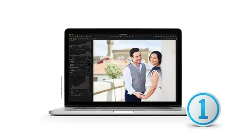
03:40 52Nino's Outdoor Image Workflow Overview
56:57Lesson Info
Nino's Outdoor Image Workflow Overview
Finally I get to talk Day finally gave me a minute. So we're gonna talk about today. Ah, a couple of things. I am going to show how to import from CF card. To be perfectly clear, is technically an SD card. That was Ah, technical error were shooting yesterday. What we did yesterday, my associate, Rebecca and I went to the roof here at CREATIVELIVE San Francisco. You guys have a little fancy little patio thing up there. It was a beautiful day and we did some outdoor shots. Um and so I took. We took a model named Lizzie up there, and we intentionally or I intentionally wanted to do some outdoor shots that didn't require excuse me that I didn't intentionally try to, you know, use any bounce light or bring any strobes or any type of screams or anything. Try to just expose for highlights. Sort of intentionally try to show you guys what capture one can do in terms of not just don't say save an image. Like I said, it's finalizing an image. So we're going to start, though, before we talk about ...
my full workflow in capture one. How to make an image look pretty. We're gonna talk about importing it, and Dave has reminded me and he's helped me learn to make sure I do my meta tagging and that's something that people other people have told me. But Dave's a very convincing man, so I'm gonna go ahead and have a go at that. But I'm gonna show you the process here that we created a new session which they went over, not yesterday, but in fact, earlier. Hey, went over that kind of concept. I'm gonna give you an idea of what I normally do. It is pretty straightforward, but what I want you to take away from it is that is basically and essentially my workflow and every single photographer, every single designer is gonna have slightly different work float. So Dave is very good at showing all the details of everything is brilliant. So with that, you're going to see how I apply. So there's some things I'm gonna do that he's shown, and some things like Don't do perhaps etcetera, but you can see how I work it kind of what you might want to call a real world example of what a photographer might do all right. So let's start. I'm gonna go ahead and just cancelling that we have our brand new fresh session. I call it Nino Si one, and I've got my SD card in there. I know Dave always says CF, but in this case, we have Nestea. So on the top left corner, we have our import. That's what the button I like to use. So I'm gonna be on my capture folder, Of course. And that's gonna usually when you pop in, uh, your str cf card in there, it will recognize that immediately. And that's usually what it tries toe try to read from. So here's a bunch of our test shots and look, it's Kris. He's like, Oh, God! Oh, God, I wish a scroll past that, all right? You didn't sign a release that never happened. Then on Dave, you mind if I import all 240 ish? Is that fine? All right. The key thing to do with my photos to make sure you put your logo on them and upload them later, Okay? Kidding. Suddenly heading to select the first sort of one that I think is acceptable. Go down to the bottom hold down shift and select the last one because I want to important those it'll show here. Import 251 images. Now, before I do any of that is any particular place on your volume day that you want me to put them? You already created session. I just want to put in the capture cold. Okay? I just want to make sure cause I did put him in the pictures folder on a Mac just to make sure you don't want me to move it somewhere else. OK, so he talked about the naming formats. Generally speaking, I know a lot of sort of. I don't want to be independent, but individual photographers we like to do just name of the file name. You know, I am G 20 to 22 90 etcetera. Especially for those who do that. Ah, born practice off, sending online proofs. The people Which other reasons? I won't go into why I really dislike that. Then they come back and say why I chose to 283 or to 285 or whatever. That's fine. I've actually kind of gotten away from that. And I'm starting to name my jobs. What? They are the model and some made some basic description on it and using metadata. Dave. So I've kind of got away from that because, I don't know. I just feel like it's more descriptive. And later on, if I'm searching around or I'm trying to figure out what what a project was or ah, session was there folder, it just makes more sense when I titled The Job Mawr literally as opposed to just go just go ahead and use the image name. I'm going to go ahead and just delete that, but I'm gonna change a couple of things first on the format, naming if you're there's a little three little dots, a little button next to it and they showed you this earlier as well. But that's all these digit counters, which I really, really like. I like to use the digit counters in particular. Usually these three or four just kind of had that in there, But then I tried toe go ahead and I go before and I might name it like Lizzie. Underscore CEO underscore SF And also like Dave, I had another underscore to separate that from the four digit numbers I've been a little bit more of that lately. Just form or literal naming. And, of course, depending on your client or what the job is, you might change that around. But instead of just hitting import and letting him come in as the final names, I find this is a minute, a little bit more sense for me. And again, I'll talk about it some other time. But I really, really don't agree with any online proof gallery. That's for another discussion I videos about, if you want to see it. All right, so I'm gonna go ahead, name the job, which call it Lizzie San Francisco. As for metadata, go ahead and put my name in there. That's a description. Oh, I don't know. We just call it demo. Shoot Creative Live with no space and a capital. L am I right, Chris? All right. Well, another thing, Dave. You can speak to this if you will, but I never, ever choose eject card or erase images. After copying, I'd rather just manually manage my card. That's I mean, I've heard of people I've never happened to me, but I've heard people say that their card corrupts the files when they delete it from here or whatever, and it's just not a good practice. I don't know of a practical means why people might do it. But I never hit that little check box saying erased the card. I'm sure there's some kind of hyper workflow situation in some production company that maybe they need that because it exists for a reason. But for me, I never do that. So I'm gonna go ahead, just import those. They should come in pretty quick, but we'll take a look as they come in. We'll take a look at a shot. You kind of see the basic philosophy that I was having. By all stretch of imagination, the sky is blown out. It's some people would hate this shot. They wouldn't think it works, etcetera, etcetera. And that's the kind of look I was going for to kind of show you guys the power of how much I can bring back. And like we talked about a little bit earlier, I went upstairs to the roof shooting, knowing that I could bring a lot of that sky back now. Photography still photography. So if I wanted a rich deep blue sky with Karl in the distance? No, I would have to apply some kind of light to her in camera. Absolutely. But still, to bring some of it back, which you're going to see how it works on an extreme shot like this. Once I decided which one I want to use a sort of like that one. We're gonna keep digging through it. Guys. There one point and was wide open. I'm gonna quickly dig to do it, maybe find one or two shots, three or four shots that I sort of like, I'm gonna go ahead and flagging this five stars. The default session has a five star smart album, so there's gonna pop right in their smart folder on Just kind of keep digging through and find a quick five star ones that I like. As for calling, I don't want speak too much to it. But when it comes to culling and choosing your shots, have a shot. Speaks to me immediately. I know it works or it doesn't. Then I can go and look for detail. I usually pick more than I want, knowing that a few might not be sharp. No, and actually love this. You know how it's still importing? Still generating previews. But I can start calling immediately. If I'm working on this one job, I could just immediately start looking through and making some decisions. We're not on the roof. I promise. The tiles. No, we're not. These air with the sun. And I like these examples because I've shot these intentionally for the second time. I think I'm gonna show you. They're supposed to be a little higher contrast. Can I show you some black and white conversion techniques? They find which one I like because I generally shoot for black and white intentionally, which I'll talk about, but just know that he's going to be black and white. That's popping in there. I will admit I am used to a very large I'm ex screen at a secondary screen. So one laptop screen is Wow. It's like doing everything through a keyhole. That's all right. Not gonna make excuses again. I show these against the sun so we can see how much we can bring some of that back. We see which ones of these I like. Lizzie was a great model. She was a real trooper for coming out. We put a call out for models and she answered and she trusted Rebecca and I. I'm gonna pop over to the five stars and start deciding which stocks I'm gonna work with when you guys. So while that finishes or while I'm scrolling through kind of making my final decisions, what I'm gonna try to show you today is typically what I would do to one of these images. Um, the ones I'm gonna work on, I haven't actually worked on before. And to me, that's important because you guys need to see me explore what I might do to an image If it's gonna look good or not. You get to see the mistakes I might potentially make in terms of artistic decisions. Rolling color wrote exposure up and down contrast and see if I like it. I think it's very important. And when I teach her touching, I always do that. I don't pre edit something in detail and then go casually edited again in order and perfect steps. And everything's in plant, I think is important that you see, if I fail so you can see the artistic process kind of calling myself an artist but you know what I mean. So you can see the creative process to figure out what I like and don't like. So we're going to see to what degree this is gonna happen. I don't like being rehearsed. I do like that one very much. I'm probably work with that one for sure. And I like better. I like that one. Yep. I'm feeling these. Cool. All right, so let's work with some of those, All right? So, first and foremost, this is like I said, some people like this blowing outlook with the background. Other people don't. I'm gonna show you what you can do to try to save some of that, at least to give it a more balanced look on God to compensate for that kind of lack of contrast that it tends to happen when you do that. So let's start at the beginning. First and foremost, obviously. You know, Dave explained earlier that this whole section here is useless to us right now because we're not tethering. So we're gonna start here. This is a perfect example of where the hissed a grand means nothing. There's a huge spike here, right, Because of all this white behind her, and that's okay. We're not going to even worry about that. I do. Like the way it came in. We mentioned earlier talking about the different curves here on the base characteristics. You can play with them if you want, but I sort of feel okay with his balance. All right. So on the white balance, this is where I use uh, we're talking a lot about using the white balance for consistency. As as they've repeatedly said, I use white balance for our aesthetics. What? I think it looks good. And I'm always a stickler for skin tone. I can I don't mind a blue shifting a little warm to a purple of my skin Tone is where I wanted to be on a huge stickler for that. So I will play with the white balance, just slide it around. So I think it looks good and every every single camera used. Like, I use Rebecca's camera on this a supposed to my own. And I realized that it reacted differently. Of course it does. So I don't have a set number. As they've said earlier. This is all relative, so I just slide it around, so I feel like I like something. In this case, I'm gonna warm it quite a bit up just to kind of give it a kind of a warm by. I do know immediately that I have a fair skin freckled face model, and when that happens, go ahead and zoom in a little bit. When that happens, you'll notice that, I think usually anyway, the fair skin, freckled face, usually the redheads gingers, as we call him. They have a tendency. Their skin has a certain transparency to it, and that transparent quality brings out certain undertones that look a little bit green. Look a little bit blue sometimes. So when I have that, I have to be particularly careful on high work with things and the freckles this allow you to make. This allows Capture one sometimes to make evening out decisions pretty well. Because you have these freckles, you could get pretty well with it. You get pretty successful with it in general, but it's not a simple as just a deep tan on a dark haired model that's pretty straight forwards. Nice and even fair skin has a little bit of transparency to it, so we'll see what happens. We'll see how successful we end up on that. But I'm gonna go and keep it somewhat warm. Sort of like that. Some of the key things I do while I'm working, I do use, like, you know, command plus and minus to zoom in arbitrarily. I hold down the space bar to get the hand tool, and I move around while I'm using my Wacom tablet. I use command zero control zero to fill the screen with the shot again So I can kind of see the force for the trees. I don't like staying zoomed in for too long because I want to make sure that whatever I'm working on looks good for the forest for the trees. Right? So this is a common common things that I do right again. The move tool, the standard to appear to the top left. I hit the V for that. Every time I finish with the tool, I hit V again. It's kind of like defaulting myself. All right, so I kind of like that warmth. Generally speaking, um, I don't try to use the eyedropper to try to set a great point, cause I don't use the great cards. They have enormous purpose. We've gone through that here for several hours. You see how useful they are for consistency. I would fail miserably if I myself had some kind of job. Are a client that I worked on regularly if I didn't use color cards. But for me, everything is about this shot. This image, how to craft the shot perfectly on that may be applied. If I have a set that's worth a little bit different. Little more sloppy, I guess. Let's go ahead and play with the color. Balance is generally where I end up after I play with exposure time. Excuse me with with white balance Just trying to send my colors in the direction that I want kind of feel it out. So usually with the mid tones first. That's what the most radical changes are going to be seen. Rolling some warmth, not too much. We have a fair skin models. There's no point in trying to make her a 10 model. That's not gonna work. Play around with that. Remember how day was playing Earlier? We talked about how these don't have numeric values and why they don't is a very powerful tool. Nonetheless, I find life. I roll this to the hue that I want this architect, we have little dash tab thing on the Ark on. And then I choose the saturation of how much it will roll in. And, of course, the lightness this way. I generally don't pull around middle circle to too much unless I'm just exploring shadows as well. I find that rolling in lately I've been rolling in a lot of warmth into my shadows, though I guess I'm quote unquote known for having cooler shadows, and you tend to do it here as heavy handed as it is. I don't pretend that this is gonna be my final color graded look, but I send it in that direction because what I'm doing is I'm feeling out the vibe. I'm feeling out if I like the direction that I'm going. It's a very organic process. It's not literally I want this color. So put it in. I want that color. So put it in. I am feeling it, and I will probably negate something that I do later on with another process, maybe, perhaps depending on how the process is going so sort of I feel like, OK, I've got the foundation. Now let's go play around with some fixes and see what happens to my color and go from there s before we play with anymore color, we're gonna move over to Oh, the exposure area here. Now, this is where it gets interesting because I feel like for the most part, she's okay exposed. She's a little bit light, but she's okay. Exposed step background. That's the problem. And I've been, you know, you heard me earlier freaking out about and Dave as well about the high dynamic range in the highlight slider. If I'm right, this should be quite an impressive result If I slide this all the way And sure enough of this, as you can see, a lot of it came back. We're not going to get a rich blue sky with, you know, wispy white clouds again Unless we let her and compensated. But we have even by pulling it away to the 100 it doesnt look completely fake. It doesn't look great out and weird radical difference. And you could see all this little fringing on the around her head That looks like it went away. Nope. There's actually wispy hair in there. That right there guys was like a selling point for me, a major selling point for using capture one because I was like, Really, I can shoot this way and bring that Oh, you gotta be kidding. I'll play around with it. Probably a little bit more with exposure, I'll take exposure down a little bit. Probably bring the shadows up. The first thing that's happening. You noticed. Don't you can see on the feet of the first things happening is you're probably started to lose. Some contrast is starting to look a little bit kind of flat. That's okay. I'm trying to create a flat base. And then I can tweak and popular contract with levels and things like that, which I'll show you shortly. Just trying to see how much I can pull from it. Which is why I always go straight to 100% and then play from there on the highlight recovery. I mean, I don't like that. Yeah, I'm kind of digging that, and I'm going to say this repeatedly while I show you this process. Guys, I end in photo shop. Okay? Not with any one particular process. But I ended Photoshopped every single time. Whether I ended Photoshopped three minutes of Photoshopped work or half on our or another hour. I don't know. It depends on the image, but because I am in photo shop, I use capture one for my one hero image. Like I said, sort of a pre envisioning like I'm gonna send it in the direction that I want knowing what I might finish in Photoshop. Okay, So, like, I know that most of the colors air right, But on the tweet, the fingertips, for example, the fingertips are usually read right, So I'm not gonna try to fix that capture one. I don't want to jump through those hoops here when I can fix it in two seconds and Photoshopped. So if you're new to retouching and editing images in general and maybe you're not sure what to use and capture one what to use in a photo shop? And there's not one simple, you know, magic answer on that is you have to figure out in your work foot. But generally speaking, when it comes to rolling in color and moving and shifting colors and exposures, I want to use capture one for that because it pulls all that lovely raw data with all those fancy algorithms we've talked about. It makes everything look smoother. Once I have that based foundation, I have minimal things to do in Photoshopped. Minimal. Okay. And if you seen my video tutorials in for photo shop for the last few years on my YouTube channel, you might go Well, you know, I've seen you do a full workflow and Photoshopped have you abandoned that? I don't abandon that. It depends on the project. It depends on what I'm trying to accomplish. So I am not trying to show you the way to use capture one as a porter photographer. There's a 1,000,000 different ways to use capture one supporter, photographer. I'm simply showing you what I do. I'm starting to lose a bit of contrast. And this is where I bring it back with levels Davis talking about that earlier. It's a very powerful tool. I mentioned that levels could be very, very destructive. Unlike a curve which generally will make, you can move your midst back and forth pretty easily without blowing out things, but with levels you can definitely do damage very quickly can undo what you just did. So I would probably bring back some of that contract just a little bit. I do not try toe follow the hissed a grams blindly. They bring this into here because I must. Now I want a slightly hazy look. So I play with it until I feel like it's working very, very careful on the light side that when you bring this in very careful. Can you undo what highlight recovery is doing very, very quickly, and it is causing if if any global changes aren't working, we could take care of that with, you know, a layer as it were, or local adjustment. But I try to do as much as I can do in the global. Affecting the entire image is what I mean as much as I can until I absolutely cannot. It's mainly because of want and laziness, but I also just try to see what I can accomplish a so quickly as possible, because what I apply, what I do here. If I had a set, if I have, I decided that was going to use other shots of Lizzie from the same exact situation then I would apply what I did over and see how it worked. Sometimes it doesn't work for every shot, and that's fine. But for the most part, I would apply the same. The same settings over there, you know, sort of feeling that just a little bit more levels to me is probably my favorite tool for controlling on images, punch or lack of punch. I will pull in the outputs. A little bit of me show you what I mean by that if I need to. If you want a hazy look when we talk about the difference on these, right, some people call this like a crush shadow. Look, it's very much very used to fool to do here because you don't get that blotchy crushed shadow that you might get in photo shop if you want to play with that look. But to be perfectly honest, crush shadows, air getting old guys. I'm probably making a lot of enemies by saying that, but it's getting old and I'm guilty of it, too. I don't know if you know what. I don't know what I mean by that. We'll talk about it, but, um, I love the levels toe. I play a lot of times in the levels to, and I also play a lot with it in black and white conversion, which will do shortly. I don't think I want to play with any of the curved. I think the curve there fine. I don't think that they would play with here. Clarity and structure. Now they shot. This is shot at 18 It's not this images and about sharpness is about mood and aesthetic. I'm gonna leave that alone loaded thing yet Been getting might hope gonna bring attention forward again, though, if you see a vignette most of the time, like for example, this is what I say in terms of just sort of aesthetics. If you look at a thumbnail like on the top right here, if you can see the thing yet clearly like an oval and a thumbnail, you probably went too far. I think that's just kind of a good rule of thumb is a little more leeway in other genres, but in portrait work, if you can see that oval, yeah, I think it's probably too much. You need to have your I go to the center of the image without making it really, really obvious. My opinion. That's it. But no, it's not my opinions. What you must do house that got better. Kind of feeling that go back to my colors and play around some more guys highlights. I think if we negate some of the warm highlights I talked a little bit about that earlier. Negates some of the warm highlights with a very, very small dash like a sky blue that helps get rid of that warm wash. This is how I do it again, very visually based. Just look, I'm just trying to get an aesthetic that I like. Yep, sort of feeling. That is weird flair right here. Didn't see that before. All right, sort of digging that vibe when you see something here, hold up a second. She want a little more being yet. And I live here in the color the color balance till now. Also play with the master. Usually, after I've done a little bit of mid tones and shadow playing on that, I play with the Masters in case there's something I've missed. Like maybe the whole thing looks better cooler, and I've taken that for granted Maybe the whole thing looks even better warmer. So I played with that. Usually, after I've done some of my mids and shadows. If you're curious, if you have never seen any of my work and you're watching this thing, who's got with the bandanna? You go to my website right now if you want, you know batista dot com and you'll see tons of how I play with color in capture one. Yeah, I don't like that. Yeah, I like a little bit warmer. That sort of works. Cool off those highlights just a little bit more. So think about this. Why am I spending so much time doing all these general sleeping changes when obviously have local adjustments or layers? Obviously, I have Photoshopped. The reason to me is more of a personal choice. I like to see how much of the image I can work on overall, because all these things will marry together a little smoother if I'm doing too much masking, um, which is necessary and some things. I find that things start to look kind of fake. Kind of quick. I've tried to employ a lack of better term, more of a natural kind of vibe in my color work, I guess. And when I start with capture one, I didn't really know any better. So I just move stuff around until it look good. And then I start realizing why I sort of like the results I got. But when I started implementing local adjustments or layers, I start getting a little more finite control. And again, I, you might think to yourself, There's everything you can do, Nino so far and everything you're about to show me you're gonna notice it is possible in voter shop, the question is why? And again it has to do with smoothness that has to do with pulling raw data. This is equivalent of with the local adjustments we're gonna work on here next. This is the equivalent of like, you know, raw smart objects and photo shop if you don't know what that is, looking those up. But it's basically be able to make small little changes to brightening eyes, adding contrast, adding a little bit of sharpness, a certain area, but using raw data, and I use it very rude mentally, I'm sure there's a lot of cool things that local adjustments conjunction, dance and do cool, sexy things. But I use it very rude mentally, I'm gonna show you through the basics that I dio. We're awfully quiet. Have any initial question so far are asked me? No. All right, so local adjustments. Um, this is how we use them. All right? Effectively, their layers, just like in photo shop. If you're not familiar with photo shop players, then you already behind the curve on retouching. So you need to get on that layers. Are your bread and butter in photo shop? Absolutely. And when I first heard, I think it was What version was it that introduced the local adjustments? Was that recent or with a Yeah, When I first heard that, I mean, he was skeptical. I might have mentioned that earlier. Um, I was very skeptical. I was only have layers. That's adorable. But then I start playing well, hold up a second. This is actually really powerful. And something hit me in the back of the head and said, I'm gonna be making all these changes with raw data that captured one processes. Yes, please. So, for example, let's say you want to work on something real simple, like adding a little bit of, Ah, speculate. Contrast to eyes, especially beautiful brown eyes like this. It's the simplest thing to do in photo shop here. It can also be simple as well. If there's other, quicker, simple ways to do it, I don't know, but this is example what I might do on the local adjustments. Um, you have a little plus and minus buttons is how you create new layers. He pushed plus and create a new one. I'm gonna call this one sort of eyes. Is there anyone way Teoh edit eyes? No, I have some philosophies, but depends on the subject. Depends on the shot. It depends on the vibe that you want, But generally speaking, I'll go ahead. I want these guys to have more contrast. I don't want to brighten. I don't think that writing the square of the I ever works, you know, the white part of the eye. I don't want anyone to brighten. I want to add more contrast that little twinkle to those catch lights that are created by the sky in this case. So I do a couple of different things. All the options that are down below local adjustments, at least on the default settings. The default layout. You'll know this, at least. You know. It's not very obvious, I know. But you'll notice that each one of these has a little paintbrush icon next to it, which is the same little paintbrush looking icon on top, which shows that those work with local adjustments. So I will probably go ahead and pop off. They wouldn't want to play with maybe clarity in life. Contrast. Yeah, nice s curve contrast. See how that's gonna start And then I'll go ahead and brush that in me. Show you how to do that. We make sure that we're on the eyes layer. We could hit the letter B to get the brush tool out. Now, whatever previous setting you were on, the brush tool could show up. Right now it's huge. Let me explain a couple of things high. Use the brush tool first and foremost. When you get the letter B, you could always right click or control click that brings up the brush settings. Ah, lot of them are just like photoshopped the size of it, the hardness of it. And as you slide this back and forth you could see two concentric circles. The outer circle shows sort of the feathering how far the softness of the brush goes, and it gives you better approximation is kind of cool. Kind of wish Photoshopped have that. To be honest with you, I'm going to go ahead and keep it sort of in the middle of the hardness here. All right, opacity and flow. If you're really a photo shop, you know how those work. But for the most part, I'm gonna make these go ahead and make it good, peg. Um, 100% everything so I can see it. What I'm gonna do is because I'm on the eyes. Local Jeff or layer. Do anything I have changed on. That layer is curved. You can't see it because I haven't brushed it in. I'm gonna go ahead and shrink the brush size down with the bracket keys and just kind of test see what's going on. All right, so that's a complete and total catastrophe, and that's okay. We can fix that. We can also adjust it. Zoom in real quick, right? We're gonna hit the letter e, By the way, which brings up the eraser, which lets us clean up our mask for you. Photoshopped experience users. That's like painting on the mask in white or black. All right, so now we can play with our curve cause we made that mask like David doing earlier many times of you to em. You can see the mask, which is his red haze would be to kind of refined that a little bit. If you're not familiar with masking and photo shop in general, this is going to seem alien to you as well. But maybe it'll help you. Maybe you're not gonna be used to adobes interface, and you'll make a lot more sense of things quicker. Turn it off, hitting em. Pull that off of there again. This is just a technique that I might use. You can turn off the check box on and off to kind of see what the look is looking like hyper settle exposure up a bit in the contrast up a bit trying to give you an extreme example so you guys can see it going to go ahead and delete erase the white parts of the I. Yeah, OK, so you see how that basically works. Hit em you can see the mask. It doesn't have to be super super accurate, but I have done is created a layer just like we do in photo shop, and I boosted a little bit exposure. Contrast little of curves just to add some contrast. Punch for a little more speculator light you see of the differences between the two eyes. Turn off, turn on and you might think to yourself again, That's just a Photoshopped thing. You know what's the big deal? But again, as you get used to this and use it more and more and more, you're going to start making more bold changes in capture one. And you want to make sure you're definitely pulling raw data for that. Yeah, that's a simple change like that. I think I have little pop a little bit more. No, uh, something that again that I also doing photos have all this stuff doing Photoshopped. I'm big on being real careful about, like teeth and eyes. If you're gonna de saturate a little bit, go ahead. I usually do do that just kind of make things a little bit. Look a little bit cleaner. That's fine, but you don't want teeth to be like powdery grey A don't white eyes to be electric white. So a very, very simple sort of extra layer. I don't that just kind of, ah, slight the saturation. There are probably more finite ways to do it, but this is simply what I do. Someone call it I white teeth and labeling your layers in photo shop in general, let alone here is a really, really good idea. That's actually something that I'm actually pretty pedantic about, actually label my layers very detailed because when I open that file back later to tweak it and this just layer one layer to layer three later in 97. It is a catastrophe, and you don't know where anything else. I'm actually pretty good about that. And my pretty good. I mean, I do it most of the time. Okay, pull down some saturation, which is very, very straightforward. And maybe just some brush some of that in make a little bit softer again. I right click to bring up the brush options Russian, some of that very carefully, very carefully. I mean sloppily. You'll be surprised when you're making mass guys, how sloppy you can be and get away with it and still have a great result. Don't sweat over it. Unless you're doing really hyper detailed composites. Then you can always tweak it anyway. Something like that. I just wanna get my mask in place, and then I can play with how much d saturation I want to do. How many people here? Tablet users. Tablet, Tablet tablet. Okay, You didn't raise him. You will be all right. Remember when you first get a tablet. It does the catastrophe, and you will swear you say lots of F bombs with my name attached to them. Think this is stupid? But if you stick with it, almost everybody can't live without. Okay, I'll do that. My number is 1 Call Dave. That's my number. So this is real quick. This is extremely slopping. That's fine, because I'm gonna refined. I'm just trying to get the basics of a mask in there and whitening eyes like this. Guys, you may not want to do it. You may not care, but when I'm gonna do some heavy handed color grading across the whole image, I sometimes like to do this. I can have a little bit of control in case migrating. It's out of control. That is how I'm worried about that is way too strong and she looks great and hazy. And that's okay because then we could just play with saturation setting something like that simple enough. If you want to play specifically with the jacket, there's a great opportunity to mask out the jacket on, do things to us. Let's go ahead and do that because you might want to denim to be more of a true blue. Are you rolling in all these warm tones? So go ahead Mass that in real quick the masses really everything guys, is everything in photo shop, it's everything here. If you're doing like I said, some really, really heavy handed stuff. Where you going to some really advanced compositing or some serious compartment removing of elements, moving a backgrounds and things like that. Then, at that point, you need to kind of go go easy with trying to do and capture one and be like, you know what? This is a Photoshopped. Also, do you know this is a perfect image to do the mask from color red in it grabber like Blue Select, you like the mass from it, and it would be very simple and easy. That's true. Would that street Let's go with that. So we'll start with the color editor. I feel moved down here. Yes, sir. That's how you would do today. I would someone choose sort of a blue. No, we can't see the hole to hole that lets get this out of here. There we go. Have you selected And like we're doing earlier, we kind of play with the range. And even if it doesn't nail the jacket perfectly, it might be just enough. You don't want necessarily a perfect mask if you don't have to, you might be just enough that you need, or you can refine it later with the brush. You know, that sort of works there. All right, So create master Layer from selection will go with that tool, and there it is, obviously labelled layer one. So we just call that jacket auto to see what that looks like, and we want to refine it. We can, but I'm gonna go and play with it first. Just without you would have to see what we get. Just just for grins. So here you know, the Kurds might actually be a good, because if you start like experimenting with color grading on curves you if you get your head around it, you connection to some powerful, powerful and very smooth looking things might go and play with that and see what kind of results again. I'm really curious. Well, that's gonna work A lot of times we do curves that you want like a pure blue. You take the B channel and kind of pushed it up in the middle and take our channel and take it down in photo shop. I love to grade with curves very, very powerful, but had to be very, very subtle because it can get very, very detail. So that's looking like so what we're doing. Yeah, I kind of like that little too strong, but that's OK. You can just kind of in a linear away from take down the saturation as well. At least is a little more true Blue, which I'm sort of enjoying. What kind of like it. Oh, by the way, David is gonna ask you Is there a way to zoom out further than this? I could see it really small cause sometimes when I'm working with it. And I meant to ask you that earlier. Sometimes when I'm working, like in photo shop. I was really small one. I have to use a large brush or something to create a vignette or something like that. Is there a way? Because I haven't figured that out. There's the proof margin. You can set the proof margin here, but you often good preferences and change a proof margin as well. Okay, so I won't do that right now. But at least give me an option. Okay, Cool. But again, I have to make that. I always have to make the decision of whether or not I'm going to go try it here or try and Photoshopped, right? What am I gonna try to accomplish? Go back to my color editor. I'm not completely convinced. I like that. You know, our Dave. Um, can you just the passivity of your layer? Nothing. I have found a my wrong on that in just the capacity of your leader after the fact. I know you can only adjust the capacity of the brush by late, placing it to begin with and they're in. That's another example of how it's not like photo shop, and vice versa. So usually I'll just take the setting in question, and I'll reduce it if I want to do that, which I kind of get where it's coming from. And that's fine. Would be doing a lot of heavy handed layering for compositing anyway then. But I know what you mean. It's it's a function that I kind of wish was there. But that's all right, all right. So let's see what else I'm gonna try to do. I know we were playing with the earlier. It's amazing to me when I did this experiment, I'm gonna go and show you guys I'm talking about, You know, we had earlier we had the high dynamic range on the background layer here. We're talking about how we pulled it up to almost 100. Well, I was experimenting the other day and I was like, Wait a minute, hold up. What I if I add a new layer and we'll call it like, I will call the highlight recovery mawr, right? What? Did you do it again? Well, actually work. I was actually kind of surprised how much it actually sort of worked. And when I slide it up, I said, Why don't see it? And that's when I start playing around discovering some other functions like film. Ask in other words, when you go to film, ask, it makes the entire the entire layer one giant mask, if you will. So we doubled up, if you will, on pulling back even mawr hdr on the highlight recovery now is that great? Is that adding a bunch of mess or noise? I don't know, but I was blown away that I could do it twice, and it still didn't look like total trash showing where my associates that and she thought the same thing. She was like, How does that work twice that looking totally horrible? No, it's not gonna bring back that pure white sky, but it still gave me a little bit more control. I don't know. That's ah, unsought of, ah, informal way of playing with that kind of function, but it shows you that you know you can you can double things up and it still looks good, is still smooth, and I know things in Photoshopped can get chunky really, really quick when you start layering and doubling up too much stuff or trying to brighten or darken too much. You can't You can't really break capture one which I really like on that. So something like that, if you want double of a little more highlight recovery than you already had, Well, that's not like what that's going now. The the other image below it that I selected well shot in the same area that is very, very different. So, um, I'm gonna try and copy and paste the same exact settings, and I just worked on and I expected to come close. Sometimes for me, that's enough, because I'm not worried about necessarily reproducing it exactly on a copy and pace of settings. But I want to at least get the basics of what I did in there. However, if I do a master copy of it all, I'm gonna have all the local adjustments with it, which are based on Mass. They have to do with that first image shape that's not gonna help me at all. So I have to kind of migrate a few of the key things that I did over or go ahead, delete the local adjustment that is my ham, ham fisted, maga flying mallets method of trying to make it work. Generally speaking, if I have a set of images to do, I will do that in Photoshopped only because I'm used to try to make them all look the same as a set. But I rarely ever deliver full sets 2030 images. So my work flow a little different in that regard most of time on delivering one or two images. That's slightly different. So I'm not gonna go ahead and apply that there because I want to show you guys, uh, my black and white conversion methods give you a little bit of thought on what I think people should do when you shoot black and white. The studio audience were all photographers here. Raise your hand. If you've made an image in Black Maiden name is black and white in a photo shop because you didn't know what the hell else to do with it after playing with it. Come on, let's see your hands looking him over. He's like, No, I haven't OK, we've all been there because you know how it is. We're like we're playing with color. Were playing with this. We're playing with that. We're sick of it. We d saturating. Go now. It's art. I'm done. All right, Um, before you even get into capture one, our photo shop or light room or anything to start doing a black and white conversion or just simply putting the color out. If you think about your shot in black and white, you have a lot more success. Okay, Apart from putting your camera potentially in black and white preview mode in your LCD Bubba black, you think about what is what is what makes a black and white image popped the best. Usually, but not always. It's contrast. So if you think hard, light, deep shadows, high highlights, etcetera, you're probably gonna have more successful black and white image when you set out to shoot black and white. If you haven't ever done that thinking, I'm going to go make black and white images When you set out to do it, your black and white images are going to look better, as opposed to shooting random stuff and then making a black and white later. But either way, I believe in controlling black and white quite a bit. There's a couple of methods that I know of their good idea or not. But what I do that I like to do when I do a black and white conversion and capture one, So let's go ahead. Let's go ahead and play with that so we'll go ahead and turn on the black and white conversion. But just earlier day was kind of going over that obviously it's a little over exposed still, So we're gonna take down that exposure. And that's another thing to while I was up there on the roof, Um, while I was shooting and she was moving and I was just kind of trying to make sure I don't fall and die, you know, little things like that, Um, because it was actually a lot steeper than it looks, but the skyline looks amazing out there. You guys should know that. It's amazing out there, I knew, and I pegged the shutter to 8000 because I didn't want to go past. I just want to leave it f 18 with a somewhat superb right out there because you guys have utopian weather. Um, I took a couple of snaps and I realized OK is not working when I switched to 25 because I need to control the light a little bit more. But I was pegged at 8000. It did help, but I also knew that the shots they were just a little bit over like this. One could be fixed and captured one easily, so I wasn't worried about it. And sure enough, you can bring that back down. And it's as if I did it right. Almost a full stop, and it looks fine. Okay, all right, so we'll come back to my black and white converter. Turn that off now It's pretty obvious, especially if you've done it in photo shop before light room that you can adjust the colors to get different feeling Vibe. Make the reds glow for skin. Almost all the skin is going to exist in your reds and yellows, and that includes all nationalities, folks. Almost all the skin is gonna exist in reds and yellows. Annoyingly, most spoilage of green leaves exists in the yellow. That's a digital imaging thing. I'm sure days could explain better the most. The time when you want to mess with spoilage is going to be yellow. But skin exists here and in my world, a portrait work. That's where I like to play with. So I'll play with this first most of time, kind of making it deeper. But I was a couple of extra things because this spring my reds up and down, etcetera. But looking, at least wait effectively. While this is on, just like if you think Photoshopped, for example, it has that layer, black and white layer everything that you do underneath that layer of you thinking Photoshopped everything you do underneath that layer, it's still gonna get converted to black and white. This effectively is the same way. So suddenly you have some liberties through some wild things, with some tools that otherwise might not look it. For example, I will come in here to the levels and change the R, G and B levels in the mid range slider quite a bit. It's still going to black and white, which gives me much more leeway to get different effects in black and white observed, especially in the mid range slider. So let's take Let's try the blue one, see what happens. We start sliding this around. It starts like cycling through the colors a little bit. Yeah, there's like a like a swirling, almost. You can kind of just refine to get a certain look. Blue didn't do much. Let's try red, and you can play with that a little bit less your green does green just like different vibe. If you're not getting anything you like out of there, you go to curves and play with RG and be right there because you're doing some radical things that would look terrible if they were in color. But you never know what kind of cool effects you can get because all being converted to black and white as you're working. Okay, see how it's kind of cycling. See that It's hard to describe what is the best way to do it. I don't know it. Just play with it. In fact, in Photoshop I have an action that I've created that uses curves and levels plus a black and white converter on top to keep just give the ultimate control. There's no I can't tell you what exactly they're doing to each image, but if you play with these curves and play with these levels and RGB channels, you can really refined to get a custom, custom black and white look in 99.9% of time. I'm happy with my black and white. When I'm done in capture one in that state, I might send it to photo shop from skin work. Dave is anyone else? Do that. Am I crazy? Lots of people use the sliders. Lots, please will use the red channels in blue channels separately for lots of different reasons. Absolutely. So again, that's just again. My might throw the hammer and it method. But I played around with that because I like total control. And yeah, as you play around with these sliders in the black and white control and you play around with levels and curves, you might be in the gating things you did earlier. But it was a different vibe as the contrast shift in the mid range shifts around a little bit. You get kind of a different vibe, significantly different vibe than you would if I you simply de saturated. So I'm a huge proponent of that and the smoothness of it. Go ahead, kind of zoom into where this was looking like here, even though I did all these radical shifts with, you know, levels and everything else. Everything still looks smooth. There's no Chungking. There's no hay lowing. There's no blotchy nous. You could force the issue like if you go too far, for for the most part, it looks fantastic. And of course, if you just go back to regular RGB levels, you can change that kind of a little more, more normal that you might be more used to, uh, black and white. I'm really liking this image. Actually, it's very rare that during editorial, do an image I might actually keep. I don't know like that. Maybe a little Clarity's I don't mind. I met up a little bit. Just add a little punch because it's black and white, you know, now starting to get in America. So I always ask about that. Can I Can I type in numbers type in numbers, please? Okay. And I did not intentionally mess with the HDR aspects because when I want a black and white, I want contrast if I can. If I can solve it by exposing for highlights. In other words, retroactively, by bringing the exposure down to the highlights are blown out. Then I'm happy with that. I rarely mess with the HDR function of them in black and white because I kind of wanted to remain that way. But every now and then, you're highlights out of control, and you have the kind of control them with this. Seems to me that's a little bit too flat. Maybe that's not the look that you like, but I kind of like that. So yes, probably what I do to that one. That's kind of what I normally do in black and white again. You could replicate all that in photo shop, of course, but just a smoothness and beautiful miss. That that capture one does is amazing on that. What else do I have here? Go ahead and apply these command shift. See? Take every single setting and applied to this one real quick. Way too dark. And that's okay. Something in contrast, the image rights. A real high contrast image that looks kind of cool. Yeah, it's playing around that. And like I said, I'm not gonna take you through, um, the full process of sending these things a photo shop, doing all the skin work because that's not why we're here. right. But understand that for me, these images are gonna range between 15 95% done here and capture one actually have a, ah challenge that I'm gonna come up soon, Do one myself. And I'm gonna challenge people the on article to do a full edit in capture one to be having done it before and just kind of gathered all the images together and get some feedback when everybody thinks cause I think there's a lot of us out there who have been switching recently is one. The reasons we're hearing creative life because capture one is hugely popular. I think that would be fair to say right day that captured was probably more popular outside of the commercial room than ever before, right? I mean, that's what I'm hearing world. Everybody knows Capitol correct. It's 99%. So it's been so saturated. It it is is the right. So it's been the reason we're creative line, I believe. You know, years ago we could been incredible because this is virgin nine. This isn't version two. All right, so we could have been here years ago, but because of having some of the strength that you're showing in skin tones and and now shooting people. That means it is more applicable to getting out and doing more of a workflow free for your kind of genre. On I'm hearing about it left and right, I give both workshops around the country and private tutorials, and I'm getting you know, I think the amount of people asking for a photo shop training you to be 100%. Now it's 90 and declining. People are like I need to learn his capture. One thing, Um and that's great. I'm sure faces particularly happy about that because it's expanding the market, but everything that Dave is gone over for the last several hours, If you're if you've been sitting around thinking what us an awful lot you know there's a lot of technical that shows you a robust and evolved application that's been around for almost 20 years or so, so that's showing what it's capable of. On the absolute extreme, you can grow with this even if you build a full production company. But if you're in in the individual photographer, relatively new independent wedding photographer, portrait shooter, glamour shooter, fashion shoot is just getting started. You shoot flowers for fun on the weekends. Still, you can use capture one, and you can benefit from all its wonderfulness. So and all things considered for an industrial grade application, the fee for it, how much it costs is absolutely only reasonable, so that when I hear that push back and I am not trying to endorse anything, we're getting any kickbacks from anybody. When everyone someone tells me, Oh, it's it's the herring dollars only and it's your whole world. I mean, it's it's going to change everything for you. It's not that bad. Maybe coming back from the old days when you know the freakin Adobe Sweet was $2000.1 nice application with $3000 things like that in the water production, $3 is nothing. So it's it seems daunting because of all these amazing things that it can do. Um, that's fine, just like photo shop. You don't use all of it either, so you may not use all of capture one, but it's gonna be scalable for you. No matter how much you grow and how much you expand your your services, you would have already like this image Let's play with it. So let's go the opposite direction. Let's go ahead and bring in the highlights real quick. See that I love that perfect. I love how that did that. They bring up the shadow just a little bit. Cool, pop the contrast. Just a bit. Conde, when that's going warming up a little bit with my white balance again that I use it in an aesthetic manner. I don't use it in a, you know, accuracy man unnecessarily. And that's OK days and calling himself the nerd all this whole time. So I'm just gonna call myself. What, What's appropriate? Crazy artists went the moron. Not more. Uh, the artist. That's fine. Great. The artist is fine. I'm also self taught in everything I do. I not particularly. I don't consider myself particularly brilliant or intelligent or anything, but I trudged through capture one, and I figured out enough of it to make my images that I like. And it turns out some people like what I do. So even me, a very informally trained artist managed to make capture won't work because I wanted to. I remember when I first started, I was tell people this famously that when I started on capture 17 after was recommended to me by Jaime A. Bar, a photographer based in Austin. I hated it. I didn't screaming from the rooftops and make a scene. I didn't start a block about how much I hated or anything crazy, but I didn't like it. And I told him I said, Dude, what's the big deal? You know, I was one of those guys. Never heard of it. Have no idea why it matters. And he was like, Dude, keep at it. So if my pool but can figure this out, you guys can two. And then if you can't, that's why you have Day Gallagher around. You can fly him anywhere in the world will take care of you. All right, for Price for a price. A big price. All right, let's play around this one somewhere. No, a little more yellow play with the cool tunes a little bit. So although I don't recommend that you run out too the field and shoot thinking well, who needs reflectors and feel light and screams? I got capture one bad, because light modeling is light modeling. You know, if you want if you want highlights. And if you want deeper shadows. And if you want a certain type of lighting pattern, you have to create that. You can't think I got captured when it's everything but in a pinch in a situation. Either when a client or your own artistic vision says I want there Oh, it's backlit. Well, okay, I'll just shoot under expose and bring it back. Think that way in a pinch, but don't go out there necessarily intentionally trying to do it. I might have told a story where I did that in the Nevada desert with a 70. A seven are to Sony. Let me borrow it and said Check it out And they boasted all about its dynamic range. And I said, Really, let's go see about dynamic range So I took Today. Seven are two outs in the Nevada desert and I went to gold now and I shot against the sun a lot intentionally. Two and three stops under and capture one brought it all back. It was amazing. So it actually can do what it says, though that's not how would approach a client job. Oh God, no. When you do an experiment on your own for the heck of it. I was out there with Renee. Robin. She was actually my model for the day on. We went out there and intentionally just mean you've seen a seven or too little Marylise right little bit camera had 85 millimeters ice on it. And just that wasn't climbing the side of mountain saying all right, dynamic range and see what happens. And ah, I'm pretty sure that that you know people. OK, let's not get into this debate. But people yell about dynamic range. They said Cannon is the worst and all that well, I'm a canon shooter. And what capture one does of the dynamic range that can and files offer is pretty darn impressive. I don't consider that. Yes, I got more of the a r W Sony file, but what I got out of the cannon files I mean, I considered amazing, and like I said, I could not get that in a CR play With that little bit contrast boost there, it's cool images by itself. There's a lot of things that I do on outdoor images that have to do with atmospheric effects and special flair, kind of effects and other things. And I still resort for photo Shopped for that exclusively. I don't try to pretend I'm gonna try to do that here, though I am very curious about trying to develop a technique to do some of these atmospheric effects in capture one that has some thoughts. I'm gonna try to develop that over the coming weeks and months and see what I come up with. And that's another thing to on the curves. Most commonly do Photoshopped as well. You always pull in sort of in the middle, right. You get U S curve or just boost up in the middle. But the very, very ends these outputs, right? If I pull that up, you get kind of a soft, hazy look which sometimes I like to do just like a level she could do the same thing. It sort of works there. We'll leave the clarity alone on that. So, really, guys, as you can see, what I do is pretty straightforward. I do spend a little more time in a different direction on black and white. Obviously, what I do is pretty straightforward in capture one, but I do it and I spend the time to make the effort, even though I could replicate so much of it in photo shop just because the end result so much smoother. And when you send that to photo shop, which is what I do is I go ahead and exported PSD 16 bit, For example. When I opened that up in photo shop, it just looks amazing. And the skin work is easier and the finalization is easier. It's not particularly complicated, but it's how I like to do things so far. And it was cool is that every week I find something new out about this program because I could still so consider myself a new person on it. And that's one of the reasons why when Creativelive approached me, I said, Let me call Dave because I know he can bring a lot more technical knowledge in a broader sense than I could. But that's what's great about You can evolve and grow with it, I think pretty easily. And like Dave said earlier, you got to be persistent. You got to stay on it because you're going to feel like it's not worth it. Like this is a bad idea. what this trial ends in 30 days, and I hope that comes soon. You don't give up, there's there's a lot of there's a lot of benefit from it. And right now, if I'm correct and it's becoming hugely popular in the non commercial world, all of us sitting here without regular photographers, quote unquote, it's just going to continue and you want to be ahead of the curve or behind the curve. So if you want to be a capture one guru since summer of 2016 as opposed to figuring it out neck at the end of next year when everybody is like Oh my God, where there's been all my life, you need to get ahead the curve now And that's going to give you that edge and that advantage as far as I'm concerned. In fact, sometimes when I first started benefitting from one, the most people would say, then that looks great. I like the coloring and the fuel in the flavor, how to do them like photo shop. I didn't want to say it was like add back with its capture one. I felt like it's like a little secret. But clearly, as Dave has illustrated, is not a secret or even close to a secret in the commercial world
Class Materials
Bonus Materials with RSVP
Bonus Materials with Purchase
Ratings and Reviews
Jesse Furqueron
Yes, per some other reviews this started slow. What turned me off was the sales spiel for the class. It also came across as a sales schtick for C1, which is ok given the presenter. Stuck with it (well most of it, had to step away at times) and found it useful. I've had my eye on C1 for a LONG time. I'm not a pro, but would consider myself a pretty serious amateur. I document old mining and narrow gauge steam engines, general travel and now do our product photography (started a new company, so all $ goes to that rather than C1, which I would LOVE to own after seeing C9). Went with Aperture back in the day because of its cataloging and price. Back then C1 didn't have cataloging, though it DID have a 2 tier price structure...(Phase WHY did ya'll do away with this?????). Back to the class. After lunch on the first day I think they found their stride. Second day, especially Nino in the afternoon was quite good. That was probably my fav session. Seemed like most questions came from the in-studio "captive" audience. Expected more from the web? Constructive feedback. 1) Could have condensed things down quite a bit. I liked the more casual approach it took later on first day and on the second day. Dave especially seemed more at ease. 2) Ya'll (Dave especially) seemed to have his topics scripted out. Given the two day nature of this, would have been nice to give the attendees an idea of agenda/timeslots for topics up front. If an agenda/timeline was presented...I totally missed it. But then, I couldn't back up or rewind the live stream when I had to step away several times... if I paused it jumped to the realtime stream :-( 3) C Lve was pushing the "free trial download"...isn't there already a trial download from Phase? What value are ya'll offering in this area above what they offer? I found this annoying, if there's an extended trial period or something through ya'll cool. If not...I'm back to the annoying aspect of it. 4) Nino, get a Cintiq :-) If C1 doesn't have a profile for Cintiq (I'm going to download the trial from Phase) Phase you need to add support for it. 5) Dave's material he presented should be in vids on his website to help him expand his C1 market..fantastic selling tool there Dave....or even better....embedded in the product itself (ala SilverFast). Phase, you listening? 6) Nino, given he's coming from a different angle, eg no skin in selling C1?, he could do a 3-5 hour intensive vid(s) and I'd pay something for that. YMMV but I liked his approach and presentation. Was disappointed no C1 on his YouTube :-( Would I pay 99.00 for this class? Honestly, no. We use 3D graphics (ZBrush) and CAD (Rhino) in our company and have been learning those over the last year. To compare. There is another tutorial company whose name I shall not mention (no, it does not start with an 'L') that specializes in vid classes for those and other 3D products. They structure their offerings on a AFFORDABLE monthly/6mos/yearly all-you-can-eat fee structure. Much more consumer friendly, and quite honestly their videos are very focused and about 4-6 hours per course. I don't see myself paying 99.00 much less 129.00 for just one course like this (especially with the sales spiel content) when other companies have a more customer friendly consumption model. A value for the $ thing. In the end I did learn some things, and I'm glad I watched what I could of it. And yeah, I'm pretty sure after this review I just got taken off the free C1 license contention list...but I'm just being honest...Dave, I will be ordering some of the LCC pocket accessories if I ever get C1...those were cool IMHO. C1 has come quite a ways. When I can, I'll add it to our software arsenal.
ira potter
I have been a user of Capture One for a couple of years but have strugled to get my head around the way to use this software as my chosen raw converter, I love the improved quality that Capture One gives me but always seem to end up scratching my head and going back to Lightroom to save time. I haven't been able to watch the full presentation due to time difference, (I am in the U.K), and other commitments but I have learnt so much in the time I have spent watching that I can finally see me waving goodbye to Lightroom in the very near future. The presenters are excellent teachers, they are funny, engaging and thanks guys you really have made a p[ositive difference to how I interact with Capture One software.