Branding: The Intentional Psychology of Color
Lesson 10 from: Becoming a Travel PhotographerLaura Grier
Branding: The Intentional Psychology of Color
Lesson 10 from: Becoming a Travel PhotographerLaura Grier
Lesson Info
10. Branding: The Intentional Psychology of Color
Lessons
Class Introduction
15:59 2How to Break Into Travel & Destination Wedding Photography
08:52 3How Are You Perceived as a Photographer?
08:42 4Brand Yourself Before Others Brand You
04:36 5Activity: What Are Your Photography Goals?
13:50 6Owning Your Own Style
23:50 7Preparing for a Photoshoot
23:46 8The Importance of Research
17:09Q&A for Magazine Submissions & Researching a Shoot
21:25 10Branding: The Intentional Psychology of Color
29:31 11Pick one Style & Stick to it
03:51 12Curating Aesthetically Branded Images
08:36 13What Magazines & Blogs Like
20:50 14Shooting to Get Published
15:55 15Video Branding: Showing the Process
09:05 16Brand Yourself as an Experience
08:50 17Behind the Scenes Video
23:45 18The Power of Weekly Social Content
17:47 19The Power of the Written Word with Photos
28:47 20How to Write a Story in Multiple Ways
05:44 21How to Repurpose Images with Fresh New Stories
16:06 22Become a Thought Expert to Further Your Brand
25:33 23Q&A: Writing & Blogging
06:54 24Create Stories Before you Start Shooting
12:46 25Submit Work to Digital Stock Agencies
26:38 26Press & Photojournalism: Having Intent & Strategy
08:58 27Steps to Get Travel Jobs
23:49 28How to Pitch to a Travel Brand
02:07 29The Importance of an Electronic Press Kit
26:39 30How to Contact Magazines, Blogs & Publications
06:52 31Shooting an Editorial Assignment
13:41 32What are Travel Editors Looking For?
33:32 33How to Develop a Social Media Strategy
16:05 34Creating an Instagram Strategy
15:00 35Sample Media Visit Form
03:33 36Push Your Boundaries Through Styled Shoots
08:36 37Travel Gear That is Easy to Take with You
17:19 38How to Start Going Where You Want to Go
17:09Lesson Info
Branding: The Intentional Psychology of Color
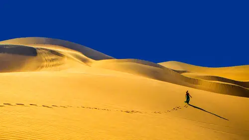
So right now we're gonna start this segment with one of my favorite topics, which is the psychology of color and what it says about you. So this is actually one of my favorite shots I took. It's probably the coolest sons that I've ever photographed on, and that was in Lake Tahoe, and it literally was like that. It was like a rainbow sunset, and this image is just one of my favorites. But obviously I way talked a lot about branding yourself in your style in your voice. And, you know, we haven't quite gotten into to writing and video and stuff yet that I'll come, but but honing in on your voice is really important. And for me, as a photographer, I finally, after the digital boom came into my own style, which is a really super vibrant hyper color. And I just have really embraced that and really wanted to showcase that more of my work. For some reason, it's not like I have invented color, but I get asked about color all the time, and I don't know why, but some people just really associate ...
me with being able to shoot color and being able Teoh creating evoke emotions with it. So I started thinking about that, and I thought, Wow, especially in the wedding world. We spend so much time on all our five senses talking, you know, thinking about the sights and the smells and the sounds and touches and everything from a wedding like people sent thousands of dollars trying to create, invoked certain emotions on their wedding day and we as photographers and we, as vendors like, actually have more like effect on the psychology and the emotional aspect of our clients and our work than we realize we we actually can create a tone and really make our clients feel a certain way. And I thought about that. But why am I not really focusing more on the emotional aspect of my imagery? Like right now at that time and I was thinking about this, I'm just shooting beautiful things that stand out to me and that really affect me and touch me. But I didn't really purposely think about the coloring of my images and what I'm actually saying. So I'm gonna dive into color and literally breakdown colors, even tell you what they what they say about you because this isn't just about your photos. It's also about where your photos live and your website and your branding or marketing materials. The fonts you use, what you wear, like everything is affected by color. And so it's important that you're kind of being consistent around the way, like with your color. For me, I'm vibrant in my personality and what I wear and my imagery, I This is even for a wedding. I don't really wear black. I'll wear color. I just feel like it so much a part of me, and I try to keep that brand of mine consistent. So attracting the clients that you want. When I started researching the psychology of color, I was kind of shocked to find out that, you know, you're not just saying something about yourself when you're evoking a certain color, you're actually attracting people to you with the colors that you choose on your website with your work, whatever it is that you're doing. And I didn't realize that there was such a cool concept to be like, Wow, I could actually attract the kinds of adventurous fund clients that I want, and for me, I had always thought about like I'm showing my work and I just randomly get brides and grooms and and, um, now I have all this control over whom attracting and even what vendors I'm working with based on the colors and amusing. So I started researching what colors of my drawn to and I'm really drawn to sort of oranges and fuchsias and green. I don't know why, but orange is like a big color for me. I can't see it now, but my toes are orange, but I I love orange. And it's always been the color of my logo for beautiful day photography. And it's been on my business cards, my marketing, and I just didn't really realize why I was using orange, so I decided to research it. Okay, so what Orange says about you? It actually, When I read up on it, I was like, This is so me. It says that you're independent, your competitive. You're assertive, tenacious, extroverted, uninhibited, always on the go and a free spirit. And I was like That was perfect. It's so it embodies what I feel like. I want people to feel through my imagery and what I do and then I thought, Wow, that's cool. That means that when I use orange, I'm gonna be attracting those kinds of people that are all those things. And that's kind of the the client I wanted at the time I was getting into destination weddings and I mean, I had always been doing it, but I was really focusing on destination weddings and marketing myself that way. And I was like, OK, I want to get that couple that wants to, like, bring me refugee and jump off a cliff and, like, do crazy shoots And I want that couple. So I was really interested in how to attract those kinds people. So I decided to use orange and my branding on my website. So we're gonna talk about one states their second. So this is actually on. My beautiful day Photography pages is my opening image, my opening page and my fonts and my logo, and everything you can see is orange. And what's cool about this is we'll talk about Zen Folio and for all of you guys out, there's an folios on the bonus materials to, and you can get a discount code for signing up with Isn't polio if you use it. So that's one. A little gift there too. But what I'm gonna talk about is one of the reasons why I signed up with an polio who they run both of my website. So I have a beautiful day dot photography and I have laura greer dot com. One is for weddings. One is travel, and they do blend if you go into destination Weddings tab on my travel site that link to my wedding site and same thing if you cook on destination weddings here, it kind of goes in the travel they link back and forth. But what's cool about employer was like before I had used this service. They're basically, um, all inclusive, like did you? Everything from hosting to printing toe albums, all that stuff. But what's amazing about it is that they let you have full creative control over what your site looks like, and you can do it really easily in the back end. As easy as it is supposed to block post. So I could go in, I could change the colors, my fonts, the layout, where my buttons are like all this stuff on the back end. So I was able to really brand my website in my slide shows with color. Same with E. With my Laura Grier site that I did. I was able to embed that adventure video in the opening, uh, slideshow sequence and really easily so it's a cool way. Two people have a lot of creative control. I can switch out images and whenever I feel like it. And before, when I had a Web guy, it was like having to email him and he had to make changes. And as the pain every time you're like Oh my gosh, um, it was I like the have full creative control. So, uh, so I made the opening image orange and my hopes that I would attract those kinds of adventurous, fearless sort of clients. But the other cool thing, too, is I. And there's like a whole side note with Zen Folio. With my client galleries, I can create sub hidden pages. So for some of you that we're asking about and we were talking earlier about doing separating your work right, like you have the babies and weddings and traveling so other, you know you can have different websites hosted within the same dashboard so I can log in, is in polio and access both my websites. Or you can also create custom hidden pages, which is really cool so I can create a beautiful david dot photography Ford Slash like, you know, Peru or something if I wanted, and I could create a whole page of the slide show and text and everything that's on Lee accessible if somebody like copies that link and pace it. So for me, there's all these different ways that I could customize my site. Taylor for people. Sometimes I've created custom sites as a pitch. So, um, we're gonna get back into pitching. I thought we'd bring this up. So for a magazine, which is a kind of a snazzy way to do it, I will go into one of my let's say I upload a photo shoot like the one that I just did in the Hicksville Trailer Palace will say. I wanted to submit that Teoh to model Weddings magazine or wherever it was. I can upload it as a gallery on my website. I can then click on my favorite 150 of them, and then I can create a custom page that could be beautiful. Dave Tawdry Ford slash Modell Weddings magazine rate. And then I could have it were when they opens up, it says, I have the story written out and a slide show of all the images I'm submitting to them, and it's like super slick and clean, right? So and they're like, Oh, wow. She created a custom website page with our name on it, right? So it's really easy with polio to be able to do slick submissions like that. Um, it's also easier for if I want to send, like, a whole gallery. And then the magazine could maybe click their favorites because I can access their favorites and then create a slide show that, like there's so many really cool back and things you can do. And it's it's made my submissions process a lot more slick. Um, I can even do custom quotes for my clients. That way I can, uh, you know, I know that a wedding is gonna happen. Like the bride and groom are interested in hiring me, and they're getting married at the certain hotel. I could maybe even make a personalized quote for them and like taken images taken from that hotel and, like put it on there and create a custom page for them. The access it with my my custom. Priceless. And it could be like ford slash Brian loves Amy or something, you know, So you can dio there's so many things you can dio. And so having creative control over your website in the back end of it is awesome for submitting to magazines and or just, you know, clients. So getting back in the color di GREss there what red fuchsia says about you? So it says that you're passionate, extroverted, energetic, confident, optimistic. In the center of attention, I have noticed that brides have read as their color their wedding or usually like de vie like it's center of attentions on me. It's funny that when I started researching, ah, lot of the colors in these that I actually made sense of the personalities of some of the brides that I photographed that have chosen his colors, further weddings. But why this is important is you want to think about how do you portray yourself and what kind of jobs you want to get who do want to track Do you want to track this kind of writer? Do you not like, if you don't think you probably don't want to be using? Well, uh, bright fuchsia or red in your marketing? Like it's a psychological game that you're playing whether you realize it or not. Okay, we're gonna We're gonna go through the color wheel here. So what Yellow says about you, I feel like I'm no weird way. I've gone through, like, my Picasso, yellow blue phases and stuff like I went through like, a dead grass phase. I don't know why this is part of it I went through. I want to put you in a field dead grass phase. And I think that was also, like, a trend for a while, but I am. And then I got into, like, a super blue phase, and then I got in my orange. I don't know why, but I go through color phases, and, um but this one is a really warm, welcoming, cheerful, happy, intellectual, illuminating color. So, um, again, what kind of vibe do you want? Teoh give off to your clients or two people that are viewing your work? The other thing too, will get into instagram and curating. Your work is. I like putting together colors that contrast each other. It is actually when I'm shooting, I look for this, so I love blue skies and crazy colors. But if I have a bright blue sky, I usually look for something contrasting like an orange or yellow to pop in there to really make it pop. I'll look for a wall or a piece of clothing, or sometimes I'll put props in there that that add that element. I love pinning two colors against each other, sometimes even just having like a ah prop on the side or something up. Even for engagement shoots, I'll ask people to bring different props enough that is like cheesy. But you never know when is putting in like a colorful parasol er or a flowy scar for something that you can do can really add something to the image and actually can evoke an emotional response based on the color what Green says about you. Green's my favorite color of all time. I think it's related to my group with three older sisters, and we always play board games, and I always ended up with green at the end is my peace because I was the youngest and like no one wanted that color. And then it became my color. I don't know, but, um, I don't normally stock my rides in the bathroom, but I did walk into the vice or a bathroom in Santa Monica, California and would just like lost my mind with the green wall is, it's amazing. So the bride happened to be in their washing her hands, and I was like, Stop right particulars, picture of you. But Green is a calming color. It's about obviously think. ICO renewal, regrowth, rebirth, balance and peace. It's it's sort of, ah, gender neutral. I guess it is gender neutral. It's sort of a like a politically correct, even color. No one really has an issue with Green. Um, but that color is Is it really For me, it's just very calming, and I like using it the balance other. I use a lot of blue in Southern California, where I do most of my shooting and also around the world you get like these crazy blue skies and everything. You also get a lot of greens. Things are really lush and so I like having the contrast of that in their green in my imagery, and I'm not going to get into a lot of my editing tips and stuff. That'll be another cloth. But I usually enhance my contrast in my blues and greens and might work, and it just makes it pop a little bit more. Just those two colors. What loses about you so blue is also a politically correct color. It's conservative, is contemplated. It's positive and intelligent. It's associated with relaxation and water and sky. So for me, obviously you can't like I could change the color of the blue and white room. I really wanted to, but it is like on a lot of marketing and travel. They love blues. They love that kind of calming feeling. They want people Teoh get that inviting feeling like you just you want to go into the photo and live there forever. And, um, sometimes I'll tweak the colors of the sky a little bit, and the type of blue can really evoke a different response if I don't know if you guys are familiar light room. But I mean I usually just take the hue thing and like selected, and I can just change the hue, the blue a little bit. For some reason, if you change it from a little bit of a dark blue to kind of a later turkey see blue. Um, it's, I don't know. It makes the image a little more tropical feeling like human. If you're in Southern California, where everywhere, but it is, it's very you know. So when you think about your marketing, you want to think about what am I conveying on my website? This is like a very calming sort of intellectual sort of color, too, if you want to use it for branding on your site purple. OK, what purple says about you and I really get some wearing purple there. Ah, unique. An individual independent, mysterious, introspective and unconventional. Uh, as a brought most of my brides that I've met that have worn purple have been like a little out there, which is I don't want to put on your one under the bus. But one of the coolest weddings I did was a bride who was actually a wicked in her life, just sort of like which witchcraft? Because it sort of is, um into magic and she was marrying a Mexican guy and they basically decided that they wanted to dio like a wedding at the stroke of midnight on Halloween and get married. And so all their formal pictures would happen at, like, six oclock in the morning when the sun was rising when he was like a vampire wedding rate. So it was, you know, a little bit like dark, mystical, mysterious. And so when I remember reading about this color, that makes total sense. But again, at the same time, I was like, Yeah, I'll show up at your wedding at midnight And she told 6 a.m. And like her centerpieces on her tables were painted skulls. And like, he was like this totally out there wedding. But, um, that color for some reason, evokes that sort of, you know, out of the box, like funky person Kristin Banta that going back to the wedding coordinator that I worked with on that shoot uses purple and darker colors and stuff a lot, too. So now we're gonna get into the neutral colors. So this is actually important, cause I like to call the neutral colors the gray, white, brown, black they're like wingman colors. So whatever you, whenever you use these colors with another one of the other colors, it actually enhances the characteristics of the other color. So so gray is a neutral color. It's clean and it's modern. It's sort of associated with silver as well. It evokes exclusivity, adds sophistication, and they consider the creative color. I'm sure you'll see a lot of gray walls and stuff here. Creativelive. It's sort of like a lot of artists and art spaces. Use gray sort of a neutral. You feel like when you take away all the extra sort of like busy environment. It allows you to be your most creative, like a clean, slate blank canvas. That's what gray is like. But when you use gray with another color, like if I used gray with orange, it would add sophistication to that color, and it on Dad's like a modern look to it. So they called gray the creative color. It's a good one to use an association with another color. What Brown says about you is masculinity. You think of trees nature and would, um, Conservancy, humility, genuineness, they think, just like you just feel like at home like you're in that brown leather chair you want to kind of sink into. And so again, brown, when used with another color, sort of kind of brings, like, humbles that color a little bit. If that makes sense and it's another neutral color that is good to show your work against. Sometimes you think of like that sepia, that sort of old fashioned feeling. White is purity, innocence, simplicity, cleanliness, truthfulness. All these things you think of like angelic and white and a lot of people have you seen instagram. A lot of people sometimes add white borders to their pictures and on the alternate, like a vertical and a horizontal and vertical, and they add this kind of thick white border around it, and it instantly makes that account look really clean and simple and sophisticated. I personally have, like, I'm like, as much color as possible biggest canvas ever. Gonna like how the image go all over the edges. That's sort of my vibe I want, like attention grabbing. But if you want something more simple and clean and intimate, this is a really good background for you. It's a good color toe have on your site or your marketing materials. And then what blacks is about you. So black again when like it adds a contrast. Moodiness, distinction, elegance, masculinity. Think like black tie. And it's funny because even when I was doing my presentation, I started for creativelive all my slides here I was using black background for everything, and and we're like, Oh, black can kind of reflect for cameras. Well, while we're like, they're talking about strategy. So then I had to change a lot of my photos with a white background, and I instantly was like, Whoa, that totally changes the look of the slide that changes like everything that I was trying to evoke and it wasn't a bad thing, but it was interesting just from changing the background palette that I was showcasing. My images on really evoked a different response. And so I think it's cool. Like I mean, you have your visual storyteller is all of you are trying to evoke like ideas and attract people. And so it's really important to think about the way you're presenting your images, not just off these colors within. Your images are important, too, but even just the way the background and your marketing materials and the way that you're presenting them. Yeah, yeah. So along those lines, people are really interested in kind of deciding which of their colors of the favorite and they want to know kind of. Can you give us some more examples of how you you've taken these decisions? You know, these are my colors and how you've implemented them. So you started to sort of give some examples of of website branding. Just kind of tell a little bit more about that. So definitely with the opening sequence is on my Web sites on my phones in my business cards have used it. I've awesome used it to pitch story ideas. So a lot of blog's and magazines. Sometimes we'll do story pallets or ideas. If you reach out to magazines. You'd be surprised that, like Martha Stewart weddings, especially does this, they will decide their color palette for an issue like well in advance. So they'll be like, Whoa, we're looking to do like, great, like we love this wedding or the submission, but it doesn't match our color palette, and you're like, OK, let's strange, but so it's interesting you can actually reach out the magazines and ask them like what their color palette is for the upcoming issues and maybe make tailored submissions to them. Or think about that while you're shooting or just pull those certain images and then presented in a way, it's cool if you can present it in a way where you're using their color palette for the submission and like having it as the background it like, helps them envision your pictures in that palate a little bit more. So that's been a cool way to use color. Um, I kind of think of how else I do it in my imagery, like again the props that I used in my in my dream standing by my girlfriend Sarah and I should also fellow photographers. She we always We travel a lot together. She was my assistant for years on a lot of trips, and it's kind of ridiculous. If you look at her, bags will bring, like, thes colorful dresses or flowy things or like a proper you know, um, and it's just enhances your image, like if you're walking around like I'm doing, Ah, photo for Instagram. If I'm doing a photo for you knows ourself. Our website. A lot of the pictures that you saw in my opening video sequence. We put a lot of thought into the color using, and I'm gonna get into my instagram curation in a second. But it just adds an element into the picture that for me, Since I'm branded and known for my color, I feel like I need to have color somewhere in my images. So a lot of times we will plan out our color scheme on outfits and things that we bring. You know who says that when you're even a tourist in a place that, like you should just be wearing like ugly hiking pants and khaki stuff and whatever, like you're ending up in your own pictures. And I'm kind of branding myself of color, So I'll show you in future pictures like, Well, plan out color schemes toe wear against certain backgrounds. Just so our social media images look better. Um, I went recently to India to Judd poor the blue city, and I'm like it's a blue city, so excited, So I like bought orange and yellow contrast ing stuff and also saris and like blue purple colors and like we literally planned out walking around and doing pick up photos for Instagram and for for ourselves. And it was all based on, like, a color story. So those are other ways that I think about were like, when you're researching locations and you see other colors, like like that hot pink thing. I was like, Who That look so good with this blue sky? Um, yeah. So I'm always thinking ahead and plotting out colors. Yeah, cool. So kind of taking that a step further, The lack of color in images somebody from England is writing in and saying, Talking about color, I'd like to know how Laura feels about black and white images. Ah, monochrome palette. What do you think about that? I mean, here's what I do. It's funny. When I shot film, I was really, really more interested in black and white. I especially love the 3200 super grainy Um, look, I think once I never was super into color and film because it never really reached that saturation that I loved personally. So I was very, very much in the black and white imagery then. But then I felt like I was gonna be a long answer, if ever, just outside. So I always felt like that I wasn't really being true. I feel like all my image was very like moody for my weddings. And I'm like, But that's not how I feel about a wedding. Like I feel really happy and excited. I'm like someone's like looking at their flowers in the window late and it's black and white and I didn't feel like it was really giving my energy out. When Digital happened, I was able to really enhance my colors and get more in the color I got. We're excited about it. It's the point. Now that I don't even deliver any black and white images, I might change like I'll pick up like 15 of my favorite ones and changed in black and white just to let them know like, Yes, you can do this and this is what it will look like. But for me, it just hasn't I don't know. I've kind of I just I usually think in color and Alice I'm delivering everything in color, but I do love black and white imagery, and I know photographers that only shoot black away and I'm, like, obsessed with their work. So, um, there's nothing against black and white imagery. Yeah, so and then one last question. Kind of a clarification. A lot of people out there were hoping he would say again, Who host your website? What? Your website on More than happy talk Polio. You guys should visit San Folio. I'm going to just go on a quick tangent about Zen boehlje because they've changed my life in terms of being able to work on location. I'm such a mobile photographer, and I mean that mobile, like on the go and physically, like mobile phone and back when I was before I was traveling a lot and I was using another company. I was still kind of fielding orders like print orders and customer service and like doing all this stuff while I'm traveling. And I'm like, I can't deal with this print order while in India. Um, And so now that I am using Zen polio, they take care of all that for you. I can literally upload an image right away from wherever I am. I can create a price point and sell it as fine art instantly. I can, uh I can make submissions to magazines and stuff based on my gallery. I could upload galleries and do all that stuff like wherever I am in the world, and the coolest part about is a super mobile friendly. I could make changes on my mobile. I could do block post were unable to do anything. But I find that when I'm traveling, I'm really sharing my websites on mobile, not desktop, obviously. So a lot of times I'm showing people. My instagram is showing them my website on mobile and like it has to function well. It has to work well and so, like switching over doesn't really like I used have a beautiful website before. But it wasn't functioning very well in mobile, and I found that to be a huge disservice. And I was trying to share stuff on IPad or a cell phone with someone because let's be honest. Everyone has a mobile device like when you're traveling. It's very rare that you're next to someone on a desktop computer and showing them your website. So definitely make sure your websites are functioning and clear and your imagery looks good on mobile devices. Very important. Um, but Yeah, I'm a huge fan is in full. I'll give one more example of like how cool that was. So I'm gonna talk about my trip recently that I did Teoh see the Northern Lights and Finland. But I was so excited about posting. I had just seen the Northern lights for the first time. And I take a photo and I'm like, I need to go posted in The only place to get Internet was in the lobby, which you had to like, sled down to the lobby to get your like in an igloo. And so I was in the middle of the night. I'm like, kind of post this photo and I go and I get to the lobby. But I post this image and this is the power technology Someone wrote me who had seen it on my Facebook page and said, Wow, it was ST Patrick's Day. So I was like, green for ST Patrick's Day. Here's the Northern Lights and I posted this picture and someone said, Wow, um, you don't know me. I live in New York and I just saw this picture, and the timing of it was amazing. I'll tell you Why are Irish uncle just passed away tonight? And he always said that he was gonna pass away on ST Patrick's Day and he was a huge fan, and he never got to see the Northern Lights. And when you I just got chills thing about she's like, when you post that picture is like we just found out he had passed away and I saw this image online, and I'm like, It's a sign for Mike uncle And she said, Would you be able to like, could I buy that picture offer you to have at the funeral, like in a couple days? And I'm like in an igloo? I was like, it just posted it like, two minutes before. And I was like, Oh, my gosh, yeah, I'm not gonna make you pay money for that. Of course I'm just gonna gift it to you. That's amazing that I just reached you. I'm like an igloo in Finland and you're in New York, and, like somehow I reached you. So I just was able to upload the pictures and polio and like it was like, What size do you want it? And I gave her options sizes and she was able to like order right away and printed for the funeral couple days later. And it was one of those things where I was like, Wow, I can't even believe I was able to just do that, you know? And I've reached somebody without knowing and so, like, sometimes you're like, I get on myself for being on my cell phone a lot when I'm traveling. But then, like a moment like that will happen where you're like, how you can reach so many people and really affect them.
Class Materials
Bonus Materials with RSVP
Bonus Materials with Purchase
Ratings and Reviews
user-670c8f
I've been listening for, like, two hours. OMG. Like, I could, like, you know, get more from this if, like, she stopped jibbering and get to, like, you know, the topic? She sounds more like a rambling stream-of-thought teenager than a mature adult giving a succinct organized presentation. In two hours, I have, like, learned about two or three things I can, like, use. Like, Ehhhh...? It's like, bor-ing! Like, whutttt? Is she, like, 15 or what? Sheesh.
a Creativelive Student
I have to start by saying that I was lucky enough to be part of the live audience in this class! What Laura has shared this 2 days, is something that will have taken me a few years to learn. Thank you for remanding me that we create our own opportunities and we have to go for what we want instead of waiting for it to happened and will these tips your share in this class, will make it a lot easier to approach editors or potential clients to be able to conquer my goals! Thanks you very much Laura and Creative Live for making all these possible for the photo community all around the world. Thank you, thank you, thank you!!!