Lessons
Day 1
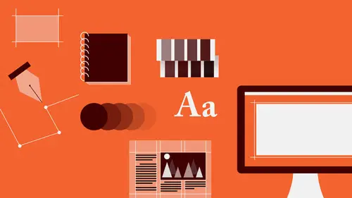
1Introduction to Graphic Design
11:27 2Graphic Design: Areas of Specialization
14:10 3The History of Graphic Design
40:11 4The Designer's Toolkit
11:32 5The Graphic Designer's Tools: Color
06:00 6The Graphic Designers Tools: Typography
01:42 7The Graphic Designer's Tools: Layout & Space
06:33Typical Work Processes
09:13 9Designing an Advertisment
41:46 10Designing a Poster
29:20 11Designing a Book Layout: Basic Concepts
36:02 12Designing a Book Layout: The Details
20:54 13Designing a Website
26:53 14How to Design a Brand Identity: Preperation
25:42 15How to Design Brand Identity: Showing the Client
18:24 16Building Brand Language
14:12 17Designing the Touchpoints
11:15 18Fundamentals are Forever
03:29Day 2
19Form & Image Toolbox
32:07 20Media & Stylization
14:37 21Representation & Manipulation
31:02 22Visual Narrative & Metaphor
19:16 23Color Identity
23:39 24Color Relationships
21:15 25Palettes & Systems
14:39 26Color as Meaning
07:09 27Typography: The Basics
25:16 28Style: Choosing & Mixing
26:01 29Text-Setting Mechanics
15:41 30Styles: Visual Qualities of Text
18:09 31Interactions of Forms in Space
24:46 32Arrangement, Logic, & Rhythm
18:57 33Contrast & Hierarchy
08:09 34Unifying Type & Imagery
05:36 35Working with Grids (or Not)
10:16 36Bringing it All Together
03:17Lesson Info
Designing a Website
And then that brings us then to the issue of editorial work when you're dealing with interactivity. And that is designing websites. So the model for the sort of the organizational or typographical model for information, on the web, is pretty much a direct, more or less direct translation of book structure, or of newspaper structure, more often newspaper structure. It is set up typically using a grid of columns in a certain number in order to accommodate certain kinds of content that might change. And here's the kind of, the use of the flexibility of a grid is that while some kinds of content may be very, very static, others might be changing on a daily basis, they may be database driven. The user may be able to select some content to appear and disappear. So the elements, unlike in a book experience, actually begin to kind of move. So there's a little game you have to play with, like, what's gonna get hidden by something, where do you need to have spaces open, and so on. And the newspa...
per, newspaper or brochure, is kind of a typical model for this kind of website that we're gonna look at, which is often referred to as brochureware. So this is a site for a construction architectural services company. It's family-owned, Italians of three generations, three or four generations back, who have been working together that long, with an incredible attention to detail, a sense of craftsmanship and heritage that they brought with them from the old country. And essentially this site functioned as a brochure for their services, introducing a profile, the company, contact information, an email form for getting estimates. Very, very prosaic day-to-day use kind of things, but its primary focus was to show off projects. My research in this case also was quite diminished in scope, and that is because I had hired DiBiasi for a small project in my apartment, and I was getting quotes. And they had given me a business card, which was thoroughly ugly, and as you can image, not well-designed. If you've every see construction companies' business cards, they tend to be sort of like lawyers' business cards, and not very interesting. So in return for a portion of the cost of the services, I designed their business card for them, which is always something that you can do. You know, you can trade, and sometimes things work out. So I chose a typeface for the name that was very strong. It's very industrial, or slab serif typeface, with very industrial character. I used essentially just the various weights within that type family, the black, the book weight and the medium weight. And on occasion, for supporting information, I simply used a little bit of a softer sans serif, something slightly condensed, as this slab serif is also slightly condensed. It's not quite a regular width font, just to be able to set it back. There's only, this particular typeface, its contours and the joints are so active, there's a lot of energy kind of pulsing around the outer contour of these letter forms. And the negative spaces tend to get really, really kind of pinched. So no matter how small, or how light I made this supporting information using the same typeface, I could not get it quite enough, so that it had other things, so that there was enough contrast between it and something else. So they got these printed, and they had a really good response to them. So they asked me, you know, what else should we do? I said, well, you should probably have a website. And they said, well, we have a website. And I looked at that and didn't really need to look further, because it was also, as you imagine, somewhat ugly and kind of like their original business card. I said, okay, let's talk, let's talk. So the reason I didn't really have to research, because here was already a kind of a feeling, there was a language involved, there was a typeface chosen already, and a sense of a kind of geometry that I could use. So the first thing I did was kind of gather information from them. So what do you want to be able to show? What's the most important part? And that was primarily projects. And the project area, or the project page within the site, was gonna carry the bulk of the stuff, the most interactivity, the most photography, the most text, and so on. And the other ones were essentially sort of lists and paragraphs on occasion, with very, very little information. In the site map I'm showing connectivity here between the individual projects and either testimonials or client list directly related, so that if the user wants to investigate the project further potentially to get a reference, to ask about DiBiasi's performance and reliability, they could just go find who the client was. But on the project pages, the projects are kind of noted by their location. So after I made the site map, I started looking at ideas. Here again, with the sketches. So I knew there was going to be some geometry involved. I started looking at things that were very, very heavily gridded out, creating sort of band structures for lists of information to move sideways, that could also contain images and potentially open and close, to reveal more information. If you clicked, it would be kind of a scrolling accordion kind of a deal, sort of column structures with headings based in either colored or solid squares with a different kind of a square proportion; really kind of asymmetrical and very, very light configurations; configurations focused on materials. This is a kind of progression of splices of wood, metal, marble, tile, to show off the kind of the detail and the material. Looking at kind of the dot that's so prevalent in the period, at the end of the name, which I added simply because it's such a strong name, and it ends with this kind of ee, and I just wanted to (pops lips) at the bottom, just to, you know, and it also became almost like a nail head at the end of the word. Some in which there would be a kind of, you know, what is often a very typical sort of letter-boxed sort of beauty shot of a project and with very, very minimal navigation. And my goal throughout was to really keep the navigation as sort of quite minimal, at the sort of the top level, or the global level, as possible, because especially in the product pages, there would be additional sub-navigation where once you were within the product pages, or the project pages, you would be able to poke around at different kinds of things. I was looking at some possibilities for images, which are not all that typical in websites, in a kind of a graphic way. And so I started to think about well, what are those images. And the first thing I thought of, you know, there's something about Italian people and Italian graphic design, especially Italian modern graphic design, that is very to the point, very direct, and at the same time not direct in a brusk or an austere way, but in a kind of casual, but very finely finessed sort of detailed way. It's almost like, it's sort of like Italian cooking. You know, it's about the freshness and the sort of native quality of the ingredients, and how good those elements are just as they are. And you sort of put them together, and then you're done. So I was looking for a kind of a strong sort of an image form. I looked at photography, and that was a possibility that I thought would be very, very interesting, since as a graphical element for a kind of a brand style in web design, you don't see it that often. And I like to make things that you don't see that often. So that it doesn't look like everything else that you see, and therefore the client stands out. I looked then also at going really, really bold in kind of a pared down sort of iconic way. I thought about whether or not kind of a linear sort of drawn icon would be interesting to kind of pick up on the linear quality of the typeforms, or possibly something that was a little bit sort of straddling the world between kind of dimensional and realistic, but also flat and iconic. And that's really sort of what drew me the most. So I made a bunch of icons of tools to use. I didn't really know what I was gonna do with them yet, I just made them. And so in the drawing of these, each element is pared down to really only what is essential for recognizing first, the physical parts of the particular tool, so that you know what the tools are, and also to show you kind of the truth about how different parts relate to each other; the fact that there is a set of grooves on this part of the drill, and that the drill threads actually rotate; that there is shininess, the gleam of light, the sort of rigid zig-zag against the softer components of the handle, with enough positive/negative interplay to show you that there is a separation between those two parts and their materials. And then all essentially, kind of line forms. You know, when you're looking at any kind of an image, there is the thing that it is, and then there is the thing that it really is, which is this is not a hammer, this is a line. And this is not an adjustable wrench, this is another line. And this is not a drill, this is another line, it happens to be a much fatter, heavier weight line, and it's also made up of two lines, a heavyweight one and a narrow one. So compositionally, in terms of how the tools work, and this is sort of just fundamentally true of the tools themselves, is that they are essentially linear in nature. So there was something there. I developed a set of supporting icons for things that might be used for searching, for gaining access to archives, for calculating estimate costs and some other details. Ended up not really using these, they kind of disappeared through the process along the way. So already I established this typography, and is started to look at, you know, what are the relationships, what kinds of information are there, and what are the functions of those information or typographical elements. So of course, there was a logo, there was headings for groups of information, or for sections. There would be text that would accompany, or support, those headings. And then there might be a subheading that separates one thought or one sequence of information of text from another one. In the navigation, I tried to create the greatest contrast between the text material that was really speaking about the subject matter, about the client, about their activities, and thereby make sure that quality of this typeface was devoted solely to encompassing, or voicing, their brand, and not really for anything else. So I went essentially to this other sans serif that I used in the business card, the navigation I had always intended was going to be relatively small, relative to the other things, so I began to look at their relative sizes. And these are, if we were looking at not the page as this size as defined by the size of this monitor, but if we were looking at these elements in the space itself, which we will soon, you would see that the height of this is essentially half of the height of the heading. So those size relationships, the relative sizing and the relative weight relations are very, very specific. So that they carry, or that they present, a certain degree of energy, or a certain lack of energy, a certain presence, emphasis or de-emphasis for the hierarchy. So I started to attend to the grid. In this case, I went with a column grid, no module. No modules, so that means there are no rows intersecting with the columns, which means that things can kind of float up and down, which they tend to do, because there's going to be likely some scrolling involved, so things at various times will not be in alignment. And there's no way to control that, unless of course you make the page non-scrolling, which I did, because I hate scrolling. It's so annoying. I'd rather flip, but that's me. So I imagined this as a scrolling page, where images of featured projects, and even the content, once selected, would kind of populate this sort of central zone, and then the navigation would expand and contract in this kind of accordion or tree formation. And then this stuff would scroll, but the branding and navigation, of course, would be sticky. I looked at a horizontal configuration to kind of maximize the proportion of most typical monitors, which is the horizontal form, where you don't have really that much height, especially if you're not going to be scrolling. So I was already thinking, well, I'm gonna try and get us not to scroll to go past this point, because I hate scrolling. And to create, again, you can see how elements of different widths, or the widths of different elements, are defined by combinations of two or single columns, as well as the spaces in between. So you get a certain kind of very recognizable pushing and pulling, as between object and space, or form and space, as you traverse the typography across the top. I looked at it kind of side-by-side, really pulling out the sub-navigation at a much larger, more dramatic size than the actual navigation header, really because once you've arrived at a page of content, theoretically, you know that you are there. So the importance of the indicator, or the titling on the page actually decreases, and the content of the page, one could argue, is really more important, especially if that content is sub-navigation. So these are individual links to particular projects that will appear in this location, once you have clicked on them. And then I returned to this kind of grid formation. You know, I'm always looking for something that's gonna be a little bit different. You know, it's a good thing not to just jump onto a convention for how information is displayed in a particular medium, and on the other hand, it can also be a kind of a problem, when you're trying to fight something that, you know, works already. You know, why reinvent the wheel? Well, maybe the wheel ought to be a little bit shinier, in this case. So I was cycling through my sketches, and I had been looking at some of those that had the little grids or dots, and I was like, what is that, what is that? Is it a background texture? Is it a button of some kind? Am I gonna organize the navigation around it? And then I thought, well, if you really want people to focus on the photograph, and its description, why don't we drop the branding down to the bottom, especially if the page is not gonna scroll. And it's gonna be kind of sticky, so it'll kind of stay in view. And then when you leave the Home page, what you're interested in, what you're focused on, is the largest and most pronounced element in the field, but we minimize it. Rather than this giant chunk of text eating up sort of visual room, like no breathing space, it becomes quiet. So these became little links. They're rollovers. So as you rollover them, the name of the dot increases in size and the name of the project pops out. So there's no listing, you have to investigate a little bit. And it becomes this kind of detail that graphically has a kind of an architectural quality to it, it talks about planning, it talks about the detail and detailed thinking about how things work that is very specific to the construction in general, but even more so to this particular family. It created a kind of a new graphical texture, as a contrast to all the linearity in the typography elsewhere. And it was something I hadn't seen before. And there it was. So I then took a quick look at what was gonna happen with the navigation itself in terms of its interactivity, that is when you rollover, or you interact with, a navigational link, how do you know that it is about to become active, or that it is even a link? So some change has to occur. So there are generally kind of two, sometimes three states that are used to describe the navigation. And when it's not doing anything, it's the resting state. When you mouse or roll over it, it's the rollover or mouse-over state, that tells you that the link is now active, that you can access it. And then very often there's a kind of a click state, that is as you click down on the link with your mouse, you activate it and it undergoes another change. I thought that last state was gonna be a little distracting, but I simply looked at some relatively simple kinds of changes, you know, first just the color and a little graphical detail, a line, just the color and weight change by itself, does it get enclosed in a box, does it change size, since there's space in between, does the line element happen on the top. Maybe it's a dot like the other navigation, because navigation is now related to dots. So the connection sort of informationally, that I'm setting up, or that I'm asking the user to understand and make use of, has to do with this dot element. Is the dot gonna also accompany some other effect, like the link sliding out of alignment position, or is it that the link actually becomes less pronounced as you rollover it? So there were some options. So that brings us then to execution, which is this. So this is the Home page. A configuration of some of the tool icons, playing with the diagonal as a contrast to the heavy vertical/horizontal axis of the grid, really extreme contrast in weight, which are again supported by extreme contrasts in line weight and positive/negative relationship within the images. You see here the rollover. I'll do that again, so you're checking it out. So relatively subtle. On mouse-over, the type becomes darker, the dot appears, in direct alignment with the dot of the logo. Structurally sound. And when we moved to the projects page, I initially had looked at, and so this is the kind of the splash page, or the entry page, for the projects. The first thing that I looked at was using another one of the icons. But because the page was divided more or less in half, and there was this kind of channel of space, the diagonal become kind of confusing, especially because the content for that particular project when it's selected, is gonna load over here. And that image would get kind of covered, interfered with, so the cleanliness would kind of disappear, the visual cleanliness. So I went back to looking at some of the photography and thought, well, the photography in this kind of high-contrast, but slightly lightened kind of tonality, carried a similar kind of presence, a boldness, but at the same time allowed the other stuff to be really much bolder. So for me there was a kind of a congruity, a congruence, a dialogue, between the boldness of the icons and the boldness of the photography, even though the icons are very, very black and the fray is very, very light. So on mouse-over, you get a change in color. I eventually got rid of, or edited out the size change, because that became distracting, and I needed to be able to float the project's name directly above it's corresponding dot at a particular height. So that got simplified a little bit, but once you click on it, the dot tells you that this is the project that you've chosen, but now the project's title, the image and its text appear in all the other locations. Over the image, there are two, well, over the image there's an enlargement icon, very, very simple kind of simple plus sign, means make bigger, augment. It's almost defaultedly structural, kind of almost a little geeky. And then these very, very pale forward and backward arrows, where you can cycle through different images for the same project. When you click on the project enlargement, it actually fills the screen, all the other information disappears, and you have a little bit of descriptive information and a link just to close the view back. I assume, you know, people hate click-through, but I assume that for the most part, when you choose to enlarge a photograph, you've done it on purpose, because you want to look at the photograph, and you don't need to be able to fluidly access other portions of information or other links while you're doing that, because you've decided to do something specific. So having all the other material, all the other links disappear, was really no problem for me. Generally, which is not often the case. Just in the same way that I hate to scroll, I hate to have to click back and forth between things to access another part of the site. It's just me, but what I think is also kind of common to other people. People are in a hurry. So anything you can do. So when you go back from there, and you return, you can then cycle over, or mouse-over one of the other navigational elements, in this case it's the profile. You'll also notice that, before we go there, and this will happen again, is that once you have selected the link and the content, therefore, that you are traveling to, that link becomes the page heading and disappears from the navigation, which from an informational design standpoint is often a no-no, but I did it anyway. Again, context is everything. There are only five links. When I've gone to one of them, and I am investigating the content in that area, I don't need to look over there to go find it again, I'm in it. And it's not a very, very deep site, so the potential for confusion, or the potential to get lost within the site, was not really a concern. So you know, when conditions warrant it, or dictate it or allow it to happen, you can break the rule here and there. Usually you want your information, your navigation to remain in the same location at the same size, over and over again, always, on every page. But you know, sometimes it's not necessary. So in rolling over profile, it takes us to the profile page, which is one of the more text-heavy pages. So you have an introduction. You'll see that profile has left the global navigation, projects has returned, profile is now the header for this page, with an introductory paragraph, and then a very, very brief history. The photograph has changed, again, to another construction subject-based image. And then you have a listing, first of primary personnel, that is basically the President/Chief Architect, Financial Officer, Carpenter, and so on. And then you can access the individual employees, like the carpenters, the stonemasons and bricklayers, electricians, by calling up, by rolling over these and going to another little page that will slide out and go back in, if you so desire. So I kind of hid that, rather than leaving that page and going to another place where you would loose this, the kind of the focus on this is that that material is still there, it kind of joins the trades of people to kind of the upper level management, but also keeps them sort of secondary, in terms of focus. On mouse-over, when you want information, there's a color change and the dot is used at a much larger scale, to house a portrait of the person in question. That link also functions not only just as a mouse-over but as a direct email link that'll take you to the email form on the page.
Class Materials
Bonus Materials with RSVP
Bonus Materials with Purchase
Ratings and Reviews
photo_dj
This is more about all of your courses - It would be really nice for instructors to answer questions during break times or even after the class. There a lot a fabulous questions that I see that never get answered. I would like to go back even the next day and see a short note for at least some of those questions. Just an idea to help out this wonderful format that you have going. I am sure to make use of the promote question when I see an interesting one.
user-1f91d5
I LOVED this class! I learned so much and since I had the foresight to purchase it, I can go back for a refresher anytime I want. Plus, the downloads are spectacular! Almost a book's worth and so helpful! Thank you Timothy, you are great teacher!
a Creativelive Student
This was an outstanding course, would love to see a more in depth typography course from this guy. I'm a proffesional photographer with a formal education in design, I hardly ever use it, so I forget things, this was great both as a review, and to pinpoint things I didn't know or thought I knew. thanks once again! well done!!