Lesson Info
8. Final Render of Coffee Maker
Lessons
Introduction
06:17 2Preliminary Sketches of Different Products
05:53 3Steps of Rendering Coffee Maker
06:02 4How to Create Quick Orthographic Views
20:35 5Description of Isometric, Oblique, 1-2-3 Point Perspective Views
11:03 6Best Angle for Perspective View
06:16 7Perspective View on Graphics 360 Paper using Different Materials
13:31 8Final Render of Coffee Maker
15:19Working with Preliminary Sketches of Street Cleaner
16:25 10Chrome and Reflective Materials
10:42 11Final Render of Exterior of Street Cleaner
06:41 12Sketches of Interior of Street Sweeper
09:18 13Design Concepts for the Interior
07:20 14Final Rendering of Interior and Exterior of Sweeper
17:47 15Defining Final Outlines and Contrast
08:04 16Creating Texture and Composition
04:31Lesson Info
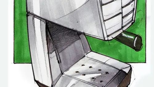
Final Render of Coffee Maker
All right. So in these Max last phase, I am going to render our coffeemaker final and good one. So we have already covered a lot in this class. We have added some arrows to indicate movement on the back, on the front, on the front, we have some presets that we can touch. I added a hand and then a picture. And then two more hands over here to indicate movement. Everything is loosely done using just non photo blue. And I'm using different corners of the paper. I'll get my composition. You see, over here how the composition varied. I kind of moved my things around. You see how this hand is placed over here? My final design. I moved my paper around and I put the hand over here because I felt I still had room on this side. All right, so this is the fun last part. Tell me one color. What color should I render it in? Read. All right. It's still let's go for some Rojo, right? All right. So you guys having your package? You should have. You guys can practice with me. We have these photocopies, ...
so verse Nice. So go ahead. and get them. And it's at some colors. And you can, um, tag along with me. So what I have over here, they're slightly over exposed, which is what I wanted so that you would have a good black line. So if we want Rojo red, what I would do first is get the right colors You might not have read over there. Um, but if you don't, then just use the colors that you have. All right. First thing that I dio would be very important. You test your markers on the side, right? You don't test your markers directly on your paper. Okay, That's ready enough for you. I would say so. All right. So we have the outline over here. What I'm gonna dio is Mark where I would have the highlights off the object. This is almost, like paint by number, right? Remember growing up? We would have that right. We get this wonderful set, so I mark first where my highlights would be, and then I decide on the color that I want to use. Um You want to work with pairs off colors? One slightly darker than the other. Um, I have a lot of reds over here, but I want to settle with one. This is more purple than if I want purple. We said red. Okay. All right. So this would be not to use. All right, So if you choose a cholera already that you wanna work with, make sure that one color is slightly lighter than the other lighter and slightly darker. Still belonging to the same Hugh. But you want to work with lighter and darker tones. So what I would do first is work. They want to have everything right or something. That would be gray. Um, I'd like to have gray for the bottom and then maybe gray for the top. Meaning, um, polished metal, but the rest would be red. So what I'll do over here is just work. Um oh, I have to say one thing before you start drawing your insurance would be to have four copies of your work. All right? That's why you guys have for this class. Are Sooners have three copies. In case you missed one up. You have mawr that you can work with, and this is actually a mental trick. You can do better when you know in the back of your mind that you have more paper toe work with. You're not gonna run out. This is your last best chance. That's not what you want. Okay, um, so if you fall into that mind trap, stop for a second and then get some copies done, and then just work with very broad strokes to cover your main area with markers, though you have to work with, you have to work fast so that you cover big areas quickly. Let's make this inside red. Why not? Um, so I added a main tone over here and now I'm going to add my read by darker red. Come on one side. So I'm gonna work darker over here when we have when we work with highly polished, highly reflective materials, we always have Teoh work with a parting line. One was like a reflection. This referred back to my finished rendering over here. You see how I have I even added some purple tones over here, so you kind of defined. You kind of break it in the middle from the middle toe. One side would be lighter from that middle to the operative would be darker. But you would have a highlight kind of breaking the two halfs, and that's what we're doing over here. You break it in the middle, you might even want to add. This is for highly polished. Okay. Might not always be that case You do like your highly polished edge over there, and then you work with your two colors. This way, once you're done with those, if you feel that you have to gain even more contrast, that's when you rescue your pencils and you work with darker tones so I can add. You see, I divide my drawing in half. I add very dark tones over here, and then I kind of blend them toward lighter tones so you can use black. You can also use some red pencils give you. If I had another marker tone, I could use it in between tone, but I don't so we'll work with those two colors. Then you work with your outlines very securely again. If you don't feel secure, um, about your outlines. This is when you would use your French curves. You clean up your edges like that. You see how clean that line Waas. You don't have to reinvent the wheel. You just use, um, templates again. He does not make you less of a designer. You would just have to use them with intention. Right? So help you along the way. You see, once I add black outlines, everything kind of comes together very quickly so you can make your preliminary sketch of preliminary color application very lose. But then he will tie up very quickly once again, once the outlines are completed. If you want to make your design very glossy and refined, you can outline your reflections with a very thin black pencil, which is what I have done in this in this one, right? You know, some outlining. Not so much here, but here and there come just to get it even shiny. Er all right, so this is how you would start adding up your color. If you want to add, you see the difference between these two? I'm going to Dio Gray over here. How you guys doing over there? What color did you pick? Gray. Well, you have pencils, and maybe you can add an accent cooler, maybe to the handle. What's that? I went out like skin pale. That would be an interesting coffeemaker and yellow Interesting in a good way. I would like that too. First happy thing you see in the mornings. A crop E? Yes. What have you have? A dog? Maybe it's just your duck kind of jumping around. You know, maker. I'm like your life, like Okay, give me one minute. I'll play with you after I have my coffee. You make mistakes. Do you feel like there's like you can like? For instance, you miss a highlight that you want, but And will you use your china white pen or pencil toe? Fill those in or Yes, Great question. Yes. That would be the first order of business. Absolutely. Another way would be to put, um, cutting board. You would put it underneath. Um, you know, we are almost done here. It's put another piece of paper under. Let's say that I made a mistake over here. I don't have You can see what I am about to dio just the kind of chop up my rendering. The important thing is to have the two pieces of paper together I would cut. Just make sure that your hands are not in the way of the sharp blade. You cut the two pieces of paper at the same time, and then you remove this piece of paper and then you replace it with this one and you put Scotch tape on the back, and then you would just fad marker on top and, uh, just like new. All right, now, the trick here would be you have to be very sure that you have the same paper to practice. I mean, the same marker to practice on. Whoops. I was going to make the mistake. That's a darker one. Do you want to use the light? Okay, that's a good one, you see? Almost disappeared. Then I add my red over here and a decisive No, nothing ever happened. Then I add some more pencil tones. And if you're happy with it, then you say tutta, you're done all right. If you want some on the composition here but I would want to do would be to do the Ortho graphic views. Render them probably using gray tones are supposed to color. First, he would take your last time, and second declined can get the idea that the calories in the perspective view of the Ortho. Graphic views would just be showing some gray and you can work faster from with that, um and then work with your outlines. If you want to add hands or body parts, sometimes what I find a easier to complete would be Instead of rendering the hand, you work around the hand. First you pick a color that you think will be good. This year's blue Let's test it on the side. Oh, wrong blue to dark. All right, this is a good blue. So instead of rendering the out Jack the hand with the handle with the, uh, water container, what I dio is just render around it. So this is a very nifty trick to get you going faster. So you add color on the background and your hand. You see, Now we can see the handle because because we have color inside the handle opening, right. And then we would work with the black outlines to define, in this case, the hand, the edge of your picture and so on. All right, I'll just finish this a bit more so you get a sense off what we're doing here. But then we can connect the dots by just showing, you know, just finished. This would be one example they hand over there. You see the hand over here? I would just have to work with maybe thinner lines to define the fingers. Do you ever work with just colored pencils or is there markers involved every time for a specific reason. Ah, now the great question. Um uh, yes and no markers. The advantage of markers is one thing. Um, markers allow here. This would be a good example. Markers allow you to fill in a large surface with color on markers, markers. Strokes blend very nicely on paper. What a great question. So you can have a uniform color if you work only with pencils. Quite often you get it gets kind of tiring when you use the same texture. We pencil over to get this kind of grainy texture. And then he might just kill the idea markers again, blending the color. And the nice thing about them is that they even though it's their consider what technique because they're with us, they come out of the tip. It dries almost instantly, and you get this flat, wonderful surface. All right, wonderful. But on the preliminary stages. You use pencils sometimes because you can work faster. All right, So I hope that you enjoyed this first part. And, um, after this one will work on the next project.
Class Materials
Bonus Materials with Purchase
Ratings and Reviews
Mike
I thought this was a well rounded introduction to this subject. Really liked the teachers attitude as well - very inspiring!