Perspective View on Graphics 360 Paper using Different Materials
Lesson 7 from: Sketch like an Industrial DesignerJorge Paricio
Perspective View on Graphics 360 Paper using Different Materials
Lesson 7 from: Sketch like an Industrial DesignerJorge Paricio
Lesson Info
7. Perspective View on Graphics 360 Paper using Different Materials
Lessons
Introduction
06:17 2Preliminary Sketches of Different Products
05:53 3Steps of Rendering Coffee Maker
06:02 4How to Create Quick Orthographic Views
20:35 5Description of Isometric, Oblique, 1-2-3 Point Perspective Views
11:03 6Best Angle for Perspective View
06:16 7Perspective View on Graphics 360 Paper using Different Materials
13:31 8Final Render of Coffee Maker
15:19Working with Preliminary Sketches of Street Cleaner
16:25 10Chrome and Reflective Materials
10:42 11Final Render of Exterior of Street Cleaner
06:41 12Sketches of Interior of Street Sweeper
09:18 13Design Concepts for the Interior
07:20 14Final Rendering of Interior and Exterior of Sweeper
17:47 15Defining Final Outlines and Contrast
08:04 16Creating Texture and Composition
04:31Lesson Info
Perspective View on Graphics 360 Paper using Different Materials
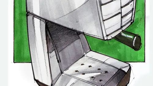
all right. In this phase, we're going to be talking about creating a perspective. You're using pastels, color markers and pencils on graphics 3 60 paper. And then we're going to be leveling the view in adding some call outs for fun. So this is already the end result. I'm done. I'm kidding. Eso This is just a rendering that is fully done. Um, just to prove a point, we if you want to show like a very shiny object, you can really do that. It doesn't necessarily have to be a car on wheels or shiny has to be akara lumber genie or something. You can do very sexy and appealing objects Chinea and red and whatever else for a different product that doesn't have wheels. All right, In this case, I have the highly reflective, um, coffee maker. I would really want to have something like that at home. You know, you wake up and you're still not fully awake. You're rubbing your eyes and you go to the kitchen and you have this thing in red glasses saying, Welcome to your day. You're about to start somet...
hing that would really get you energised. So this is what I was thinking are supposed to something great that blends with your kitchen. No. Maybe I want something that is just says that I'm here. Use me. Um, when we work with highly reflective materials, we have to work with high contrast. And we'll get to that in a sec. Right When we get to that, Um, how old I'll be working on this. This is how I'm going to be finishing this class, which is the same one. I'll repeat it over here as well as two extra shots. My Ortho graphic views that I have developed before, as well as a hand to give myself a sense of scale How the object is really used. I need to show it to just get a sense on how he would be handled. Yes. And can I do that on the same page? Absolutely. All right. So what I have over here iss shiny er objects. You know, not everything has to be a car, but, hey, sometimes you want to do a car, render a car, and this is how you would do it, right? You have, um you have first the concept. Remember? High was developing my speaker my speaker over here using different points of view. Once you lock into an idea that you like, you can do the same thing with, in this case, a car from the back from one angle from the back, the opposite angle, a front view that would be a North. A graphic projection, all right. Similar to what we will be covering later worries my my coffee maker right from the front. Or we call it, decide the side view of the card just as we see it. 3/4 view slightly from the top because this case would be a car that he's designed for speech. It's kind of low in 3/4 views, so you can do that too, right? Different views just to get a sense of where your design is going hard to develop. How did I develop that? We start to more preliminary stages before I got to this. This is the tor a moment where you would want to share it with your client. These are more preliminary sketches that you don't necessarily have to share with your client when this is where you would have more fun. This is pencil, pencil work everything preliminary. You see how I have some wheels down over here? Um, I used ah lot of these wheels using I drew them using my templates. Right. So don't forget, this might come very handy. We come, they come in different in different types. Very open or very narrow. Right. This is my second stage. I've got my lines cleaned up using just pencils like a blue pencil. And then I cleaned clearly cleaned up my lines for them. From here, I started adding color. All right, so, um, I'm going to show you too. The end result on some of these drawings, and then I'll get and render these one here. When you render an object in industrial design, it is very important that Jew, if the object needs to be explained, you need to show a hand or moving parts. For example, we have over here, we have a glue gun, and we know really how guns are really hold. But our help. But it would be a good idea to show a hand to give it a good sense and high would be used. And these are actually my own hands. And I just very simple. I took a photograph off, holding nothing in dear. I took a picture putting the computer. Then I printed out that photograph and and I just traced the hand. Same thing here. I scale my hand down slightly so that I would have a smaller drawing over here. And then I place my drawing on top. Just making sure that the fingers would be placed wherever they need to be played needed to be placed. Then I added a color to give it a good contrast. All right, so these works really great. What you want to do when you have a drawing like this would be to it would be self explanatory. You would have it to your client. You would present it to the client in such a way that they would not really have to pick up, pick up the phone and say, Hey, um, what do you mean by this? How big is this? In a way, this is like a grown up child, you know, they fend for themselves, right? You know, the drawing is there, you know how to You said you know how big it is because we all know how big hands are right hands are not like this. Their hands, bigger or smaller than a really vary too much in size now in product design until we have hands to give it a sand self scale. This is a hand holding a picture before a coffeemaker, our concept. But I added two more hands to show high would be operated right with more complexity. We have a little container here, a little trapdoor. If you double click on it, it would open, and then you would place your coffee cartridge there, and then you would close it. So that's why I added these two arrows over here in red so very different color than the rest of the drawing, so that you would get a sense that, um, it's something external. The arrow is not part of your object. The arrow is just to show you how it is operated. Then another hour over here, drawn on the bag to show that this the back door can be opened up so that you can put your water there. Regarding the addition of call outs, we add call outs in product design so that we have, um so that we have a way to explain. Sometimes it is not enough to just show hands or arrows to show moving parts. Some of the times you have to add, I'm gonna draw these on this night. Over here, you draw with very thin black lines. Um, breath in blue lines. Your, um you're the place where you would be adding your call outs and you just simply right on them. If you notice about the I take my time. When I write my letters in product design and industrial design, you have to make sure that you that you write very clearly you write your text very clearly because this is a slugger has your name and a date. It's a legal document. So it could be, you know, it's a legal document. It's part of how you communicate with your client. So it has to be understood Well, and they just write slowly. What would we want to say about this? You know, um, well, actually, I just ready here. But when How you write ISS, take your time. Who I don't like the over there could have done better. Wouldn't refills fit there? It wouldn't show. I would just add another line there. All right. And then I would dio, uh, this is called a call out arrow to point to the different parts in industrial design. And we do these very fun weekly lines to connect your call outs to the object. This are called call out arrows. Would you, dio is draw them in a single stroke without really stopping halfway. So this is when again, you would have to breathe. Okay, I can do this. 123 Figure out where the line would be and then just go very quickly and do it. I like my errors to be half arrows like this, but you can also do a tick mark, Or you can do like a little circle. Some people may do like a full arrow like that or an empty arrow. Fans here takes too much time, but you might like it. Whatever you do, just make sure that you use them consistently throughout. Okay? Okay. Is there a reason that they're squiggly, or is it just cause great question? First they look more hand, um, hand drawn. When you do something that is more hand drawn, you are invading the client into a conversation. It's more lose. If you draw like a straight line, it looks more technical. And when you do very technical drawings, clients often say, Well, uh, not say. But they might think, Ah, this drawing is done. I don't feel I am invited here. This drawing is complete. I don't have anything else to say. Another reason is the curved arrows are very different. You don't typically see a line like that in your object, so it's very clear that this is out. This national belonged to your design, so they started two very good reasons. Great question. Keep on coming if you have more questions. Also notice how your call outs as much as possible. They are aligned vertically, all right, very important. That's part of your composition, and I just go quickly over here, so I know we have to. Dio are good drawing. Still, this is just a joke. I did one day with a class that I had Let's designed the ultimate barbecue there would be placed outside to school. When we invite faculty and students over a list or something, what would be your most awesome? You know, Barbecue Grill said. So we're starting kind of coming with ideas. We d like a brainstorming session. And then we added call outs to explain the different parts. It had everything on it. This is a portable. Now, this is a refrigerator. So we would have our cold beer over here. Then we have another one for wine. Then we have over here two racks to smoking. Different thesis is I think this was just a smoker. This one was just a regular grail and we had a top guessing rain. We could cover it. Then we added errors so that we would indicate all the movement of the different parts and then call outs. All right. Very fun to Dio. Don't be afraid of using arrows to really indicate how objects can be explained. Remember our speaker over here, right? I did my front on my side. I finally settled down with one idea. I added my hand again. Um, they took a picture and then in for a shop or any other programs, you can just flip your image. If you don't like you take a photograph of your hand like this You can just rotate it to be a native, you know, like it This way you can flip it. You can flip it horizontally so that the thumb would be facing the opposite side, and then you scale it and then you trace it. If you don't want to print it on and then trace your photograph your printed page very carefully. You put this on top off your computer screen and you trace it. I say very carefully because viewing if you draw very intensely, you might actually damage the screams. Just be careful with that. But you still can trace your hands very nicely there. All right, so you can add your Ortho graphic views as part of your background. This is what I did here. Otherwise, you know, backgrounds were really great to show on object and then to make it stand out a bit more. And this is part of the composition, and this is how I will end up this class
Class Materials
Bonus Materials with Purchase
Ratings and Reviews
Mike
I thought this was a well rounded introduction to this subject. Really liked the teachers attitude as well - very inspiring!