Developing Cinematic Portraits in Lightroom®
Lesson 47 from: Cinematic Lighting for PortraitureChris Knight
Developing Cinematic Portraits in Lightroom®
Lesson 47 from: Cinematic Lighting for PortraitureChris Knight
Lesson Info
47. Developing Cinematic Portraits in Lightroom®
Lessons
Class Introduction
04:29 2What is Cinematic Lighting?
06:42 3Motivated & Practical Lighting
07:41 45 Cinematic Lighting Tips
04:53 5Low-Key & Upstage Lighting
06:26 6Control Your Fill Lighting
05:18 7Show Depth In Your Image
13:24 8Pre-Production for Cinematic Lighting
22:42Grip Tools: Clamps
08:41 10Grip Tools: Apple Boxes, C-Stands & Grip Heads
10:53 11Grip Tools: Pins & Portable Gear
04:50 12Grip Tools: Scrims, Silks, Flags & Tape
13:52 13Grip Tools: Wind and Haze Machines
04:07 14Grip Tools: Unusual Tools
04:47 15Grip Tools: Filters
11:05 16Grip Tools: Q&A
15:04 17Theater Shoot: Concept
08:03 18Theater Shoot: Pre-Production Considerations
08:48 19Theater Shoot: Lighting Gear
04:27 20Theater Shoot: Motivated Lighting Considerations
26:47 21Theater Shoot: Lighting Walkthrough
20:45 22Theater Shoot: Capturing The 1st Shot
27:37 23Theater Shoot: Hero Shot
21:47 24Theater Shoot: Capturing In The Seats
21:48 25Airstrip Shoot: Concept
05:49 26Airstrip Shoot: Pre-Production Considerations
19:31 27The Haircut: Location Specifics and Motivated Lighting
13:17 28Working With Scrims On Location
06:34 29The Haircut: Getting the Shot
24:28 30The Haircut: Shooting Plates
08:21 31Staggered Planes: Location Specifics and Motivated Lighting
08:10 32Staggered Planes: Getting The Shot
08:23 33Capturing Plates With Talent In Background
16:26 34Airstrip: Environmental Portraits
07:01 35Airstrip: Location Shooting Q&A
22:05 36Using Plates to Create a Pano in Lightroom®
16:08 37Transform Tool
04:50 38Post-Processing 1st Theater Shot
09:48 39Retouching Details in Photoshop®
13:09 40Color Grading in Alien Skin Exposure X3
06:27 41Post-Processing Theater Hero Shot in Photoshop®
08:11 42Creating a Spotlight in Photoshop®
05:31 43Adjusting Color for Cinematic Lighting
12:28 44Post-Processing: The Haircut
12:08 45Coloring the Sky and Removing Modern Building
05:10 46Creating a Pano Using Plates in Photoshop®
17:12 47Developing Cinematic Portraits in Lightroom®
07:29 48Retouching Cinematic Portraits in Photoshop®
08:57 49Color Grading Cinematic Portraits in Alien Skin
13:20Lesson Info
Developing Cinematic Portraits in Lightroom®
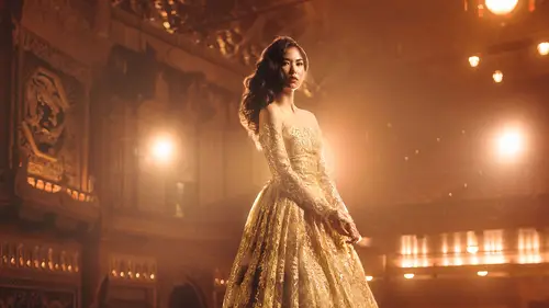
I'm gonna take you through one more. And, we're gonna go to the singles. And so, this is a set of a few images. I'm not gonna retouch the black and whites but, I'm gonna, I'm gonna start with an image like this because I feel like it has this nice little warm light. Then go to my develop and reset it, okay. So this is what this image looked like on a camera. It's a little bit warm, what we did was we added in that light. I know I said I only used one light for this, this was that extra, what we had an extra little CTO and through it in the back and kinda made something that looked a little bit like sunset. This obviously fights a little bit of the cinematic motivated lighting stuff that I was talking about, but, you know, we'll get over it. Okay. Now, first thing that I'm gonna do is actually adjust the exposure a bit. I think it's a bit too bright especially for end of day. And so, I'm gonna bring it down to something closer to this. This brought it down to about a stop. I was probabl...
y a bit hotter than I was really I should've been, and so, I'm gonna put it to be about right here. Okay. Now, my white balance is not in a great spot, so, what I'm gonna do, because this light is so, so orange, I can actually get away with going a bit more into that bluish color a little bit, so, something a little bit colder than, than neutral, by just a bit. That still makes my orange-y light very orange-y. Something like that maybe. So, it makes my orange-y light very orange-y and even though this was shot at, I think it was shot around three o'clock, it really doesn't look that way. So, this is what happens when you get to overpower the daylight. So, this is a pretty good starting point. I gonna tweak this a little bit more, I think there's a bit too much magenta. I wanna kind of play to the greener olive tones in this. So, I've got that orange-ish highlight, which is helping with the skin tone and making it look like daylight. But, I've gone a little bit into the olive color, which I think ties in to the clothing and the plane a bit more. Again, it's all about creating that color continuity and tying the color grading into the image itself. So, I've got a nice bit of color right here. Now, I'm gonna come down to this section and flesh this out a little bit. So, let's double click on the blacks and the whites and see if I like that better. I think it's a bit too much with the whites, I'm gonna bring that down. I think the blacks should come up a little bit as well. It gets me pretty close. Now, so it looks good. See what shadow detail looks like. So, sometimes what I'll do is I will bring like shadow detail up and then I'll bring the overall image down, cause it helps me kind of bridge the gap. Same is true like I'll bring the highlights up and I'll bring the overall image down. And that can be a way to make certain adjustments that require a bigger adjustment as well. Why might you do that? Well, with skin, for example, in lighter tones of skin, when you want to smooth it out, you push the highlights up because it compresses everything in to that tonal range. And, when you do that, it makes it look smoother. But, it also makes the skin look really bright. So, to keep the highlights pressed together, but still give yourself the overall look and feel to the image that you want. Bring the highlights up, push the overall image down. (snap) Meets in the middle. Okay? Alright, this, I think, looks pretty good. I'm gonna give myself a little pump to the clarity. Let's see what my vibrance looks like, but we bring the saturation down. I usually like to go up with the vibrance and down with the saturation. Vibrance will give the whole overall image a bit of pop of color, but, it preserves the skin tones a little better and then saturation is gonna get me into that more olive tone, bleach bypass kind of a, kind of a look. Alright. Now, the skin in particular, I think is a little bit reddish, so, what I'm gonna do is come down to my HSLs and I'm gonna go to my orange tone, which is skin, and, I'm gonna tweak it a little bit, see how it's a little bit red this way? I push it just a little bit more into the yellow and it helps me neutralize out that color cast in the skin tone. You can push it too far, and it becomes green, so be careful about that. And, then saturation. That looks pretty good. No green. My red. We don't wanna do that. It gives him lipstick. Alright, so, tweak this color just a little bit. Okay. So, I think this looks really nice. And, where it began, is here. This is why the development process is so very important. This is a huge difference. And, nothing has hit Photoshop yet. I haven't even done a local adjustment on this yet. So, if I wanted to, for example, to give myself a bit of a better flare, radio gradient across there's already a flare there, but, now it's even more of a flare, if you wanna go this route, like you can do this. I don't love it, but, like, I don't love it in this image but, in certain images, this can be a very effective little extra thing. You know, it looks better there maybe. Just a little bit more subtle. Okay? And so, here is where this might end up from here alright? And, the nice thing is, is like let's say you come to this image here and you hit previous, all I gotta do is a few tweaks to the exposure and it's good to go. That's what that plus and minus comes in to play. Okay? Now, I think this looks pretty good. I'd also, I like to do a little bit of preemptive sharpening. We'll kick it up to there a little bit, and it looks better. And, that looks really nice! So, no clipping. I've got a tiny bit of highlight back there, that I should probably get rid of, which I'll do when I get into Photoshop, but, yeah, no, I'm pretty happy with that!
Class Materials
Bonus Materials with Purchase
Ratings and Reviews
Bruce Walker
This course is simply terrific, and I highly recommend it. Firstly it arrived at the perfect time for me as I am soon to do a studio shoot very much in keeping with a cinematic or theatrical aesthetic. Secondly it's taught by Chris Knight who I swear is like a long-lost twin brother. :-) There are so many parallels in the way he thinks and works to my own style. So I avidly watched this as soon as it was available for anytime streaming. This is the first time I have made extensive use of the CL iPhone app, btw, and I love how it pretty much enabled me to seamlessly switch back and forth from desktop viewing to my iPad that I carry around the house during the day. I was able to make coffee and still carry on taking in the course, uninterrupted. The content is fantastic, delivered succinctly yet entertainingly. Some material and ideas are already in my repertoire and were reinforced and validated by Chris' demonstrations. But he also introduced a lot of ideas and methods new to me and very welcome. I was particularly glad to see how practical it is to stitch a series of tripod shots into a wide pano. I have been afraid to try that but I will now be using that in my next shoot, for sure. As alway, his post production practices revealed all kinds of tips about Lightroom and Photoshop I didn't know. Negatives. The volume level mastering is iffy. It started out at a decent level then midway through one of the early lessons dropped so much I had to turn up my sound system to compensate. And as I write this one lesson (34) is missing and in its place was a duplicate of the next lesson (35). I expect CL will have that fixed shortly though (I sent support a note).
Jeph DeLorme
One of the best classes I have viewed at Creative Live. Definitely worth the investment of time and money. The pace of the class allows you to learn extra tips and tricks throughout the process. Great instructor, highly recommend this class to anyone looking to step up their creative game.
a Creativelive Student
excellent class in all regards. outstanding instructor with experience in complicated cinematic shoots but who also is willing to thoroughly cover the basic nuts and bolts. i wish all creative live classes were of this quality.
Student Work
Related Classes
Lighting