Considering Color: What is Real?
Lesson 6 from: Fine Art Landscape and Travel PhotographyPeter Eastway, Tony Hewitt
Considering Color: What is Real?
Lesson 6 from: Fine Art Landscape and Travel PhotographyPeter Eastway, Tony Hewitt
Lesson Info
6. Considering Color: What is Real?
Lessons
Overview of Fine Art Landscape and Travel Photography
08:44 2Our Passion For Photography
07:38 3Looking For The Next Great Photo
19:05 4Peter and Tony's Photography
18:35 5What is a Landscape?
15:48 6Considering Color: What is Real?
13:16 7Shooting Travel Photography: Exotic Locations
13:33 8Preparing for a Travel Shoot: Research
16:35Who Should You Travel With?
12:13 10Photographing People
04:25 11Choosing Gear for Travel
21:26 12Overview of Aerial Photography
09:03 13Flying Machines: Planes, Helicopters, Balloons and Drones
18:05 14Shutter Speed in Aerial Shooting
12:48 15Manual vs Auto Focus
14:28 16Lenses for Aerials
13:14 17What to Shoot When You're in the Air
17:52 18Using Emotion to Capture Your Images
14:28 19What Stories Do You Want to Tell?
08:44 20Who Are You as a Photographer?
14:41 21Finding Your Creative Process
14:20 22Getting Your Vision Across
26:56 23Quick Image Enhancements Using Lightroom and Capture One
06:21 24Light, Color and White Balance in Lightroom
19:55 25Histogram, Hue and Contrast in Lightroom
09:16 26Masking in Lightroom
11:50 27Cropping and Aspect Ratios in Lightroom
13:19 28Image Adjustments With Capture One
13:38 29Further Adjustments With Capture One
13:44 30Advanced Editing Concepts With Photoshop
07:38 31Peter Eastway Enhances Landscape Details
13:08 32Tony Hewitt Uses Multiple Images to Build Texture
13:04 33Peter Eastway Aerial Edit
09:33 34Tony Hewitt Aerial Edit
15:40 35Part 1
10:31 36Part 2
08:18 37Part 3
09:31 38Part 4
07:08 39Part 5
05:50 40Part 6
24:19 41Sharing Your Vision: Exhibitions
11:54 42The Artist's Statement
10:17 43Preparing Print Files
03:39 44Framing Options
05:50 45Exhibition Space
06:43 46Once the Exhibition Is Up
13:11 47Making a Photo Book
18:49 48The Art of the Print
16:51Lesson Info
Considering Color: What is Real?
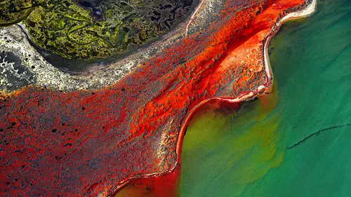
ND5 is the group that we're in, Ninety Degrees 5, not neutral density 5 but Ninety Degrees 5, and Dr. Les Walkling who is the professor at RNIT forever, several decades, and he's an amazing resource of photography and everything like that. When we speak to him we feel like he's a friend of ours, but we always feel like we're getting an education. And we've just finished doing this project where we had an international curator sit down and tell us and say high color photographs might work in books and magazines-- he was talking to me 'cause that's what I do-- they just don't work on a wall, they don't work upbeat, you shouldn't do that. And he was pushing me towards a more desaturated, and a German aesthetic, you know what I mean. So I thought, okay, that's fine. So Les and I were walking around the Perth gallery and I'm looking at the paintings on the wall, and these painting our out of gamut. Their color is just flying in your face and you walk away and you need sunglasses, it's so mu...
ch color there. And I said to Les, why is it that we can't have color in our images? I basically said to the curator, I said you're the curator, I can't change how I do things. If you don't like my photos, run 'em down small, don't run 'em. I have to go for color. So for me, I don't understand why, as photographers, we can't have strong color. I've got a little bit of a reputation for having strong color, it gets for images a little bit like this. You do have the only version of Photoshop with a saturation slide that goes to 200%. (laughter) Just saying. So again, this to me is, the colors were this rich. I'm not kidding you. When we were out there in the desert a fire had been through and it just left the raw, red earth. It is red like this out in western Australia. The green, because it's new growth from those leaves, it's just like the greens that you get in spring here. The colors are so primary. And the sun's going down so the colors are there. But then I come over to this image, which is black and white, it was originally in color, it's been squished together, all sorts of stuff. Again, the color, I was looking at some photographs, or some paintings actually, under some tungsten light-- we know that tungsten light is very warm-- and then I looked at the photo again the following day in daylight, realized that I had a different vision of it, and it was this color, and that's what inspired me to create that single color there. The color doesn't have to be strong, but it can be powerful. If it is powerful, then sometimes you need points of reference. Where the water is in there I have taken any color out of the water and made it pure and white so that the color balances against it. So you're using color in a way like a poet or an author might use words. You can say things in different ways. You can say something literally, or you can say it in a poetic way. You use different words to emphasize, you can have adjectives, you can have verbs. You're using color in a way to say I want you to notice this more than this. Yes, we both are. And I know that's a little intro to the fourth segment we're doing later on, where we're gonna talk about words and et cetera. I'm on your side, Tone. You can talk about the poetry all you like. Then the other thing was, looking back here, this image was dull and gray when I started and I've painted all of the colors in. Then I also had an opportunity to come back and revisit that photograph when post-production techniques have improved. I reprocessed it in a new version of Capture One, reprocessed it in Photoshop, and the colors just started to come to life. So I had this reputation, ladies and gentlemen of the jury, about being a rather strong use of color. 300%. And then suddenly I'm sitting in a room, we've just been doing an exhibition with Tony, over in west Australia, and Tony's been asked to give a presentation to the phase one international something or other, and this photograph comes up on the wall, and all of a sudden I can see 573% color saturation, not 200, which I have been accused of. And I just want to say Tony, that here on international television, Creative Live, for the first time, I just want to acknowledge that you are now the grandmaster of super saturated color. Thank you Tony! (applause) It's an honor I carry quite comfortably. Really this one was purely because I did this on Peter's laptop which has the 200% slider. This image, again, part of the project which we were all working on and when I was working with this picture and I was sort of finalizing it, first of all I cropped it to a square. I wanted to add drama by having that diagonal going from corner to corner. But what it didn't say, which was really hitting me in the planning ahead, all of us, was the intensity of the red sand that came out of that desert. You saw in one of Pete's picture with the tree he had brought some red back in, but that shot of Peter's was probably the way it was when you were standing there, it really was. This has gone a little further, not a lot, but the idea being when people look at this picture I have abstracted it to be about color, shape, and form. Color, shape, and texture. It's about the fact that there's this vibrant red sand, warm, hot. You can feel it going through the middle of the picture. When you see this as a 60-inch print it looks 3D. You can walk up to it and you actually feel like it's doing that. What are you saying? I can see all the heat coming off, I just need to warm myself up. And what I wanted to share was that there, that barrier of red sand separates this primordial soup, this swamp of green, of life. You can look at that and the color of that is congruent with life, like growing microbes and all of that. But this separates it, and then over here is the ocean. And the other thing I wanted people to see was the wind. How do you see wind? Wind is invisible. But you can see the evidence of wind, and we see the evidence of wind where the red sand blows into the water. We see the evidence of the current of the water. Which way is the water flowing? It's flowing that way. How do we know? Because color is telling us the story. I'm using color the same way you do Pete to tell the story behind the picture. It's not just a shot of the coast, but here's what's going on. The wind is blowing, the current is going down, life is going on here, separated and protected from the salt by this vibrant red brand. So it wasn't just one photo though, was it Tony? When you're on a roll I believe you should keep going so I'm gonna stay standing. This one was called Nature's Whip. This is actually very simple. Straight shot, cropped off from the edges. No squishing or squeezing or anything like that, straight shot, and then I've just desaturated a little bit around the edge of this sand and just brought up the yellows in the middle, partly to hold the eye in. So instead of a tonal vignette, this is more of a color vignette and a saturation vignette. And then just composed it in a way that allows these sort of whip, these rivers and streams, to bring the viewer's eye. This is very much about directing the viewer's eye. You come in from here quite strongly and as you travel along you keep getting coaxed around because of the darkness and the drop of color. You get coaxed around, you end up, and you pick back up on these trails and away you go again. Helps you to explore the image. So how does the color work in this thing? That's an interesting picture, you know. This came from two exhibitions ago called Coast Two, and I was flying along the Ningaloo Reef-- which is sort of half up the coast of the west side of Australia-- and I was with a pilot in a plane, a 150 Cessna, which is a very small plane, it only does a top speed of about 100. You feel like you're in a lawnmower that's got wings on it. You're very close. You're in the plane this close. Pete, I know how much you hate being this close to me. So I'm sitting in this plane and I'm thinking I've got four to five hours a day in this spotter plane for whale sharks. Four to five hours a day for four days. I was being sponsored, it's gonna be great. What I hadn't figured out was when you're flying along with a spotter plane the pilot has to spot the whales so he was outside the reef and all I was looking at was the ocean. We went up, and when we turned he had to come along so he could see the reef, All I'm looking at is the land, and I wanted the reef. So I had to pick up shots as we crossed across, as we sort of turned at the end of each loop. Anyway, we were flying at about 800 to 1,000 feet and I said to him, well, what happens if the engine cuts out? And you have a conversation, because this kid was 16. That's how young you can be to get a pilot's license. I'm thinking, you're and you're up here to get some hours, what happens? He goes well, he kind of looked through the end, there's a mark on the side of the door, and if the mark is here I know I can pretty much glide to the beach. And I'm sort of listening, my confidence level is starting to deteriorate a little bit. You figure there's a photographer in the plane, you wanna be reasonably confident with your pilot. And he was good, don't get me wrong, great pilot. I thought, what does it look like from 4,000 feet, because I'm figuring in the back of my brain that gives us a lot more glide time back to the beach. We went up to 4,000 feet and I noticed something, and it's a bit like the tree shot, Peter. When I went up I looked down and I saw this thing that looked like Australia with a big fat thunderstorm over the top. I know you will pick that up quicker than anyone else, but it looked a bit like Australia. And then I noticed I could see right through to the bottom of the reef. This is extremely deep here. Whales go up and down the coast. Then for a moment I had this flash as to where this image needed to end up. This was called New Earth, because I looked down, I saw a map of the world. I saw a map of another world. I saw a map of perhaps a way the world looked millions of years ago, and that's what that picture's about. When you see it at 86 inches and you stand in front of it, that's what you would see. This one, Tony, is almost dull in comparison. It is. Well, I didn't wanna go overboard. Again, sort of a tidal area, this is rivulets of water. As the tide comes in and out it leaves these sort of corridors in the sand. And it just, to me, was all about life. The color is about life, the shape is about life, trees, et cetera. So again, the symbology of it is quite simple. The composition allows it to be very obvious as to what I want you to look at, and the use of color, this is about the colors of life. So again, the use of color is there for a reason. What we'd like to just perhaps conclude on is the idea of when we're talking about color is that should color be real? And I remember, what I saw was probably a reproduction first, but I've seen the original of a Sandro Botticelli. And in the background there is a sky and the sky is definitely green. Certainly it was in the first reproduction that I saw, which may or may not have been right. Because obviously the colors over time, it's 500 years old, the painting, have changed. But it's a green sky. And people say to me, green-- they don't ever question that, but when I do things, so for instance I've got this photograph here taken in Queenstown where there's a green lake, and people say, "How could that be, that green lake?" Epson used that photo for many years for its promotion advertising for its printers because it was different and people questioned the green lake. The original capture, you can see there, has a blue lake. You guys being from North America will be quite familiar with lakes that are green, green is not unusual. But for the Kiwis, for the New Zealanders, to see their precious lake green was a challenge for some of them. And I think that, for us, if we're doing work for a magazine that expects, or a context that expects truth, then maybe you shouldn't do that, but as artists, why not? Another photo I get asked about is this, and they say, "Was the water really that green?" Well before I answer that, I'll show you a couple of other photos that were taken and these are just straight out of the camera. They're just around there, and you can see that the water really is super super green. But when we went back a little bit and the clouds came over the water wasn't that green in the capture, but my memory was that the water was green so I felt that I had license to bring the green back. And certainly that license was the inspiration for putting that color in there. So I don't think we have to have exactly the colors that we're provided with, if you don't want to. Color is a really useful tool with which to bring in emotion, ideas, expression. We're known for playing with color, and we love color. I think that's going to show over the next little while. I think that's where you don't have to go that far, and we're trying to show that you can go that far for a reason. And you don't have to have everyone like it, not everyone's gonna respond to it, but it's your choice. And in the same way that people would use contrast in black and white to create impact, and sometimes that contrast was so heavy, where they'll have very heavy blacks, and sometimes you look at it and go it's not that heavy, but it gets an impact, it tells a story. That's what we're trying to say.
Class Materials
Bonus Materials with Purchase
Ratings and Reviews
Esther Beaton
Two Aussie blokes just having fun. Peter and Tone did us proud by representing the spirit of Australia, which is: don’t take anything too seriously. They hit off each other well, in fact, they are the best twosome I’ve ever seen on Creative Live, each giving the other respectful space yet not being shy about taking the micky out of the other guy when appropriate. The whole dialogue was spirited, informative, casual and fun. They also perfectly proved the symbiotic relationship between red wine and beautiful photography.
Swapnil Nevgi
Loved the positive energy of this class. Just finished watching it and I would definitely recommend it to someone who wants to take their landscape photography to the next level. This course is not about learning camera or software skills, but learning how to develop conceptualizing and composing skills. How an award winning creatives mind works is a lot more important than how to use camera. This is exactly what I was looking for and very happy with my purchase. Also it was good to see some of their raw vs post processed files to learn how far the professionals like Tony and Peter go with post processing (Something I have always been concerned about). Knowledge about exhibiting was also priceless. Thank you, I have learnt a lot in this class and I am sure it will reflect in my work in future.
Debra
This class is fabulous! One of the best on Creative Live. Peter and Tony share so much of themselves and their great art that you can't help but want to pick up your camera and get out to shoot. It was like watching two close friends. Thanks very much for a very enjoyable 2 days of learning and viewing.