Image Adjustments With Capture One
Lesson 28 from: Fine Art Landscape and Travel PhotographyPeter Eastway, Tony Hewitt
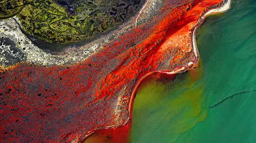
Image Adjustments With Capture One
Lesson 28 from: Fine Art Landscape and Travel PhotographyPeter Eastway, Tony Hewitt
Lesson Info
28. Image Adjustments With Capture One
Lessons
Overview of Fine Art Landscape and Travel Photography
08:44 2Our Passion For Photography
07:38 3Looking For The Next Great Photo
19:05 4Peter and Tony's Photography
18:35 5What is a Landscape?
15:48 6Considering Color: What is Real?
13:16 7Shooting Travel Photography: Exotic Locations
13:33 8Preparing for a Travel Shoot: Research
16:35Who Should You Travel With?
12:13 10Photographing People
04:25 11Choosing Gear for Travel
21:26 12Overview of Aerial Photography
09:03 13Flying Machines: Planes, Helicopters, Balloons and Drones
18:05 14Shutter Speed in Aerial Shooting
12:48 15Manual vs Auto Focus
14:28 16Lenses for Aerials
13:14 17What to Shoot When You're in the Air
17:52 18Using Emotion to Capture Your Images
14:28 19What Stories Do You Want to Tell?
08:44 20Who Are You as a Photographer?
14:41 21Finding Your Creative Process
14:20 22Getting Your Vision Across
26:56 23Quick Image Enhancements Using Lightroom and Capture One
06:21 24Light, Color and White Balance in Lightroom
19:55 25Histogram, Hue and Contrast in Lightroom
09:16 26Masking in Lightroom
11:50 27Cropping and Aspect Ratios in Lightroom
13:19 28Image Adjustments With Capture One
13:38 29Further Adjustments With Capture One
13:44 30Advanced Editing Concepts With Photoshop
07:38 31Peter Eastway Enhances Landscape Details
13:08 32Tony Hewitt Uses Multiple Images to Build Texture
13:04 33Peter Eastway Aerial Edit
09:33 34Tony Hewitt Aerial Edit
15:40 35Part 1
10:31 36Part 2
08:18 37Part 3
09:31 38Part 4
07:08 39Part 5
05:50 40Part 6
24:19 41Sharing Your Vision: Exhibitions
11:54 42The Artist's Statement
10:17 43Preparing Print Files
03:39 44Framing Options
05:50 45Exhibition Space
06:43 46Once the Exhibition Is Up
13:11 47Making a Photo Book
18:49 48The Art of the Print
16:51Lesson Info
Image Adjustments With Capture One
For those of you who... A lot of people come to me and say oh Capture One is so hard to use. If you know how to use Lightroom, Capture One is essentially the same. It's just slightly different tools, slightly different names. But really it's just as easy. And the reason that I like to use Capture One is because it matches my creativity better than Lightroom. So it's just a personal choice. So I'm not telling the world out there that you need to move from Lightroom to Capture One. But I would encourage you, you can download a free copy of Capture One. And what I've done for the magazine, what I've done for Better Photography magazine a number of times, is I've got Capture One on the left, and Lightroom on the right, and I've imported the same file. And then I've made adjustments. I make an adjustment to the first in Capture One and then I do it in Lightroom and I try to match it. And what you find is that oh I can match the greens in both perfectly, but the yellows will be different. Le...
t's make the yellows the same. Damn, now the greens are different. So the guys behind the scenes, it's like two different chefs making the same dish but they have slightly different recipes. And it's a matter of whether you like Burger King, or you like McDonalds, or whatever it is. It's just a difference. Different flavor. A different flavor. So I just recommend everybody to do that little test themselves. It'll just take you an hour. And then you make the decision which recipe works best for you. So I thought what I might do is actually just, for the first bit at least, show people what I might do at the end of the day. So I've been out of the studio and I come back and I'm gonna do reasonably what I would call a quick edit in Capture One. Okay, so people who've got Capture One and don't go to Photoshop or Lightroom, we've gone and we've taken our time working through a couple of pictures in Lightroom to show people here, here's what we're doing. I just would like people to get a little inkling as to just how quickly you can change a picture with just a couple of steps. So this is the file. If we look at the histogram, it's probably underexposed by a stop maybe. Why? Well it was a pretty stormy night. We are pretty exposed at that place where we took this shot. But if you have a look, I've chosen to keep my ISO at which means I'm probably gonna have less noise problems than if I'd gone up to say ISO 400. I'm at 0.1 of a second. If I'd slowed it down much more, I remember that there was a lot of breeze and I was worried about getting too much camera movement. And I'm at F11 to try and give me some depth. Because I was actually shooting something on the ground, and then the sky lit up. So when I come back and I look at this picture... So you just turned the camera and went click. And taken a shot, right. So I'm gonna jump white balance and I'm gonna go straight into exposure. And if I hit auto, it lightens up the photograph. But I do notice down in this bottom corner here that it's getting a little bit bright. So I might pull that back a little and I'll go to my contrast. Now a lot of you who use lightroom will see a lot of similarity in these tools. So if I grab contrast and I push that up a little bit, suddenly it's getting a little bit of the drama that I felt when I was standing there. And all I've done is made a couple of very basic adjustments. In fact, if I left exposure where it was, I'd probably get very close to that sort of drama that I want. But I can see that's a bit light. So I'm gonna go half and half. I'll get a little bit of a push on my exposure. And interestingly enough, it's only 0.4 of a stop that I needed to get somewhere close to what I wanted. And then I go through and I say okay, I don't really need to worry about high dynamic range 'cause if we go back to the histogram, look at it. Now I said to you, Peter, what happens if you hit auto-levels? Now I just noticed that auto levels isn't there. So I'm gonna add that tool. If we go into levels. There it is there. So I've got levels. And if I got auto, wow, now I've brought in a little bit of edging. And I can deal with that, as you know, if I go into light falloff. Capture One allows me to even it out. Look at that. What happened down in the bottom right that time? Yes, I've noticed that as well. So let's go back into here. And we go right, why did that happen? Well, this auto level popped it in. So I can just go back and adjust it. But the auto level gave me and idea of how much drama was available. Yes, yep. Question? Well, I guess, how do you know how to play with the levels dialog? 'Cause that's a little bit more complicated than what we've done so far. I mean, Lightroom has got the curves, which essentially lets you use it like the levels anyway if you want to. Sure, so the one on the right, I've got what's gonna set my white point. So if I bring that in. If I say I'm gonna set that here, than everything to the right of where I put that point is clipped, is white. And I know on my histogram that I've just clipped half the information. I've turned it all bright white. I don't want to do that. When I started with that levels out here before I gave it auto, essentially I didn't have any whites. And I don't have any blacks. And in order to build some contrast, all contrast is doing is bringing them closer together as you know. So hitting auto says okay, here's roughly the sort of feel you can get out of that picture. But hey, guess what, we're gonna clip that a little bit. So I'm just gonna pop that out a little bit there and make sure I don't get rid of that. And you can tell that by the graph shape where it finishes, can't you? I can, plus also, I have a little indicator on. And that's in Lightroom as well. That is in Lightroom as well, correct. So I can take that back and say right now all the information is safe. That's bothering me. We might crop that out in a moment. Similarly, if I turn that on it should show me, which I haven't got turned on, there you go. I'll have to go in and turn that on. But anyway. It can show blue as a different color, yeah. So, couple of quick changes and suddenly I've got a lot more drama than what I started with. But now it still feels a bit dull. What happens if I push the saturation up? Wow, look at that. That was just a couple of steps. And suddenly I've got a picture that I like. But I might take that back. I can get a little bit clever with Capture One. I can actually choose individual colors a bit like you did in Lightroom. So if I go in here and I say right, if I go into... Oops, not there. I'm gonna add a tool, very quickly add a tool. And I'm looking for. Color editor? Color editor. Which thank you, is about there. So I'm gonna bring that in. I'm gonna go to the advanced mode. I'm gonna grab my little eyedropper, similar to what you did in Lightroom. I'm gonna jump in here and I'm gonna start with these yellows. 'Cause to me they're the heroes. All right, now look at that. Almost green. And I'm looking at that. And you're right, it is green. But I'm more interested in the gold. I'm actually gonna cheat and I'm gonna say no I'm more interested in these colors. And I'm adjusting the feather. I'm adjusting the selection. So if I pull it round here, I'm now going to be adjusting everything from blue 'round to orange. I don't want to do that. I just want to work on the yellows. Okay, understand. So I push this up. And I can see what it's doing to the yellows. But that bottom corner has gone ballistic, which I kind of like in some ways. But the problem is because it's global, it's affecting everything. So I'm gonna rethink this. I'm gonna go back. I'm gonna turn that off. And instead, what I'm gonna do, is I'm gonna to an adjustment layer. Okay, like we did in Lightroom. Like we do in Photoshop. Okay, so I'm going to add an adjustment layer. And in this case I'm going to use a brush and I'm going to choose a brush that will allow me to draw on the areas that I want to have an affect. Or, I could go to a gradient. Now that might be a bit easier in this case. Gonna grab a gradient mask and start in this corner. And I'm just gonna this. So I have a bit of a mask there. Now I'm gonna go back to my color editor and I'm going to select those yellows. And I'm going to push them up. And that will just reduce the affect. So I can work on that area if I wanted to align. All right, don't really like what that's doing. Let's go back to where we started. All right. But I've gotta be conscious of this corner. Now if I go up here, you see this image here, I've managed to keep the intensity of that yellow and the blue about the same. But I've lost this hero in here. Right, okay. So pulling that back. So I'm looking at this going well what do I really want to talk about? I want that to jump out. I want the little bit of structure here to jump out but keeping that under control. So you want the bottom left to be darker and those two little clouds to be lighter because the lighter clouds are going to attract the viewers attention. And also, I think the color could be a little bit richer. Sure. 'Cause that will also attract attention. Saturation, lightness, contrast will all attract attention. Will all attract attention. Correct, okay. So we go back into here and I think well, I know we're not a big fan of the Clarity slider. But if we did add just a little bit to it? We can see the affect that local area contrast has on the picture. It sure does. You can see how it's adding a little bit of affect. So I'm gonna work this as if I'm doing what I would call a quick edit. Maybe a little bit of structural assist, maybe not. So again, don't be afraid to have a play. I'll pull that back. Still looks a little bit flat for me. I'm still just sort of not happy about the brightness down there. Maybe what I need to do is more worry about tone than color here for this. So go back to our layers. Go back to that local adjustment. Gonna go back onto layer one. Layer one which is what we're on. So we've made those changes in the wrong place. You have, yeah. Okay. We did put a mask in here. We did put a graduated mask in there. And we can see where that mask is affecting. And that's about the area I want it to affect. Now I can go back into my exposure. And I could either affect the exposure. Or maybe brightness. Just pull it back a little. Pull that back a little. And now that area of the picture is not so strong. Now you jumped in and you used aspect. Keystone, yep. So down here I'm looking at these things here. And I'm not, kind of that little bit is grabbing my attention. And I don't want it. I could crop it out. Or I could just play around with my aspect and suddenly it's gone. But I've now lost this little bit of yellow up here. Now why wouldn't you have just cropped it out though? Or are you preferring the shape of the clouds when you do that? I do like that. But you know the compromise is to crop that out and leave that in, or change the aspect. Just a little bit. Maybe take it out. And as I'm looking at it, know what I'm thinking? I'm thinking I've got too many heroes. Right, okay. Not that you can have too many heroes. But in this case there's too many heroes. That's the hero for me. That's right, I agree. And that I think I don't like it being so obvious. So what I might do is now go back into layers. I'm going to add another layer. Adjustment layer, but this time I'm going to draw a draw mask. And I'm just going to grab that section there and be very particular in my color editor. I'm going to select that absolute center of that gold and make sure it doesn't affect the blues. So I'm gonna bring it right around here a little bit more. Now, suddenly if I just reduce the saturation there, it just reduces the impact of that. So just losing a tint. Just a little bit. So what you guys are looking at might be a very subtle and maybe unimportant adjustment whereas for Tony it becomes very important because of what he wants to see. And I find that when people are starting, they often do one or two adjustments which make big changes. But they're a little bit unrefined, a little bit raw around the edges. And the other thing is that one of the things you'll develop with experience is that the projection of what I'm looking at on my screen, particularly on my color balance monitors in my studio, and what it's going to look like on paper. Because the end of the day, most of what I'm doing here is going to be in exhibition or it's gonna be there to be viewed in physical terms. And I know that things like the contrast around this little guy hanging in the air like a spaceship, I want that to be punchy because on paper, I want people to feel like when they walk up that it's coming off the page. So I need that to have a little bit more structure, a little bit more contrast. Would you lighten that up a little bit more? How are you gonna make us look at that? Well, I could do that with again, I could go back in and do an adjustment layer if I just want to work on that area. So let's see, we're gonna add another adjustment layer. And just use a brush and I go right into here. So let's say we zoom in a bit. We grab our brush and we go right in here. Make it a bit smaller. And I'm just gonna do a little bit of what you showed us with your dark room technique from A-D-F on this. I'm just going to paint a little bit in here like that. Maybe a little bit over there. And I'm gonna say right, what happens if I just do a very simple exposure lift? Wow, a bit too hard. If I go too hard, you can see it won't work. So it's gonna be very, very subtle. Maybe a little bit of contrast lift in there as well. And maybe a little bit of saturation lift, like so. So if we turn that on and off, it's only subtle. But if we zoom back out. And what was also interesting was that the mask isn't necessarily a complete... It's not precisely the same necessarily. Now you can do channel masking. You can do luminosity masking. All different ways that will self mask particular areas of the image. But often the brushes that I'm using, if you look at the shape of the brush, and we'll see this in the next section, the brush looks quite different to the subject that I'm changing, and yet you can't see what I have done. I mean you can see what I've done, but you can't see where I've done it. It's still invisible as a technique. Yeah, and the sort of things I might do at the end, I might look at it and go, can I give that a little bit more kick? Well maybe, oops. I think we're in an adjustment layer. So let's just go out of that. Go into here. Go back to our background layer. I might grade curves. And I'd look at this and I'd go, what happens if I just give it a little bit more of a punch like that. And you know, that's the sort of thing I'd look at. Sitting at night. Been working through the day, sitting in my hotel room, whatever, and going I like where this can go. And I've done that in what, three or four minutes, with a couple of changes. So that's something I think I'd like people to understand is it's okay to play.
Class Materials
Bonus Materials with Purchase
Ratings and Reviews
Esther Beaton
Two Aussie blokes just having fun. Peter and Tone did us proud by representing the spirit of Australia, which is: don’t take anything too seriously. They hit off each other well, in fact, they are the best twosome I’ve ever seen on Creative Live, each giving the other respectful space yet not being shy about taking the micky out of the other guy when appropriate. The whole dialogue was spirited, informative, casual and fun. They also perfectly proved the symbiotic relationship between red wine and beautiful photography.
Swapnil Nevgi
Loved the positive energy of this class. Just finished watching it and I would definitely recommend it to someone who wants to take their landscape photography to the next level. This course is not about learning camera or software skills, but learning how to develop conceptualizing and composing skills. How an award winning creatives mind works is a lot more important than how to use camera. This is exactly what I was looking for and very happy with my purchase. Also it was good to see some of their raw vs post processed files to learn how far the professionals like Tony and Peter go with post processing (Something I have always been concerned about). Knowledge about exhibiting was also priceless. Thank you, I have learnt a lot in this class and I am sure it will reflect in my work in future.
Debra
This class is fabulous! One of the best on Creative Live. Peter and Tony share so much of themselves and their great art that you can't help but want to pick up your camera and get out to shoot. It was like watching two close friends. Thanks very much for a very enjoyable 2 days of learning and viewing.