Light, Color and White Balance in Lightroom
Lesson 24 from: Fine Art Landscape and Travel PhotographyPeter Eastway, Tony Hewitt
Light, Color and White Balance in Lightroom
Lesson 24 from: Fine Art Landscape and Travel PhotographyPeter Eastway, Tony Hewitt
Lesson Info
24. Light, Color and White Balance in Lightroom
Lessons
Overview of Fine Art Landscape and Travel Photography
08:44 2Our Passion For Photography
07:38 3Looking For The Next Great Photo
19:05 4Peter and Tony's Photography
18:35 5What is a Landscape?
15:48 6Considering Color: What is Real?
13:16 7Shooting Travel Photography: Exotic Locations
13:33 8Preparing for a Travel Shoot: Research
16:35Who Should You Travel With?
12:13 10Photographing People
04:25 11Choosing Gear for Travel
21:26 12Overview of Aerial Photography
09:03 13Flying Machines: Planes, Helicopters, Balloons and Drones
18:05 14Shutter Speed in Aerial Shooting
12:48 15Manual vs Auto Focus
14:28 16Lenses for Aerials
13:14 17What to Shoot When You're in the Air
17:52 18Using Emotion to Capture Your Images
14:28 19What Stories Do You Want to Tell?
08:44 20Who Are You as a Photographer?
14:41 21Finding Your Creative Process
14:20 22Getting Your Vision Across
26:56 23Quick Image Enhancements Using Lightroom and Capture One
06:21 24Light, Color and White Balance in Lightroom
19:55 25Histogram, Hue and Contrast in Lightroom
09:16 26Masking in Lightroom
11:50 27Cropping and Aspect Ratios in Lightroom
13:19 28Image Adjustments With Capture One
13:38 29Further Adjustments With Capture One
13:44 30Advanced Editing Concepts With Photoshop
07:38 31Peter Eastway Enhances Landscape Details
13:08 32Tony Hewitt Uses Multiple Images to Build Texture
13:04 33Peter Eastway Aerial Edit
09:33 34Tony Hewitt Aerial Edit
15:40 35Part 1
10:31 36Part 2
08:18 37Part 3
09:31 38Part 4
07:08 39Part 5
05:50 40Part 6
24:19 41Sharing Your Vision: Exhibitions
11:54 42The Artist's Statement
10:17 43Preparing Print Files
03:39 44Framing Options
05:50 45Exhibition Space
06:43 46Once the Exhibition Is Up
13:11 47Making a Photo Book
18:49 48The Art of the Print
16:51Lesson Info
Light, Color and White Balance in Lightroom
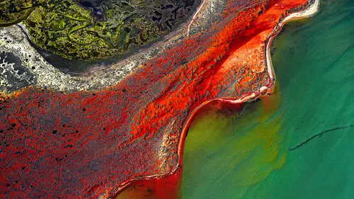
I've picked a series of photographs here, some of you have seen yesterday as a starting point and they're just the raw files. What I wanted to show is that when we're shooting-- this one has actually been adjusted a little bit just to give you an idea of where we're going, but you'll see out of the helicopter here I've got three shots. We talked about shooting aerials yesterday. I've actually got, in that series, probably 15 photographs because I saw the angle coming up and I just kept on shooting. So shoot a lot and then pick the one that you like the composition the best. I can spend an hour trying to work out which is the best composition out of those three, and there's probably no difference. When you're making that selection, you're in Bridge or Lightroom or whatever it is going through as a choice mechanism, do you work on each image and then decide or do you sort of look at the basic files and decide before you start doing too much work. I normally have a look through my who...
le shoot and I will mark photos that I think are worth looking at. Sometimes I just can't resist, I have to stop on that photograph and enlarge it up to make sure it's sharp, and if it's sharp, I'm happy, because I know I can do everything else later on. That just comes from experience, because I know what I-- I think I know. I don't always succeed, I have to admit. Sometimes we start off on a photograph and you get to the end and you go, "Still not there." You've picked one out of these three, obviously, those first three. What made you choose that one? Just because the balance of the trees in the bottom-- let's just enlarge that up a little bit. You'll see there are trees in the bottom, over on the right, then over on the left. So I've got this bottom left, middle right, top left, back right, so that there's soon of a curved line that's leading the eye through the composition, and that's what attracted me. And if I go back to the other ones they've still got the same composition, basically. Oh, let me find-- there we go. We've got the similar composition but maybe up here the trees will be too close to the edge of the frame or something like that. But this is not too bad, anyway, as a photograph. We might fiddle around with this one. When we look at the histogram you can see here that I've overexposed up there. It wasn't my fault, it must have been the camera. But, you know, it's not too bad. The histogram just ends right there, it's not jammed right up, so we should be able to get a little bit of detail in there. Can you show us how we might check if that's clicked at all? Well, in Lightroom, I believe you can turn these little things on, but you've asked me a question, this will come nice in red and I've got no idea. So thanks for that. The way I check is I just simply darken on the image. And I can see my histogram is moving. What you can find is, on the histogram, sometimes when it's right up there, you don't know whether there's another little bit, a little bit on the right hand there, but if this was jammed right up against the right hand edge then you know we're clipping. We talked a little bit about clipping yesterday, about not wanting to overexpose our files. As I drag that down you can see the histogram here changing, and there's nothing to the right, so I know that I've got detail up in this bright area. One of the things, I guess, I'd also like to just mention to the class is that when we're looking at our histogram on our camera, that's really important, because we're collecting pixels. Now that I'm looking up the histogram here in Lightroom it doesn't worry me whether I'm clipping or not because I might creatively want to have an area that's all white or all black. This is now just information and I don't have to be subservient to that histogram being in any particular position. So the histogram is important in the camera, it's just information for me when I'm doing post-production. It will tell me whether I'm clipping, but it doesn't necessarily matter. Clipping meaning I'm over or underexposing and creating areas of white or areas of black. In the first impression of this image, you says the trees, bottom left, middle right, top left and back out to the far right. Does that drive part of your decision making in terms of where you're gonna finish off on your exposure slide? I suppose it does. I mean, here, why do I see those trees there in those three positions? I mean, there are trees elsewhere, and so I'm lucky. I mean what attracted me to take this photograph in the first place was the light, the way that the light was just highlighting parts of the landscape. The fact that the light was working in those parts of the landscape meant that my eye bounces from left to right, to left to right. And I suppose that means whatever your corrections or adjustments you're gonna make now to that raw file, we need to protect that detail. That's correct, exactly right. We want to keep the detail in the highlights. Because when we enlarge that picture up we wanna make sure that the tree trunks have all that detail in them. When we drag up you'll see as it comes into the sunshine we're starting to lose a little bit of detail. We're probably losing a bit of sharpness of the camera at the top of the image there too. So perhaps its better to say that we're not just protecting the detail but more importantly we're protecting the impact that they're having, so we're not letting the impact be diluted, if you like. You can do that using exposure, but you can use contrast and you can use saturation. Yeah, exactly, exactly. The guys, as I understand it, from my conversations with the Adobe engineers, and I think it hasn't changed in those times. They created the basic panel with basically a top down approach, and they acknowledged up front that not everybody works this way all the time, but a lot of people asked for an approach: I've got my raw file, what do I do with it, what order do I approach things. There are a lot of great classes here on Creative Live on how to use Lightroom and how to use Photoshop and all that, so we don't want to focus on that, that's not what we're about. We're about the thinking side of using these tools. We'll show you what we're doing, but if you want to know the nitty gritty about any particular tools, please reference Creative Live. I was just gonna say, so coming back to it, just to summarize, we're here about the idea behind it, what you photographed and why, and how to achieve the best expression of that idea. If I answer that question for you, for me, in this photograph, what's really important is the light hitting the trees, the tops of the trees. I want the viewer, when they look at my photograph, to know, ah wow, this is lake light, and isn't it amazing how this light is just skimming over the tops of those three groups of trees within the landscape. This exposure that I've got here, does that give you guys the message that I've just expressed to you? And my suggestion is, no, it's way too light. Yeah, I feel like this other thing is distracting. But before we do that-- Well, okay. So I'm going to jump now. Rather than using the suggested approach of color, a tone, and then presence, I'm actually going to start on tone because tone, for me, is more important for this particular image. Let's just use the slider and drag the exposure down and you can see as we drag that exposure right down, it might be quite dark now, but we've got beautiful detail in the trees and the trees are certainly where the eye goes to because we've darkened down everything else. Does that work for you, Tony? What I'm getting the sense is that it's as much a sense of exploration as it is a sense about mechanics or process. Yes. And not being afraid. I mean often we've worked in workshops where we do semi-tutorial sessions and people are working on their images and we say, "Just make an adjustment to the exposure." What they'll do is they'll get in there and they'll go really gentle. And it's like no. Do that, do that. Okay, they're the extremities. Now go in a bit less. Okay, when do the trees start to pop up, and so and so forth. And that's about exploration, it's about not being afraid to push things around and go, well, that's where it starts, and that's where I want it to end up. And it's interesting because I know that there are some instructors I've heard who have said, "Oh, you don't want to be just coming in here "and going backwards and forwards or whatever, "you wanna know what you're doing." If you're processing thousands of images every day that's 100% good advice. But if we're doing one or two art pieces-- We're here about fine art photography. I'm not doing this for thousands and thousands of images. I've picked this photograph as being something that I want to potentially hang on a wall or put in a book so I'm going to spend a little bit of time, and that, as you say, is a process of discovery. A voyage of discovery, I would suggest. Being able to just play with the image and see what it can say for you. I'm going to-- Let's start with-- We know that the detail is there. How do you find the color balance? Tony, is that okay? Well, I mean it's probably close to what it was but I do think it's possibly a little bit warm for me, but then others wanna say it's too cold. It's a preference, isn't it. I find the yellow in the trees, I suppose that's a bit strong. Maybe we should have done this as a little bit of an introduction before. People say to me, "What lens should I buy next," and I say, "A good quality monitor." (laughter) Because, we spend, Tony and I certainly, we spend a lot of time in front of a monitor making creative decisions about how light or how dark our photograph should be, or how colorful they should be one way or another, or how warm or how cool, and if you don't have a monitor that is accurately telling you that information, how do you know what you're doing? And you can do something on a monitor that's not quite right and then you put it out on the Internet or you make a print and everybody else sees those colors and tone differently. You end up losing your hair like me, it's a problem. The quality of your decisions in creativity is based on the quality of the feedback and information that you're getting as you make those decisions. That was really important. We use EIZO monitors, E-I-Z-O, because they are a nice flatscreen, not too glossy or anything to look at. The range of colors, the color gamut, is very high. It's almost Adobe RGB if not Adobe RGB. And very consistent. We're cheating a little bit. We've got a head start, I realize, over a lot of you, because they're not cheap, monitors, but that would be my next lens. Also with-- I'll leave that, that's fine. We have a question from Kenna. Yeah, thank you. Just because people are asking, a question from Doug Parks was, "Are there any other tools that we can use "for calibrating a monitor?" Do you use any of the physical calibration tools? Would you recommend that? 100%. Your monitor, whether it's a laptop monitor or an EIZO desktop monitor, it should be calibrated, and the process is using a colorimeter, like the Spyder, there's a Spyder 5, I think is at the moment. (mumbling) I think they're now X-Rite. Also when you buy some of the EIZOs they have a built in colorimeter which just comes up and does it for you. It's a great idea. I guess I calibrate once a month. Computer monitors-- I say computer monitors are a little bit like wine, is that they can mature and change over time and so you need to bring them back to the middle, which you can't do with wine. Eventually they all overmature, so a monitor is never going to last you forever. But they're going to last you five, 10 years, that's not a big problem. Calibrating once a month I would recommend. Some people would say once a week, some people would say once every three months. It depends how often you use it. Within our studio with commercial work as well we tend to calibrate at least once every two weeks just to stay on top of the... Regularly is the answer there. Thank you for the question. I guess when you're saying the picture perhaps looks a little bit warm, this is the As Shot. As Shot means the color temperature that was set by my camera, and I always have auto white balance on my camera because I know I can change it later on. I have a quick look at auto, and that warms it up even more. Because this is kinda narrow, this is 40 degrees centigrade down on the ground, this is hot, and it's red dirt. I quite like the warmth. I also use the white balance clicker here. When I come down to here, let me just come over to here. Oh, I've lost it, but anyway, you can click on different areas. I can turn that on permanently but I'm on screen and I'm fussed and I can't quite remember how. By clicking in different areas it will set a different white balance for you, and it can make quite dramatic changes. I often look for an area that's gray or neutral within the picture, and then I click on that area. If we said those rocks there were gray, I click on that and that sets the image based on that. Although this tool was designed to give you an accurate color white balance I'm really just looking for a creative expression, what makes me happy. So if I've got a good quality monitor I know the colors that I've got. I'm just looking for the right color that expresses what I want to say. That's probably something I feel really passionate about, there's that factually correct color, but if you look at art anywhere, it's about expression, it's about a personal preference, and you're not gonna please everybody. You asked me what would I do and I felt like it was a little bit warm, I would have cooled it down a little. As soon as we asked the computer what it would do it says, "Tony, you're wrong. Bzzt. "It should go the other way." I think people need to have a clear view in their mind again, what they're trying to say with these pictures as you work on them, because if you follow a process that someone's told you and says it has to be this, it has to be this, it has to be this, you're gonna end up with a sausage factory and all the pictures look the same, and I suppose that's the antithesis of fine art. Fine art is about taking image and saying, this is my bent, this my slant or my version of what I felt. I think that's a good point. Thank you, Tony. I've just gone back to auto, a nice warm color balance, and we'll leave that and say that's okay at the moment. What would we do next, Tony? Well we'd probably look at the highlights because you've got some highlights at the top there that I feel are pulling me up out of the picture. As I start I get those lit trees in the bottom left, I get the lit trees in the middle right, I get the lit trees in the top left, but then my eye whiffs out to that bright area at the top. What would you do with that? I'd darken that down because I think when we're talking about composition, composition isn't just about framing the camera up, it's all about-- it's also about, not only-- it is also about the tones that are around the photograph and in this particular instance the tone up here is very bright. So if we're looking at that picture our eye is being subconsciously drawn to that area and I want the eye to be consciously and subconsciously drawn into this area down here. If we crop that off, that's one way. Maybe we should look at straightening it as well. I was gonna say, the horizon's wrong. Let's go into our crop mode. We can straighten that horizon up a little bit and as we straight it down we're losing it a little bit. I tend to think that doesn't look too bad. Well you've kept those main tree areas that you were looking for, and the ones on the bottom left haven't come out of the frame completely so I think we can work with that. I've lost the sky completely so now I don't have to answer Tony's question to show you how to darken it down. Isn't that easy? I like easy answers. Thank you, Tony. You're welcome. We're here with the exposure and we can still fiddle around with that a little bit. As we darken the exposure down you can see that we get detail in the background, which I'd probably like to keep. As we lighten it up I like the fact that there's a little bit of detail in the hills there, because if that's too dark it's a little bit too mysterious. What Lightroom and Capture One have got is the ability to adjust the shadows or the highlights independently of each other. I'd say that this is a shadowy area so I'm gonna come along over to my Shadows slider and I'm just going to drag it to the right and see what happens. You'll see that it's lightening it up a little bit, it's adding a little bit. If shadows isn't going to give you quite enough you can come down to the Blacks switches. A little bit problematic because it's doing other things as well but it might give you the answer. Technically there are reasons why I wouldn't move the Blacks as far as I have, but just for this part, this exercise, we're just looking at this as an exploration. It's now lightening up the other area in the image without losing the detail that we've got in the trees. Do we need to lighten them that much? I wonder if I liked it when it was a bit darker. I think I'm with you, Tony. I just need to know there's some detail there but I don't need to know what it is so much. To me that gives a drama of the cragginess. It actually accentuates that time of the day and it comes back to what you said this picture was about, it's about that light clipping the top of the hills. I agree with that. Let's just take a look at the Contrast slider because the Contrast slider can sometimes do all of that automatically. As we drag it to the right we increase the contrast. Wow, so that's made a big change. See how it darkens the darks, lightens the light, and what has it done to the mood of that photograph? It certainly added some drama, which is one of the things that I like, and it's also put a strong focus on those trees. Because they've darkened absolutely everything else. What happens if we went the other way with contrast? I mean, we're back where we started. (laughter) Maybe not my best work ever. I won't be offended, that's all right. But it also gives it a more pastelly look so depending on the sort of photograph I wanted to create-- maybe it's a photograph for a fairy tale book or something like that where you didn't want the drama, you didn't want the dark, ominous tones of those dark shadows. It's not a right or wrong, it's what makes you happy. But I'm with you Tony. Let's come back and add in a little bit of contrast. Not too much, I'm just looking at-- You're just looking for 200%. It's not there. (laughter) That's not looking too bad. May be a little bit too dark up in that area so I'm just going to grab my shadows and just lighten it up a fraction. That's about right. Maybe that's all we need to do with that photograph. This is that question, isn't it? How far do you go with an image? So many people will look at a picture and say, is it finished, what do you think of it, and other photographers will look at it and say that you've got a long way to go. I know with my work, we were talking about this before, often that the challenge is to know where is enough, when have you done enough. Because there always seems to be something we should look at. I'm looking it this picture and I think, there's a couple of areas, the top left where the light is, I'd like to darken off just the ledge of the frame, just where the bright areas hit the frame, like bringing them in a little bit. Is that an overall global vignette, or is it more brushing in a bit of darkness, taking the saturation, taking the brightness off those edges. So yes you can continue to tweak an image but what you've got there in front of us is a great picture to start off with. Yeah, as a starting point. Let's pick another shot. Go back to our library mode. Let's have a look at hill inlet. Beautiful part of the world. Beautiful part of the world. Actually has some of the whitest sand in the world in the sand of Whitehaven Beach. Yeah, that's just down here. Part of that sand was used for the Hubble telescope, to make the glass. When you walk on that sand it has that real (makes squishing sound). Is that where all the sand went? Because there's a lot less than there used to be. Yeah, they kept pinching it for the satellite.
Class Materials
Bonus Materials with Purchase
Ratings and Reviews
Esther Beaton
Two Aussie blokes just having fun. Peter and Tone did us proud by representing the spirit of Australia, which is: don’t take anything too seriously. They hit off each other well, in fact, they are the best twosome I’ve ever seen on Creative Live, each giving the other respectful space yet not being shy about taking the micky out of the other guy when appropriate. The whole dialogue was spirited, informative, casual and fun. They also perfectly proved the symbiotic relationship between red wine and beautiful photography.
Swapnil Nevgi
Loved the positive energy of this class. Just finished watching it and I would definitely recommend it to someone who wants to take their landscape photography to the next level. This course is not about learning camera or software skills, but learning how to develop conceptualizing and composing skills. How an award winning creatives mind works is a lot more important than how to use camera. This is exactly what I was looking for and very happy with my purchase. Also it was good to see some of their raw vs post processed files to learn how far the professionals like Tony and Peter go with post processing (Something I have always been concerned about). Knowledge about exhibiting was also priceless. Thank you, I have learnt a lot in this class and I am sure it will reflect in my work in future.
Debra
This class is fabulous! One of the best on Creative Live. Peter and Tony share so much of themselves and their great art that you can't help but want to pick up your camera and get out to shoot. It was like watching two close friends. Thanks very much for a very enjoyable 2 days of learning and viewing.