Cropping and Aspect Ratios in Lightroom
Lesson 27 from: Fine Art Landscape and Travel PhotographyPeter Eastway, Tony Hewitt
Cropping and Aspect Ratios in Lightroom
Lesson 27 from: Fine Art Landscape and Travel PhotographyPeter Eastway, Tony Hewitt
Lesson Info
27. Cropping and Aspect Ratios in Lightroom
Lessons
Overview of Fine Art Landscape and Travel Photography
08:44 2Our Passion For Photography
07:38 3Looking For The Next Great Photo
19:05 4Peter and Tony's Photography
18:35 5What is a Landscape?
15:48 6Considering Color: What is Real?
13:16 7Shooting Travel Photography: Exotic Locations
13:33 8Preparing for a Travel Shoot: Research
16:35Who Should You Travel With?
12:13 10Photographing People
04:25 11Choosing Gear for Travel
21:26 12Overview of Aerial Photography
09:03 13Flying Machines: Planes, Helicopters, Balloons and Drones
18:05 14Shutter Speed in Aerial Shooting
12:48 15Manual vs Auto Focus
14:28 16Lenses for Aerials
13:14 17What to Shoot When You're in the Air
17:52 18Using Emotion to Capture Your Images
14:28 19What Stories Do You Want to Tell?
08:44 20Who Are You as a Photographer?
14:41 21Finding Your Creative Process
14:20 22Getting Your Vision Across
26:56 23Quick Image Enhancements Using Lightroom and Capture One
06:21 24Light, Color and White Balance in Lightroom
19:55 25Histogram, Hue and Contrast in Lightroom
09:16 26Masking in Lightroom
11:50 27Cropping and Aspect Ratios in Lightroom
13:19 28Image Adjustments With Capture One
13:38 29Further Adjustments With Capture One
13:44 30Advanced Editing Concepts With Photoshop
07:38 31Peter Eastway Enhances Landscape Details
13:08 32Tony Hewitt Uses Multiple Images to Build Texture
13:04 33Peter Eastway Aerial Edit
09:33 34Tony Hewitt Aerial Edit
15:40 35Part 1
10:31 36Part 2
08:18 37Part 3
09:31 38Part 4
07:08 39Part 5
05:50 40Part 6
24:19 41Sharing Your Vision: Exhibitions
11:54 42The Artist's Statement
10:17 43Preparing Print Files
03:39 44Framing Options
05:50 45Exhibition Space
06:43 46Once the Exhibition Is Up
13:11 47Making a Photo Book
18:49 48The Art of the Print
16:51Lesson Info
Cropping and Aspect Ratios in Lightroom
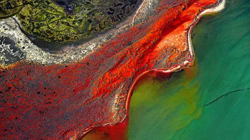
Alrighty, so you wanted to talk a little bit about our aspect. Yeah. Our transform controls. Yeah, so, would you, is that how you would leave it, that? Well, actually, this one I did, but I hear what you're saying, and we're giving a talk today, so why not? I, when, when we look at painting for inspiration, I used to look at artists and say, wow, they're starting with a blank canvas. They can put anything anywhere that they want to, and isn't that wonderful? I'm a photographer. I'm stuck with what is in front of the camera. But in digital, we can actually do a little squishing and expanding and stuff like that, and one of my favorite techniques, one of my favorite techniques is to squish things together. I tried it with early digital cameras, like three megapixel cameras and stuff like that, but when you did it, the result was so pixelated, and so I forgot about it for a few years. Then technology moved along, and now we've got, you know, 30, 40, 50, 100 megapixel files, you kn...
ow. You can do quite a bit of squishing and stretching and there's no adverse effect when we're looking at it. But aren't you distorting reality? Yes, yes, but just having a cup of coffee distorts reality. And so does a fish-eye lens. (laughs) And so does a fish-eye lens. It's interesting we'd talk about that, because the perspective control lenses like Canon and Nikon put out, it's interesting, if you shift them all the way up, and then you point 'em down, you find that you get this real great squish effect automatically. But let's not go there, because that wouldn't be true. Okay, so let's just look at the, not the scale, the aspect where we stretch it out or we squish it in, and by squishing it in, you know, the reason, why would I do it like that? Only if the shape was more pleasing. How do I know if the shape is more pleasing? Because I like it, so, I mean, who else can make that decision? You know, this is just fine art, I'm just having a fiddle around, and so I often feel that you can't quite go far enough. As I am squishing, though, I am losing a little bit of the top, but maybe that's good, because it's focusing attention on this. Yeah, I think the area on the left, if I just grab this for a minute, this area here, I wouldn't want to lose this corner. No, no. I wouldn't want to cut the frame, because I think that's really important, to have a boundary, 'cause that, this area here, if I can just have that for a minute. Sorry. That's okay. This area here, outside that slick, is a frame outside the content. That's right. It's not a square frame, it's actually a liquid frame, but it actually holds the viewer's eye in in the same way that a vignette might do. Yeah. Alright, so let's, let's just, I'm just going, see this, there's a little area up here in the top. Yeah. I'm just going to go as, I guess, try and get rid of that back, so I don't want to go over. Don't lose those edges, you'll upset me. There you go, that's better. Okay, so how about, how about we, well, I haven't actually moved it far from the original, now, Tone. You like it without. I did, that top corner, top right, I agree with you. What I'm starting to notice now is also the bottom right, there's some footprints and some tracks coming, which lead us. Yes, yes. It's a beautiful little leading, little subtle leading line into that center of the image. So that's something that we can all play with, let's-- My point being, as you change pictures, as you crop them a little bit, as you bring up contrast, as you bring up saturation, other parts of the image start to become more noticeable than perhaps you first saw in the beginning. Okay, so if we come back up, let's see if we can build up the strength of that oil slick over the warmth of the, well, it's not actually all that warm yet. Maybe we should fiddle around with the color and just see what happens if we bring that color up. There's kind of blues and magentas, there's not much else in there, is there? Well, I might start looking down here and there on the gray. Okay. So, actually, in previous explorations with this, I noticed that we go to our saturation sliders, and we do look at the blue. We can bring that up quite a bit, strengthen it. And then I actually like the yellows down here, as well. Well, what I'm noticing as you're doing this is this separation between the slick and the actual dry area underneath it is becoming greater. Much more obvious. The distance between them, yeah. And now it does start to look like liquid pouring over a sand flat. And notice how, with this image, where I'm using my hue saturation, it's a global adjustment. Because there's only blue in the middle and there's no sky, I don't have that problem that we had with the previous image that we played with, so, you know, this is a really, really cool tool. I love playing with the colors. Okay, so if we're, question, sure, oh, sorry, through those chair (laughs). Speaking of color, at this point, would you be conscious, subconsciously even thinking about color theory and how you're gonna have complementary colors? You're talking about the yellow and the blue. Which, that, that's right, am I consciously thinking about it? No way (laughs), subconsciously, definitely aware of those. I know that, in another version of this file, which maybe I can pull up, or you possibly saw yesterday, I've actually concentrated around this area, sort of a yellow color, which is the opposite of the blues, and I've darkened down the frame, et cetera, so it almost looks like there's this yellow cauldron bubbling underneath the blue oils coming over the top. So, yeah, so, reading books about color theory and reading, I mean, painters, when they're applying the paint, you know, making their masterpieces, they're all about using color, because they can put whatever colors wherever they like. And certainly having, I won't say I'm a great studier of it, but I've looked at a lot of Renaissance art, and that, to me, has taught me so much about the use of color to direct the eye around the frame. Certainly, when I say it's taught me a lot, it's not like doing a university degree. It's just sitting down and enjoying the images, and, like I was talking about yesterday with the 10-10-10, it's about critically analyzing what those paintings are doing and how they are doing it, and that's what you take away. Peter, with the colors here, with that yellowish cast on the background and the bluish cast on the oil slick or the water, they're about the same intensity. Would you increase the intensity of one or the other to sort of pull attention towards them? Oh, let's have a little fiddle. Let's go to our luminance, and I'm just fiddling around. I don't normally use the luminance so much, see whether I can darken that down a little bit, darken it down a lot, perhaps, maybe a little bit too much. I was actually, Tone, just gonna come up to my exposure now, and just darken the whole image, or maybe increase the contrast a little bit, and that just brings those color, and that, that separation up. Is that what you're sort of getting at? Yeah, so just like, finding ways to pull apart that blue area and the gold area even more? Yes. Because that's what this picture essentially is about. I agree, and so adding the contrast here, just lightening it up a fraction more. And it's kind of juggling three or four balls at once, trying to figure out which combination is going to give you the best effect. And then coming down maybe to the vignette and just darkening those edges a fraction. Yes, I don't like that. Yeah. I prefer it not so vignetted. Yeah, well, you see, okay. Well, it's your picture. It's my picture, I'm gonna vignette it just a little. And I like, I think the middle of this image, where the water is, I think, and a little bit more contrast even in that middle blue area is, just over in here, if that had a little bit more, more-- Okay, well, let's do that, let's add an adjustment brush, and let's-- I'm not going too close to that white, because I don't want that to pop too hard. Okay, but we might need to-- Needs to be sort of in the center, just really concentrate the attention. Yeah, perfect. And just increase the contrast here. More? Yeah, not too hard, eh, that's good. It's just sort of, it's almost like a map. Yeah, that, yeah, a little bit like a map, so, again, just short adjustments, but I guess, I hope you can get the idea of how much control we do have over our images using Lightroom. So one question is from Wolf the Art, who says, can you talk a little bit about images where deterioration of pixel occur in the skies in the gradient, in the gradient manner? Is there a shooting technique that does not, that, sorry, is there a shooting technique, or does he just blur those areas in post-production? So the-- Okay, so I'm guessing that you've got an image which has possibly got a little bit of noise in it. Right. And as you're darkening it down, the noise becomes a little bit more apparent. My suggestion is that it is probably difficult to do, you could try to blur that part of the image, so make a copy, but within Lightroom, hmm. Hard one. Hard one, yeah, I mean, in Lightroom, okay, if the image was there, you could look at putting on an adjustment brush, brushing over the area there, for instance, if that did the trick. Reduce the contrast? Well, reduce the contrast, actually, we're gonna go negative clarity. It just might smooth it out a little bit. But listen, that's just a, within Lightroom, I don't know how I would go about that. It's a bit hard without seeing the image. I know that people often talk to me, when they darken down their skies, and they start to get a banding in the sky, and that's because they're doing an adjustment in an eight-bit file. Well, we're in Capture One and Lightroom, we're essentially working with 16-bit files, and that shouldn't be happening anymore. When you go into Photoshop, it could be a bit of a problem. But I feel I've skirted around, I don't know whether I quite have answered that correctly. It's alright, that's alright. Part of that could also just be the exposure. I would be interested to know what the exposure was. Send the file in, let us have a look. There you go, that's from Wolf, alright. And that was kind of similar question to Doug Parks, who had asked about how you balance some of the, some of the adjustments that you're making that cause more noise, is that a concern for you for this type of work? It's-- Well. No, after you. I don't have noise as a problem with the files that I'm using. A lot of them is shooting with the Phase cameras, so that is an advantage. Shooting with the DSLRs, for instance, I know that I push my Canon 5DS R a lot, because it's 50 megapixels. I'm shooting some of these aerials, for instance, there is noise in these files. This was shot with the Canon 5DS R, and it possibly had a higher ISO. What do we got, ISO 400, that's not gonna be a problem. But I've had others at ISO 3200, et cetera, and there is a little bit of noise there. I live with noise, I guess, a little bit. It doesn't worry me so much. I used to be paranoid about it, but now, I don't worry so much. Also, when you make a print, a lot of that noise sort of disappears, because hopefully, only photographers look at a print that big, and most of the people who look at the photographs are at a distance. What do you find? Well, I was going to say, the other thing is that it's interesting, since digital came in and people started to see clean images, clean files, versus noise or grain on film, we got to this point where we got really paranoid about any noise. And yet, sometimes noise is actually an interesting advantage. It adds to the picture. The other thing is, depending on the paper stock, if you're printing, we do a lot of printing, sometimes those textured papers, you don't pick up the noise as easily as you do on, say, a shiny gloss paper or a metallic paper. I find metallics tend to show noise a lot easier than, maybe, a watercolor-textured paper. So it does depend a little bit on where that picture is gonna end up, too. But I, I'm thinking back, because noise can be an issue, and to get rid of it, I suppose most of my adjustments for noise, I've done in Photoshop later on, and sometimes, where there is noise in those areas, I might darken them down further so that there is no noise visible. I'm just thinking back to a waterfall shot that I've got from Iceland, and there was quite a lot of noise just in the shadow areas, and so I made them even darker so that the noise disappeared, because it was a distraction to the image. So it is an issue, I understand. When you make the adjustments that we're showing you here in Lightroom and Capture One, and in Photoshop, when you're using DSLRs and mirror-less cameras, if your original exposure was under a little bit, there is going to be more noise, and that's why people talk about exposing to the right, in other words, getting your histogram as far to the right without clipping is going to minimize the noise problem. So again, it doesn't help you if you've already got a photograph, but as a process, when you're capturing, expose to the right without clipping. Awesome, thank you, and can I just say, I had a little a-ha in this last segment by watching you work? Because I did not know that you can go into, when you're working with the brushes, and double click on effect to clear it all out. To zero that down. And, to zero it down, but then also, I really appreciate how you kind of pump up the exposure to show where you're brushing, and then hit refresh, and then do the adjustments, so. That's just my ignorance in Lightroom, so thanks for making me look good. No, I (laughs), other people noticed the effect and the setting that to zero, too, so thank you.
Class Materials
Bonus Materials with Purchase
Ratings and Reviews
Esther Beaton
Two Aussie blokes just having fun. Peter and Tone did us proud by representing the spirit of Australia, which is: don’t take anything too seriously. They hit off each other well, in fact, they are the best twosome I’ve ever seen on Creative Live, each giving the other respectful space yet not being shy about taking the micky out of the other guy when appropriate. The whole dialogue was spirited, informative, casual and fun. They also perfectly proved the symbiotic relationship between red wine and beautiful photography.
Swapnil Nevgi
Loved the positive energy of this class. Just finished watching it and I would definitely recommend it to someone who wants to take their landscape photography to the next level. This course is not about learning camera or software skills, but learning how to develop conceptualizing and composing skills. How an award winning creatives mind works is a lot more important than how to use camera. This is exactly what I was looking for and very happy with my purchase. Also it was good to see some of their raw vs post processed files to learn how far the professionals like Tony and Peter go with post processing (Something I have always been concerned about). Knowledge about exhibiting was also priceless. Thank you, I have learnt a lot in this class and I am sure it will reflect in my work in future.
Debra
This class is fabulous! One of the best on Creative Live. Peter and Tony share so much of themselves and their great art that you can't help but want to pick up your camera and get out to shoot. It was like watching two close friends. Thanks very much for a very enjoyable 2 days of learning and viewing.