Lessons
Overview of Fine Art Landscape and Travel Photography
08:44 2Our Passion For Photography
07:38 3Looking For The Next Great Photo
19:05 4Peter and Tony's Photography
18:35 5What is a Landscape?
15:48 6Considering Color: What is Real?
13:16 7Shooting Travel Photography: Exotic Locations
13:33 8Preparing for a Travel Shoot: Research
16:35Who Should You Travel With?
12:13 10Photographing People
04:25 11Choosing Gear for Travel
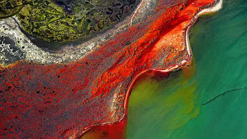
21:26 12Overview of Aerial Photography
09:03 13Flying Machines: Planes, Helicopters, Balloons and Drones
18:05 14Shutter Speed in Aerial Shooting
12:48 15Manual vs Auto Focus
14:28 16Lenses for Aerials
13:14 17What to Shoot When You're in the Air
17:52 18Using Emotion to Capture Your Images
14:28 19What Stories Do You Want to Tell?
08:44 20Who Are You as a Photographer?
14:41 21Finding Your Creative Process
14:20 22Getting Your Vision Across
26:56 23Quick Image Enhancements Using Lightroom and Capture One
06:21 24Light, Color and White Balance in Lightroom
19:55 25Histogram, Hue and Contrast in Lightroom
09:16 26Masking in Lightroom
11:50 27Cropping and Aspect Ratios in Lightroom
13:19 28Image Adjustments With Capture One
13:38 29Further Adjustments With Capture One
13:44 30Advanced Editing Concepts With Photoshop
07:38 31Peter Eastway Enhances Landscape Details
13:08 32Tony Hewitt Uses Multiple Images to Build Texture
13:04 33Peter Eastway Aerial Edit
09:33 34Tony Hewitt Aerial Edit
15:40 35Part 1
10:31 36Part 2
08:18 37Part 3
09:31 38Part 4
07:08 39Part 5
05:50 40Part 6
24:19 41Sharing Your Vision: Exhibitions
11:54 42The Artist's Statement
10:17 43Preparing Print Files
03:39 44Framing Options
05:50 45Exhibition Space
06:43 46Once the Exhibition Is Up
13:11 47Making a Photo Book
18:49 48The Art of the Print
16:51Lesson Info
Part 5
First thing that hits me is the darkness of the shadow, so I can see the point of the silhouette, I just feel like it's maybe a fraction heavy and it's taking the attention away from that really cool little gondolier. Okay, so the thing that hits me most is the scale. Well, yeah. I mean I just think that that scale is great, but I'm with you, I think it's a little, yeah I don't have enough information. The heaviness for me is pulling me away from seeing the scale, and a very hard scene to photograph in some ways, but I would imagine though that you know, if he's got the raw file, the information is there. Now we have to be careful in a situation like this because maybe what has attracted me to the photograph is the contrast in these areas here. What he's not perhaps leaving the viewer who doesn't know what he's looking at is these areas here, which are possibly, they're not completely dark, so it's obviously not intentionally fully black, but there's not enough information in t...
here either. And when we get up into the highlight area here, it goes completely white, and that's a challenge. If you're gonna put a black border line around your photograph, it could hold it together a little bit better. You've got some great shots where you have completely white sky, so maybe I should be letting you deal with this as well. Well the interesting thing here is if we reduce the contrast but we want a white sky, then what's gonna happen is we reduce the contrast, we're gonna bring back more day tone to that sky. So we probably need to work on them in two separate parts, and I think just that foreground, if we just mask off that bottom right hand corner and see if we can get that with a little bit more day tone, knowing we're using a jpeg of course, we're gonna. Alright, so you want to do that first, do you? Well that's just one approach. No, no, it's just now, yeah, okay, just. Paint it in, let's see what we can do. Of course, as we lighten this, that little cloud under the gondolier is gonna go a little bit bright as well, which isn't a bad thing, because it kind of pulls your eye down. Oh that's interesting, color's gone a bit skewed, but there you go. And we're gonna have to pull it all up, but we'd just be interested to see what's there, and somehow reduce the change of, yeah, that's better. I just took out the color a bit because you can see that there's a color in there. Which I've taken out. Can I make a suggestion, because at the moment. Okay. Absolutely. I'm just doing it, I'm just going to, where's my, come on, click, get working. I just want to see how it works as a square format, or just moving, if not a square format, just putting that, doesn't necessarily have to be square, it's just putting the cable car just in the bottom left. It certainly accentuates the scale. That's just my thought for how I would compose it a little bit differently. Okay, so what do we do up here, do we just leave that? Because that's, when you're there, that's what you see. I don't mind it, I mean, yeah, I was going to say, when you say make it a little bit whiter, I don't mind that being a little bit creamy, I think if you make it too white-- No, I wasn't, I was thinking it was too white if anything. Okay, well maybe bring a little bit more detail back, there may be more detail back in that, just in that hidden trees. So I'm just using the highlight, I'm on the wrong one, hold on. Get back to background, and then try. Okay, so it's gonna go a little bit dull, but just even a hint of it, that's better. And then what we can do now is bring up the intensity of the red in the gondolier. Well we can also bring up the exposure overall as well, which brings back a little bit of that detail that was got in there. Maybe there's a little bit too much down there in that onlay there now. See how that's perhaps a little bit too high. Well actually, maybe just take it out of that bottom there like that, so. A little bit too much. So yeah, and just maybe pop the red. Pop the red, okay. Do you want me to do that as a layer? Yeah I think so, then we can have a look at it. I don't think there's any other red there, so you can almost just, yeah. Yeah, I know, but I'm just thinking, I just bring the saturation up. There's not a lot there, is it. No, so it's probably good, you probably don't want it to be a fire engine on its own, do you. No, my only other bit of feedback would be with the raw, I'd be a little, just go in and have a look and make sure the blacks aren't so heavy there. And still have dark areas, but not such large areas of dark, because I think it it pulling the eye a little bit. Because we're lightening a jpeg, as I say. Yeah, the jpeg file has had certainly half of all the tonal values thrown away and also a lot of the color as well depending on the color space. So we've not got as much information there as we possibly could have. Yeah, it just lightens that up a little bit, doesn't it, yeah. A little bit hard to see, I mean I'm seeing quite good here, not necessarily seeing so much of a reference over there. Pretty contrasty over there. And the other thing is I'm hoping that everybody's getting the same feeling that we're getting, that's always the challenge. The other thing is the color balance has a very cyan-y color to it. So we just go down to the background. Well we can, but I was also going to say that the other thing is that perhaps there's a good way to explain the type of ambience and the atmosphere at the time, it could be it looks quite cold, that's what it feels like. Of course, if you do reduce the level of cyan, you're going to increase the red, which will help that gondolier pop a little bit more as well. Don't mind it as that more selected minimal color but it works pretty well, doesn't it. Yeah, no, it looks nice.
Class Materials
Bonus Materials with Purchase
Ratings and Reviews
Esther Beaton
Two Aussie blokes just having fun. Peter and Tone did us proud by representing the spirit of Australia, which is: don’t take anything too seriously. They hit off each other well, in fact, they are the best twosome I’ve ever seen on Creative Live, each giving the other respectful space yet not being shy about taking the micky out of the other guy when appropriate. The whole dialogue was spirited, informative, casual and fun. They also perfectly proved the symbiotic relationship between red wine and beautiful photography.
Swapnil Nevgi
Loved the positive energy of this class. Just finished watching it and I would definitely recommend it to someone who wants to take their landscape photography to the next level. This course is not about learning camera or software skills, but learning how to develop conceptualizing and composing skills. How an award winning creatives mind works is a lot more important than how to use camera. This is exactly what I was looking for and very happy with my purchase. Also it was good to see some of their raw vs post processed files to learn how far the professionals like Tony and Peter go with post processing (Something I have always been concerned about). Knowledge about exhibiting was also priceless. Thank you, I have learnt a lot in this class and I am sure it will reflect in my work in future.
Debra
This class is fabulous! One of the best on Creative Live. Peter and Tony share so much of themselves and their great art that you can't help but want to pick up your camera and get out to shoot. It was like watching two close friends. Thanks very much for a very enjoyable 2 days of learning and viewing.