Lessons
Overview of Fine Art Landscape and Travel Photography
08:44 2Our Passion For Photography
07:38 3Looking For The Next Great Photo
19:05 4Peter and Tony's Photography
18:35 5What is a Landscape?
15:48 6Considering Color: What is Real?
13:16 7Shooting Travel Photography: Exotic Locations
13:33 8Preparing for a Travel Shoot: Research
16:35Who Should You Travel With?
12:13 10Photographing People
04:25 11Choosing Gear for Travel
21:26 12Overview of Aerial Photography
09:03 13Flying Machines: Planes, Helicopters, Balloons and Drones
18:05 14Shutter Speed in Aerial Shooting
12:48 15Manual vs Auto Focus
14:28 16Lenses for Aerials
13:14 17What to Shoot When You're in the Air
17:52 18Using Emotion to Capture Your Images
14:28 19What Stories Do You Want to Tell?
08:44 20Who Are You as a Photographer?
14:41 21Finding Your Creative Process
14:20 22Getting Your Vision Across
26:56 23Quick Image Enhancements Using Lightroom and Capture One
06:21 24Light, Color and White Balance in Lightroom
19:55 25Histogram, Hue and Contrast in Lightroom
09:16 26Masking in Lightroom
11:50 27Cropping and Aspect Ratios in Lightroom
13:19 28Image Adjustments With Capture One
13:38 29Further Adjustments With Capture One
13:44 30Advanced Editing Concepts With Photoshop
07:38 31Peter Eastway Enhances Landscape Details
13:08 32Tony Hewitt Uses Multiple Images to Build Texture
13:04 33Peter Eastway Aerial Edit
09:33 34Tony Hewitt Aerial Edit
15:40 35Part 1
10:31 36Part 2
08:18 37Part 3
09:31 38Part 4
07:08 39Part 5
05:50 40Part 6
24:19 41Sharing Your Vision: Exhibitions
11:54 42The Artist's Statement
10:17 43Preparing Print Files
03:39 44Framing Options
05:50 45Exhibition Space
06:43 46Once the Exhibition Is Up
13:11 47Making a Photo Book
18:49 48The Art of the Print
16:51Lesson Info
Part 6
The first thing that strikes us here obviously the content like all these images and as a photographer the one thing you gotta remember is it all starts with the content. What's inside the frame, there no point in trying to fix everything in post production if you haven't even got it in the first place. So I look at this and it's all about the texture. It's all about those shapes in the ground and if it's about texture and it's about that sort of textural quality, how can we work with texture? What tools do we use to bring that texture out? Well obviously things like contrast, we kinda do that straight away. And then if we go into our curves, we can push the blacks in and that will darken that dark side of the edge. That also helps to do something like that. That's just two ways that you would create impact pretty quickly on an image like this. Then you'd look it overall and the top left hand corner for me or that top section is a little bit light. So we might put an adjustment layer, ...
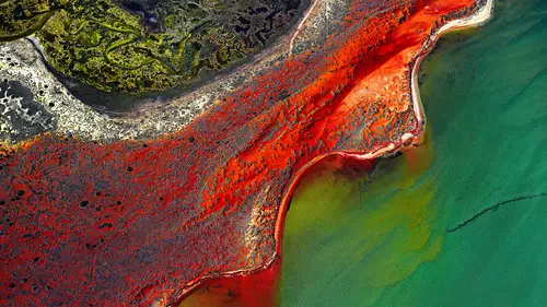
with a gradient on. Would be one way to go to to paint it in either way. Whichever you like better. I'm just having a tiny issue here. Okay, come on. The idea being to reduce the way that out eye wants to disappear into the top left. To cover the highlights or pull the exposure whichever you want, that's probably a little bit heavy. There you go, it's just a circle thing. The other thing with this picture, it has a feeling because of the perspective that it's taken, well gonna be careful here, This doesn't necessarily have to be an aerial out of a plane or helicopter, this could be taken from from six feet from you standing there. But one of the things you could do is just using the aspect tool you could tilt it up a little bit, and it might give us a little bit more of an abstraction that works in a bit more pleasing way. Without losing the bottom so that's the part to play with. You don't want it to cut off the bottom. That kind of feels a little more, Even having a little bit of color right here, there's color in here. Did you have a question Kenna? No, I just want to, I'm looking at the page where the person submitted it. I just wanted to pass along when you said it might not be an aerial that the person said I saw this while walking early morning at the beach. It seemed interesting, I didn't do much post-production just so they give me the opportunity to tweak it, what you would do with it. And it's fascinating I looked at it and recognized it because I've done the with my phone. It's one of those magical things about the planet earth, I think that you could go up to three thousand feet and see a shape then go up to 10 thousand feet and see a river delta that looks the same. Then you can go walk on the beach and it's the same thing again. You don't need a helicopter always to get aerials. Okay, let's move on to the next one Tony. So there's a lot of this sort of stuff in the southern U.S., southers Utah and around that area, that western area of the U.S. These canyon countries and quite amazing with this water created canyons. One of the things strikes me as an outsider when I come in is the color as well as the form, but particularly the color. What do you think? I think that probably the most challenging aspect is here keeping detail in the shadows, as well as the highlights. Certainly the photographer here had decided that the sky needs to have some color because I've got some shots like this where the rocks are great but the sky is completely white and no detail at all, and it's a challenge to put 'em together. As if there is a part of this corner of the rock here that's almost translucent. So if we can look after and protect some of those values, at the same time, as we look around here as you said. What I'd be doing is I'd be going into an exploration phase and the first thing I'd do using the high dynamic range sliders, pull them up to see what is gonna be protected and what can come back, but particularly the shadows. Start to get that creamy look in there so does that mean we can push out exposure up a little bit. We've still got a little bit of detail in that scar we can work with that, we could pull the contrast up, or down but the contrast going up will add to the color. Then we could selectively go through maybe we need to protect the highlight which is the sky. So we pull that up and that will hold some of that detail but if we go too high that will look like it was cut and pasted. But now we've got a file that if we go and work with color we could probably pull out that orangy section in there and it will start to work. But we have started to lose some of that blue. Which is a challenge. Now to actually darken that sky down is not going to be a quick, easy fix for us here at the moment. That might be something that we look at doing with a mask just to get a little bit more detail in there. I mean we, that, I can't do it easily here. Then because there's so many, tonality wise if you took all the color out of this you've got a lot of different, the waves of the rock you've got that shadow highlight detail, the textures of the rock, working with either contrast or clarity you could actually accentuate that as well. So I'm just going to have a little look and wonder if we were to just brush through a particular area which is obviously of interest. And then maybe use our clarity tool. And just, just doing a little bit. Just adding a little bit more contrast in there, it's not doing a hell of a lot. It's pushing the noise up at that level but it just gives you those edges in there, without, hopefully, my mask hasn't touched the edge. It has a little bit here, a little bit there. Because you don't want the edges to be affected by the clarity tool, otherwise, that's gonna create highlights around there and that will make it difficult for you to then drop the dark in the blue down later on. But fantastic location and great angle. what happens if we just you know. Just using the color editor just quickly. I mean we push the color enough. When we look at it there, that's telling us that it, based on the profile of the color gamut that's been set for here for us to look at in a preview, there's not a lot of room to push dark colors. If we push it we're gonna lose the detail in that rock. If we pick this color in here, we've got a little bit of room to move, so we could actually increase the intensity of that a little bit, it's starting to pull out here. It doesn't work for me. I sort of think that the color saturation that was submitted to us was pretty right. But they're the area's I would explore just to see what I could get out of that file. But I think that blue sky, you'd wanna hold on to that as best you can. If we can. I've got to say, good composition too. The way it's been put together. And sore neck I'm sure at the end of shooting it. So, Tony, this is one you picked out to have a little bit of way. A simple sharp black and white already presented to us so we don't have a choice there. But you've got this very simple soft skyline I'm not sure what's going on in the background there. Dust or birds. Birds. And this looks like there's been a bit of work done. But I suppose the comment I'll make is that the textures of those nets or I think they're nets or something like that in the foreground you could probably work with the highlight and shadow data on it and pull them out a little bit more and get the more three dimensional feel if you like. All right, so let's. It could be a very simple one could just be a brush across that's bottom half. I would leave the sky quite soft. I wouldn't start trying to increase any contrast there. We just bring up these nets. And ropes just give them a little bit more structure, a little bit more modeling and that will allow that to come forward and give us a bit more depth in the whole image. Too much? Let's have a look at the original. Straight away that just adds a little bit to it. I've pulled the exposure back a little because it's more about the contrast than the overall lightness and don't want the dark areas to get too much lighter, but I would like those highlights to brighten up a little bit. So that's just bringing the eye into there because the sky's quite strong. When we turn that off the sky is very brought, if we turned it upside down the eye goes very quickly to that area. So we're trying to compete with that. That's right, by turning that adjustment on now we're lightening that area at the top so that the subconscious view of the tonality becomes the same as the conscious view of what we're actually looking at. And then the other thing I would look at with is the floor the boat, perhaps. Is this a boat, no I think this is in the wharf Tony, isn't it? Maybe it is, whatever. So the floor, the ground down here, just down in here, I would look at maybe darkening that a little, just to give us a little bit of again, modeling. But it is a wharf you're right. Would you consider cropping? Where the ropes are? Yeah, the third one in on the left, cropping down, so that is just being framed by that on the open, yeah well. To the right to the right, more, more, more. Oh, you want it all the way over? Yeah. I wouldn't, and the reason is that I think that you've now got these areas in the middle of the picture which are kind of where there's something missing and I do enjoy that repetition that starts us off, Peter what about you? I'm actually going to disagree with you Tony. Because my starting point area was here, exactly because of what Tony just said. And then as you moved, and pushed me over to there I now see that as a repetition of shapes going through, and it works for me. There you go, two beats one every time. Actually no, I've got an extra vote. I get an extra vote because I get the vote of the author who presented it this way. So the author actually had the intention of including that so it's a draw. I can see where you're coming from too. I can appreciate what you're saying. Again, I would then just be working on the highlight sections of that netting just to try and get it to come down a little more. Again just balancing, just making sure that what's important to the photograph has the strength of tonality I think that's what we need. Now there are a couple down here, I like this one Tony. We quite liked this one just as it was, but then it was just too damn good. Who the hell's putting photos in like this and saying fix them up. So let's flip it around to 180 degrees. And again let's just use that exercise of where does an eye want to go. For me all eye is looking at the bright waterfall at the bottom of what we are now looking at. And yet when we bring it back to its normal orientation. The flow of water, our brain is telling us it comes down and flows down and down towards your feet. So I would just like a couple of tweaks on this where the attention can go to the foreground a little more. That's a good idea. So what would you like me to do here you reckon? So, we need to bring up the highlight in the foreground. So adjustment later, and are you talking about this bottom area here? I'm talking mainly about that section of water that's coming through. I don't think we need to brighten up too much of the foreground though we may select some of the shinier faces of some of the rocks. And just bring that up very softly. Just to pull you're attention down. Without flattening it, so we wanna kick a little bit of contrast. So that's now pulling me down into the pool just that little bit and then, conversely, reduce the impact of that waterfall in the background. Now, that may not be the author's intent. But when I'm looking at it, I'm just getting pulled to the background and yet all the flow of water is bringing me towards the front. I'm just going to take that whole section out Tony, and just lower the contrast on. That might do the job. That's helped already, can you guys see how we're now getting more of a depth to that picture? Very subtly. I do like that rock that sitting at the bottom of that, well it looks like it's at the bottom of that waterfall, I think if we brighten it it's kind of sitting between the two points of interest. I'm thinking, what are some of the rocks in the foreground or maybe that one there, that we can just brighten up a little. Which one here? One there just a little. And then there's a couple in front of it. That's it, just one of those. Let's make the adjustment, a bit contrast as well perhaps. And maybe a couple of under the rock pool, just a little hint. That's probably, you have to do in a separate layer. You don't want to move it high. Because it's on the water but you get the idea that now I feel like It's too strong isn't it. Yeah, we do it on a separate layer. Now it feels to me like there is a background, a mid ground and a foreground, whereas before the way that the tonality was across that picture it was working against what my brain was telling me what's happening. Wonderful shot, wonderful shot. I know I put this one in, I chose this one Tony, because I know how much you like because the water's leaving. Well, that's right. And there's an MB filter probably. Possibly well could be late in the afternoon, who knows, but the reason I picked it is because I think back to Middle Hurst where we do our workshops and the fact that it's quite similar in terms of those huge cliffs at either side, and I saw you last time we were there taking a few photos of these, of the water, and I thought you solved it very well, and you'd be able to solve this one as well. Solve what, what's the problem, I don't see a problem here. Well, okay, I suppose I'm not quite too sure whether it's quite balanced. So I find it very bright out here on the top right and it's briugt here as well. What about the balance of the framing. I mean it is an interesting frightening in that you've got the sky leading us out top right and the water leading us out bottom left. And so there's a lot of color ends and texture in the rocks on the bottom right. So we can work with that and that would certainly even out the bottom. But the the top left is the area you probably need to do the most work, even out the volume of white and blue. That's is where you were heading? Is that right? Yeah, pretty close. Essentially that the footprint of the sky that volume of light here, if that can match the volume. Be closer too. The blue area then we start to get a balance. We've got a duck couple dynamics now. It's kind of a crisscross it's quite nice. It's not just toning here, if you pull the highlight you're gonna see an apricot color coming through. Protect it, just a slight apricot drifting up. And when you do that I think now, we drop that down a little bit. We're losing that so maybe we should do that as an adjustment layer. Now what we're doing us we're doing it selectively rather. We don't want to adjust it globally. We're going rough and ready with when we do masks they may be more precise than this, maybe be not so, okay let's just darken that down. If we bring up some of the highlight in the water it sort of various, it ranges from a midtone to a highlight tone, that will then pull the eye again further towards the left and start to create a balance, and then we can work on the yin and yang of the cliff and the rocks on the bottom. So the sky is balancing the water and the rocks can balance the cliff face. Might use a little bit of clarity just to see whether that can bring. And even a little saturation on the blue. So maybe color edit a tone, just see if that blue can have a little bit more. It actually came up when you did that so, that's fine. Now we've got a little bit more balance between the brightness of the sky and the brightness of the water. I'd love to see some of this detail in the rocks brought out because there's some beautiful colors in there, there some beautiful textures. You notice we're working on these components of the image separately. So what do you think down darkening down a little bit? Just a hint bur we wanna make sure some of the highlights start to pop out using contrast and definitely saturation. Pull a bit of contrast up on it and just. Yeah, I just wanna get the contrast that we might lose the black and release the shadows a little bit, I don't know whether I want that. I think, I wonder whether with even less contrast might perhaps You know I like a little bit but again this is where the creative process becomes personal. The idea is there's four elements, there's the sky, the river, the rocks in the foreground And the cliffs. now we just need to add a little bit of grit to the cliffs, just to balance out the rocks. We don't want to be equally textured because they're in the back so they shouldn't have the same level of contrast. This is a clarity patch. Well, yeah and also just maybe brushing on a layer that sort of rock fall, it looks a little bit lighter toward the edge. So, we're using something that's already existing in the photograph. And we're just going to paint down that area there and then maybe across the screen, right down across the bottom as well. Hit my laser button and just fine tune that a little bit so it doesn't go over, and then we just lighten it up bit by bit. And that diagonal. That leads into the bank of the river on the other side and that looks nice. And it probably, there's a couple of rocks in the foreground. So it's our starting point one, two, three, four, five. And then there's there, I'd possibly play now with this rock here, but this one here, I think we could make a little bit of a hero out of it just in the bottom corner. So it's about starting with the global balance and then finding little points of interest in the front. it not be better because I couldn't lighten that up so well, just because this is quite a useful thing thing. If I or maybe I was on the wrong layer. so there isn't but that's. Darken down. A little bit. Everything else. And now that that rock becomes a hero. He's is a challenging one Tony. Because there is a lot happening in there isn't there Is there too much happening in there? I think they might be depending on what the intent of the author was, but but without knowing what the author's intention was we can do whatever we like. Absolutely. This is a wonderful and we can take a hint. if the author, we assume there's a conscious decision the cropping and in camera capture. And I look up here these trees, I think well they're not really showing us the top of the tree so perhaps that wasn't even the considerations. So we probably don't need to worry about holding on to that scar, we could probably crop that. But I am worried about taking that out an then losing the the top of that yellow tree because that that yellow tree seems to be the obvious hero. So if that that's the obvious hero, interesting isn't it, I've got one at the top, two down the bottom and then three over here, or three and four if at like. There's that triangle, yet I find all of this space in between is a little bit problematic. If I took the crop tool, you move it across to here, I've got a simpler composition whereas so I can understand top and bottom or optionally I've got this horizontal one way where maybe I also need to just move that a little bit closer where I've got the colors going across, but I'm just, it's a hard one to sort of work out where do you put it all, sometimes in a situation like this I go and I use my aspect ratio and I just join them together simply because then there's less space in between. I often by default end up with an almost square frame. But I don't think that's going to quite work here because there's just too much distance. But just a thought I had, so this is this is a tough one. Maybe we don't need all of the reflection down there below. We've got that hint so maybe we aim for a diamond shaped, a sight triangular shape there like that. If we were to perhaps look at our highlights let's just try and because my eye is going to the snow which it shouldn't, just maybe to take that down a little bit. I think we need to get the tree to come up here we need that tree to bounce. Once we got that tree bouncing, as soon as you do that. The contrast up. And maybe select that yellow, select that yellow, it's going to bring up, so you could choose to select the yellow on terms of this part here, if we bring it up, the part that's over here, so I just show everybody. If we bring up this yellow we're gonna pull yellow up all the way through and it's kinda gonna spread. And we could use an adjustment layer just pull the yellow up here. Okay, let's give that a go. Now when you bring up the yellows almost spindly little tree like this. It's gonna be hard because this stuff behind the tree that's not yellow and we're gonna make that potentially yellow as well. Even if we use the color editor. That will give it a go. Okay so, color editor, button. I would zoom in on this. I found it. Just to give an idea, while you've got that pushed up. Push it right up, now just take the handles on the edge of that spice and just show how you can shorten them in and select where you want to have the effect. So I would move it around to the left a bit more and pull the red away, get rid of the red just have the yellow. So when we're now not affecting the edges so much we're focused in the tree. A little bit too strong perhaps? Let's go back to how we can help just bring it up to what we like yeah. Okay I think the next certainly leading the eye giving us a center of interest probably don't need to add into too much there. Although one of the things that you commented on was my shiny water the other day. The glassy effect, maybe we just show them we just try and see, it doesn't always work perfectly. Always good to do this of stuff live, isn't it Tony. Absolutely. So why don't I just paint over there, and if I use my curve, and just increase the bright white points I'm clipping a few of the bits there and in there. I see that it just. Glasses up. Glasses up a bit, just gives you more of that reflectivity. Yeah it's a challenging shot. But I do like that and the only other thing I'd probably do is this green tree over here. I'd probably take out that green there a little bit. Would you crop it out to take it out? I think I'd take it out, I'd reduce the saturation, I'd crop the tree up. I agree with that. So we come here to our color editor, thinking, thinking, thinking. Let's see if I could find the dream. That looks about right, and just a desaturate it down so that it's not competing. There, that's better. There's a couple of other little things you could do but I think it's a picture that's very busy so you kinda gotta isolate certain areas, such as the bush or the tree and this picture is done which I think is worked really well, is the water and just concentrate on those areas. Okay, I think we're done. And it's such a shame because there were so many pictures and every picture you could have spent an hour on. We could have chosen on picture and done a whole lesson on it. In all seriousness, those photos that were sent in, the standard was extremely high so, which is great because it shows me that the photographers that are listening to us and the photographers I hope they gonna take away this idea fine art. Of taking these photos step beyond what is a capture.
Class Materials
Bonus Materials with Purchase
Ratings and Reviews
Esther Beaton
Two Aussie blokes just having fun. Peter and Tone did us proud by representing the spirit of Australia, which is: don’t take anything too seriously. They hit off each other well, in fact, they are the best twosome I’ve ever seen on Creative Live, each giving the other respectful space yet not being shy about taking the micky out of the other guy when appropriate. The whole dialogue was spirited, informative, casual and fun. They also perfectly proved the symbiotic relationship between red wine and beautiful photography.
Swapnil Nevgi
Loved the positive energy of this class. Just finished watching it and I would definitely recommend it to someone who wants to take their landscape photography to the next level. This course is not about learning camera or software skills, but learning how to develop conceptualizing and composing skills. How an award winning creatives mind works is a lot more important than how to use camera. This is exactly what I was looking for and very happy with my purchase. Also it was good to see some of their raw vs post processed files to learn how far the professionals like Tony and Peter go with post processing (Something I have always been concerned about). Knowledge about exhibiting was also priceless. Thank you, I have learnt a lot in this class and I am sure it will reflect in my work in future.
Debra
This class is fabulous! One of the best on Creative Live. Peter and Tony share so much of themselves and their great art that you can't help but want to pick up your camera and get out to shoot. It was like watching two close friends. Thanks very much for a very enjoyable 2 days of learning and viewing.