Lesson Info
1. Primer and Intro Must Watch
Lessons
Primer and Intro Must Watch
35:14 290 Second Advanced Edit On Signature Color Image
05:24 3Soft Skin Color
07:15 490 Second Advanced Edit On Soft SkinColor
04:27 5Vivid Color
11:28 6Black Crush
08:40 7Vivid Black Crush
07:55 8Glam Ciolor
05:562 Minute Advanced Edit On Glam Color
06:21 10HDR Natural Color
07:12 11HDR Vivid Color
08:17 12Soft Pastel Color
07:57 13Signature Soft B&W
09:18 14Vivid B&W
09:53 15Clack Crush B&W
08:45 16Vivid Crush B&W
07:43 17Glam B&W
08:07 18HDR B& W
08:14 19Fuj i400h
09:41 20Fuji 400h Plus HDR Fade
11:45 21Fuji 400h Plus Rich Tones
06:03 22Fuji 400h Plus Rich Matte
06:25 23Kodak Portra 800
10:09 24Kodak Portra 800 HDR Fade
07:55 25Kodak Porta 800 Rich Tones
07:21 26Kodak Portra 800 Rich Matte
07:20 27Illford HP5 Black Crush
10:12 28Illford HP5 Lifted Matte
07:41 29Ilford HP5 Deep Black Matte
09:01Lesson Info
Primer and Intro Must Watch
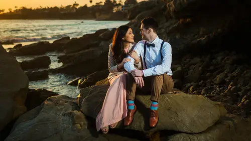
Hello, everybody. My name is Pie and welcome to S R Lounge, where we're here to help you be a better photographer. And today it's all about the lightning preset system. And this video is the primer video for those of you that have purchased the present system. So this is the one video that you need to watch. We're gonna walk you through the entire system, how it works. So you guys can hit the ground running. And believe me, it's gonna take less than 30 minutes. It's going well with your time, and you're gonna be able to use the preset system to get to any look within just a matter of seconds and a couple of clicks for those that don't have the presets. We'll check out this video. You can see how it works and see that something that would work well inside of your workflow. So let's go ahead. I want to talk just from the top about the five major changes or major updates in the preset system. And basically what ended up happening was as I was updating the previous version, I ended up maki...
ng so many changes based on what I wanted that I kind of realized that the preset system needed a complete overhaul. So number one we've added a completely new section of mixology is including 25 of our own internal Linenger's A mixology is for both color black and white, so modern color in black and white, as well as filmic color and filmic black and white effects. They're absolutely fantastic. Gonna walk through those number two. I completely changed and revamp the framework. So we simplified the framework by reducing and removing the whole soft versus vivid thing and making it one single framework making it easier to use but also more powerful at the same time. And believe me, that is possible. Remember, three, we have a completely revamped curve system. So not only have we re vent each curve to make sure that the totality is even better, we've also added two additional sections of curves which we're gonna show you. Number four is we have new and refined brushes for retouching and four advanced effects and so forth. And number five, what was number five? Number five? Oh yeah, we have new color toning guys. We have filmic color toning which have included and We've also refined the previous color toning as well. We'll also throw in a couple extra tools and tips. But I'm not counting those. Those are just bonuses. So let's start from the top with number one. We're gonna go over the mixology that we've included, and we'll let you guys play with these. But let's show you. So I'm gonna go into mixology is right here, and I have a lovely little image pulled up here. And I'm really excited to show you all the new film effects because one of the request that we've gotten the most is how to create these pastel Fuji 400 age Kodak portrait those pastel film looks. And in the past, it was very kind of difficult to get there. We've made it incredibly simple. So we've built that into this new system, So check this out. We have LDP color film, these air, all one click presets. These are the ones that we use in the studio to get to any one of these final looks, so you don't really need to do anything beyond these. But if you want to customize them, you can. We'll get into how to build mixology is in just a little bit. So let's go to our let's do Fuji 400 h. I'm gonna click on food, You forward, h All we have to do now is just simply adjust our exposure. I'm gonna bring my exposure up and, you know, always shoot things Mawr on the warm side. So I find that when I want to go for a filmic look, I'm generally cooling things down a little bit. So with just a little bit of exposure and temperature 10 adjustment, we have our pastel color look and look at this. It looks absolutely beautiful. We have those nice kind of warm, well, very bright skin tones, which is very flattering. And if we want more of the color, we could switch this over to vivid color instead of kind of that mawr, you know, toned down Look. So this is a more vivid color. Look, this is the standard Fuji 400 h. Look, we also have portrayed 100 the vivid version of Portray 100 really these air more based around portrait 408 100. But I just kind of kept it simple. You know, all of this is my interpretation of film. I feel like it's kind of silly to say that this is the way film is because film always looks different in every situation, every environment. The best thing that I wanted to do was create a version of Fuji 400 that I like. And so that's what these are. So I think this looks gorgeous. I'm gonna just tone this down a little more. We have this beautiful kind of Brighton area. Look to the image and it looks fantastic. Let's apply this to another image. I'm gonna go over here. This is Paul von Ritter, Paula moderators, one of my great friends, and he's a fantastic photographer. So be sure to look up his work. There's one of his shots and I thought it was gorgeous not only from the posing the expression but Paul shoots of this filmic style in it. And it just lend itself so well to these kind of looks. So I'm gonna select Let's go ahead and do the 400 h. And what I'm gonna do on this image is just I actually love the way it looks, right. They're gonna brighten it up, though, and just leave it right there. I'm gonna create a virtual copy. Just you can see the differences in some of these. So let's do a vivid color and I'm gonna tone down the temperature a little bit. Let's do a portrait. 800 hdr fade when that's gonna do, is gonna keep some of the dynamic range to the image. But it's also going to give a little bit of a wash to it. That looks really nice. Let's also do some of these Ilford. Let's do a black and white. Let's do that high contrast black and white and you'll notice with each of these ads this beautiful little bit of Let me actually go the previous one a zoom in on the previous one. You can see that I made my version these presets at a very soft and subtle amount of grain where it doesn't really look like green. What we're doing is actually de sharpening via are sharpening settings and we're adding a subtle amount of green to reduce that digital effect. I feel like that digital high definition look is what is a dead giveaway for Ah, you know, whether you shot it on DSLR and actual film camera. I love the way that looks. That looks absolutely gorgeous. That's the HP five high contrast. We have 85 lifted Fade, which I'm gonna do that one next. Just you guys have an idea of what all these things doing and how they work. So look at this. In just a matter of moments, we have several different versions of this of this beautiful image, and every one of them looked gorgeous. And I love how the tonality and everything works on this. I don't want to get myself a pat on the back, but I'm just getting So that's the filmic mixology is now. For those of you that love, like you know, the traditional ldb style LDP has broken into two styles as of late. Um, one is a more traditional style, which is kind of our vivid color HDR that kind of look. And we've also adopted a new film ical, because we have a lot of clients asking for that. So when they come into the studio, we actually asked them which look they like, and we shoot based off their mood board to create one of those styles. So let's work in the LDP color style. So I'm gonna go to ah for this image. Let's go to our what I would typically do, which is a natural HDR. And all I can do from here is just back off the temperature a little bit. Okay? And right there, one click and a temperature adjustment. And look, we get to this beautiful image. Looks gorgeous. I'm gonna add a little radio burn. So let's just pull up a 0. burn from the retouching and just put that in there and this looks absolutely awesome. I'm done. I don't have to do anything to that image. Now let's go back to and select another image for this one. I want to create Let's say we want to go for Amore. Super high contrast. Vivid. Look, you know, like like there's a lot of tigers that are really popular and they're doing a lot of these very, very high contrast kind of hdr looks so I'm just gonna correct this up. I don't want to update my apple stuff. Not right now. Don't you know in recording, let's go to HDR vivid color. I wouldn't use the vivid color when it's a close up shot is because it can go nuclear on skin tones. But we do have a fix for that, but this looks fantastic. Now, I'm gonna make a little tweak here, and I'm gonna show you how to do this later on. But I'm gonna go in a definition. And this is basically if you are familiar with the previous version we had soft versus vivid definition is now what you used to define that. So I'm gonna go in hard enough the image a little bit. So we have mawr mid tone contrast in mid tone definition. And then let's see here, I'm gonna go and do, Ah, a little bit of extra sharpening on this. I would call that pretty good, but I want to give you a little taste of some of these brushes. And again, we're gonna have tons of mixology, ease and tutorials on this, so you don't need to learn all once, but I'm gonna choose this Highlight, Bloom, what is it gonna do is it's gonna target highlights while letting shadows remain where they're at, and it gives it a very like, beautiful boost and overall kind of contrast, it looks fantastic. And you can drop it over the sky as well. It's gonna kind of Brian that up to which I might do there. But what I'm gonna do also is just grab a little graduate filter brush and just pull this down and we're gonna go with a negative 0.5 Burn right here, folks. That was a negative one. Let's go. That negative 10. And this looks gorgeous. And look at this. We have this beautiful super high contrast dynamic range high, everything, just punching image. And we can if we want to tone up Thea warmth of it to kind of give it like a little extra kick there. I love that looks fantastic. OK, so little taste of the brushes as well. Let's show you some of the other additions we have this we have a beautiful new ah precept that I've added in there called Lam. What this is designed for is you know, a lot of images like, say, newborns and booed wa and fine art type stuff, and that kind of have really benefit from a kind of boost where it kind of blows out the highlights a little bit kind of lets the highlights bloom while retaining contrast. That's exactly what the gland effect us. So if we go this signature color, you could see signature color has a really nice look to it already. But glam color It kind of gives it this highlight bloom and while retaining contrast and everything, so we just tone it down a little bit in terms of the temperature, we get this beautiful look like that one click and already this now all I'm gonna do now is use my tool to add a profile correction and just adjust the exposure down a little bit because that sigma has so much vignette ing when we do that profile correction. Really adjust the exposure quite a bit, But look at the before and after on that it looks absolutely gorgeous. I'm gonna go and apply this to another image. So check this one out, do the same thing we're gonna do. So here's like a vivid color, right? Looks vivid color. It's beautiful over like Environmental Portrait's, and I even like label. So you'll see next to these close up newborn environmental portrait. These air the typical situations that I like to use these types of effects in so soft color would typically mean you go to for this type of image, not brining up. But glam color is gonna just give it this rich boost in kind of highlights and tonality, which looks fantastic over skin, it looks absolutely beautiful. I'm gonna pull a graduated filter with a one stop dodge from the bottom right of this just to kind of brighten up her body a little bit. And by the way, we've simplified the brushes and refined them a little bit too. So that way, when you use alter or option to click on a pin, you can move it right or left. Right is gonna strengthen and to the left is going to reduce the strength of that preset. So everything has been adjusted so that basically can incrementally dial up and dial down. One of everybody's biggest request was, how do we adjust opacity? Well, enlightened. We don't have that option. And Photoshopped we do. But enlightened, we don't. But with that pin option, we can adjust the strength. Now with the new refined precepts. There's another great image to kind of show you guys the difference mean like a black crushed here. That black crush which we would use to kind of keep a lot of blacks and depth in the image and we brighten it up, you know? So we have this beautiful kind of sun flare, but high contrast looked at the image. But look at what this, uh, glam color does. You can see it. You can really see it in the in the highlights that they kind of bloom in this image, it looks quarters. And I love this kind of low key version of that image. Also, we have, of course, like if when it comes in newborns when it comes to anything like this, you know, you can use really any of these, but we all the lgb color I'm gonna show you some of the black and whites actually, don't even show you guys so soft, black and white for saying newborns if you want to keep it more on the soft side or a vivid black and white, which is probably what I would use in this circumstance Wales have black crushes for when you have flares and so forth. Let me do one thing here. I want to just show off something a little bit. Let's try one thing. I'm gonna either do glam color on this one or if it's too much, actually do like that. Glencoe looks fabulous on this image. Fabulous. What we're going to also is I'm gonna go into my brushes and let's use one of our new brushes are Sun flare Plus, now I have direction of light in this image. And you know what? Let's use the graduate filter instead. So I was gonna use that I'm direction of light here, but I don't have a flair, but let's say I want one. Well, now there's a brush that we can just pull in our flair, and essentially, we're just gonna drag it back to the point that we want. And then with the new graduated filter in light MCC weaken, select this brush and holding down option or ault, if you're on a PC option. If you're on a Mac, you can adjust your flow up and down, and we're gonna just erase out the effect where we essentially don't want it or basically where we just kind of customized this little flare here. Okay, so, boom, I like it. OK, so now What we've done here is we've added this flair. Look at this. We have this beautiful little flare coming in from the right and it looks just a Ziff. It was shot that way in camera at the before and after within. Just a couple of clicks here. Gorgeous. Okay, so that was the mixology is Let's move on to number two, which is the refined framework. OK, so I'm going to select this image now from previous users. You'll notice that we previously had a soft and a vivid category, and if you're a new user, basically these were soft versions or more vivid versions of the same preset, and it create a lot of duplications. And he was kind of unneeded because some people like that image is more soft. Some people like that images mawr defined and harder and grittier, but it didn't merit having duplications of everything. So we removed that, and instead we've changed the framework a little bit. So the new framework is starting basically with a foundation style izing that foundation preset, modifying your base tones and then modifying the definition of that overall effect. And when we talk about the preset system the power in the prison system is it's a system to create presets, a system to get to any different look within just a couple clicks and also of being creative and testing out different looks in a very quick and efficient manner. And so you're going to see that as we start working through here, it's not only gonna be it'll open up creative possibilities, but for us who we always have new producers coming in the studio. It really opens up possibilities to put their finger tips when they're just starting out inside of lighter. So you don't even have to really no leg room. This is gonna help you to become a better post producer simply by understanding the framework itself. So the way that this is designed is to work in a layered approach, just like how we would work inside a photo shop. We would layer one effect on top of another, so foundation preset is gonna dial in all of your basic settings. Stylization is gonna be your first step and kind of customizing the overall look and style of that effect. And then we're gonna tweak that look with our base tones and then finally dialing our final definition settings to kind of modified. So what I'm gonna do here is I already have a mixology that's created that's gonna get us to the final look. OK, it's hdr vivid color. So if we select that, it's going to get us essentially to exactly what we're gonna go and you can see in one click that's already done for you, and it looks absolutely amazing. But let's do this on our own. So what we're gonna do is we're to create that mixology now. So I'm going to start by saying, Well, for my color, I want dramatic color for this image. Okay, I want dramatic color coming from the camp. So select that stylization. I can choose to modify my curves so I can I can choose to, and the way that these curves work is the first word describes what it's gonna do over the exposure. The second word describes its effect over contrast. So in these quick curves of bright wash is gonna brighten and then wash out the contrast. It'll brighten exposure. Wash out the image. Ah, bright Matt will brighten but then put a matte finish on the image. So it's gonna Matt What? You're basically like a subtle fade neutral washer is going to keep our exposure the same. But watch out the image neutral punch, which again is gonna leave the exposure but punch up contrast Neutral map so forth Now neutral punch is are actually sorry The dark washers are gonna darken and washout dark matter's gonna darken and leave a subtle fate Noodle punches standard in all the foundation presets But if you want to modify that, you can I'm gonna leave that words and for right now let's skip over the lens edge Softening, which is also now in stylization as well we're going to know with bass tones is what I want to do with this image is bring back my dynamic range I want my shadows to be boosted on my highlights to come down So I'm gonna go to HDR and I could just step up the level of dynamic range that I want with every one of these clicks. Okay, so if I decide that HDR plus plus isn't enough, I go to plus bless plus so I'm gonna click all the way so my my my dynamic ranges all the way boosted. That's fantastic. Onley problem is now the definition of the image is a little bit flat. And that's what this new section is. Let's say that I want to add mawr kind of that mid tone contrast mid tone definition that basically done in clarity. I can choose to soften if we're working on Portrait's or I can choose to harden. If we want a more vivid portrait or for work on landscapes, I'm gonna choose to harden it. And I can choose again different steps and different levels here. Okay, Now I'm familiar with the prison system, so I know where I want to go with it. So I don't really need to click multiple times. I just want to demonstrate how you can click and reduce the effect or increase the effect on top of this. I want to boost my contrast. So let's go up and just step this up to different levels of contrast and see what we like. And I love that right there. It looks fantastic. Now this looks great. Now the elastic I'm gonna do is just sharpen up the image a little bit, so I'm gonna zoom in and I can choose different levels of sharpening. I'm just gonna go ahead and do sharpen plus plus because for a landscape, I want a little bit of extra sharpening to it. This is that same essentially mixology that we chose to import. But this is where we define if we wanted something to be vivid or if you wanted to be soft. And so rather than duplicating the presets like we did before now you can have specific control over the overall mid tone contrast and shadow detail and so forth are are sharpening and everything. Now, let's say that, you know, for this image, I would like to do one thing I'd like to add in my profile. Correction. So in tools, we have the option to add profile correction. I'm gonna do that. And now I love this present. I've created my own custom mixology, and I want to say this out. So I'm gonna go ahead and we're going to save this to a mixology right here. I'm gonna click on. Plus, what I'll do is I'll add a new category of presets, so I'm gonna is at a new category and we call this 15 and I'm gonna call it pies. This is just a demonstration. Landscape presets, okay? And we're gonna put this inside of the mixology hit, create, and I just create a new section right there. Okay, so now inside that section, I'm gonna go A. This is pies, vivid HDR and I've already titled This is for landscapes. What we're gonna do is select all, and there's certain things that I would recommend de selecting when it comes to creating presets. One is white balance because typically, white balance you two just in camera and then tweak from image to image. They're generally not a single white balance that's gonna work for every single image. Unless you happen to shoot all of the images in the exact same scene. Number two is the exposure, because again, we're gonna need a tweak exposure from image Damon's to turn that office. Well, I also like to turn off the graduate filter in the radio filters simply so that we don't save any of these local adjustment filters inside of one of our presets. Okay, so that wouldn't really make sense, because again, those need to be adjusted on an image to image basis. What I'm gonna do here, though, is I'm gonna de select lens corrections, But I'm going to save my lens profile and my chromatic aberration. Anything else I don't really need in there? And then I'm gonna leave everything else selected and press create. Now it drops in our new preset, and now we create our own mixology. So look at this. Now we have that one click preset that has my specific needs for a landscape image. And there it iss so one click from this to this. But again, I did have a version of this saved. If you look right here, I have hdr vivid color. If I click this, there's gonna be one little difference. Remember how I told you that these are our portrait, our wedding and portrait mixology that we've included? That means that it's a bit softer. So when you compare that to the vivid, it's gonna have less Mentone contrast because those are designed for Portrait's, as opposed to this one will be coming out with more mixology is for fitness will be sharing all those things and again to find those. Let me just go ahead and pull this up real quick. I'm gonna go and just open up a new tab inside of chrome and you'll see under S R Lounge. There is a section right here for lighter recipe, So simply click there and you guys can not only see the recipes that I'm adding. You can also add your own recipes where you're adding in that before in the after photo and helping others to see how you got to certain looks and we will have prizes and we'll have all sorts of features. And so we highly recommend you guys going doing because if you haven't awesome image with a great recipe, we will feature it will feature your work and everything, so it's completely worth doing. Okay, let's go back to our settings over here. So we understand the basic framework. Okay, so we choose a foundation. We style eyes. Let's go through just maybe one or two more examples of that. So I'm gonna select, for example, let's do this image right here. Okay, So with this image, let's say that we want to go for um or, uh, let's just say I kind of amore high contrast, look to it. But with natural color Someone choose natural color I'm gonna add in skin d sat for our foundation presets. So that way it has a little bit of skinny saturation. Now I want to say I add a little Mattan here, so I'm gonna put in a quick curved add a neutral Matt, This is another cool thing. We've put our lens edge softening up in the stylization. So now you can go. I want to add some softening around this with a radio softener. So I'm gonna go radio. Plus, you can press shift em or you gonna simply collect, click on the radio filter tool and grab the pin that had just added and now does move it into place. So we're just gonna grab that pin and move it right over our subject. Each one of these is gonna add 12 or three of these pins or sometimes more of these pins so you can kind of control. Like if this is too much of a softening effect, I can go back to just a Radio one and then just pull this where I wanted to be and call it good. You'll also notice that the shapes of them actually vary, So you get a really nice effect overall. Okay, so that's that. And now we've stylized it. Now what I need to do is kind of just adjust. Overall, I'm going to just adjust my exposure up a little bit. And right now, the image lacks a bit of overall contrast, so I can get contrast back by doing a levels boost. So if I do A levels, who's gonna brighten up the highlights while pulling down the shadows and I can click to see where I want to go with that or if I just want to crush the blacks, I can pull the blacks down, is by simply crushing it and brighten up the overall image. Now, I like the levels boost option because it leaves my highlights kind of nice and kind of bright. And it looks gorgeous right there. Okay. And from here, we can go and define the definition. If we don't like it like if you want a more soft image, weaken, soften up further. If we wanted to be mawr kind of on the hard side. Like I know a lot of wedding photographers prefer their images to be more grungy kind of looking. I preferred a little more on the soft side. That's just our style. But then you can also tweet like contrast. If you want to boost, say, contrast up, let's go to medium or say back it off to boost light. But now what we've done here is we've added a matte finish. We've tweet, contrast. We can add film. Great if you want, we can d sharp and we can do all that and have a custom preset now. And really, once you get familiarized with this, it's four clicks. It's choosing a foundation style izing, modifying bass tones and definition, so 3 to 4 clicks and you can have a custom preset based on whatever you like. So that's how this overall framework for basic developing works. Now that we've gone over the basic framework, let's just show you a little bit of the advanced Customization system or the A. C s framework, which concludes of concludes. It includes adjustments for color. Toning includes our curves or the advanced curves and special effects. Now Colin toning is pretty straightforward. Weaken, tweak our saturation weaken de saturate, weaken, saturate or you can modify age of cell keep in mind one thing all of the age of cell and black and white options do modify not only the age cell but also camera calibration as well. The reason why is because everybody wanted filmic toning and to get to film atoning, we had to use camera calibration to get there. So that's something that you like advanced camera calibration type stuff, and you like to tweak it. You're gonna need to take those out of the preset in certain cases. But for most of you, that really shouldn't ever be a concern. So let's say for this particular image, let's just skip over this. We don't really need to dio You know, all of this is pretty self explanatory. We'll have additional videos on this kind of stuff, But let's talk about the Kurds. I think that's one area that really could use a little bit of extra, uh, education up above. We have stylization with quick curves. Right over here we have the advanced customization curves. Now, what that means is curves down here. These are the seven types of curves that we have a bright wash, bright Matt, neutral Washington punch and so forth down here we have those same curves, but they're divided based on color schema. So now you can actually modify the color within an image by simply selecting a different curve. So in the neutral colors, these air colors that aren't gonna modify existing tones and that's basically what the quick curves are. The quicker czar, the exact same bright wash bright Matt neutral wash. But also we have neutral color toning for cross processing. So up here we selected a neutral matte. Correct. We selected this little Matt option. If we choose a neutral Matt with cross crossing down here, it's gonna retain the exact same tonality in terms of contrast and so forth. But now it adds cross processing to our colors. If we choose a cool color neutral matte. So if we go down here and choose, Teal is gonna add green. So teal is green as eras. Blue violet is purple Kool cross processing is cross crossing the cool, biased basic, so it's gonna have a more cold tone to it. So we have specific control now over the processing of the image. If you want to have a more warm tone to it, we can choose a neutral Matt with a warm tone. Any time we adjust from the same type of matches to a different color, it simply is adjusting the color tone and not the actual kind of quality to the contrast and so forth. Okay, so this is a warm, across process version. We can go back at any point time with me, the select just a neutral Matt up here. Or we can choose one of the neutral color mats over here. Same thing. We all have the same thing that black and white curbs as well. So these air all black and white versions with different types of tone overlays. So a neutral Matt with Amber is gonna add a black and white with basically a little bit of yellow Tony. So if I select that standard black white, you'll see the amber as labour. That yellow tone bronzing Islam or brown azar is more of a blue and cooled off tone, so you can have very specific options to customize each of these curve options within the advanced customization curves. Okay, what else do I want to show you? Let's go to special effects Under special fix, we have one additional layer of color control with split toning Bith as like a little bit of my German inside kind of popped out right there with a little bit. No, that's like Is that German? I don't know. But anyway, with split toning, weaken, basically add additional levels of, say, color so we can add yellows. And the first word defines the color going into the highlights. The second word is into the shadows. So yellow, violet, yellow in the highlights, violent the shadows. And now we have another layer of color toning. Then we have special effects been getting if you do desire vignette ing effects. So we essentially have with with the process system, we have one level of color control with temperature intent to with our tone curve three with Rhs l. We have four with split toning and then we have camera calibration, which, if you're using, like, say, our filmic effects. So you have complete control over every single one of these options, and you can create your perfect version of food, you 400 h or your perfect version of dramatic HDR color. Let's go through and just do a couple other images. I'm gonna go through and, ah, let's land on an actual I'm gonna choose an actual effect that I would want to keep on this image. So I'm gonna reset, is allowed by pressing control shift our and what I'm gonna do is just start with the mixology and generally my mixology. Get me where? Do what I want to go because these airline specific styles So I'm going with this one is just choose. Let's go with glam color cause it's gonna have this nice blooming effect. And I might do black crush just because it might reduce this already has quite a bit of bloom. So I think I like that black crush because it has a little less bloom. And I like that. It looks great right there. All right, now, let's go to this image. So let's see what we can do here with just one single click. I'm gonna go ahead select HDR vivid color. This is far enough back that we can select this and I think I'll be fine. Okay, so there we go, and we're gonna go with a profile correction. So we have that edge brightened up. Now I'm gonna brighten this up a little bit, and I'm noticing that the skin tones are still a bit nuclear. Remember that we have all of the retouching tool. So we have detail enhancing. We have retouching with, you know, skin softening and so forth. They all worked fantastically well. So try them out. What we do here, just pull a little bit of that HDR effect out by using the UN enhanced HDR skin and then we're gonna paint that over the skin. It could be a little bit loosey goosey with it. All right, That looks great. Now, remember, once you've painted that in that you can hold down Ault or option click on that pin and simply drag to the right to strengthen the pin or dragged the left to reduce the strength that pants. I'm gonna pull us to the right so the skin tones are just a little bit less nuclear. Now, let's go ahead and select our radio filter, and I'm gonna use a 0.5 burn. We're gonna just bring that around them. I love the look of that, OK? And you know what I might even do for this one? Actually, before we do that, let's go to our stylization. I'm just gonna drop in this radio. Let's do a radio one So it just drops in a radio filter and we're just gonna bring this up and see if I like, like, let's see if that's enough. So should soften the edges. And I love that effect kind of towards this, it has that very much like a tilt shift. Look to it. If you want to strengthen its go to radio plus the square ones, by the way, these use graduated filters. One quick note. There's a bug inside of lightning that does not allow us to create a resetting option for these, basically, the the local adjustment so you can't reset a local adjustment with just a preset. There are ways of doing it, but it's convoluted, and it doesn't. It's not clean, basically. So I would recommend is any time you apply one of these, just if you want to remove it, reset it out manually by either clicking on the reset here under the radio or going into your graduated filters and then clicking the reset button under a graduated filter. OK, so for right now is click a radio plus, so this is gonna drop in two pins and yes, Do I want to? Or do I want one? I think I want just one. Let's go. Just one. And I was gonna grab that pin. I'm gonna pull it right up to our subjects. You therefore Perfect. Okay. And I'm gonna put in a Newell brush right here. If I want to take it is pull the exposure down that one. But let's do that. And then let's switch this over to a negative 10.5. So now it's gonna kind of burn everything else down and watch this. I have another brush in here. I don't know if I show this to yet, I might have actually showed it to you. It's the highlight, Bloom. So again, we have these highlights on the rocks, but they don't really jump right now. What I want to do is just kind of kick him up a little bit while leaving the shadows. And what this does it just have this beautiful kind of enhancement to the image where it looks as if there's just kind of these Mawr contrast he highlights. Yet we kind of retain our shadows and everything and look at this quarter's image. I mean, it looks fantastic. It has still a very natural vibe, too. By the way, this is kind of the closest crop I would do with that vivid HDR because we want to make sure skin tones don't go like to nuclear on this kind of, ah, image. It works. If it's too much, just go back to the natural HDR instead of that one. All right, let's go over just one or two last little tools right here. I'm gonna go and select this image actual. Let's do this image right here. Okay? One little tool here that we built in as well is this de saturate tool and actually got the suggestions from Matt Roberts. He's another one, my good friends. And what this does is a lot of times we have a hard time dining and exposure when we have color and everything else to look at. And this is a perfect example of one of those images, because when I look at this in color, it actually looks pretty well exposed. But when we look at it de saturated, we can see that it's a little bit on the dark side. So I'm gonna go ahead and switch to dis saturate and just adjust the exposure. So if you like doing this, if this is a part of your workflow, you can do this. And what we'll do now is you can either re saturate at that point and bring it back in the color. Or you can just simply select one of mixology. And what I'll do is probably use glam color on this one. This one does pump up the highlights quite a bit, so we might need to adjust down just a little it Let's go ahead and do that. I'm gonna add my profile correction. Remove that vignette ing. I'm gonna just cool the image a little bit. Maybe just a just down a tiny bit, because that adds quite a bit of brightness to that preset already. And look at this beautiful image right here. That glam color. I love the way that it just makes everything looks so soft, and I really like would have nothing to do on this image. If I want to just deliver this the way it was, I wouldn't need to do any retouching or anything. All right, I'm gonna show you guys one other thing. Let's do. Actually, this image right here, that's gonna be our last little image we're gonna work on. We have a whole number of ways that we could work this image. I'm gonna do a portrait. 800. Let's say we want to go with them or filmic tone. So I'm gonna drop that on there and I'm gonna brighten it up quite a bit. I'm gonna cool it down and add a little bit of pinks into it and just kind of get into this nice, neutral point. Now, I love the way that this looks, but let's say that we wanted it. We have this little fade up here, but I want to turn that fade into a nice little sun flare. So I'm gonna grab that sun flare this time we're gonna use a radio tool. I was gonna kind of paint that in a little bit right up in that corner, holding down alter option. I'm just going to subtract a little bit of that out of this so that we don't kind of cover the face too much. Maybe bringing in over here on the left side. We get a little bit that light bleed coming across the frame, and I'm even gonna go across the top side, too. So let's shrink this down, go across the top and what I'll do is I'll just kind of minus it out as I go. So I'm holding on altar option. I'm using a relatively low flow. I was kind of painting and removing it out until I have this nice kind of natural bleed into the image. There we go. We have, like, a nice little foodie 400 with some flair. How wonderful. I'm gonna get a little more pinks in. This guy's got a lot of greens. I'm gonna keep it on a little bit on the cooler side. That looks great. Okay, there's averages, All right. Last last thing was picked this little detail image right here and again. It's all about your personal preferences. With this kind of stuff, you can start with a mixology. Let's say we start with, like, vivid color, for example, and let's see it. Punch it up and I love the way that punches it up. I might go to signature colors, so it's a little bit less kind of punchy, and that looks fantastic. But if you want mawr detail and definition, feel free to go into, like choose a mixed mixology. To start with, you can choose a mixology or a foundation to start with and then go into definition and feel free to harden it. If you want that mawr kind of mid tone contrast and add additional sharpening and do whatever you need to get to your final look again, these air kind of based on our specific styles and our specific looks. But we've made it very simple to modify that. That's it for this video. Hopefully, you all enjoy this little primer into the new lightning preset system. Let us know what you think we'll see you all in the next video.
Class Materials
Presets
Ratings and Reviews
Gonzalo Blasco
Cool presets, but the course is a little slow...
Taras Onyshchuk
The importing by copying and pasting the presets into the directory doesn't work for me in Lightroom Classic.
a Creativelive Student
Pye and his website courses newsletters and teaching style and education are 2 nd to none! I have his presets and some courses Brilliant stuff !