Editing an Image Using Curves
Lesson 36 from: Adobe Photoshop: The Complete Guide BootcampBen Willmore
Editing an Image Using Curves
Lesson 36 from: Adobe Photoshop: The Complete Guide BootcampBen Willmore
Lesson Info
36. Editing an Image Using Curves
Lessons
Introduction To Adobe Photoshop
04:05 2Bridge vs. Lightroom
06:39 3Tour of Photoshop Interface
18:21 4Overview of Bridge Workspace
07:42 5Overview of Lightroom Workspace
11:21 6Lightroom Preferences - Saving Documents
08:19 7How To Use Camera Raw in Adobe Photoshop 2020
05:10 8Overview of Basic Adjustment Sliders
13:09Developing Raw Images
30:33 10Editing with the Effects and HLS Tabs
09:12 11How to Save Images
03:37 12Using the Transform Tool
04:48 13Making Selections in Adobe Photoshop 2020
06:03 14Selection Tools
05:55 15Combining Selection Tools
07:37 16Using Automated Selection Tools
17:34 17Quick Mask Mode
05:07 18Select Menu Essentials
21:28 19Using Layers in Adobe Photoshop 2020
13:00 20Align Active Layers
07:29 21Creating a New Layer
06:15 22Creating a Clipping Mask
03:02 23Using Effects on Layers
11:24 24Using Adjustment Layers
16:44 25Using the Shape Tool
04:39 26Create a Layer Mask Using the Selection Tool
04:39 27Masking Multiple Images Together
15:15 28Using Layer Masks to Remove People
10:50 29Using Layer Masks to Replace Sky
10:04 30Adding Texture to Images
09:11 31Layering to Create Realistic Depth
05:35 32Adjustment Layers in Adobe Photoshop 2020
05:29 33Optimizing Grayscale with Levels
10:59 34Adjusting Levels with a Histogram
03:37 35Understanding Curves
06:18 36Editing an Image Using Curves
18:41 37Editing with Shadows/Highlights Adjustment
07:19 38Dodge and Burn Using Quick Mask Mode
07:14 39Editing with Blending Modes
08:04 40Color Theory
05:59 41Curves for Color
16:52 42Hue and Saturation Adjustments
08:59 43Isolating Colors Using Hue/Saturation Adjustment
13:33 44Match Colors Using Numbers
16:59 45Adjusting Skin Tones
05:25 46Retouching Essentials In Adobe Camera Raw
10:52 47Retouching with the Spot Healing Brush
07:53 48Retouching with the Clone Stamp
06:51 49Retouching with the Healing Brush
04:34 50Retouching Using Multiple Retouching Tools
13:07 51Extending an Edge with Content Aware
03:42 52Clone Between Documents
13:19 53Crop Tool
10:07 54Frame Tool
02:59 55Eye Dropper and Color Sampler Tools
08:14 56Paint Brush Tools
13:33 57History Brush Tool
06:27 58Eraser and Gradient Tools
03:06 59Brush Flow and Opacity Settings
04:17 60Blur and Shape Tools
11:06 61Dissolve Mode
09:24 62Multiply Mode
15:29 63Screen Mode
14:08 64Hard Light Mode
14:54 65Hue, Saturation, and Color Modes
11:31 66Smart Filters
11:32 67High Pass Filter
13:40 68Blur Filter
05:59 69Filter Gallery
07:42 70Adaptive Wide Angle Filter
04:43 71Combing Filters and Features
04:45 72Select and Mask
20:04 73Manually Select and Mask
08:08 74Creating a Clean Background
21:19 75Changing the Background
13:34 76Smart Object Overview
08:37 77Nested Smart Objects
09:55 78Scale and Warp Smart Objects
09:08 79Replace Contents
06:55 80Raw Smart Objects
10:20 81Multiple Instances of a Smart Object
12:59 82Creating a Mockup Using Smart Objects
05:42 83Panoramas
13:15 84HDR
11:20 85Focus Stacking
04:02 86Time-lapse
11:18 87Light Painting Composite
08:05 88Remove Moire Patterns
06:11 89Remove Similar Objects At Once
09:52 90Remove Objects Across an Entire Image
05:46 91Replace a Repeating Pattern
06:50 92Clone from Multiple Areas Using the Clone Source Panel
10:27 93Remove an Object with a Complex Background
07:49 94Frequency Separation to Remove Staining and Blemishes
12:27 95Warping
11:03 96Liquify
14:02 97Puppet Warp
12:52 98Displacement Map
10:36 99Polar Coordinates
07:19 100Organize Your Layers
11:02 101Layer Styles: Bevel and Emboss
02:59 102Layer Style: Knockout Deep
12:34 103Blending Options: Blend if
13:18 104Blending Options: Colorize Black and White Image
06:27 105Layer Comps
08:30 106Black-Only Shadows
06:07 107Create a Content Aware Fill Action
08:46 108Create a Desaturate Edges Action
07:42 109Create an Antique Color Action
13:52 110Create a Contour Map Action
10:20 111Faux Sunset Action
07:20 112Photo Credit Action
05:54 113Create Sharable Actions
07:31 114Common Troubleshooting Issues Part 1
10:23 115Common Troubleshooting Issues Part 2
07:57 116Image Compatibility with Lightroom
03:29 117Scratch Disk Is Full
06:02 118Preview Thumbnail
02:10Lesson Info
Editing an Image Using Curves
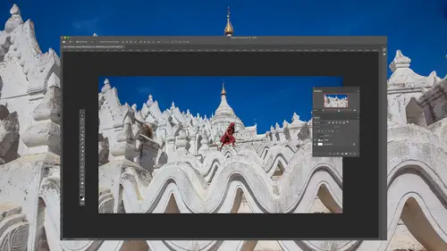
So let me show you how to think about curves by working on some images. And when we do, we're gonna end up using adjustment layers because that's when they become when curves becomes dramatically more useful. So just in case you haven't used an adjustment player, let me introduce those to you first. Then we'll start learning how to think about curves and apply it to images, and I think that's when you'll get excited about what it offers. So in my layers panel, I'll go to the bottom. I'll click on the adjustment layer icon, and I'm going to choose, not curves right now just because I want to talk about adjustment layers. First, I'm gonna choose a choice called Black and White, which would take all the color out of my picture. I'm just choosing adjustment. That's obvious, then. This is an adjustment layer. It's an adjustment sitting in its own layer, and it's a Ziff. You're standing at the top of the layers panel looking down, and you're looking through the adjustment layer, and it is ch...
anging your view of what's underneath. In this case, it's a black and white adjustment layer, so as you look through it. The color information that's found underneath can't be seen because it's absorbing all that color. Well, when you have an adjustment layer like that, remember, I went to this icon half black and half white circle to create it. You also get a mask, which is this white box, and we have a separate lesson about layer masks, which is what this is. And so if you haven't seen that lesson, you might want to look for it. It's part of the complete guide, and I'm gonna come here and grab my paintbrush tool. Since we already have white in the mask, I'm going to switch the color on painting with to make sure it's black. There's a little double arrow here I can click on to do that. And now, wherever I paint with black, it's gonna remove my adjustment. And so therefore, the image will come back to full color. So I'm gonna come in here and just paint where I want your I toe look. And if I released my boss button and you look in the layers panel, you'll see the black paint that I'm applying. It's only showing up in the layers panel when I released the mouse button, because it just is trying to make sure photo shop is speedy when I'm painting and that it's not trying to update things which could slow it down. So here I'll let go again and you'll see the layers panel update. But when I paint with black, the main thing is, is I'm removing the adjustment, preventing it from applying wherever it is I'm painting. Therefore, I can only get it in certain areas of my picture. And so we're gonna end up using adjustment layers when we're applying curves, because then afterwards, I can paint with Black to indicate where I don't want it to be applied. And so I'm going to remove this adjustment layer by dragging it to the trash. I just clicked on its name, dragged into the trash, and let's start using curves and see what we can do with this picture. And we can also, if you'd like, use brightness and contrast in levels because there are also available as adjustment layers. So, for instance, brightness and contrast, What I would like to do is dark in this area right here. Well, in brightness and contrast, how do I do that I have a brightness control, and when I move it, it darkens everything. It doesn't allow me to target this area, to be specifically precise about it. Or I would like to make this area the difference in brightness between that area and the area that's behind it in space mawr similar to each other, that would be lowering the contrast between those two areas. I do have a contrast control here in brightness and contrast. The problem with it is it thinks the difference between a bright area in a dark area is 50% gray. Anything brighter than that is considered a bright area. Anything darker than that is considered a dark area. Well, what if this area and this area were both darker than 50%? Great. Well, if that was the case, I don't think it is. But if it waas adjusting contrast would cause both of those areas to brighten or darken. The main thing is, I don't have any control here to say, How can I get those two areas more similar in the same is true. If I throw away this adjustment layer and I come in here and use levels in levels. How do I tell it to darken this in Brighton that specifically I have a slider over here on the right, which will brighten everything, force more years, toe white. We got the middle one, which will brighten and dark and everything. But the relationship between those two areas will remain the same. Let's throw that away. It's on Lee when you get into curves that suddenly you have control. The key, though, to using curves is to always have the little hand icon turned on. You can just click on it, and as long as it's got a dark background, it's turned on. But I use it every single time. I use curves, so if you go to the upper right of curves, there's a little side menu you can access right here in one of the choices in there is auto select targeted adjustment tool. That's what the hand is called. It's the targeted adjustment tool. So if I turn that on now, if I go back to the side menu, you'll find a check box next to it to indicate it's on. That means every single time I ever get into curves, the hand icon will be turned on automatically. What the hand icon does is if it wasn't turned on, then you could have whatever tool you previously were using over here in your tools panel active. And if you move your mouse on top, your image. That's what it would be thinking about. Clicking on that icon means Let's de select whatever tool was previously active in our tools panel, so that now we have something specific to curves active. And now you come out here into the image and I want this to be more similar to that in brightness. All I gotta do is move my mouse over this area. If you looking curves, do you see a circle in that circles moving? If I move my mouse around well, that indicates exactly how much light is in this area. And if I click the mass but watch what happens to that circle, it just turned into a little dot. That's like adding a dimmer switch on your wall that's going to control how bright that area is, where my mouse is. I'm gonna also move my mouse to the darker area behind, and I'm gonna click, and now I have the equivalent to two dimmer switches. Those dimmer switches air telling me how much light was in those two areas. And so if I come in here and look, you can tell that one area was brighter, cause this is higher. It's like in your kitchen having the dimmer switch turn really high, just not all the way as high as it could go. And then the other area is using less light because it's dimmer. Switches lower. Well, all we need to do to get those two areas toe look identical is to get those two dots to be the exact same height. And if I were to move this dot up to get there, it's like taking a dimmer switch and moving it up. You're gonna brighten things war. I could take this, not instead and move it down to the same height as the other. Well, if you take a dimmer switch and you move it down, what happens to use less light and things get darker or I could meet somewhere halfway, move the upper one down and the lower went up. That's going to make the brighter is get darker because I'm moving. It's dimmer switch down and the darker areas get brighter. It's your choice. Just look at the image and say, If you wanted those two areas to look more similar, would you do it by darkening this part or bright Ning that I think I dark in this? So I'm just gonna pull this down. It's the same height as the other, but then we got to just get rid of this little part here that loops down. So I'll add 1/3 dot Try to get him now. Do you see that these areas are identical? It's not that that's what I needed. I wanted less of a difference between the two. I don't need them to be identical. So let's put this back up there and I'll just watch it as I just to say Okay, somewhere around there, they're starting to look more similar. All right, let's just start working on this image and I'll show you the way I think about curves in general, most the time in curves. If I want to brighten or darken something, I use one dot I click on the object that I want to broaden your darkened and I think in my mind. I have a dimmer switch and I move it up. If I want Brighton down if I want to darken when I do that, though the entirety of the curve is gonna move up or down in. So afterwards I'll end up painting on the mask with black to say I don't want it to affect these areas. And therefore I can limit what part of the image we're working on. If, on the other hand, I want detailed toe pop out of the image, not just brighten or darken something, but have detail jump out, then I'm gonna be adding two dots on my curve. Ah, look at whatever object it is that I'd like to detail to pop out on. And I'll add one dot on the bright part of that object in one dot on the dark part of that object. And then I'm going to make them more dramatically different height. So let's see how that works. So first I want to brighten something. If you look in the right side of this photograph, you see one little bitty chick over there all by itself. Well, I want it to be brighter than it currently is. So I'll go over here and do curves adjustment layer that hand tools turned on automatically because we have auto select target adjustment tool turned on. I'm just gonna come all right over to it. I'm gonna click, and now it's like, have a dimmer switch in my hand. I'm gonna pull it straight up. I'm ignoring the rest of the picture. Just looking at that chick in bringing it up until I like its brightness. Let's say right about there. But now if you look at the curve we're ending up with you, see a dot that was added to the curve right here. That's the data added. It's working on whatever was this brightness level and it's brightening it up. But the rest of the curve changed along with it. So now I grab my paintbrush tool and I'm gonna paint with black wherever I didn't want that to happen. So wherever I paint with black, the image goes back and in fact, I'm gonna paint across the entire picture because then I can just zoom up on the chick in paint with white because whites, what allows the adjustment to apply, and then I can come in. Just say OK wherever I paint here, where should apply, and I can get it exactly how it like I'm not gonna be as precise as I usually would be with painting, because I just takes more time and I want you to learn about curves instead of just learning that I'm a good painter. Zoom out, command zero. Just zoom out controls in windows. Now, if that's too bright now that I've painted it in, all I have to do is either go here in curves and grab the DOT that's already there and pull it straight up and down. It's a dimmer switch, so it works just like a dimmer at home. There we go. And then, if I turn off the eyeball for the adjustment layer, here's before there's after the other way I could have lessened. This is instead of adjusting the curve that's here, I could lower the opacity of the adjustment layer. This means how strongest the adjustment gonna be when it's at 100%. I get 100% of what I dialed in, uh, in when it's less than you get less than what you asked for. So I could have lowered the opacity instead. Now let's work on other areas. In this case, I now want your attention to go over here. And I'm gonna do that by making the detail that is in this guy jump out. Usually the way you make the detail in something jump out. Did you get a greater difference between the bright and dark areas? So I'm gonna do a new curves adjustment layer that hand tools turned on and I'm going to click on two parts of this. I'm gonna look for which area do I want the detail to pop out in? And I'm thinking about kind of this area, so I'm gonna add two dots, one for the dark part of that area. But I didn't mean toe get what I just did. I accidentally had two fingers on my track pad, which made it have a little ah, dialogue, Papa. And then I'm gonna go for the bright area. So now I have two dots, those air to dimmer switches, and I just want to make the difference in height between the two more dramatic. If I move the upper of the two dots straight up, that's gonna take the brighter area and brighten it more. Ignore everything except for the bird. Then if I want to, I don't have to. But if I want to, I could take the dark area and bring it down to make it even darker. But I don't think that's gonna help. It's dark enough then I didn't want that to affect the entire picture. So I'm going to fill this mask with black to say, Get it off my picture Because any part of a layer mask that's black prevents the adjustment from applying. One way of getting a mask that's already existing to turn black is to choose this command that makes a negative out of something. So if it used to be white, it'll be black. And if it used to be black, it will be white. And now I grab my paintbrush painting with white, and I paint in the change wherever it is. I wanted it, so I wanted your eye to be drawn right over in here, so I paint that in. I could bring it up here to It'll probably work fine. He's got to be careful right now. I have a soft edged brush And if I get too close to the edge of the picture or used too large of a brush, I'll get a little glow around him. So I just need to be precise with where I paint. I'm gonna hide this adjustment layer by turning off its eyeball. There's before going back on theirs after you see the detail just pop out of that thing. How did I do that? Any time we want the detail pop out, I add two dots to my curve. I look at whatever object it is or area where I want the detail to pop, and I added out for the darkest part of that and another dot for the brightest and I'll get two dots. Then I'm gonna make him or dramatically different in brightness. And if you move the upper dot up, you're gonna brighten that part, move the lower dot down you're gonna dark in that part depends on the picture. As far as what should be done. Just look at the image and say, Would this thing need to be darkened? Or would it need to be brightened? And if I glance at it, it's dark enough in the dark areas. There was no need to move anything down. All right, then there's a check over here on the side. My eye goes to it, and I don't want to. I want to make it harder to see that. Make it harder to see the detail. So I'm gonna create a curves adjustment layer, and we're gonna do the opposite of what we did to the main character in here. I'm gonna add two dots again. One to the dark area of that object, one to the bright area of the object. And I'm now going to make them more similar to each other. That means we have two dots. The higher dot is for the brighter area. Lower dot is for three darker area, and I want to get him closer to the same height. If I made it exactly the same height, we just have a gray area. We wouldn't have any variation. So I look at this little guy, the chick there, and I say, would I like to darken it or brighten it? To accomplish this? I don't think I need to darken it. It's already close to black in the darkest areas. So it's the bright areas that I want to darken up. That means go for the higher, not hire means mawr light. Remember, it's like a dimmer switch. So grab that higher dot Just pull it straight down. If I move it to the left or right, it all it's by accident. That would be like going in your kitchen and grabbing for the light switch that controls the light above your sink and you accidentally grab the one for the hallway. You're not going to get what you expected. You always want to add a dot and if you're going to move it most the time you were straight up or down. So I've done that. I don't want it to affect the entire picture. So I want the mask to turn black so it doesn't apply anywhere. I use this command right here so often that I use the keyboard shortcut command I on the Mac control I am Windows. I'm gonna type that. That means invert. Then I would grab my paintbrush and I'm gonna paint right on that guy. And if I hide the adjustment layer, here's before See how he jumped out. There's after now. He's kind of disappearing, and it's just a little too much. I could either back off on the curves adjustment or go up here to my opacity slider in lower it toe. Lessen the effect. Good enough. But what we're doing here is we're adding contrast if we make it steeper between two dots and we're reducing contrast if we're making them similar and height. But unlike using brightness and contrast, the adjustment with brightness and contrast, it's thinking about specific brightness levels all the time. Like 25% gray is a let's say, highlight in 75%. Gray is a shadow, and you can't have it deviate from those. But here we get to plug in exactly what should be brightened in exactly what should be darkened. So we look at an object when we say, Let's look at the bright area of it in the dark area. Add dots for it. Neither make it steeper between the two to make the detail pop out or make it more similar to make it harder to see the detail. So lots of things I could do here I want a dark in the road that's in the distance, so curves adjustment layer. If it's just darkening. One dots fine, just one dot pull straight down, then I don't want it to apply to the entire image. So I typed command. I remember that's invert control. I am windows. I grabbed my brush, and if I paint with white, I can paint in the change and I can darken up that road. You just have to be careful with your painting, which I'm not doing right now, because I'm trying to get you to learn about curves, not about how to paint. But now if I hide that adjustment, turn it back on, you can see the darkening effect, and I could just be more careful with my painting to be better at it. So there's all sorts of things we can do with curves, but it's my favorite adjustment. It does take a while to get used to, but I think it's really worth it.
Class Materials
Bonus Materials with Purchase
Ratings and Reviews
Noel Ice
I am an avid reader of photoshop books, and an avid watcher of photoshop tutorials. I have attended (internet) several hundred of presentations. In the course of this endeavor, I have found my own favorite photoshop websites and instructors. Creative Live is probably the bargain out there as well as among the top three internet course sites. I have to say with great enthusiasm that the best Photoshop instructor is Ben Willmore. There are many great ones, but truly, he is the best I have come across, and, as indicated above, I have watched literally 100s of tutorials on Photoshop. I have seen all of Ben's courses, I think, and among them, this one is the best by far, and that is saying a lot, because that makes this course the best course on Photoshop to be found anywhere. I am going back and watching it twice. Not only is it comprehensive, but Ben is so familiar with his subject that he is able to explain it like no other. This is crème de la crème of Photoshop classes. I have been wanting to write this review for some time because I have been so thoroughly impressed with everything about this class!
ford smith
Highly recommended if you want to take your Photoshop skills to the next level. Ben Willmore is clear, concise, and professional. He also has a good speaking voice that is not distracting but also keeps you engaged. Lastly, I would recommend that as you become more advanced, increasing the speed of the video (one of the options given on the menu)...especially if you've gone through the course once before and maybe want to watch it again. The double speed is very efficient as you become more advanced in Photoshop. Thanks for the help Ben!
a Creativelive Student
Wow. I cannot communicate the value of this course!! The true value in this course is how the instructor identifies workflows you'll need before you'll ever realize it, repeats important information without it becoming annoying, and explains the "why" behind the techniques so well that even if you forget the exact method, you can figure it out via the principles learned. Excellent value, excellent material, excellent instructor!!!