Editing Composite Shoot #1 - Selective Color
Lesson 44 from: Creating a Fine Art SeriesBrooke Shaden
Editing Composite Shoot #1 - Selective Color
Lesson 44 from: Creating a Fine Art SeriesBrooke Shaden
Lesson Info
44. Editing Composite Shoot #1 - Selective Color
Lessons
Class Introduction
07:25 2Overview of Brooke’s Journey
20:13 3Your Timeline is Nonlinear
05:37 4Using Curiosity and Intention to Build Your Career
03:26 5What Factors Dictate Growth
08:24 6Organic Growth vs. Forced Growth
05:18 7Niche Branding
04:57 8Brooke’s Artistic Evolution and Timeline
24:27How Can You Get Ahead if You Feel Behind?
10:02 10Ideation and Conceptualization to Identify Meaning in Your Art
05:54 11Idea Fluency
10:33 12How to Represent an Idea
07:01 13How to Innovate an Idea
07:07 14Creating a Dialogue With Your Art
05:48 15Conceptualization For a Series vs. a Single Image
03:43 16Transforming a Single Image Into a Series
03:12 17How to Tell a Story in a Series
03:28 18How to Create Costumes From Fabric
07:20 19Brooke’s Most Useful Costumes
02:19 20Using Paint and Clay as Texture in an Image
02:56 21Create Physical Elements in an Image
10:22 22Shooting for a Fine Art Series
05:45 23Conceptualization: Flowery Fish Bowl in the Desert
04:08 24Wardrobe and Texture
04:54 25Posing for the Story
05:32 26Choosing an Image
01:23 27Conceptualization: Rainy Plexiglass
11:34 28Posing for the Story
04:17 29Creating Backlight
02:37 30Photo Shoot #1 - Creating a Simple Composite
17:51 31Photo Shoot #2 - Creating a Dynamic Composite
06:31 32Photo Shoot #3 - Creating a Storytelling Composite
07:40 33Shooting the Background Images
06:14 34Editing Samsara Shoot #1 - Working With Backgrounds
24:35 35Editing Samsara Shoot #1 - Retouching the Subject
04:20 36Editing Samsara Shoot #1 - Color Grading
02:45 37Editing Samsara Shoot #1 - Floor Replacement Texture
15:24 38Editing Samsara Shoot #1 - Final Adjustments
03:21 39Editing Samsara Shoot #2 - Cropping and Editing Backgrounds
05:25 40Editing Samsara Shoot #2 - Selective Adjustments
03:55 41Editing Samsara Shoot #2 - Adding Texture + Fine Tuning
03:21 42Editing Composite Shoot #1 - Compositing Models
06:58 43Editing Composite Shoot #1 - Expanding Rooms
02:17 44Editing Composite Shoot #1 - Selective Color
02:47 45Editing Composite Shoot #1 - Selective Exposure
04:04 46Editing Composite Shoot #2- Masking Into Backgrounds
10:45 47Editing Composite Shoot #2- Creating Rooms in Photoshop
06:11 48Editing Composite Shoot #2- Compositing Hair
05:07 49Editing Composite Shoot #2- Global Adjustments
04:49 50Editing Composite Shoot #3- Blending Composite Elements
05:00 51Editing Composite Shoot #3- Advanced Compositing
08:46 52Editing Composite Shoot #3- Cleanup
03:34 53Materials for Alternative Processes
06:20 54Oil Painting on Prints
05:41 55Encaustic Wax on Prints
03:09 56Failure vs. Sell Out
05:14 57Create Art You Love and Bring an Audience To You
03:35 58Branding Yourself Into a Story
05:40 59The Artistic Narrative
05:26 60Get People to Care About Your Story
03:36 61Get People to Buy Your Story
11:36 62Getting Galleries and Publishers to Take Notice
03:41 63Pricing For Commissions
06:43 64Original Prints vs. Limited Edition Prints vs. Open Edition Prints
02:11 65Class Outro
01:00 66Live Premiere
16:14 67Live Premiere: Layers of Depth 1
04:41 68Live Premiere: Layers of Depth 2
07:12 69Live Premiere: Q&A
16:10 70Live Premiere: Photo Critique
47:33Lesson Info
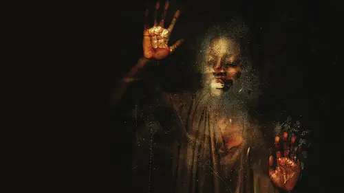
Editing Composite Shoot #1 - Selective Color
so I think this looks really awesome in terms of compositing. It was super simple, right? We didn't have much to do because it was just adding pieces on that were shot there. So the lighting was the same. The color was the same. The perspective was the same. The backdrop was the same. That makes it really nice and easy. So okay, we've got that. Let's just do a little bit of color work here and figure out how we want this image to look. I'm on my background copy layer, and I can see that the dress is a separate layers. So let's go ahead and combine all of these layers. I'm going to use a shortcut to stamp visible, which is control Ault Shift E or Command option shift E. Just make sure your clicked on the very top layer that you want, because it's gonna select that one and all the layers below it to duplicate and merged. So that's what we've just done. Layer three is the duplicated and merged layers, and you can see that just popping in there. Same thing. Nothing's changed. Okay, so the ...
reason why I did that was to put all of the different pieces on one layer so that I can selectively change the red. I just wanna play and see what we can do with that red color. So I'm going into image adjustments. Replace color. I'm going to select where I can see. It's a little bit pink in the dress, just somewhere around there, and I want to get rid of that pink color and make it true red. When you click in to replace color, it gives you an eyedropper tool. So I just click the pink making just clicking all around inside there and you can see it turns black and white. So with your fuzziness slider, if you pull it up, you're going to have more selected. It's going to turn white versus whatever is dark will not be affected by your changes. All right, so I'm gonna take the hue and start to play with that so you can see what it's doing. It's just totally changing the color here, and you can see that we need to add some that didn't get included. But we'll do that later, so we have options. We can make this dress whatever color we want I could go with green or brown or purple or any color that I want. So that's really exciting for me to be able to have that much color control, especially when it's so vital to the image. So I'm gonna go and make this just a much richer red, and I'm going to do that by taking the hue up like we did to make it have a little bit more yellow in it. So what I'm doing is adding yellow to the red, and I'm going to take the saturation up quite a bit so that it really pops. And then I'm gonna take the lightness down a little bit. It's just gonna be a richer red. So if I click on that preview, you can see that it had a blue cast. Now it has a red cast truly read because of the yellow being added
Class Materials
Bonus Materials with Purchase
Ratings and Reviews
a Creativelive Student
Brooke never fails to deliver. I found this course superb from start to finish. From exercising your creative 'muscle', demystifying taking self portraits, and showing that they don't have to be perfect before you begin editing, to walking you through her editing process and how to price your work. Brooke's enthusiastic personality and excitement about the work shines through it all. Definitely recommended!
Søren Nielsen
Thank for fantastic motivating an very inspiring. The story telling and selling module was very helpful - thanks from Denmark
Rebecca Potter
Thank you! Thank you! Thank you! Brooke for this amazing class. Inspired and so full of practical knowledge, this is the best class I've ever watched. You have given me the confidence to pursue what I've always been afraid to do. Watch this space!