Editing Samsara Shoot #1 - Floor Replacement Texture
Lesson 37 from: Creating a Fine Art SeriesBrooke Shaden
Editing Samsara Shoot #1 - Floor Replacement Texture
Lesson 37 from: Creating a Fine Art SeriesBrooke Shaden
Lesson Info
37. Editing Samsara Shoot #1 - Floor Replacement Texture
Lessons
Class Introduction
07:25 2Overview of Brooke’s Journey
20:13 3Your Timeline is Nonlinear
05:37 4Using Curiosity and Intention to Build Your Career
03:26 5What Factors Dictate Growth
08:24 6Organic Growth vs. Forced Growth
05:18 7Niche Branding
04:57 8Brooke’s Artistic Evolution and Timeline
24:27How Can You Get Ahead if You Feel Behind?
10:02 10Ideation and Conceptualization to Identify Meaning in Your Art
05:54 11Idea Fluency
10:33 12How to Represent an Idea
07:01 13How to Innovate an Idea
07:07 14Creating a Dialogue With Your Art
05:48 15Conceptualization For a Series vs. a Single Image
03:43 16Transforming a Single Image Into a Series
03:12 17How to Tell a Story in a Series
03:28 18How to Create Costumes From Fabric
07:20 19Brooke’s Most Useful Costumes
02:19 20Using Paint and Clay as Texture in an Image
02:56 21Create Physical Elements in an Image
10:22 22Shooting for a Fine Art Series
05:45 23Conceptualization: Flowery Fish Bowl in the Desert
04:08 24Wardrobe and Texture
04:54 25Posing for the Story
05:32 26Choosing an Image
01:23 27Conceptualization: Rainy Plexiglass
11:34 28Posing for the Story
04:17 29Creating Backlight
02:37 30Photo Shoot #1 - Creating a Simple Composite
17:51 31Photo Shoot #2 - Creating a Dynamic Composite
06:31 32Photo Shoot #3 - Creating a Storytelling Composite
07:40 33Shooting the Background Images
06:14 34Editing Samsara Shoot #1 - Working With Backgrounds
24:35 35Editing Samsara Shoot #1 - Retouching the Subject
04:20 36Editing Samsara Shoot #1 - Color Grading
02:45 37Editing Samsara Shoot #1 - Floor Replacement Texture
15:24 38Editing Samsara Shoot #1 - Final Adjustments
03:21 39Editing Samsara Shoot #2 - Cropping and Editing Backgrounds
05:25 40Editing Samsara Shoot #2 - Selective Adjustments
03:55 41Editing Samsara Shoot #2 - Adding Texture + Fine Tuning
03:21 42Editing Composite Shoot #1 - Compositing Models
06:58 43Editing Composite Shoot #1 - Expanding Rooms
02:17 44Editing Composite Shoot #1 - Selective Color
02:47 45Editing Composite Shoot #1 - Selective Exposure
04:04 46Editing Composite Shoot #2- Masking Into Backgrounds
10:45 47Editing Composite Shoot #2- Creating Rooms in Photoshop
06:11 48Editing Composite Shoot #2- Compositing Hair
05:07 49Editing Composite Shoot #2- Global Adjustments
04:49 50Editing Composite Shoot #3- Blending Composite Elements
05:00 51Editing Composite Shoot #3- Advanced Compositing
08:46 52Editing Composite Shoot #3- Cleanup
03:34 53Materials for Alternative Processes
06:20 54Oil Painting on Prints
05:41 55Encaustic Wax on Prints
03:09 56Failure vs. Sell Out
05:14 57Create Art You Love and Bring an Audience To You
03:35 58Branding Yourself Into a Story
05:40 59The Artistic Narrative
05:26 60Get People to Care About Your Story
03:36 61Get People to Buy Your Story
11:36 62Getting Galleries and Publishers to Take Notice
03:41 63Pricing For Commissions
06:43 64Original Prints vs. Limited Edition Prints vs. Open Edition Prints
02:11 65Class Outro
01:00 66Live Premiere
16:14 67Live Premiere: Layers of Depth 1
04:41 68Live Premiere: Layers of Depth 2
07:12 69Live Premiere: Q&A
16:10 70Live Premiere: Photo Critique
47:33Lesson Info
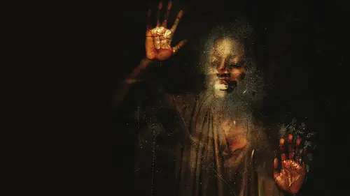
Editing Samsara Shoot #1 - Floor Replacement Texture
Okay, So once we have all of that filled back in where we want it and it looks like we're pretty close, the background is a lot darker than it was, so we're not gonna have any sort of weird highlights coming up in the background behind her. I want to start thinking about how we're going to add that floor in. How are we going to get that look of there being cracked ground underneath her first, I'm going to save because I have a bad track record of that, Okay. And I'm going into bridge to look for my stock folder. And my stock folder has lots of textures in it. And I specifically brought this one which has this cracked ground. So let's take that in. And your first thing you notice is that it's the wrong perspective. We were looking at her kind of looking straight at her. This is looking down at the ground, so we're gonna have to do a lot of manipulation. But I am not afraid of it. So don't worry about manipulating this image. It's gonna work out just fine. We're going to use the move too...
l to drag and drop this image in okay and we can drag it into place so we know that it's gonna roughly go right around her. And I'm not gonna bother making a bigger smaller right now because we need to change perspective really drastically. So I'm going into image. Sorry, Edit, transform perspective. And I'm just going to pull the bottom edges out to put it on the same plane that she was on just like that. And yes, this is a lot of stretching and, no, I would not normally want to do something like that. But the benefit here is that it's only going to be a teensy little bit, and it's going to be under other layers, so I will allow it. So I'm going to go ahead and create a layer mask there, and we're going to erase all around to create a really soft transition from where the cracks are, too, where the darkness is on the outside and hopefully it's going to start to look like it's really there. Were going to have a huge, huge lighting issue to start, and that's okay because we can fix it. It's also obviously on top of our subject, which we don't want. I'm going to make my brush size even bigger and take the opacity down to 50% to try to create a more believable transition around the edges here again, taking the opacity down and again, going around the outside edges just to create that look like it's really fading. And now we're going to get it off of our subject. So taking the brush size down so that we're fitting within the subject here, taking the hardness up because the subject is in focus, so the hardness should always match. If the subject is in focus and opacity back up, we're going to fully erase it off of her Now. Now, I can't really see where she is, So I'm gonna erase more than I need Thio all around her and then bring it back exactly where I need to bring it back. Okay, so we've raised too much right now. Let's go in and see where we need Thio. Restore it. Okay. Looks good. Smaller brush. Switch to white and come in. And you can see I just made a mistake here, which is really important to point out because I make mistakes. All the time I made the mistake of starting to erase it and blend it before erasing it around her. So now I'm bringing it back at 100% opacity when I had already tried to blend it into the background. So that step has to happen second. So that was just a mistake and that's okay. Just keep going. It doesn't really matter very much at all. There are other things that I'm thinking about here. I'm thinking about how I can possibly create shadows because it doesn't look like she's sitting on this ground It alright, we haven't changed the color, the lighting, we haven't changed anything about it. So we're gonna have to create connection points of shadows where she sits on this cracked desert ground. And however we do that there are multiple ways. We simply have to make sure that she is connected appropriately that whatever lighting we used its simulated and how we do the shadows, shadows are quite difficult for a lot of people and for myself included because there are so many different types of shadows. There are shadows that are really harsh that are really soft that have different color temperatures in them. And that is something that we have to think about when we're creating the shadows in her going Thio. Just get rid of that and almost finished. Okay, now let's go and really bring back that desert. And then again, because I messed that up. We're going to do it again. We're going to start erasing the outside edges okay, there, and we'll do that all again. So now I'm going to go in on my layer mask with a big soft brush. Had 100% opacity. Now we can start to erase the outside edges just like we did before, because we brought it back up to her skin already. So that's great. And now what do we do before we lowered the opacity? Now that hard edge is gone and again, sweeping around the outside edges and lowering again and sweeping. So it's going to really start Thio fall off in the distance once you do that. Okay, good, it's falling off right. It's almost like there's a spotlight on her, but now we know that this ground is too bright for this situation that we're in. So let's create a curve adjustment layer and pin it down by clipping it onto our layer to which is the cracked earth. And let's just darken. It will darken that layer down a lot good, and that makes it blend even more. Now the shadows come in. I'm using my lasso tool to create shadows underneath her foot and leg. Here, definitely need something there, absolutely, all in that area and on the other side of her Azaz. Well, maybe even that far out. So we'll right click, and this is not going to be a once and done things. Shading takes a long time and many different layers to get it exactly right. So let's try 60 pixels for that one. Create a curves layer and pin it down to that cracked broken floor, and from the highlights start to pull down to create a shadow. You can also play with the mid tones to see how that goes, just in terms of creating something a little bit darker, and I like how that looks. I think it's a little too much back here behind the back leg, so I use my brush tool Thio. Just a race lightly. 30% sounds pretty good, so let's just erase it lightly from that area. There we go. And that looks pretty good to me. I'm gonna need a little bit more shading just through there where it's really dark and maybe a little bit through here. Just wear her knee connects, right? Click and feather. Let's do 30 pixels this time and one more curves. Adjustment layer pinned down and right from the mid tones this time. So we want a nice dark shadow. Okay, great. Now the shadow is not underneath. I'm sorry. The cracked ground is not underneath the layer with all of the color that we already added. So one more curve pinned down, and we'll just make sure that it has that same yellow hue that the rest of it does by adding yellow and adding some red. So now it has the same Hugh. I think it could even do a little more with Cem yellow. There we go. Okay. So you see how we did that? We've added a new floor. We've added shading. It looks pretty natural to me. I think that it could use a little bit of contrast. So that's the final step curve. And let's see if we can. There we go, because the subject has a lot of contrast on her. We want to make sure we'll pin that down. We wanna make sure that the ground has the same amount since it wasn't there. And it doesn't have the same properties applied to it. Okay, Not bad looking pretty good. Okay, So I like where this is going so far. I'm going to grab some texture to put in the background, and you might be thinking, but Brooke, you had texture in the background and you got rid of it. Well, the thing about backdrops is that you can't really choose where the texture goes. It's always in the same spot. And if you use the same backdrop multiple times, then your images will have the same texture in the same spot in every image. So I want to avoid that by adding my own texture in, and I'm just gonna look through it the different options that I have and what might be most appropriate. And I think, to keep with the cracked kind of dry look, we'll go with something like this that already has the cracks in its cracked and crumbling. So let's take that in the same thing that we did before dragging and dropping it, okay? And then control T or command t to just stretch it across the image wherever you think it needs to go. I think I actually wanna flip it. So let's go into edit Transform Flip Vertical. And I did that because I didn't really like this portion very much. But I really like all the texture up in here, So I wanna make sure that shows up where the subject's faces, because that's gonna be the area that we look Thio more than anything else. Now, when I change the blending mode on that layer, there are many, many things that I could dio. This is lighten, which is my favorite for really dark images, because it's going to stick to whatever's darkest. That's pretty much what we want. But you can always go through all of the options to see what works best for you, and I think that we will go with lighten and now, obviously this looks ridiculous because it's covering almost the whole image. There are some things that we could do for that we can create that curves, layer and pin it down and we can play with how bright that layer itself is. If we make it darker, it's going to blend more into the background. So that's one really good option. We can also just take the opacity of that layer down so we'll just go ahead and start to take the opacity. And don't forget, when you add an overlay into Photoshop, you can manipulate it all you want. So create a layer mask on it and get in there and see if you could just erase it where you're not as fund. So obviously, on our subject, we wanna I want to get that off of her just a little bit there like that. And I'm going with a A really low opacity. So I'm not worried about, you know, just wiping it all the way. I want to slowly work at it to create kind of, Ah, a nice visual, uh, movement with the texture that's in the background. I want to get it off of the helmet because that's the area of clarity in the image. When I talk about the area of clarity I'm really talking about, where do you want the I to go first. And that's usually the clearest part of the image. The area of most contrast, the brightest thing, the darkest thing. So I'm making sure that I have that look. I really like the position of this texture. You can see that it's kind of has a circular sweeping motion around it. So I'm going to leave that. But I like toe layer my textures. So let's go find another texture. This one immediately stood out because now I'm looking for shape and pattern and form. And this has that same shape, pattern and form of the sort of circular look to it. So let's take that in. This makes me really excited because I love, love, having repeating form and shape in an image. I accidentally pin that down. So let me release it, Okay, Now it's its own layer, and I'm going to stretch that just like I did the other one all the way across. Okay, Good. And then just move it wherever I might want it. I think that looks good. Same process. We're gonna go in, probably choose, lighten lower the opacity, and also play with the curve adjustment on that. So that we can see if it should be brighter or darker. What needs to happen there? We're just adding contrast, bringing it down. I really like this texture. I know it's very heavy handed right now, but I think that it is creating exactly the right flow and movement that I want to see in this piece. And it adds abstraction to it quite a bit. So I'm gonna take the opacity up a little bit. Make sure that I'm getting that texture off of the helmet because I don't want to see that there or on her skin so much. I wanted to overlap a little bit, so I do want there to be some bits of texture overlapping, but I want to get rid of it in other parts. So I'm just finessing with how far that texture goes, and I might even play with making it a little bit darker. I think it's a little heavy handed, yet there we go, just bringing it down now again, getting rid of some of the texture overall, so making the brush bigger and lowering the opacity down to 20 just getting rid of the texture. All through that area a little bit. Good. I think that looks really nice. Maybe through there. Okay, go ahead. I like how that looks quite a lot, but the issue for me is that the textures don't have any color. And I wanna make sure the colors very uniforms. So I'm gonna create one more curve adjustment layer and let's see if we can add some color into that texture by going to blue and adding yellow and going thio read and adding red, making that cohesive color palette. Okay, I think the textures too bright around the edges. So I'm gonna select wherever I want it to be darker. Just like that. Right? Click and feather. Let's do a big 1 500 pixels this time. And then right, click and select. Inverse. And now I can make that texture just a little bit darker on the outside edges. There we go. This is looking really beautiful. I think
Class Materials
Bonus Materials with Purchase
Ratings and Reviews
a Creativelive Student
Brooke never fails to deliver. I found this course superb from start to finish. From exercising your creative 'muscle', demystifying taking self portraits, and showing that they don't have to be perfect before you begin editing, to walking you through her editing process and how to price your work. Brooke's enthusiastic personality and excitement about the work shines through it all. Definitely recommended!
Søren Nielsen
Thank for fantastic motivating an very inspiring. The story telling and selling module was very helpful - thanks from Denmark
Rebecca Potter
Thank you! Thank you! Thank you! Brooke for this amazing class. Inspired and so full of practical knowledge, this is the best class I've ever watched. You have given me the confidence to pursue what I've always been afraid to do. Watch this space!