Lessons
Class Introduction
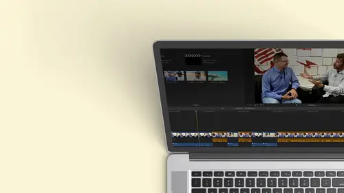
12:34 2Exploring Final Cut Pro X: Navigating the Interface
32:32 3Exploring Final Cut Pro X: Project Timeline
18:23 4Exploring Final Cut Pro X: Basic Editing
16:07 5Refining Your Edit Introduction
15:15 6Refining Your Edit: Trimming
37:06 7Refining Your Edit: J and L Cuts
09:00 8Refining Your Edit: Roll and Overwrite Edits
06:25Refining Your Edit: Slip and Slide Edits
03:51 10Refining Your Edit: Auditions
09:27 11Setting Up a Project From Scratch
17:03 12Setting Up a Project: Importing Media
35:52 13Setting Up a Project: Keywords and Smart Collections
21:07 14Working with Audio
13:56 15Working with Audio: Syncing
23:40 16Working with Audio: Mixing
21:28 17Working with Photos and Graphics
09:55 18Working with Photos and Graphics: Scaling and Positioning
14:05 19Working with Photos and Graphics: Ken Burns Effect
15:17 20Working with Photos and Graphics: Animating with Keyframes
15:51 21Filters and Transitions Introduction
03:04 22Filters and Transitions: Applying Transitions
18:13 23Filters and Transitions: Applying Filters
14:23 24Titles and Generators: Lower Thirds
11:43 25Titles and Generators: Titles
05:40 26Titles and Generators: Backgrounds
11:46 27Advanced Skills: Color Correction
38:35 28Advanced Skills: Speed Changes
15:48 29Advanced Skills: Stabilization
05:53 30Advanced Skills: Green Screen
13:11 31Multi Camera Editing
06:04 32Multi Camera Editing: Organizing Your Media
08:54 33Multi Camera Editing: Creating a Clip
07:12 34Multi Camera Editing: Audio
09:25 35Multi Camera Editing: Working with 4K Footage
06:56 36Finalizing, Exporting and Archiving: Final Checks and Tweaks
04:34 37Finalizing, Exporting and Archiving: Exporting Final Project
25:46 38Finalizing, Exporting and Archiving:Cleaning House and Archiving
15:22 39Bootcamp QnA
14:53Lesson Info
Advanced Skills: Color Correction
this is going to be a fun lessons because we're gonna do some of the things that a lot of people have been asking about throughout the course. We're gonna look at color correction, how you can fix colors in an image that are slightly off. Maybe you have, ah, color cast to them. Are you want to match them, Teoh one camera to another camera. So we're gonna get deep into color correction as deep as we can get in the time that we have a lot of, um, speed changes. So there's a lot times you want to slow something down, speeded up, played in reverse, do variable speed where it starts at one speed, ramps up the ramps down and then comes back. And then we're gonna end with, ah, green screen, which is great because it's so easy to do green screen to chroma key, something in final cut pro 10. And with all that, you'll be able to take again your program up to those next levels that you wanna have them at. So with that, let's go over to the tape, are go over to the computer and take a look at some...
of our challenges and talk a little bit about color correction. So I have a couple shots here, and I'm just going to show you both of those. Uh, neither one of these is truly neutral in the color. It was intentionally shot that way so I could do this. I'm ah, horrible cameraperson, but hopefully not that horrible. But there are times when you don't have your white balance set right. And for those who are not familiar with that jargon of a white balance, when you shoot something on video, the camera needs to know what is considered white and light has different temperatures. We talked about that at the very beginning of the class. Very briefly. So day like is a little bluer. And these inside lights is incandescent. Lights are warmer there, more towards the gold side. And there's variable colors in between. Sometimes you might be in the situation. Maybe you're shooting inside of a warehouse. They have mercury vapor lights. Those actually come across as purple just for the people out there. I have a couple of people in the audience cringing because they've shot in warehouses and mercury vapor lights are horrible to shoot under, so most of the time the camera can do a good job figuring out what's truly white. Now you may set yourself, but I go to these places that all looks normal. White to may I know our brains automatically white balances. If we look at something white long enough and we know it should be white, we do it. If you ever quickly look outside from inside and you and your brain hasn't adjusted yet, it's gonna be real fast. You might. It might look a little blue, but the camera would get confused. So if you have like an open window and you have lights on the inside, it doesn't know which one to compensate for. So either the window's gonna be very blue or for compensates for the window. The interior is gonna be very golden. That's harder defects because you have mixed temperatures. But if the camera has been set up wrong, maybe you said it for manual. You forgot to change it the next day. Or maybe you have just a cast a large cast because of an open window. I had a horrible experience getting color balance. I shot um, event under a big red tent, so everybody was tinted a little red. They all look sunburned, so I had to color about no matter what I did, I tried balance in the camera so you can fix some of those things. So that's one of the things we'll be talking about. We'll look at, as I said before, just taking a shot and manually adjusting it so it looks better and then matching some things that these are the two shots were working with. And you could go into the color correcting tool and finesse it. But sometimes you just want to do something really quick, and there's a great feature in final Cut, and that is the color balance option. You can get to it a couple of places, so I have the clip selected and directly under that viewer, you'll see there's the little magic wand we saw that earlier in the audio section of the class, where you could do audio, enhance match audio. Um, but there's also these three areas here. Now you'll notice and you'll get frustrated. Go Well, wait a second. I can see the color board, but why can't I do balance color, match color Well, even though my play had is part above this clip color needs toe have the clip selected so you could go down and click on that. But I'm already over here and I'm lazy, so I'm gonna teach what I dio wherever and I mentioned. I think this once before if you are parked above a clipping, it's not selected. And you want to select the clip, The Seiki will select the clip that's below it. Now, with its selected I can go to this drop down and I see the other two things are now no longer great out. Okay, so if it's great out, it's probably because you don't have the clip selected. So I could go ahead and I could say balance, color. And it's gonna make its best guess is manufactured already Balanced color once grand Option B. And it did do a best guess here. Okay, I'll tell you. Sometimes the best guess is a great now, to me, that looks a little bit pink. Okay, balance color. So it tries to compensate. And this was the challenge. I had blue light coming in here. I had the interior lights of the studio in there, so I now have to take that to the next level. So it's a good start. Sometimes it's perfect if you're dealing with consistent light. But in this case we have mixed light, and I have a similar problem. Here we go had hit the Seiki and I go balance color, and it's probably good to learn the keyboard. Shortcuts for color, which is command option B for balance, will do match color, and that's gonna be command option M for match. But I do that. This it kind of did a better job. It still is a little more gold. I can play with that, but it's trying to neutralize this area. So sometimes that's all you need to do. You just go to an emergency, you know, it doesn't quite feel right. And when you hit balance color, it does a couple of different things. First of all, if there's a color, caste is tries to neutralize itself, there's takes the red, the green in the blue, and it tries to adjust it to get a neutral gray. The other thing it does is if the contrast isn't right. If it's not, if the blacks on is rich and the whites aren't as brightest should be, in other words, is low contrast. You will actually try to improve the contrast. So it's fixing to things the contrast as well as the color balance. So, for instance, if I want to this clip here and I tried to do that, I need to hit, see, to remember, to remember to do that and I'm gonna go back and we're going to choose Call about them not going cheap with a drop down. I'm going to use the real thing, which is command option B, and it goes ahead. But so does its best guess again. It would balance it, but this was a tough shot. She's too dark there. Probably little pale there. Bright light studio lights, those some of the challenges so it could get you to a certain place. Sometimes it does a great job, but usually need to go to the next level in the next level is actually opening up. The color board are putting the color corrector on, so the first way that you might think of doing it and it is, uh, okay to do it this way is you might go into the filters. So you open up your filters, you type in the word color, the bottom C o L o r. And you see the color correction filter, and I can take that, and I can drop that on a clip. And with it on the clip, it now appears appear. Select the clip first. That would be a good thing. Zoom over here. There it is color correction, so you could do that is very manual eight way of doing it. The other trick is if you have the clip selected and you don't want to go all the way over and open this up and keep this open. There's two other ways that you get into that you could say Show color board, which is the drop down or command six would automatically open the color board, and as soon as you make a modification to the clip, it puts the filter on automatically. So really, that's the best way to do it. But I wanted to show you where the other color correction filter was found, which is the same one because you can stack color correct er's so you could use it to fix one element, and then you might step inside to fix something else. Usually that's referred to a secondary color correction where you're just focusing on a specific color, are luminous value and trying to improve that element. So think about that. You make be doing multiple color corrector, so I'm gonna hit command. Six automatically opens this up and let's take a look at this by itself and what can be done here. There's three areas that you're working with color. This is like the Hugh how it's tinted. Okay, if there's a color caste saturation, the richness of the color are the subtle nous. Closer, black and white and exposure. How bright and how dark the images. You'll notice there are three pox on each of these they their work differently in each one. So let's start with exposure because usually when I color balance something, I work with exposure 1st 1 thing you need to be aware of is that if you make something darker, the colors will appear richer with the way their broken out in an RGB color space, this little jar getting. But if you have worked in color spaces before you'll be aware of that so if you make something darker, the colors will get richer. If you make it lighter, the colors will seem a little more washed out. So that's why I work with this first. And also sometimes you just correct exposure. You don't even see the color caste. Now you can do this with your eye, but ideally, you should use some sort of a numerical represents something that's neutral that's guaranteed better than your eye, cause your eyes could be tricked. So there's something called scopes and you might have seen them in a studio. And they have scopes in here, and I'll show you how to turn them on to turn on your scopes. What you need to do is you go to this view drop down menu and you say Show video scopes. Keyboard shortcut is command seven. Now away. That I remember. This is command six is my color board in. The next thing I probably want to look at is my scopes that's coming on seven. I want to Ah, one through six shortly. So there we go and it opens up a scope area. Now, when I'm color correcting, I generally don't need to look at my library. It's not an efficient use of my real estate so up here. And I think we saw this at the very beginning. There's a few buttons this we know turns on our inspector show that this will show or hide our timeline, which we turned off the timeline. So we when we imported, we could have more real estate. This one closes the browser. There we go. Now we have more real estate so we can see our image here, and we have one scope. But you can look at multiple scopes, and I'll give you a real quick overview of the primary scopes you might be using. So when you click on the View menu, you'll see there's a couple options here. First of all, how many of these scopes do you want to see? Well, let's go ahead and open up to Scopes, and the two default scopes are a way form and a vector scope. Zoom out and make this a little bit bigger. I don't actually want to see my, um, timeline is big because I don't need to, and I want you guys to see it betters. I'm just gonna pull that down and we're good there. So I have to scopes, and one of the things you can do once you have your scopes out is if you need to see them brighter. You can use this slider if you want them dark. You to do that now. Why would you make them brighter or darker? Well, when your color correcting, you kind of want your eyes to be neutral to the ambient light in the room. So if your room's really bright, you might want to bring it up. But if you have a dark room, you don't want these to be so bright that it's distracting you. And all of a sudden you're not really seen colors the way they should be see, so that's why it's there. But these are the two basic scopes you can also choose if you want to see them in color or black and white. So, um, I'm gonna go ahead and explain to the U these in color, so the ones on the lower side this is your vector scope, and it's a scale of between 0 100 that we're working with. 100 is the brightest white, the brightest area that you ever want to go to because anything above that is not considered broadcast safe. You lose all the detail, okay? And you never want to go. Zero is absolute black. So if I was looking at this and it was low contrast, I might only have my my traces. These recall traces between, like, 40 and 80. And if you look at a low contrast, seem like on a cloudy day and so that's a situation where you might want make the blacks a little richer and open up the whites. Okay, we're gonna show you how to do that. So this is really talking about the luminous value of your image. And technically, if you look at the image, you could see that that's probably the wall. That's probably her. I think that's the edge of the wall. And then that's probably the back wall with the window. It zoom out and see if that's the case. Yeah, so it's kind of a visual representation off. What's going on? If we take a look at that on another clip, which is much darker, um, you see a lot in the shadows here. Okay. And again, that's the black wall behind her. There's the dress. There's the piano, So you kind of see that you could look at this either in color if you want to, or you can look at this in black and white, so I'm going to right click on it. I'm gonna choose to look at that just as black and white. Good. So we spent two black white because right now I don't need the colors. I just want this to C 0 to 100 now. What's this? This is my vector scope. Spectroscope tells me if there's a color caste and how saturated my images. So the further out things go, the more saturated they are. There's some little squares here, these little targets you should never have colors exceed that area That's over a supersaturated. It won't look good, and it's also again, not broadcast. Say so. That's the guy. And then you'll look at this scene and you can see their skin tone. That's kind of between yellow and red, and there is something closer to the red. That's probably the skirt is a lot of black there, so I can kind of see what the colors are now we're not gonna get super deep into the color balance it. We could do a whole day on color correction, but there is a line here in the left quartering at about 30 degrees minus three degrees. That's actually the color of skin tone, so you can actually color correct based on a person's skin tone when you get really experienced with this. And the cool thing is, we all reflect skin tone all reflects colored the same way is just luminant values. So somebody is very fair skin and something very dark skin. Their skin tone would be along that line. It's just a matter of Lou Minutes, which I think is actually pretty cool. So that's an idea. We saw it on this clip. We also have it over here and we can look there. These are are more balanced. If I turned off my, um, auto balance here, OK, Do you see how the scopes have changed? It actually opened this up a little bit. It made it a better image. Okay, if I looked at the next one again, would be good if I actually selected that. So it did its best guess, But I may want to do more, and that's when I'm ready to use my scopes and use. The color board will explain how the color board works, so let's go back, and this looks like it's a little more challenging of a shot. I may keep my balance color on, so a lot of times I'll try that you don't have to do balance color to do the color board. They're mutually exclusive, okay? And the order where you apply them. It always puts the balance color before the color board so that you can't switch the order of these because it's trying to do the best gas and then you can start tweaking it. Okay, so it did do its best guest. Just fix it a little bit, But now I want to work in the collar board. So one of the things I did, but I wasn't zoomed in, so I'm gonna do it again. Is when you're in the regular video tab. If you want to see that color board again, you have to hit this little arrow and that slides over and you see the color board command six would also get you there. And then when I went back into this little button right here. Yeah, you go back and forth. Now, let's look how we would work with this. We're gonna work with exposure first, so maybe I want to open this up a little bit. I want to bring the blacks down, too, Where they hit zero point. So I have three pucks. The far left puck works with my shadows. The middle puck works with the mid range of my light, and the white works with the highlights. So if I go ahead and I bring this down by just dragging it, I'm adjusting the darkest areas and I can bring that down. So my image is a little richer. Okay, on a lot of times, you know, if it's not rich enough, you pull that down. It didn't really affect the middle are the highlights. I try to be very specific here. There is a global park on the left, and this actually affects everything. So you have to move in the whole line up and down so you can move the whole line up and down. So maybe I brighten the whole scene. And then I bring this back down again to hit zero and then I might go. Do I want to open up my whites that I could as long as I don't have a hundreds getting it pretty bright, and then I could play with my mids until it visually looks the way I want. So I've done that. Really, all have done here has expanded the contrast. If I want to see my before and after, I can simply step back and toggle the color corrector off and on. So this little more punch to the scene. Additionally, I haven't if you notice when I made these changes, it didn't affect the vector scope because I was only dealing with Lou Minutes. This is color. This is Lou Minutes. Okay, so we'll step back into the color corrector, and now I want to work with this. Well, I can see there's a blob, and that's more towards the red there, and I can see there's some twigs blue because there's my blue. That's her outfit so I can see what's being affected. So I'm gonna go over here and I can switch over to color, and this board could be a little confusing at first because some people are used to seeing a wheel when color. Correct. So it's a different way of looking at things I can affect color. And this is for color caste globally with this big puck. So the way it works is if I wanted to add green, I bring this up. If I wanted to remove Green If there was a green cast, I would move it down. Okay. You don't always have to deal with Queen. If I move this left and right, I can pick any color. I want to add or subtract. So if I wanted to bring this over here and bring out some red, I could just notch that down. It's already better care. Got rid of that red hate it when things work too quickly. It doesn't let me show anything else. Okay, I was surprised by that. But let's say that's the case now. I can also control the color in just my shadows, my mid range in my highlights. So if I wanted to, this well might still be a little pink, so I could go over here and pull this down, making it a little green. If I do that. But I move it left and right to pick the color. I'm changing and then up and down to add or subtract. Do you see what's also happening to my vector scope? It's moving its primary. So if that was on skin, I could see exactly where it needs to hit at that minus 30 degree line. So we're good to go. If I have a pocket. I moved it down and I want to reset that With the puck selected, I hit the delete key and it goes back to neutral again. Ah, and that's true of any park anywhere here. If I wanted to reset the whole thing, I have to step back into the actual filter. And I would just do the reset right there. Color corrector be set, go re separate, does the whole thing. But over here you do it one by one. So those are two things. That is my color caste. I do want to point out, and this is a pretty cool thing that I don't think a lot of people are aware. If I select a puck, I can use my left and right arrow keys to move it horizontally to the color. I want, like used the up and down keys to very precisely add a little bit of remove a little bit of color, a lot nicer than actually dragging it. Okay, go ahead and reset that puck by double clicking and hidden delete. So that's might be high. Tweet the color. Now I go over here to saturation works pretty much the same way this will globally saturate the image or de saturate. Notice the vector scope, the circular scope. OK, when there's no color, there's no traces as I bring color back in, you see it's getting bigger. And then as I start saturating it, it even gets crazier. Okay, and that's obviously oversaturated. It looks a little better on the TV than it does on my computer, but I think we're pretty good. So again, like with Fluminense, like with the Q. I have multiple pucks, so maybe I want to bring the saturation down off the wall, and I know that's in the highlights so I can go ahead. I'm just de saturating the brightest areas. Okay, so her leotardo is still blue, and then maybe I want to bring down the saturation in my blacks pretty much black should be neutral with no color cast, so I'm kind of happy with that. So, as you see with the balance color with this color grading, I get something that I like. It's a little bit better and let's step back. We'll go back here, and if I want to see the before, I could go ahead and on check it. And this is something important to do when your color correcting. A lot of times you get 95% of the way there, and then you spend the next our thinking. You need to tweak it. You need to go back and remember how far you've come because you can spend hours and hours on a shot. Funny story. Nothing. Story story. I was teaching a color correcting class to a bunch of professionals that we're going to go out and teach other people to color. Correct. We went around the room to a people of room. First Guy says, Yeah, I've been using this editing program for years, but blah, blah, all this experience each each one of these guys 10 15 years experience, you know, as an editor and as a teacher. And this last guy. We get to the last guy and he's like, really quiet and shot. He's like, almost embarrassing. He goes, Well, you know, I'm not an editor. Um, and I really haven't taught a lot. But what I do is I'm a DaVinci color corrector. And at the time, that was like the color corrector. I mean, and we were, like, all turning him going. We're not worthy were not worthy because, I mean, it's an art to really color, correct. And you definitely need tohave. You know, if you're going to go to a theatrical, our film and you want to really do it right, you have to have the right room with the right monitors and everything. Balance. So it was like suddenly we you know, we were the ones looking at him asking questions, and the best question somebody asked him was, So when your color correcting, how many shots do you have to usually do in a day? And because I usually do anywhere between four and 600 shots a day? And we were like So you now know how much time he spent in? This is a guy who does it professionally and part of it. Yeah, he knows what he's doing. But he knows how much time to spend on that, because you can spend three weeks color correcting something that you just It's a rabbit hole. Okay, so the best thing is, always see where you came from, my turning it off. The other thing is when your color correcting. If you start staring at an image too long, guess what your brain does and white balances. Okay, so sometimes you have to just like look away at something neutral and then look back and you'll see the actual colors. One thing I didn't say at the beginning is when your color correcting off of a computer monitor. It's not truly, always a neutral monitor. Okay, you can use ah spider to balance it, but realize that your scope sometimes arm or accurate in the way that computer monitor is presenting colors. Maybe you have the luminous turned down, and so you're making everything too bright. Or maybe it has a pink tinge on the screen, so you make everything to green. So that's why your scopes are important. And that's why if you're doing serious color correction, you need to actually have a monitor that's color balanced and neutral. But with that, let's continue and we can see we can. We can work with that. So color balancing it images is nice. We're gonna turn his back on the where we wanted to be. This also something called secondary color correction that I mentioned. And I'm gonna work with this shot and maybe I'll showed on the next one. Sometimes you get the image right, but then you need to isolate and fix one area. Maybe the color of her leotardo has now changed a little bit. And the team she's dancing for, it needs to be more of a teal. Okay, because that's why I tweaked it. So they're going. That's a problem. So I can put another color corrector on there. And this is an instance where I will go back to my filters and drop that on our could have just double collected. So I have a second color board that I'm working with. But before I start working with the color, I'm gonna hit this button right here. That is a shape or a color mask. If I click on that, I'm gonna do it a shape and then I'm gonna take it off. If I click it, I now could draw a shape and Aiken scale it and I can soften it. And what I can do is anything inside of that space will change colors. So if I quickly step inside to this second color board and I'll do something just by with the saturation, I basically could bring down the saturation inside that space. This is really good if you need to focus on a little area, but you're dealing with a physical drawing space, which a lot of times you do want to do. But sometimes you want to deal with a color. So I'm gonna go ahead and step back and undo all this. I think I can actually I deleted my shape masking what happened? It made the whole thing black and white, cause I dragged this down, select my puck hit delete. I want to focus just on the blue. So when I choose the mask instead of doing a shape mask, I do a color mask. So I'm going to click on that. And now I get an eye dropper and I can go over here and I click and drag, and I can see where it's trying to pick up the blue. And if I hold down the command key, I should get a plus and I can add a little bit more. So ideally, I've just grabbed the blue area. I can see right here that that's the blue. I can also control the softness of it. But I've isolated the blue. Or at least I hope I have because I'm kind of running and gunning. But if I jump over to the color board and let's just work with saturation if I saturate this, it's only thinking of the part of the blue that I grabbed. Okay, I could also go in and start tweaking the shade of it. Okay, so I didn't grab that much. I'm gonna go back, grab some or step back, hold down the command key rushing through this. This is and sometimes if I have other blue around, I might actually go with ah, second mask of a shape, a shape and a color to find it I'm gonna do is jump to the next one, cause this is really easy to see. I tried that one and I could get it, but I don't want to tweak too much. I have this shot here that I'm correcting. And so the first thing I might do is put on my basic color corrector, and I'm going to immediately go ahead, step into the color board. And what I want to do is just deal with exposure when actually open up the blacks because they're a little crushed little bit. Bring up my mid range. So now we can start seeing the rest of the room, which I like, and maybe I'll bring down my highlights so her skin doesn't get to blown out. So this is a little better. So exactly the greatest opportunity. But I really want to work with that red dress, so I'm gonna go back. It's to read. It's blowing out. You know the scene. It's too distracting. Also, another color corrector on it. With this next color corrector, I'll go to the collar board. We gotta go back. You need to select the dress. So I choose my mask. Gonna do a color mask and go ahead, grab it and expand the area. Let's do another area. I hit the plus key. Oh, you know what I wasn't even like the plus keys. The shift key. I was doing it wrong. See, even somebody who had it's all the time can make these mistakes. Okay, so now I've expanded it. Okay, So because I've isolated the red dress, I can go here, step in to my color board, and I'm gonna go to saturation and just bring down how red that dress is. Okay, If I needed to and I wanted to change the tent of it, I could go into color and change its color. Okay, so that's how you notice this is really cool, because I'm only dealing with that and she is not changing. Color it all. OK, so that's the idea between that's how to use the color board and do some basic color correction with first balancing ah, color board. And if you need to secondary color correction on Lee, go as far as you need. And if you do any of these and you're going to another shot that was shot in the same camera, you can copy and paste. Okay. We learned how to do that earlier. Command C command option v Kam pace the attributes, and you can paste those color changes if it's something you're going to use a lot. So let's say I made this change. I can actually go over to this color corrector and depending on if you have the full inspector open at the bottom of the screen. If you double clicked and you only have the inspector at half height, it's right here. But you see presets and under presets there's the option to save a preset. So if you're working on a show and you are color correcting one camera shot, then you can keep going back and revisit that. Or if you make ah, specific look with a color corrector. Maybe you designed something you wanted to have a certain you know, maybe you're tinting everything a little bit blue because you wanted to look like night are cold like New York when they shoot New York. If you look at a show, everything's like blue and cooler on bmore contrast ing. You gonna Miami and everything is saturated and normal, and then you got a Hollywood In California, everything's golden, you know, so you can create a mood with the color. So maybe you want to say that for Ah, something you want to use for the rest of a film that you might be using. So is there any questions at this point? So I've got a video, um, about 20 clips, all shot with a 32 k light. And there was enough daylight coming through that it just greened it up. So how would I go about applying those changes across every single clip on making it? Just so you globally have This entire riel is Saca's tie. Riel is correct. So let's go here and go to this clip. And what I'm gonna do is I'm gonna hit shift F shift F is actually a match frame of the clipping. Your timeline back to a clip that might be in your browser. Okay, so in my clip, in the browser and under this, I have to remember, because this is and I do apologists. I have, like, 19 different applications in my head, but I believe that you can do a color balance inside, but I am not sure you might have to bring it into Oh, it did come to me if I talked long enough. It comes to me. This is kind of a really, really kind of cool thing. I want color balance. This you saw I could not do that because I can't throw it on a clip that's in my browser. If I select this and I choose open clip, watch what happens? It actually opens this clip in its own timeline. Basically, it's a clip of the video and the audio. It's all the elements inside. Think of it as a package. Now I can select this video and because I'm inside the clip, I can add a color corrector. And with that color corrector, I can go ahead and finish what I want. I'm gonna actually just do a real quick finish here. I'll do a balance color it balanced it. I'm going to step into the color board in the color board. I'm just gonna pull down my saturation a little bit, probably in the mids. I want to leave a little bit. It's I think you'll over statured and maybe under color, I want to bring down the golden the highlights. So I'm gonna grab this, go to gold and pull that. Okay. I did that on a clip that I said open in open the clip in the timeline, not go ahead and close it. When I go back to this clip. Now, shift F and I bring this clip into my show. The correction is already there. Okay, So now I can do it for So if they're all one continuous take, I can do it. If it's a lot of clips, I'll create a preset are all copy and paste them on All but the trick is stepping inside by saying opening the clip. I do want to point something out. I fixed that clip. This clip right here. Let's take a look at that clip here. If I had nothing done, nothing. I want to go ahead and make sure there's nothing on this clip here. Um, going to remove that s O Okay. So what happens is even though I fix the master, any clip that's already in my sequence doesn't get affected, because as soon as you drag a clip from here to here, this is a new instance of that clip. Okay, So any future ones I bring in will be corrected. How would I fix that? Okay. Why not learn how I fix it? Kind of learn to replace that it much earlier. So if I wanted to fix this, I would select the clip. We learned how to find it in the browser shift. F is a match frame, and then I can go ahead and just to replace. And now I've replaced it with one that has it applied to the master. Great question. Luckily, my brain worked, so we're good to go. Still have to remember how to invert that. But I'll post that to the Facebook group if it comes to me after the class. So let's talk about magic. So I have to scenes that are pretty close here. It's a matter of fact. I think they're almost too close to be ah, illustrative of what I want to dio um, so I'm gonna go ahead, grab another clip, which we know is oversaturated, and let's go ahead and wedge that in will do an insert next to another shot. So I have this clip and it w key, and we have this clip that is not color corrected, and this one that's not color corrected. But I want I like this less saturated look and they're back to back, and I want a very quickly. See if I can get close to matching So what I might do to start and I don't have to, as I could just see what a balanced color will dio and it pulled down the saturation and it did take out some of the warming of the scene. But that's not really close enough. There's definitely a different fields. I cut back and forth, so I want to match this to another shot in my program. So with this selected, I can go to that drop down. We talked about that. You should remember command option B. To be able, Teoh automatically balance color command, option em to open the match color option. You don't remember it on day one, but if you're doing a lot of color correcting and one day learn the shortcuts, so match color, I click on it. My interface changes. This is the clip that, uh, I wanted to match its been balanced a little bit, and now I can scrub over any other shot in my timeline or anything in my browser. And I can say I want the color palette to be as close to this is possible and I click on it and it will automatically adjust. If I don't like it, I could try another one. Okay, when I get the one that I like, I hit apply match, and it's gonna be I matched it to the dance thing. So it's not Mariska. Match it to this one, so I didn't like that. I can click it again. When do apply Match Command option M opens the dialogue. Pick this shot here. Apply match and you can start tweaking them together. So apply matches pretty easy. It doesn't always get you there, but it could get you close. Sometimes it works brilliantly, and sometimes it's confused because maybe it's another angle, and in this angle there's a lot of red on the wall, and then that angle. There's a lot of yellow in the sky. Cloudy skies, yellow. Maybe it's sunset. Okay, so you know it's not magic, and that's why you have these other elements. But I do want you to notice that balance color happens first, then match color. Then, if I put the color boards on, they come below. So to put a colored board on just to show you it is command six. And as soon as I make any change, it adds that if I step back, you'll see that my color board comes next and you can start stacking these. And remember, you can toggle these on and off to see your before and after. So in a nutshell, that's color balancing color correcting in final cut pro 10. We learned in filters all the different cool filters they have. They have a whole bunch of filters that are stylistic so that if you're doing something, you want to give it a look into bring that full screen. Go ahead. We're gonna go here. I'm gonna delete the word color so we can see all of our filters. And then if you look up here, their style eyes and you have a whole bunch of different fields here, and as you step through, some of these are different looks. You also in the color board, affects presets. I don't want to save on the one that's been open this whole time. Cancel is there were a bunch of presets that I can open from a drop down
Class Materials
Bonus Materials with Purchase
Ratings and Reviews
a Creativelive Student
Wonderful. This is the first time I've seen any of Abba's classes, and he's a great teacher. I've been watching the live sessions for the past few days and have picked up a ton of great tips that will indeed speed up my workflow in FCPX. He's a great teacher, and does a wonderful job of setting people at ease, ie. where he says things like, 'there's no trick questions', and times where he will click on something wrong, then he'll go back and show his mistake (pointing out his minor mistakes are actually a beneficial lesson). In all, wonderful wonderful wonderful. Thank you!
Lara
Fantastic teacher. I enjoyed every video, super worth it. I've been reluctant to jump into FCP X since it got upgraded from FCP. Now I feel confident to work with it again. Seems pretty self explanatory, but I am glad I watched the course. Abba covers pretty much everything you need to know. I also loved his personality, made me want to learn more each day.
Alan Pole
Absolutely brilliant. Abba gets to the point, is clear, organized and articulate, and lays it all out in a manner that quickly brings your confidence level from zero to hero. Highly recommend this to any photographer who wants to blog, build ads, or include video in their offering. I feel like an amazing new world has been provided to me. Thank you!