Lessons
Day 1
1Introduction
15:18 2Post-Production Workflow
26:52 3Troubleshooting
12:20 4Setting Up Hardware
29:32 5Create A Rough Cut in Prelude
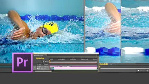
43:29 611:30 am - Introduction to the Adobe® Premiere® Interface
31:56 7Configure Preference Settings
22:47The Media Browser
10:03 9Capture and Import Media
37:09 10Reviewing a Clip
29:17 11Create an Edit
24:18 12General Q&A
14:18Day 2
13Editing Review
18:24 14Editing in the Timeline
35:10 15Trimming
36:13 16Organizing the Timeline
31:19 17Labels and Markers
14:18 18Transitions
24:57 19Introduction to Audio
31:26 20Audio Editing
45:36 21Mixing in Audition
26:51 22Audio Effects
37:41Day 3
23Normalizing and Syncing Audio
24:54 24Text Effects
38:12 25Blend Modes
14:48 26Motion Effects
43:07 27Filter Effects
34:28 28Chroma-Key and Lumetri Looks
19:56 29Color Correction
57:31 30Editing a Mini-Doc
41:09 31General Q&A
26:54Lesson Info
Chroma-Key and Lumetri Looks
I want to take a look at three categories or three things that this next section one look at Chroma Key, which is green screen making a background go transparent. I want to look at the loom, eh? Tree looks, which is brand new with the CC release and we're gonna spend as much time as we have available to us plus five minutes. I'm just warning everybody. Now we're gonna look at color correction. So let's take a look first at Chroma Key. And to do that, I'm going to go over to here first. A bit of background about chroma key. What we're doing with Chroma Key is we are taking a green background and we are making that green become transparent and we're replacing it with the background of our choice. In the past, we used to think about green screen as I have to like the foreground the same way I like the background. Notice our model here. I've got a perfectly lit green screen. There's no wrinkles. There's no folds. It's evenly lit from top to bottom. This is a professionally lit green screen...
, and she also is reasonably flat. Let I mean, there is some modeling to her face, but there's not a lot. But in point of fact, there is no relationship, no relationship between the way you like the foreground and the way you like the background. We'll see this in our second example. Today. There's several reels, several rules you need to keep in mind about green screen number one. You want the background to be a smooth and evenly lit as possible. You don't want to use fabric. You don't want wrinkles. You don't want folds. You don't want creases. You don't want cracks. You want that background to be a smoothest possible. Painting it on a background is a better thing than hanging any fabric. Second, you want that green background to be evenly lip. And the reason is we're keying out a specific shade of green and that green needs to be as as consistent across the entire background as possible. Third, and this is a biggie. You wanna have at least 10 feet of distance between the back of your talent and the back wall if you think about it. If I'm standing, this is me and this is the wall. If I'm standing next to the wall and that whole Wallace painted green with light that hits it. The green from appear is not only falling on my back, it's rolling over into my shoulders, giving me, Ah, green edge around my hair and over my shoulders, which means that I've got a really bad spill problem. It's gonna be really hard, correct. If I instead move myself 10 feet away from that wall, the only light that's going to hit me from that wall and the camera, which is right here, the only light that's going to hit me from that wall is going in a straight line. I'm not gonna have any curving over my shoulders. There's gonna be a clear delineation between where my shoulder ends and where that green background starts. The closer you get to that green screen wall, the harder your key is gonna be. The more unevenly lit that wall is, the harder your key is gonna be. The more ripples and rolls when Faye and folds you've got in that fabric, the heart of the key is going to be remember. Our job in this class is not to make our life difficult. It's to make our life simpler. Now there's a really good chroma Kier inside Premiere called Ultra Key, and we're gonna be using that for this particular example. But give yourself a running shot at success 10 feet away, evenly lit, smooth surface. So this is, Ah, clip I have from Istock Photo and it's ah ah model. And this is a really bad example of something that's difficult to key. She's got big hair with individual follicles of hair flying out in all directions in the past. We just sort of give it up is a bad job because it's just too much detail. Here's how this works. A chroma key always consists of two layers. There's the foreground later, that which has the green and a background layer. The background layer always goes on V one. The foreground layer always goes on. V to foreground has got the green screen background. Doesn't we always apply FEC's? We always apply effects to the top layer, so I select are green screen layer, and I'm going to go over here to the effects palette, and this time I'm not going to search for it. I want to show you what all we have available. I'll go down to video effects, and these are all the different categories we have to work with. In my case, I'm gonna go to the keying category. And although there are ah lot of options for keying, there's Onley one you should use. And that's the ultra key. You drag the ultra key on top of the V to clip and let go, and absolutely nothing happens because the default setting of the key here is that it doesn't know what the background color is. So we go up to the effects controls tab, and let's just take a quick look at this setting here. Output determines what we're going to be seeing as the result of that filter composite means. We're seeing the results of adding, combining compositing those two clips together. Alfa Channel allows us to see the map. This is actually the most helpful part of this filter. Color channel is useful. I've never used it. Settings will just leave those out. The default. The very first thing that we want to do is we want to set the key color. So we're gonna click the eyedropper tool, and I want to kick click a color That's nearer her face The hardest part two key is hair by far, Harris the hardest. So I want it. And that which we look at first, is someone's face. If I've got a key that's tearing out around their ankles, most people aren't going to notice that if I've got a key tearing out around their face, they're going to spot it in a heartbeat. So you want to sample the green, which is near the face, but not so near. We're gonna pick up some hair or skin. So I'm gonna click here and I sample the green and that quickly, I've got a key. Now, I've got a little bit of spill here about living a green comin through here, but just us a single click. If we take a look at this, that's ah, pretty good looking key. You can see the green right about there. We have a little spill control, a little bit of spill coming in here. A little bit of a green edging will come back to that in just a second. So what we do once we've got this initial key pulled is we switch from composite toe Alfa Channel inside Alfa channel. Our goal is that which is supposed to be opaque must be solid white. That which is supposed to be transparent, must be solid black, and you want as few shades of grey as possible. Now you could twirl down each of these triangles, and you discover a whole lot of different controls. But there's only three for right now that you need to concern yourself with. We adjust the density of the foreground by adjusting transparency as I click. Hold on drag transparency. Notice how I start to see shades of gray appear in that image. Your goal is to make sure that there are no shades of gray. You want to find the point where all shades of gray and they lose their lost last in her hair. You want to get all the shades of grey to disappear in the background. If the background is dusty, has flecks of white in it. You adjust the shadow until the background is solid black, so you adjust the shadow until the background is solid black and the transparency until the foreground is solid white and do it in the order of adjust transparency. First, adjust shadow second, then we're done with the mat correction. Go down to spills, suppression and in spill suppression. This is how you get rid of that green cast. It's the spill setting to see it. We're going to go back to composite. If I grab the spill setting a dragon heavily in one direction or the other, we're gonna have a strong green cast at zero on a strong magenta cast at 100. Because green, as you're gonna learn in about half an hour, the opposite color to green is magenta. And so we add opposite colors to get the colors to cancel. I'm gonna add just a little bit of, ah, spill suppression to get rid of that green that's in the hair. And now when I press control Tilda, we've got a really nice key with her hair king, and it looks yes, you look wonderful. So that how we do a key Except this is what we would traditionally call chroma key set up. I want to show you a different chroma key. Set up something that takes advantage of the power that chroma key provides. This is, uh, this is Lisa. And again we have a professionally lit background. Look how smooth that green is. It's actually painted green on a plaster wall with no texture and the plasterers smooth as we could get it without having it be glossy. But look at the lighting that Lisa has much more dramatic much mawr, N. C. I. S. And what she's doing is she's looking off camera and she turns and looks at us. This is definitely evil. Villain time now. A couple things that's cool about this is, although sees she's in the center of the frame. She need not necessarily be centered in the frame, and you'll see this in just a second. So let's chroma key. Lisa, we're gonna go back to the effects tab, Go back to the ultra key drag. The ultra key on top of Lisa grabbed the eyedropper tool click something near, but not on her face. And she's keyed against that blue go up to composite go down to Alfa Channel. Not bad. Twirl down Matt Generation tweak the transparency setting and we find the point where she goes solid white. Okay, find in shadows where shadows go solid black. I'm gonna try to hold a little bit more of her hair right about there and then switch back to composite and see what that looks like. Control. Tilda looks pretty good. I got a little bit of green right there with her hair. And so we'll close the map and twirl down spill suppression, and we'll just dial out a little bit of that Green control. Tilda. Good enough. For the moment, we would tweak that mawr if I had more time. But all we're gonna be doing is dragging the spill setting back and forth. But here's why. I think this is so cool. I'm going to disable the chroma key background and put her in front of a different background. This is the Yarra River at night. She wasn't shot at night. She was shot in the afternoon. She was shot in studio in near L A. But look at how the color on this side of her face is picking up the color of the river. Look how the cooler colors over here are reflected. All of a sudden, she looks much, much more in keeping with the key. By the way, that halo would be adjusted by changing the shadow detail. I'm going to skip that for right now. A couple of things I want to show you. I'm gonna grab the horizontal position for Lisa, click and change her position here. And I can move her over to there because there's no background that she's against. So now I can reposition her and have her turn and look at me. All right? I'll select my chroma key. See if I could get rid of some of that, uh, halo. There we go. Now, when we look at it, I pulled the shadow down and we got rid of that halo that was glowing around her. I got some green spill will adjust. That was spill suppression. All right, now it gets even better. Let's pick on something we learned earlier today. Okay, Give me that Really malevolent evil villain. Look, she does evil villain. Really? Well, I'm going to select my background clip. Go to the effects tab. Type in the word blur. Drop in what we've already realised. The best blurs the Gaussian Blur. Highlight that clip. Go to gloss, Gaussian, Blur, Bird, The black background. We've created an instant depth of field shot that looks like it was shot on a DSLR camera and yet the background was shot in Australia. The foreground was shot in L. A. And we composited the whole thing together inside Seattle. This is the power of the chroma key provides. We don't have to have flat lit stuff. We can take advantage of colors we can take advantage of, of shadows and shading. Because all we want the green to be is we want to green to be a solid green as possible. Flat, smooth, no wrinkles, no creases. And we're gonna make a transparent and drop in our own background. On top of that, this is very, very cool stuff. Is that not cool? Thank you. Where is this river? I'm sure. Where is this river? The Yarra? Why are runs through the center of Melbourne, Australia. The casinos are on the left and the downtown is on the right. And this is on a suspension bridge that goes over the river. Where's Tom? We need him. All right. Now let's, um let's do something different. There's something new with the CC release called Loom Entry Looks, and I'm gonna go back to some pawn five media and pull in our Grand Teton clip and pull in, Let's Go to Hawaii will pull into twin waterfalls here and we'll set an arbitrary in will set an arbitrary outlet. It that down to the timeline and everything fits as usual. I was not paying attention to my play head. Why does that not surprise me and we'll add the twin waterfalls. One of things were about to do. Starting about minutes is we're gonna take a look at color correction, but sometimes we either don't have time for color correction or we don't understand how color correction works. Jim, just toe ask you a question. Have you ever had a client that wants the sun and the moon and we'll pay you 50 bucks for it? Most of them, you know, when you think about it, what we're what we are is we are in business. And if the client has $100 that means that they should have $100 of your time. Doesn't mean it should have four weeks of your time. Remember? Good enough is good enough in the eyes of the client. Not good enough in terms of your eyes, Jim. I'm sure you could always make something better if you had the time, but in order to have the time, you gotta have somebody paying you for the time. Consequently, when you're doing your work, sometimes you just have to use a template or use of pre existing effect because they only have 50 or 60 bucks to do something that you could do manually. But it would take five or six hours and cost a whole lot more. What Adobe has done is they've taken the deep color engine out of speed grade and create a Siris of looks with it called the Elementary Looks, which are pre built color grading looks that you could achieve inside speed. Great. If a you knew how it worked be you had the time and she had the inclination to be able to do it. This solved several problems faster, better, easier, and it's It gets you in the ballpark. Here's how it works. Go to the effects folder. I'm gonna Taurel up presets, toilet video effects and you notice there's a folder here called Lou. Met Tree looks twirl down Lumet tree looks, and we can now see what the looks themselves look like. I would like to see that if I could open it. Oh, guys. Oh, you know, wife's there because I have the word blur there. Click off the word blurred Now 12 down the metro looks and the four elementary looks show up. Now, inside, When we 12 down, Cinematic, If I grab a black line, it allows me to scale my windows So Mr Scale issue can see what's going on. This is a short, small thumbnail that shows you what each of those looks looks like. So I'm going to grab the cinematic one look, which is ours. Chroma saturated, gamma reduced setting. Grab that dragon on top of Grand Teton and notice. I have a different look. It doesn't move the Grand Tetons out into the plains of Nebraska. What it does do is it simply enhances the color treatment, the grayscale treatment of that particular image. The source is on the left. The result of the look is on the right now. Scott, this is a hard question. You're ready for this? Yes, sir. Which tab do we go to that allows us to control effects. He affects him. Yeah. No, no, no, no. If that controls, that's much better. Good It's good, and I noticed that when you click the effect controls Tab and you were so close you almost won the new car as it is. I've got a bicycle for you. So we've got the effect controls Tab selected and notice there's a loo metric cinematic clip. There's absolutely no settings for this. I mean, yeah, there's a setting if you click here, but we're just gonna ignore that. There's nothing to change you, the likely you don't like. It's like a blend mode. So how do I delete it? We're back to where we were before. No harm, no foul. Let's try something different. Let's say we scroll down. This is a classic day for night. It's now night in the Grand Tetons. Now it isn't really night. We've just made it looked like night. And if we decide that we don't want it to be night, we want to be date daytime again. You highlight the name and look hit the delete key and it's gone. This is designed for people who need tohave. Their images look different, but they're not exactly sure how to go about doing it. Thes looks can be easily applied. De saturation. Which one? That I actually used quite a bit. Because I want to illustrate a point. I want to have maximum de saturation. Boom. Black and white. That's cool. And the, uh oh, we scroll farther down, we got style looks, we have a dreams. Look, this is what I think everyone dreams look like after they've been indulging a bit too much and or we've got a sixties look, A seventies. Look, we've got all these different looks that we can work with. You simply drag it over. And if you like it, keep it if you don't delete it. Jim. Yes, sir. Could it be any easier? I don't think so. Brilliant. I remember in the olden days we used to, like, put the blue filter on the front of the film camera. Do the nighttime shot? Yes. And what was the problem with that? Oh, well, just just never really. Well, there's a bigger problem with that. Once you shot the film with the filter in place, you can take it off, right? The benefit here is because the filters applied after the fact. Then if you don't like it, you can take it off for you can tweak it right now. These maybe thes thes are tweak herbal. But the basic idea here is to just take it work with it as is, if you like it. Great. If not, don't use it at all.
Class Materials
bonus material with purchase
Ratings and Reviews
Jfraz
I love this class. It is highly technically, but there is an awesome wealth of information to be had, even if you are a beginner. I've been struggling for a while, trying to look at YouTube videos and whatnot, but this class helped me make better sense of what I needed to do in all of my video editing. You get such a great foundation that's going to help you go further.
Valentine
I recommend Larry Jordan's course there is a lot of in-depth information that will help the beginner as well as the advance premiere editor. The only thing is that his humor is a big corky for my taste but if you look beyond that you get a lot from his teachings. He genuinely wants his students to succeed and get paid well in this field which its nice.
a Creativelive Student
This is one of my favorite courses on Creative Live. Larry Jordan teaches in a way that I can follow and is easy to stay focused on. He has a crazy amount of knowledge about this topic as do all the Creative Live teachers. I love this site so much, has done more for my business than all the other sites I have used combined. Keep it up CL!!