Lessons
Day 1
1Free Preview: Camera RAW: Exposure & Contrast
42:43 2Camera RAW Q&A
20:25 3Camera RAW: Color
23:03 4Understanding Histograms
07:57 5Camera RAW: Localized Changes
35:36 6Understanding Saturation Clipping
09:42 7Camera RAW: Noise Reduction & Lens Correction
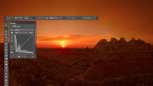
16:34Curves
44:44 9Curves Q&A
20:46 10Keyboard Shortcuts & Adjustment Layers
24:41 11Review of Curves & Adjustment Layers
16:13 12Hue/Saturation
19:08 13Day 1 Q&A
14:27 14Day 1 Wrap-Up
03:40Day 2
15Day 2 Pre-Show Banter
13:26 16Review of Day 1 Process
38:53 17HDR
33:41 18Advanced Layer and Masking Techniques
29:29 19Using Curves with Color
39:42 20Color Correction
35:04 21Color Correction Q&A
14:30 22Example Photos with Curves and Adjustments
25:09 23BONUS: Printing Tips
03:42 24Retouching
23:27 25Advanced Retouching
19:49 26Directing the Viewer's Eye
16:43 27Day 2 Wrap-Up
01:12Day 3
28Day 3 Pre-Show Banter
10:52 29Fixing Lens Flare
14:36 30Hiding Clouds
15:47 31Color, Hue, and Saturation
08:21 32Essential Keyboard Shortcuts
13:18 33Technical Issues
15:00 34Preparing Images for the Web
18:36 35Exposure Bracketing and Photo Stacking
15:52 36Blending Modes
35:07 37Review and Q&A
05:05 38File Formats
21:12 39Brush Tools
14:34 40Transplanting Clouds
20:39 41Selective Focus
18:00 42Converting to B&W
20:03 43Color Spaces
22:03 44Thanks + Credits
03:56 45Fixing Extreme Problems
20:33 46Sharpening Images
23:41 47Day 3 Wrap-Up
04:59Lesson Info
Converting to B&W
Another thing we might want to think about is converting the black and white. There are many different methods for converting in black and white, and usually there's no unnecessarily right method, meaning there's no universal method that works in all pictures. I have a strong preference for one particular choice, which I'll share with you in the end, but that particular choice you usually have to spend money on. And any time that's the case, I try to show you what else you could use instead, because if it's good enough, you know who wants to spend money all the time. Because, um, if it's something you do on Lee every once in a while, it just doesn't make sense to spend money. So anyway, the first place you could do it is here in camera, in camera raw. There, different tabs across the top. In one of those tabs eyes. This one here. That's the H s l slash grayscale tap. If I click there, there's a check box called Convert to Grayscale and that will pull all the color out of my picture. I ...
think in the preferences the default is that it might automatically hit the auto button for you, which is gonna automatically move the sliders a little bit but doesn't look like it did it here. There's an auto setting here, which I believe there's a preference that says, Do you want to automatically hit that when you choose black and white here? Since these are all zero doubt, I don't believe it did. So I'm gonna click the auto button that analyzes the contrast your picture, compares it to the color of the picture and tries to figure out if it could move. Some of these in this case is to a little s shape. But what this does is these various sliders will control how bright areas are that used to be read or used to be orange or used to be yellow where it used to be. Blue, that kind of stuff. You can grab each one of these and pull it up. If you need to brighten things that used to be read, pull it down. If you need to darken them and you confined to in the end result, see if you can get it to be more towards your liking, then here in camera. You can also add color back to your image. Excuse me. I take a sip of water. You can add color back into your image. And in fact, this isn't being processed with the current version of Photoshopped. Let me click on this little arrow. I didn't notice that I usually don't like straight black and white images. I like images. They have a little tone to them. Excuse me, and so you can add color back to your image. The way you do that here in camera raw is there's another tab right here that's known as the split toning. When you click on split toning, you tell it of a particular color you'd like to put in the highlights of your picture score one you'd like to put in the dark portions of your picture. And if I were to bring this up, let's say I want to put a color in the dark portion of my image. I wanna put to be a warm tone. Just moving this slaughter isn't gonna do anything at all to your picture because the saturation slider is going to control how strongly effect is. And that's currently at zero. So you're not get any strength at all. But once you start bringing up the saturation, you're going to start seeing the color showing up within your image. You can choose to put a different color in the bright portion, your image, and sometimes it can look into scene. If you put the opposite color in the bright, then this choice, called balance, controls what it considers to be a highlight in what it considers to be a shadow. What general tonal range should it consider? How far should this warming effect extended towards the medium brightness tones in your picture? And so I could move that around to really influence how much of the image is going warm vs Cool. And so if I end up converting to black and white using camera, then it's usually by using the choices under the HSE L tab, moving these sliders to get what I like. And then afterwards, going to the split toning area to add a little hint of color back in. Because I find if I have just a strict black and white image, it just doesn't have ah ah, warmer, cool feeling to it. I like it more when it's not perfectly neutral, so That's one place we could do it. I'm gonna reset this and I'm gonna hit open image. If you want to do something similar and you're not working with raw file or you don't decide to do it until you've already come into photo shocks, you needed to do retouching and other things. Then to do the equivalent. Here in the main part of Futter shop, you could go to the image menu. You can choose adjustments, and you can choose black and white, although that would apply it directly to your picture. If you go to the bottom of your layers panel, you can do an adjustment layer as well of black and white. With this, we have a similar interface where I have sliders for the various colors, and there's also an auto button just like before. Where can try to calculate what you'd like to dio and I can move these around. One thing that's nice about these kinds of controls that can first be frustrating is when you look at your picture, I can't remember what color various areas were. And if I want to get this area right in here to be brighter, what slider diagram without seeing the full color image again, it's hard to tell. I could turn off the eyeball icon at the bottom here and see that it's kind of a reddish purple. And then I would figure out which one of these sliders to move to brighten it. But the other thing you could do is just like when you're in curves. There's a little hand icon here, and that means that if I click on and then I move on top of my image and click, it should do something. With that adjustment. Wanna click? So I'll click on this object and it will figure out what color it used to be. And it'll move the proper slider to affect everything that is that particular color. Then I go to a different area, and if that's a different color, I can adjust it separately, which is really nice. You will find that certain areas who will be able to adjust like this one might not does just a little bit, and that would usually be something that would be a shade of gray. You know, if this was a white object, when you turn this off. Yes, those are white. It will try to figure out what hint of color is in them, and it will grab the slider for that color. In this case, there's a hint of science in there, but it's not gonna change it much because there is only the tiniest hint to scion in it. In here, if you'd like to apply a color, there's a tint check box. If I turn down, it'll out of color. If I click on the square that's next to it, I'll get a color picker, and I could choose what color that is. It's only a single color, though, unlike split toning in Kameron, where I can have different color for the highlights. Different color for the shadows. But neither one of those processes are my favorite. When it comes to converting to black and white, let me show you my favorite is, and unfortunately you have to pay money to get it. And that is, if I go to the filter menu, there's a choice here called Nick Software. It is called Silver Effects Pro. But the reason why I want to show it is because oftentimes what is something you have to buy? I just mention it. I won't show it to you because you can go and investigate yourself this, though, If you see it, you won't want to do it any other way, and that's why I want to show and see it. It's only when it's that kind of thing, where it's so blatantly obvious that it's ridiculous to do it most other ways. Here's the interface on the left side, there presets, and it takes your picture and applies the preset so you could just grow through here and see if one of them gets you as close to the end result that you were visualizing a Z. You can. So I might go up here and I saw one. I think it might have been this one. I just click on it. It will apply that precepts the picture, but it's not just going to apply the preset. It allows me to modify all the settings related to the preset, and I'm not gonna go over every single slider in here because we'll be here for an hour. But I want to say just in general how much control you have if your images overall too bright or too dark Of course, you can adjust that, or if it's on lee, the highlights that are too bright or too dark. You could adjust that you can adjust the shadows separately. So if you need to bring out shattered detail, Midtown's all that kind of stuff. Just go down here further, Uh, I want to bring up my contrast. A little structure will be hard to see here, and that's why they give you this little area down the bottom. Notice the loop. The loop is where it's going. Teoh. Magnify your picture so you can see what it looked like up close in some of these things, you'd only see if he saw it up close. So if I bring structure down, you'll see that preview change. And if you watch it when I bring it up structure, you could think of a little bit like clarity in that. If I bring it up, it's going to exaggerate the textures within a picture. If you're used to doing black and white in the film, days used to be able to put different colored filters in front of your lens to effect the way they looked. You can click on any one of these. If you'd like to simulate, look of using different color filters, you can even tell it an exact color and strength. I mean, if you just look at the amount of control that's in here, turn that off. You can simulate different film types if you use the shooting and kind of film, but you can also just turn that off and ignore it. If you want a grainy black and white, you can end up putting in great. And then what I like also is down here. Finishing adjustments is you content. The photograph in these tents are not necessarily just generic one color ones. They can vary a little bit, so it starts off with neutral. But then I could just come in here in mouse, over these, and I see an instant preview on my picture of what it would look like with various colors, and it's just really nice to be presented in that way where I don't feel like I need to do that much work. I want a dark in the edge of my photo. I could do that. It's just the amount of control you get in what I'm done obviously click. OK, so if you compare the amount of control, it's in there to the amount of control that's in camera or is in photo shop. It looks like camera or photo shop didn't really try. You know, they added a some interesting sliders, but it looks like the solution in that plug in is like a professional level thing for people that convert to black and white and after using it, you want usually want to go back. And so, if you notice with other plug ins, I just kind of mention him and then say You can go look at him. But that's one particular one where if you do a lot of black and white, you gotta know about that product. And that is from Nik Software's and I, K. Um, software. Any questions about that here We to, um, see bananas. Asked. If we want to change an image of black and white, would you recommend that we do all the other required adjustments and retouching first or where with this? Where does it fit? In my workflow? I would say it could be helpful if you make certain adjustments to your picture ahead of time, make sure that if there's any highlight detail you need to get or shatter detail, it's best to do it ahead of time specially in camera raw. Because, remember, you can get extra highlight and shadow detail you can't get after you open it all the way. So in this particular case, if I wanted detail in these objects that were white, it would have been much more effective for me to do. That came a raw because there we can get extra highlight and shadow detail. Also, if we brighten up our shadows in camera, it can pull out more information than it came with this. I would also suggest that use saturate your picture a little bit more than you might usually saturating. The picture is going to separate the colors more and make it easier to be able to independently adjust one area from another. Also, even if you're gonna end up in black and white, it's actually important. Teoh. If you want the most control to color, correct your picture because what happens is if your picture is not color corrected. If it's too orange, then when you work with slaughters that work on the colors independently. It thinks most things are orangish, whereas if you color correct the picture, you get the most separation between colors. You can really get a lot more control over it. When it comes to retouching, it depends. There's a lot of things when it comes to problems like lens flare in small issues that I don't know if I'm gonna notice them after I convert to black and white. So I might put off doing them until after the fact. Uh, but if it's normal, big time or touching of getting rid of objects and things like that, I might do him ahead of time. Photo Shop will have more information to blend with when you're using the spot. Healing brush and other things might be able to do a little bit better job. So Michael J. Just had a question. Would like to know what you think about do or try toe Oh, and Photoshopped. It depends if you mean a true dual or tri tone, that would mean you're gonna print on a printing press and you're only buying two or three colors of ink. Uh, if that's the case, I'm not used to thinking of that when it comes to reproducing fine art photography kind of thing. I used to do that back when I was a graphic designer, and I wanted to save money on and therefore in a print, a brochure. And instead of buying Sigh in magenta, yellow and black ink to print with, I'm gonna buy black and whatever color I want to take my photos with. And if that's the case, then it could be nice. If you're talking about for converting the black and white and then adding the color back in and you're not printing on a printing press, you just gonna view it on screen or you're gonna print on your desktop printer or something like that. Then I'm not overly into the the duo tone try tone thing. I find you just unless you're overly good at thinking about curves in a Houston thinking about inks. I think that a solution like this is gonna be much better. Yeah, so I think that's kind of a similar question. Teoh nicely, Antonio says, is there are ways to do an image in two colors instead of black and white, like the image being only purple and yellow there is ways to do things only purple and yellow in which we could kind of go back and forth with the conversation. That question I would have is Does he mean purple and yellow ink? Meaning we're gonna print on a printing press that because it's a completely different situation compared to just visually having it look like it's going purple and yellow. I'm gonna go with visually, visually. Well, that could be split. Tony is one way. Another method is to do the following. If you go to the bottom of your layers and create an adjustment layer, there is one called Grady int map. Radiant map. Radiant map will pull all the color out your picture and then replace the different brightness levels that make up your picture with different colors. So let me choose. Radiant map in this little bar determines what is gonna happen to the various tones that made up my image. Whatever ends up showing up in the left side will replace what used to be black in the image which shows up on the right will replace what used to be white and so on. If I click on the little arrow that's next to it. I can choose presets. Most of these presets air ridiculous for this purpose, but some of them at the bottom might be interesting. Let's see what happens when I click between them. So there he wanted purple in, whatever got purple or whatever. The problem with this is that it's gonna change the brightness of your picture when you do this so things like your shadows will not possibly stay dark. So what I would usually do is if I was going to apply. This is before I start messing with it. I've created my adjustment layer. I would go to the menu at the top of the layers and change the blending mode of color if you remember color. But it means Onley. Allow me to change the color. Do not allow me to change brightness. So if I do that, I'm gonna keep my shadows nice and dark. I'm gonna keep my highlights nice and bright. And now I could go through these presets and see what it would look like with various ones. The top ones aren't really designed for working with black and white. Some of these down here, though, might not be as bad and you can always make your own. If you want to make your own, the way you do it is you click on the preview for this Grady in, just cook anywhere within it and you'll get an editor. And so, if I didn't want red in my shadows right here shows me the color of red. By the way, the way I got to that is I clicked in the middle anywhere in this this colored bar and here I can click on this double click on this little square That's red. And I can tell it what color I'd like to use when you make it a little less colorful. And I can double click on the one on the opposite side until what color to use their how colorful. And you can grab the middle diamond to control the transition. So it really depends what you're looking for without being will ask more back and forth. I don't know if I'm delivering at all what they want. Um, so does give you some sense that absolutely. And I think you showed us how you did black and white. But little had asked, Can you show us your second favorite way to do black and white. That is not third party software. The second way would either be in camera raw, which I showed you or what I did Ah, moment ago with that black and white adjustment. Meaning I did show you that first. So that's why did okay, great. Another thing. It could be interesting in his after you convert to black and white. If you do it, where in the Knicks off where it can deliver a separate layer. If you don't use the Knicks software instead, you use an adjustment layer of black and white. It would be on a separate layer to if you're not going to reproduce it using just black ink. You could also lower the capacity of that a little bit and just let a hint of the original colors come through. And I often like that look. It was just the tiniest into color
Class Materials
bonus material with purchase
Ratings and Reviews
Jim Pater
I taught Photoshop (version 5) to graphic design students at the college level. I had great fun teaching. This is the perfect course to show others how they might go about teaching a Photoshop course. Congratulations Ben, on your excellent teaching style and methods. I thought I already knew quite a bit about Photoshop but this course made me aware that there's always more that you can learn.
Ron Greathouse
This course is one of the best Creative Live Courses that you have made available to us. I have purchased at least 12 courses and this course is my personal favorite. Ben is an excellent instructor and should be teaching at the university level. He is great!