Lessons
Day 1
1Free Preview: Camera RAW: Exposure & Contrast
42:43 2Camera RAW Q&A
20:25 3Camera RAW: Color
23:03 4Understanding Histograms
07:57 5Camera RAW: Localized Changes
35:36 6Understanding Saturation Clipping
09:42 7Camera RAW: Noise Reduction & Lens Correction
16:34Curves
44:44 9Curves Q&A
20:46 10Keyboard Shortcuts & Adjustment Layers
24:41 11Review of Curves & Adjustment Layers
16:13 12Hue/Saturation
19:08 13Day 1 Q&A
14:27 14Day 1 Wrap-Up
03:40Day 2
15Day 2 Pre-Show Banter
13:26 16Review of Day 1 Process
38:53 17HDR
33:41 18Advanced Layer and Masking Techniques
29:29 19Using Curves with Color
39:42 20Color Correction
35:04 21Color Correction Q&A
14:30 22Example Photos with Curves and Adjustments
25:09 23BONUS: Printing Tips
03:42 24Retouching
23:27 25Advanced Retouching
19:49 26Directing the Viewer's Eye
16:43 27Day 2 Wrap-Up
01:12Day 3
28Day 3 Pre-Show Banter
10:52 29Fixing Lens Flare
14:36 30Hiding Clouds
15:47 31Color, Hue, and Saturation
08:21 32Essential Keyboard Shortcuts
13:18 33Technical Issues
15:00 34Preparing Images for the Web
18:36 35Exposure Bracketing and Photo Stacking
15:52 36Blending Modes
35:07 37Review and Q&A
05:05 38File Formats
21:12 39Brush Tools
14:34 40Transplanting Clouds
20:39 41Selective Focus
18:00 42Converting to B&W
20:03 43Color Spaces
22:03 44Thanks + Credits
03:56 45Fixing Extreme Problems
20:33 46Sharpening Images
23:41 47Day 3 Wrap-Up
04:59Lesson Info
Curves Q&A
So what I'd like to do is talk a little bit about how to get this to effect isolated areas. And that way it's gonna become much more useful, and you'll see why I apply it to a large number of images before I do that. Are there any general questions about just how the curve works? First of all, can we just I just want to acknowledge for you that chat room is on fire. The guys are going crazy in here about how much they're learning and how many lightbulbs air going off and having gold nuggets. Just the way that you have broken down curves for people is people haven't seen anything like it. I taught art for 34 years and supervised didn't teachers. Ben is a master. They're coming up with new names for the course fundamentals of raw sounds. Of what? Rock rock. Any questions? Yeah, I just I just want to say I'm, like, forget all the people out this'd is changing. My Yeah. This is changing everything for me. I can't believe this. How simple. And anyway, I can't say enough about this. Yeah, I ...
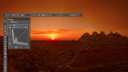
mean, I don't think it is good yet because we haven't The images haven't looked good when we're done yet. So once we get a little bit further, I think you might get more excited about well. And that's what people were saying. You haven't even reached the channels yet and they're still they see where it's going. All right, well, let's ask a question. Just at the beginning of this we talked at the beginning of this. A lot of people have asked, including photo graphics. Can you talk about what? The differences between tone curves and light room and curves and Photoshopped and can you do all of this same thing in light room with the curves? Can we use square that away? OK, you can do, in general these things in light room, but if you noticed when I was, um, done with most images, they didn't look exceptional necessarily. And I said that I apply them to isolated areas on most of my pictures. And that's the thing you can't do in camera, were light. Room is I can't take the adjustment brush and painted in where I want it, and that's when it becomes most powerful. And so, yeah, you could do a tone curve on something in light room or Kamerad. And you could do that if you want to bring out a little bit with detail in certain areas. But they're gonna be most likely small changes where you do a subtle change because otherwise something else somewhere else in the picture will screw up if you do, um, or extreme one. And so I find that I rarely do them in camera or light room and that it's when I get to photo shop where I can isolate areas very precisely, that I do it all the time. So So I just love again. Blown away by people's comments, Angie says. I canceled all my appointments for the next three days. We're getting an overwhelming response. So whatever you, whatever you're doing differently all right, very much appreciate it. All right, so a question from Fashion TV from Singapore. Any practical tips on handling curves adjustments to avoid the banding issues in our final images? Um, you got to be careful when they're smooth, smooth gradations and things, especially in skies. Uh, if you apply certain curves, you're gonna end up getting with those post or ization. It's another word for banding. It's more of the technical term for banning where it looks kind of stair stepped, where it used to look smooth in. That'll happen a lot. Mawr if you work with who was known as an eight bit image instead of a 16 bit image. So let me show you where you determine that when you're opening a raw file. People love the eight minute versus 16 minute conversation. Glad you're going. All right. So yeah, here I'm in camera at the bottom of my picture. There's some text that's underlined, and this text includes my color space That's here, which will discuss on another day, and then it says eight bit. And then it gives me the dimensions of the picture in pixels. Tells me how many megapixels that is. So on. If I click on that, then this will come up and right here. I determine how much information is sent. A photo shop when I opened this picture so I could have the choice between eight bit and 16 bit. Eight bit means 256 brightness levels, and that's enough information to make your picture look good on screen and look pretty darn good one is printed. That is, if what you got out of cameras, what you wanted. If, on the other hand, you want to make changes like we are, your picture is going to look a lot better if you choose 16. 16 bit means don't give me just 256 brightness. All those that's what's needed to reproduce the image. Give me thousands of brightness levels so that I have extra so that if a sky would usually vary in brightness from one side to the middle of the sky, let's say the difference in brightness is picking number. It's different by 12 shades of brightness. Well, if I go into curves then and exaggerate that, I can see a 12 step stair step if I if I was going to be banned in or whatever, I can see it because I can see those 12 steps of exaggerated. If I feed it. 16 minutes worth of information will be thousands of brightness levels and in that area that used to have 12 shades from side of the sky to the middle is now going to have maybe 200 shades, and now I can exaggerate that brightness difference in there, and I have enough information in the file to keep it smooth. So if what you got a camera is what you like, you finished the image in camera eight. That's probably fine. If, on the other hand, when you look at what's in camera, it needs quite a bit of adjustment. Afterwards. You want it to look radically different than what it did in raw. Then you want it set to 16 bit, so you have that extra information. So when you pull on it, it doesn't suddenly start doing banding. So that's the first place that I would think of. Just one warning about that is 16 bit files or twice as big. On your hard drive is eight bid files, and once you start adding layers, they become even bigger than a PID files. So you're making a commitment to bigger file sizes, but I think it's worth it. And if I opened my laptop and I go in here, this would be set to bit for all the images, I hope because I very commonly do more radical curves. You can sometimes tell if you were getting the banding where, if you should at least inspect your image to see if it's present in the way that you do that is, you open up a hist a gram. If you go to the window menu, there's a choice of hissed a gram, and if you choose that, you can get this guy now. This is similar to the history Graham that you'll get in camera, and that means you look at the grey area in this case to think about tonality. You look at the color area to think about color, and when we're talking about curves most the time we're thinking about the gray area. If the hissed a gram looks solid, continuous, then you're fine. If, on the other hand, the history Graham starts breaking apart and looking like a comb where there's gaps in it, then that means instead of having a smooth transition from one shade to the next, you have an abrupt one, and you don't have the shades in between. So if you're hissed a gram after you've adjusted, your picture looks like a solid shape. You're good you have. If you have this brightness level, you also have the one that's one shade darker, one shade darker and one shade darker enough for smooth transition. If, on the other hand, your history am starts looking like this where it's not a solid mass, instead it looks like a comb. Then it means I have this brightness level here, but I don't have the one. The little spit brighter in the little spit. Brighter and little desperate. Brighter. There's a big jump between this one and the next one. There's a gap in here. That gap is where you it means that you are most likely going to start seeing post or ization stair stepping in. Look in your picture wherever you would have a smooth transition from one shade to another. Similar shade across a large area sky is the most common, and if you get the the comb kind of history ram, then inspect that. See if it ends up looking that way. If you can go back and work on a 16 bit version of that image instead of an eight bit, because that's what happens with eight bit ones. If you can't if you're stuck with it, add noise because what happens is if you have a sky and it was dark over in. This side is bright over here. This is area of your sky and it starts looking like has banding where it's stair stepped, where each one of these is a different color and you can easily see that line. Adding noise breaks up this line. It makes it harder for your eye to see it. And so if you add noise, you end up just visually breaking it up. You want a noisy image, but you'd rather have a slightly noisy image that one that has banding but 16 did. It's the main thing that will save you there. Yeah, it doesn't matter if you shoot 12 or 14 raw. How does that translate its? That's where I'm confused. OK, between eight and 16 bit. Yeah, I actually have to look at the numbers because in the in my brain, I don't have on the top of my head. What 12 or or versus 14 bit is If anybody is on the great Google, you could type in 12 bitten in 14 bit and tell me the difference in the numbers. But the way bits work, you just have to do a little math is one bit means you could have something either on or off. It's like a light switch. Two bits. Each time you bring this up by one, you double the number of choices. So on and off means you have two choices. Two bit should be four choices. Three bit should be eight choices. Four bit should be 16 choices. Five, six bit, 64 7 bits that 1 28 and eight bit to 56. There's no bits work, um, in So JPEG files are always a bit you're always ending up with just the amount you need to make it look good on screen or print. Okay, no extra leeway. So if you're saying talking about your camera setting, that would be higher. Would you have to have just have to keep this? Not these numbers going so nine bits would be 5 12 10 bits would be 1024. 11 bits would be 2048 and 12 bits would keep it going, you know, each time you're doubling the amount. So if you're difference on your cameras, the difference between 12 bit and was at 14. Yeah, yeah, it's going to be a lot more information. The problem is, each time you double this number, like from 8 to you double your final size. So if you're going to start bumping him up even higher file sizes, they're gonna be bigger. Gilmore information. So I would say, if you notice that you get post or ization after making some of Jospin's like your skies don't look smooth, Um, then you might consider bumping up that setting on your camera. But I haven't tested it enough to really give you a definitive answer of bat. Should everyone do that or not. So I would simply say, if you notice post or ization when you're printing your images or when you see them on screen, consider bumping that up and see if it improves the so when you bring in a 14 file into, say, photo shop or or even light room. Where is it in your editing and 16 bits? Where is it gathering the other information from? If it's not there, there is. It's not gathering other information. It's like having a 16 space garage for cars, and you only have 14 cars in it. It's just it could contain 16 bits and to be honest, it only contains contain 15 minutes because the extra bid is used for other kind of math. But all it means is I can have an eight bit file in a 16. 18. I have eight bits worth of information in a 16 bit file. Just converted 18 8 bit image to 16. It didn't add any information. It just made it. So you could have more if you did something to your picture to add those shades, like put a Grady intended or something. But so, yeah, just because you're in 16 bit mode doesn't mean that you have 16 bits worth of data. If you start out with J Peg file, you have eight minutes with the data because that's all J Peg can handle. And so converting a 16 bit doesn't really give me anything extra. You want to start with something that had that many bits? As many as you can. Yeah. Ben. Yeah. Just in case you were unaware of the impact you're having on people. You have several marriage proposals. I'm sorry. I'm engaged. Uh, you know that? Sorry, Karen, You didn't hear that? No, she's not. Sorry. She's happy. Hey, like I already got him. Yeah. Do you want to move on or should we do a little bit more and more questions? I'm fine. Um, so many great questions coming through. It's hard to choose them. And Kim photo from Norway had asked if we could do curves like this on a portrait of a person. I don't know if we're gonna get to that, but, um, Bob Dell said, Can you discuss the relationship between color and tone shifting? One always affects the other, but I don't understand the relationship. Okay, I can talk about briefly. I'd like to get into adjusting color, uh, possibly tomorrow, just cause that I want overwhelming too much today. If we get a chance, we might do it today. But in general, anytime you dark in a picture, regardless of what tool it is you're using to darken, it could be brightness and contrast levels could be anything. You'll find that the saturation of the image goes up and so sometimes is you darken image. The image becomes too colorful, and then you need to do an additional adjustment to deal with the color when it comes to curve. Specifically, if you in curves. Leave this menu that's found right up. Trump's up here. That thing to RGB. You're attempting toe Onley. Adjust the brightness of your picture. It's when you click here and change to one of these three that you're gonna just color. And that's what will most likely talk about later, and that's when we might apply it to portrait. It's more to tweak the color. I love going to these if I have somebody with sunburn, and I need to make him look normal, that kind of stuff. Unfortunately, I don't have a picture of somebody with sunburn that I have the rights to use here. I might see if I could locate one or something. I'll actually no. I do have those Russian guys on the park bench. I can use those cats and get rid of their sunburn. But we'll do that using these choices here. So as long as you leave that on RGB, we're trying to adjust. Just atonality mean the brightness of your image, and if you find that it changed the color, it's because you did one of two things. Either darken the image, which is gonna make it more colorful or party or curve went downhill instead of our pill, which inverted your colors, gave you the opposite color. And if you want to prevent that from happening, what you can do is the following. I'm going to see if I can dark in this image, right click on the little hand, if you can tell, this is becoming more colorful here as I darken it. Click OK, and then immediately after I apply that I could go to the edit menu. And there's a choice called Fade Under the Edit menu is called Fade in Fade always talks about whatever you did immediately before that, so in this case, it says fade curves. So I'm gonna choose that. And now I can either lessen the adjustment by lowering the opacity. It just means back off on my adjustment or right here. I think she's a mod to apply it in in this can limit how it can affect my picture and with adjustments. One of the main choices that I use here is the bottom choice, called luminosity. Luminosity is just a fancy word for brightness, and if I set this toe luminosity and you watch the picture, do you see that the wall didn't get his colorful now. So when it's central luminosity, it means Onley be able to change the brightness. Do not be able to mess with the color. And so that way I can dark in the image, and it won't become more saturated now if you're using an adjustment layer, which I usually would do. We just haven't talked about adjustment layers yet. Fade command would not be available because all the fade Command is doing is offering you two choices that if you used an adjustment layer, those two choices would appear right here at the top of your layers panel. So once we talk about adjustment layers and we start using adjustment layers, you don't need to use fade. You just change this opacity or this menu right here. Um, and so that's one way you can deal with that. Let me see if I can find a more colorful image to just give you a better sense for what it's doing in curves. I'm gonna make the curve go upside down, for the most part, and that inverts the picture makes it a negative. Same, misusing the invert command under image adjustments click, OK, and then I'll come over here right afterwards and fade it. Enough said it to luminosity. So now it can only affect the brightness. It can affect the colors, so that means if you could affect the brightness, it should. It should give me my original colors. Yet give me the brightness change that I requested, which means things that used to be a black and white things that used to be white or not black, but the colors air. What they used to be looks kind of weird, but you could do that works with any kind of adjustment. If you ever do any adjustment or if you run a filter and you found the filter shifted the colors within your picture. For instance, Filter stylized in Boss. It'll make everything look gray and shift colors around, but can look cool. Okay, but I want my original colors so fatum in use luminosity. So all can affect is the brightness. Those were the original colors. You might not be used to see them that vivid and stuff, but with the boss effect. Not that I really need that look like you say. No, it's not just adjustments
Class Materials
bonus material with purchase
Ratings and Reviews
Jim Pater
I taught Photoshop (version 5) to graphic design students at the college level. I had great fun teaching. This is the perfect course to show others how they might go about teaching a Photoshop course. Congratulations Ben, on your excellent teaching style and methods. I thought I already knew quite a bit about Photoshop but this course made me aware that there's always more that you can learn.