Lessons
Bootcamp Introduction
16:22 2The Bridge Interface
13:33 3Setting up Bridge
06:55 4Overview of Bridge
11:29 5Practical Application of Bridge
27:56 6Introduction to Raw Editing
11:00 7Setting up ACR Preferences & Interface
07:39 8Global Tools Part 1
16:44Global Tools Part 2
20:01 10Local Tools
22:56 11Introduction to the Photoshop Interface
07:13 12Toolbars, Menus and Windows
25:07 13Setup and Interface
11:48 14Adobe Libraries
05:57 15Saving Files
07:39 16Introduction to Cropping
12:10 17Cropping for Composition in ACR
04:44 18Cropping for Composition in Photoshop
12:40 19Cropping for the Subject in Post
03:25 20Cropping for Print
07:34 21Perspective Cropping in Photoshop
07:11 22Introduction to Layers
08:42 23Vector & Raster Layers Basics
05:05 24Adjustment Layers in Photoshop
27:35 25Organizing and Managing Layers
15:35 26Introduction to Layer Tools and Blend Modes
21:34 27Screen and Multiply and Overlay
09:15 28Soft Light Blend Mode
07:34 29Color and Luminosity Blend Modes
12:47 30Color Burn and Color Dodge Blend Modes
07:43 31Introduction to Layer Styles
11:43 32Practical Application: Layer Tools
13:06 33Introduction to Masks and Brushes
04:43 34Brush Basics
09:22 35Custom Brushes
04:01 36Brush Mask: Vignettes
06:58 37Brush Mask: Curves Dodge & Burn
06:53 38Brush Mask: Hue & Saturation
07:52 39Mask Groups
05:52 40Clipping Masks
04:11 41Masking in Adobe Camera Raw
07:06 42Practical Applications: Masks
14:03 43Introduction to Selections
05:42 44Basic Selection Tools
17:41 45The Pen Tool
11:56 46Masks from Selections
04:22 47Selecting Subjects and Masking
07:11 48Color Range Mask
17:35 49Luminosity Masks Basics
12:00 50Introduction to Cleanup Tools
07:02 51Adobe Camera Raw
10:16 52Healing and Spot Healing Brush
14:56 53The Clone Stamp Tool
10:20 54The Patch Tool
06:38 55Content Aware Move Tool
04:56 56Content Aware Fill
06:46 57Custom Cleanup Selections
15:42 58Introduction to Shapes and Text
13:46 59Text Basics
15:57 60Shape Basics
07:00 61Adding Text to Pictures
09:46 62Custom Water Marks
14:05 63Introduction to Smart Objects
04:37 64Smart Object Basics
09:13 65Smart Objects and Filters
09:05 66Smart Objects and Image Transformation
10:57 67Smart Objects and Album Layouts
11:40 68Smart Objects and Composites
10:47 69Introduction to Image Transforming
04:34 70ACR and Lens Correction
09:45 71Photoshop and Lens Correction
14:26 72The Warp Tool
11:16 73Perspective Transformations
20:33 74Introduction to Actions in Photoshop
09:27 75Introduction to the Actions Panel Interface
05:06 76Making Your First Action
03:49 77Modifying Actions After You Record Them
11:38 78Adding Stops to Actions
04:01 79Conditional Actions
07:36 80Actions that Communicate
25:26 81Introduction to Filters
04:38 82ACR as a Filter
09:20 83Helpful Artistic Filters
17:08 84Helpful Practical Filters
07:08 85Sharpening with Filters
07:32 86Rendering Trees
08:20 87The Oil Paint and Add Noise Filters
15:08 88Introduction to Editing Video
06:20 89Timeline for Video
08:15 90Cropping Video
03:34 91Adjustment Layers and Video
05:25 92Building Lookup Tables
07:00 93Layers, Masking Video & Working with Type
15:11 94ACR to Edit Video
06:10 95Animated Gifs
11:39 96Introduction to Creative Effects
06:08 97Black, White, and Monochrome
18:05 98Matte and Cinematic Effects
08:23 99Gradient Maps and Solid Color Grades
12:20 100Gradients
04:21 101Glow and Haze
10:23 102Introduction to Natural Retouching
05:33 103Brightening Teeth
10:25 104Clean Up with the Clone Stamp Tool
08:07 105Cleaning and Brightening Eyes
16:58 106Advanced Clean Up Techniques
24:47 107Introduction to Portrait Workflow & Bridge Organization
14:47 108ACR for Portraits Pre-Edits
21:27 109Portrait Workflow Techniques
18:46 110Introduction to Landscape Workflow & Bridge Organization
12:17 111Landscape Workflow Techniques
37:36 112Introduction to Compositing & Bridge
06:59 113Composite Workflow Techniques
34:01 114Landscape Composite Projects
24:14 115Bonus: Rothko and Workspace
05:15 116Bonus: Adding Textures to Photos
07:05 117Bonus: The Mask (Extras)
05:18 118Bonus: The Color Range Mask in ACR
04:54Lesson Info
Practical Application: Layer Tools
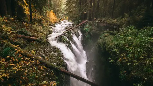
This is a much better looking version of that Seattle photo, from before. I kind of pre-baked it a little bit for you here. This would be, what I could consider a good quality photo, before going on to things like color grading. So, I have this work flow that I do. It's tone, color, artistic effects. Tone, color, artistic... I've gotta say it twice every time I say it. But, I modify the tones in the image, and I do that in Adobe Camera Raw, more than likely. Sometimes I even do it in Photoshop. And then I modify the colors in the image. And that right there, to me, could be what could be referred to as a technically good photograph. That would be, if you're a technician of photos. There's a difference between a technician of photos and an artist. A technician would get this to a point where they're like, "Yep, that's acceptable. It's poster quality, good to go." But the artist comes in and says, "Wait a second. "No, no, no. This isn't quite where I want it to be yet. "I need to push th...
is a little bit further." So, this is the transition of this image. That's why I'm showing you this image versus the one that we had before. It's also usable, it's downloadable, for you as well. So I'm gonna go ahead and I'm a do the color burn and the color dodge. But I'm gonna incorporate a couple of different things with that. So, let me go ahead and go to the color fill. A nice solid color. And I'm a change this to a magenta color. Press okay. And I'm a change this blend mode to something like soft light, just to see what happens. One of my go-tos, often, is soft light. Just as I'm thinking about the process because it makes bright areas brighter, dark areas darker, and doesn't affect them to much in between. After I do soft light, I then can adjust the opacity. Cause this quite a bit coming through here. I'll just go ahead and drop this opacity, just a little bit, to about there, looks good, about 50%. Notice what I'm doing here. I'm making this look like a much more robust, beautiful magenta sunset, then it actually was. Because here's the deal, the last time I was out here, for Olympic National Park, I had one chance to go to this park and shoot this shot. And when I went there, I was like, "Yes, I'm gonna "get the greatest sunset ever." That's what we always say to ourselves, and it never happens, right. It's always the times where I'm doing dishes and I look out the window, and I'm like "Ahhh, why am I not out there?" But we get to be the artist. We get to be the one that decides what the end user sees. They don't see the process that we went through to get here. They just see, "Oh my gosh. "What a beautiful image." And memories are kind of interesting. So, memory in terms of, and I'm going on a little tangent here, but you'll see how this plays in. I've got brothers and sisters, and any time you ask them, "Hey, remember what happened when we were six?" And they're like, "Oh, yeah. This happened." And I'm like, "No, this happened." And my sister is like, "No, this happened." And I'm like, "Wait, no, no. You guys got it all wrong. "This is what happened." And then we go to our dad, and he's like, "No, no, no. You guys are all wrong. "This is what happened." When it reality, nobody really knows. So if the sunset happened on the Seventh, nobody really knows. Get it? So you can do whatever you want to these images. That's what I'm getting at there. Memories are subjective, and the sunset is subjective. They don't know that this March 7th, at 2018, and this is what the sunset looked like. I'm giving you justification. All the justification in the world to make these adjustments. If you needed any, you have it. So, what I've done here, is I've done a soft light blend mode. That's a calculation, to make the areas in the image a little bit more on the magenta side, and the highlights a little bit more on the magenta side, in the dark areas, but not make the whole image all magenta. Then I drop the opacity to 50%. So what else do I have options for here? I've already done soft light, I've already done opacity. I have the option of blend diff. So if I double click on this, I can blend diff to make sure that this only affects the sky. So I'll move this over here, and if I click this and move this over, notice how the city skyline area of the image is preserved. Right? Move this over. But the highlights exist within the sky. So I'll push this over as far as I can. Press alter option, split and feather that over. And now what I'm doing, is I'm getting a really nice transition between that magenta sky and how it fills all of the highlight areas that you would technically see anyway in a sunset. Right? You got a nice beaming, magenta sunset. All the highlight areas are going to have a magenta cast to them. So I can drop the opacity. That's a little bit too much, we can drop the opacity. So there, we'll just double click this and call this "highs" for short. Cause that's our highlight areas. Got a nice, good transition on those highlights. Now let's do one. Let's do an analogous color scheme here. And we'll add another color fill. And we'll select a darker blue. How about right there. Press okay. So here we'll go and we'll change this. Let's try soft light. See what we like there. And let's try color. Let's do color. We'll do color and we'll drop this opacity down, to get... And really, what I'm doing is, you might be thinking, "Well, the whole image is blue." But, yeah, you know, what I'm thinking about here is my shadows. I've done my highlights, let me do my shadows. So what am I thinking about? What am I looking at? What is my biggest concern right now, when it comes to this blue? It's nothing that's going on with the rest of the image. So don't just say, "Oh, well I changed the color "and it didn't work." Well, drop down that opacity, see what those blues look like, with a nice lift, or the blacks, the shadows. A nice lift of those shadows while adding a little bit of the color blue. If I double click this, I'll call this "shads" for shadows. And now, I have opacity set. I have color set. What else can I set? Blend diff. What do I want to protect? The highlights. So, if I double click this, I can move this over. And I can move this over, so that it protects all of the underlying layers, highlights, to give me a nice, smooth transition, in that image between areas of light and dark. I can go probably a little bit further. Bring this over. I usually bring it over, until I see what I like, then alter option, split feather over. And there we go. So now, look at that difference. Two color overlays. One set's a magenta, one set's a blue, to give us a nice analogous color scheme to this photograph. But it can be dramatically altered at any point. If I double click this blue, I can now change this to maybe a deep red, or a deep orange, like a blood orange. Then double click this magenta, maybe change this to cyan. The magic is gone. I'm almost back to normal. You see the difference there? Color makes a world of difference, in your images. Especially, when you're using those colors in conjunction with things like blend diff, and soft light, opacity. And it's not a drastic change. We're not trying to make drastic changes here. So, let's go ahead and change that back to magenta cause I really liked the way that looked. Change this back to blue. We're not going for drastic changes, we're just going for nice, subtle changes that build up on top of each other. If I want to take this even further, maybe I want the luminance values in this to be a little bit brighter or a little bit darker. I could add a curves adjustments layer. And this would be just basically a contrast adjustment. I can make the whole image a little bit darker, to kind of get that evening kind of feel. And bring up those highlights, so it's not so dark in those highlights. And if I don't want this to affect the color work that I've done below, I have another application for that. Right? I have that application, or that blend mode, of luminosity. So now the colors are not being affected by that curves adjustment layer. The color work that I already did down there, is not being affected at all, by what I'm doing with that curves adjustment layer. And I've got a nice, beautiful transition, with darker darks, but still with the same color that I just applied to, below. And if I wanted to, I could even blend diff with this, as well. So maybe, drop the opacity a little bit here because it's a little bit dark. Double click. And if I really wanted to make sure that this is not affecting my highlights, and only affecting the darkest dark areas of my image, what can I do? Protect all the underlying areas, highlight areas. Alter option, split and feather. And while I may not be able to see that, I can turn that cover overlay on, and that's what I'm actually protecting. If I go back into those blending styles, blend diff, right to there. That's the only place that that curves adjustment layer is now affecting. Alter option, split and feather it over. Perfect transition. And if I turn that cover overlay off, there's the before. And then if we turn all of these on. Cool thing about layers too, we can discuss this, layers are really cool. You can like, zip. So, if I zip from down here, up here, all of them come back on. If I zip from down here, they all turn off. And again, alter option will just, singularly turn one of those layers on and off. So I know we covered a lot. We covered all of the layer tools, that I call them. And we discussed them as basically, cell phone applications. At the root, a cell phone can only make a phone call. But when you put these applications into it, it can do anything under the sun. Same thing with a layer. At it's root, it's just a layer that sits on top of all the other layers. But when you get into the little applications of it, you can change and manipulate that layer to do many different things that happen in one layer. Now, what I really want you to grasp from this is some of the effects, these are three layers that are creating this effect. If you didn't know how to manipulate your blend modes, and your opacity, and your blend diff, like that, this could take 15 layers to achieve the same result. So one layer, when you use things like blend modes, opacity, fill, blend diff, you have access to all kinds of things in one single layer. Instead of having to 15 to 20 different layers to get the same effect. So do we have any questions? So how would you now save this image out, for a presentation or a print? It's perfect, a perfect question. The question was, how would I save this out for a presentation or a print. It depends on what I'm doing. Some printers want a TIFF file. If they want a TIFF, I would save down a flattened version of a TIFF because a TIFF can also contain layered data. And maybe I don't want them to have my layered data. Some printers want JPEG. If I was gonna just save this out as a JPEG, I would just flatten it down and save it as a JPEG. The cool thing about JPEG and saving in Photoshop, is that you don't actually have to flatten it. I could just go up to file, save as, JPEG, and it would automatically do the flattening process for me. That's a really important thing to understand too because if you flatten this work down and then maybe this is a PSD, and you save over it, all that work's gone. So make sure that, you know. So, if I'm printing, it's gonna go to JPEG. If I'm doing client, if I'm sharing with a client, say it's a portrait shoot, I might use the "save for web" feature to make sure that I bring that into a smaller version, for them. Which we covered that in the set up and interface. So, those are. Yes? So I'm looking at that image, and the thing that of course attracts me, is the mountain. Mount Rainier. How would you make that mountain pop a little bit more? That's a perfect question and when we get into masking I'm a show you exactly that. What I would do, is I would do very similar things. Notice how, when I talked about these applications, I'm missing the fourth application, which is what we're gonna get into with masking. And with masking, that's where I would do very similar things to what I'm doing here, and then paint areas around it. So that area only affects that mountain. We'll get in to that, though. Yes, ma'am? And then, I kind of didn't understand quite well the this layer and the underlayer. What is the difference between those two? And how do you know which one to chose? Right. So the questions was, what's the difference between this layer and underlying layer? And this layer and underlying layer, let's go ahead and just open that up, real quick. One more time, so you can see that. I believe that was this one, right here. So, this is what we use for this layer and we use for underlying layer. So if I double click on this and look at the layer styles that are happening here, this is a very easy thing to look at because of the nature of it. This is a black and white photo, so it's very easy to see what blend diff is doing here. But with this layer, if I press, if I just move this over, this is saying any blacks, in this layer, just remove it. Okay? This is saying any whites, in this layer, just remove them. Temporarily, obviously, because it's blend diff. But now, if I say underlying layer, whatever's underneath that layer will start to show up. You're saying, allow the underlying layers to show through this layer. Or protect the underlying layer, from what I am doing to you right now, with this layer. That is the hard part to wrap your head around. That's why, a lot of times, I don't use this top slider. I typically use the bottom one because I'm thinking of everything that's happening below that layer.
Class Materials
Bonus Materials with Purchase
Ratings and Reviews
a Creativelive Student
Amazing course, but don't be fooled into thinking this is a beginner's course for photographers. The problem isn't Blake's explanations; they're top. The problem is the vast scope of this course and the order in which the topics are presented. Take layers for example. When I was first learning Photoshop (back when we learned from books), I found I learned little or nothing from, for example, books that covered layers before they covered how to improve/process photographs. These books taught me how to organize, move, and link layers before they showed me what a layer was actually for. Those books tended to teach me everything there is to know about layers (types of layers, how to organize them, how to move them, how to move them two at a time, how to move them two at a time even if there are other layers between the two you're interested in, useful troubleshooting tips, etc. ) all before I even know (from a photographer's point of view) what it is the things actually do. The examples of organizing, linking, and moving mean everything for graphic designers from Day One, but for photographers not so much. Blake does the same thing as those books. Topics he covers extremely early demand a lot of theoretical imagination for a photographer who doesn't already know quite a bit about what he is talking about. Learning about abstract things first and concrete things later only makes PS that much harder to understand. If you AREN'T a beginner, however, this course is amazing. I thought it would be like an Army Bootcamp, taking you from zero and building you into a fit, competent Photoshop grunt. Now I think it's more like Army Bootcamp for high school varsity jocks. It isn't going to take you from the beginning, but the amount you'll get out of it is nonetheless more than your brain can imagine. I've been using PS for years to improve my photographs, and even to create the odd artistic composite or two. The amount I've learned in the first week is amazing, and every day I learn something -- more like many things -- which I immediately implement to improve my productivity and/or widen the horizons of what I can achieve. If you ARE a photographer who's a Photoshop beginner, I'd take very seriously the advice Blake gives in the introduction: Watch one lesson, and practice the skills and principles you learn in that one lesson for two weeks. THEN watch the next lesson. You can't do that of course without buying the course, so it's up to you to decide whether you'd like to learn Photoshop and master Photoshop all from the same course. Learning it first and mastering it later will cost more money, but I think you'll understand everything better and have a much more enjoyable ride in the process. As for me? I'm going to have to find the money to buy this course. There is simply way too much content in each lesson for me to try to take on all at once, but on the other hand I don't want to miss anything at all that he has to share.
Robert Andrews
Blake Rudis is the absolute best in teaching photoshop. His knowledge and how he presents the instruction is clear and concise - there is NO ONE BETTER. Yes, his classes require some basic skills, and maybe I'd organize the order of (or group) the classes in a different order, but, let me be clear - if anyone is to be successful or famous in the Photoshop world, it should be Blake Rudis. I strongly recommend his teaching. I started photography and post processing in 2018, and because of this class, I'm know what Im doing. The energy you get when you create something beautiful is profound, it makes you bounce out of bed (at 4AM) like a 5 year old, to go create. It's a great ride! Thanks Blake, & Thanks Creative live.
Esther Gambrell
WOW!!! I've been purchasing CL classes for several years now and have watched HOURS of "How-To Photoshop" classes, but this is the first one I've actually purchased because of the AWESOME BONUS content!!! SERIOUSLY??!!?!? A PLUG-IN??? But not only that, Blake is SO easy to understand, and he breaks down concepts in different ways to connect with different people's learning styles. I REALLY appreciated this approach because I am a LEFT-BRAINED creative that has an engineering background, so I really connected to what Blake was saying. THANK YOU FOR THAT! There are TONS of Photoshop courses out there, but I found this one to be the most helpful in they way Blake teaches concepts so that you know WHY you're doing what your doing. I feel like he taught me how to fish with Photoshop to feed me for a lifetime instead of just giving me a fish to feed me for one day. This is the BEST overall PS course out there!!! Thank you!!!!